Reputationhub - Powerful Travelreview Landing Page Template
Reputationhub is a dark-mode, data-forward landing page template built for travel review management platforms. It opens with a live reputation scorecard, leads straight into an interactive review audit tool, and stacks detailed comparison tables below. The design uses an Acid Digital color system to turn feature-dense information into a compelling, high-trust experience that drives free trial signups.
by Rocket studio
Quick summary
Reputationhub is a single-page, click-through landing page template designed for travel review management platforms. It combines a Dashboard Preview header, an interactive review audit tool, and stacked comparison tables into one persuasive flow. The Acid Digital palette keeps the experience sharp and immersive. Visitors see real data value before they ever reach a signup form.
Who this template is for
This template is built for founders, product teams, and marketers launching or promoting a travel review management platform. It speaks directly to the professionals who use such platforms every day.
- Revenue managers at boutique hotels who track ratings across multiple online travel channels
- Destination management company owners monitoring guide and experience reviews across languages
- Hostel and hotel chain operators watching sentiment shift across cities after rebrands or campaigns
What problem this template solves
Managing reputation data scattered across review platforms is a daily pain point for hospitality professionals. This template addresses the core communication gap between what a platform does and why a visitor should care right now.
- Visitors land without context and leave before understanding the platform's value
- Feature-heavy SaaS pages overwhelm readers with lists before earning their trust
- Generic landing pages fail to show live data value, so the product feels abstract until after signup
What you get with this template
You get a fully structured, single-page landing page built around a proven persuasion sequence: show the data first, let the tool do the selling, then confirm value with a detailed comparison. Every section is ready to customize with your platform's real content.
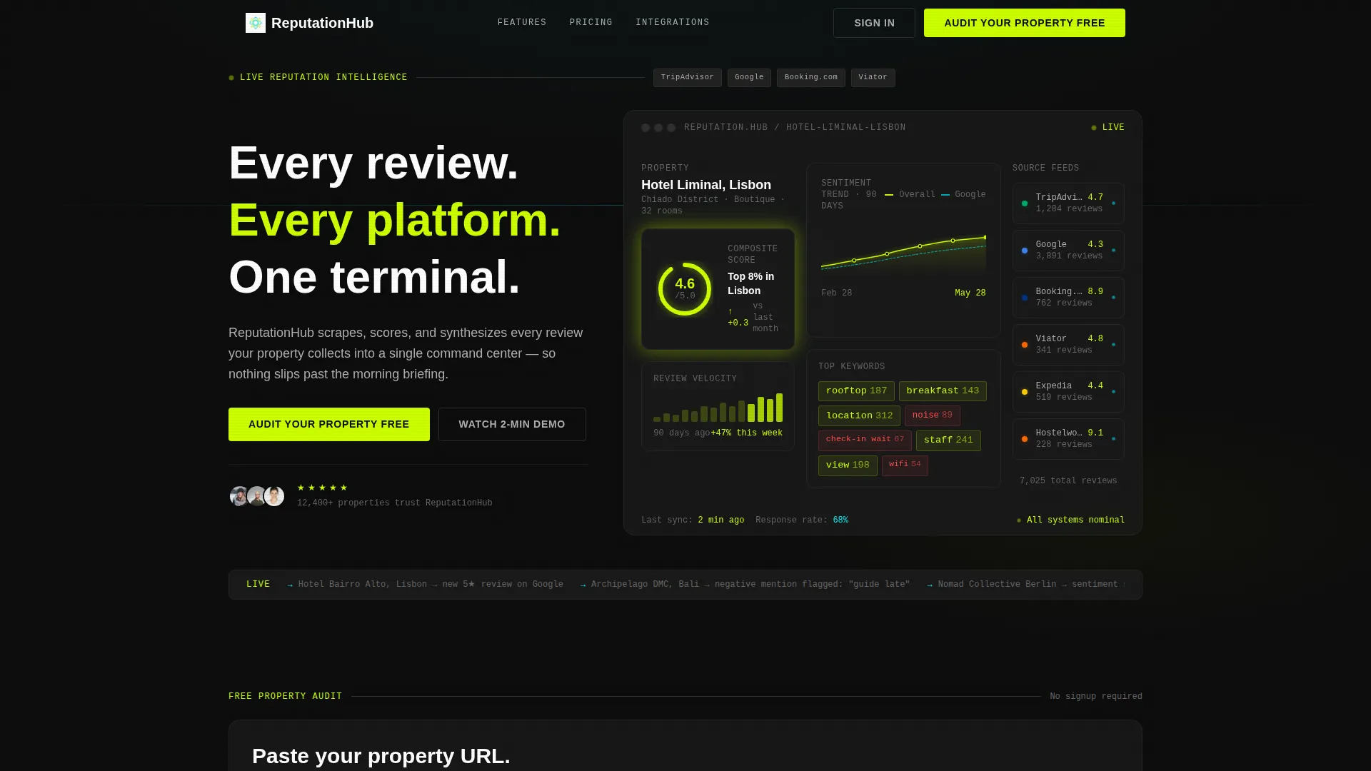
- A hero section featuring a live-rendered reputation scorecard for a fictional boutique property, showing composite score, sentiment trend, and source badges
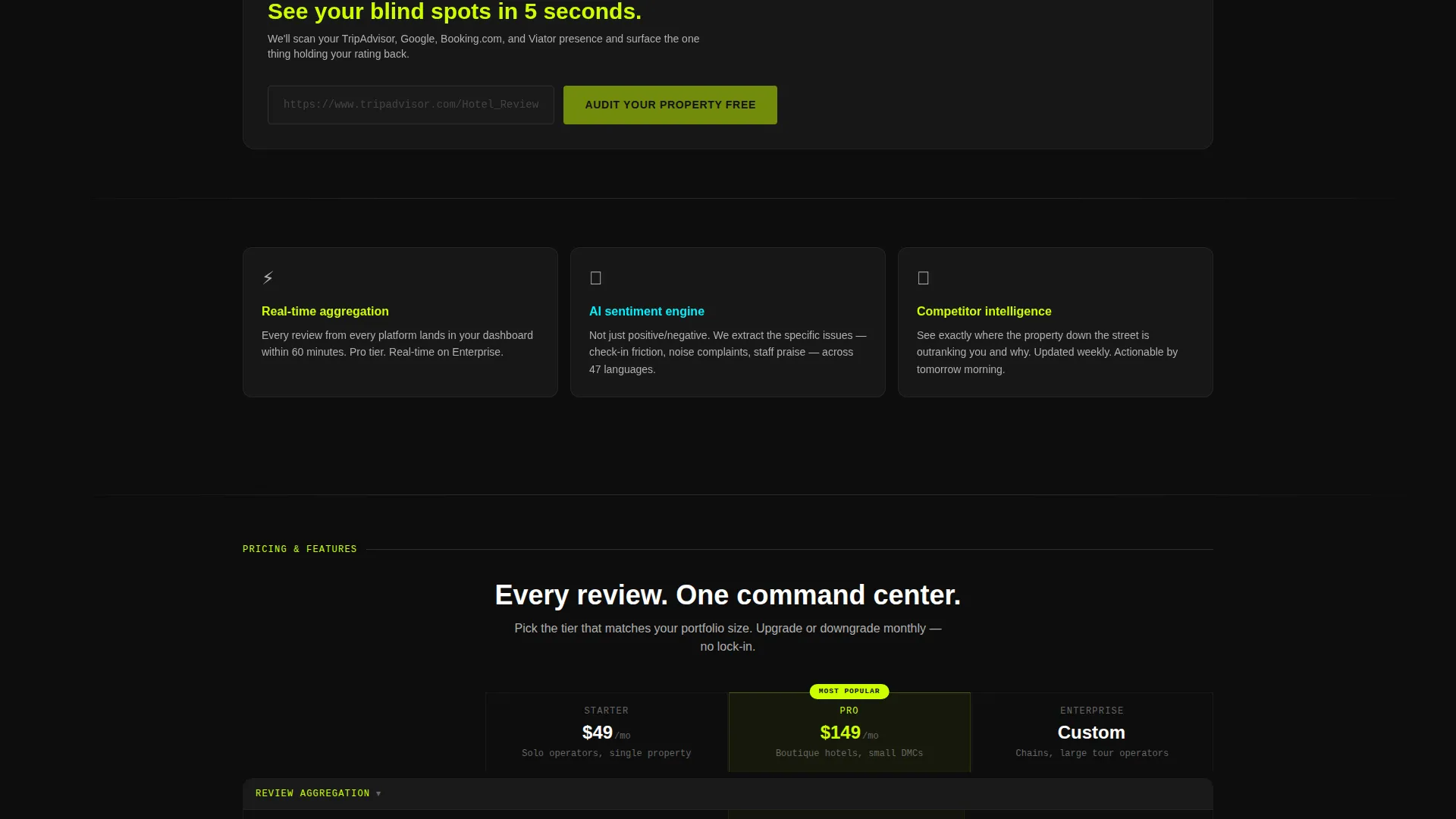
- An interactive review audit tool block where visitors paste a property URL and receive an instant simplified reputation snapshot
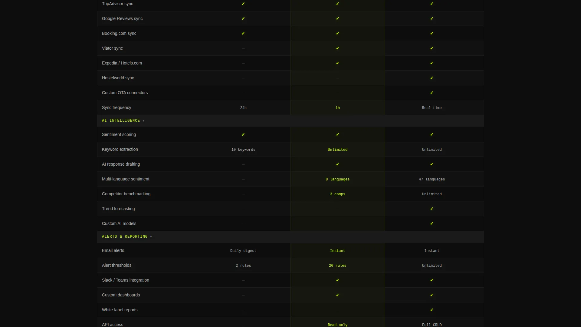
- Stacked pricing and feature comparison tables with chartreuse checkmarks against a terminal-black background
Feature list
This template includes a focused set of layout and interaction components drawn directly from the creative brief. Each feature serves the click-through goal of moving visitors toward a free trial.
Dashboard Preview Hero
The header opens with a rendered reputation scorecard for "Hotel Liminal, Lisbon." It displays a composite score of 4.6, a 90-day sentiment trend line, star counts, review velocity, keyword clouds, and source badges from six review platforms. Visitors immediately see what their own dashboard could look like.
Interactive Review Audit Tool
Positioned directly below the hero, this tool block accepts a property URL and returns a simplified reputation snapshot. The output includes total review count, average rating, and one critical insight highlighting a specific gap. This instant value delivery is the page's primary conversion engine.
Comparison Table Layout
Multiple comparison tables stack vertically, placing plan tiers side by side. Each row covers a specific feature category such as review aggregation sources, artificial intelligence response drafting, competitor benchmarking, multi-language sentiment analysis, and alert thresholds. Chartreuse checkmarks against the dark background make feature density feel energizing.
Dual Call-to-Action System
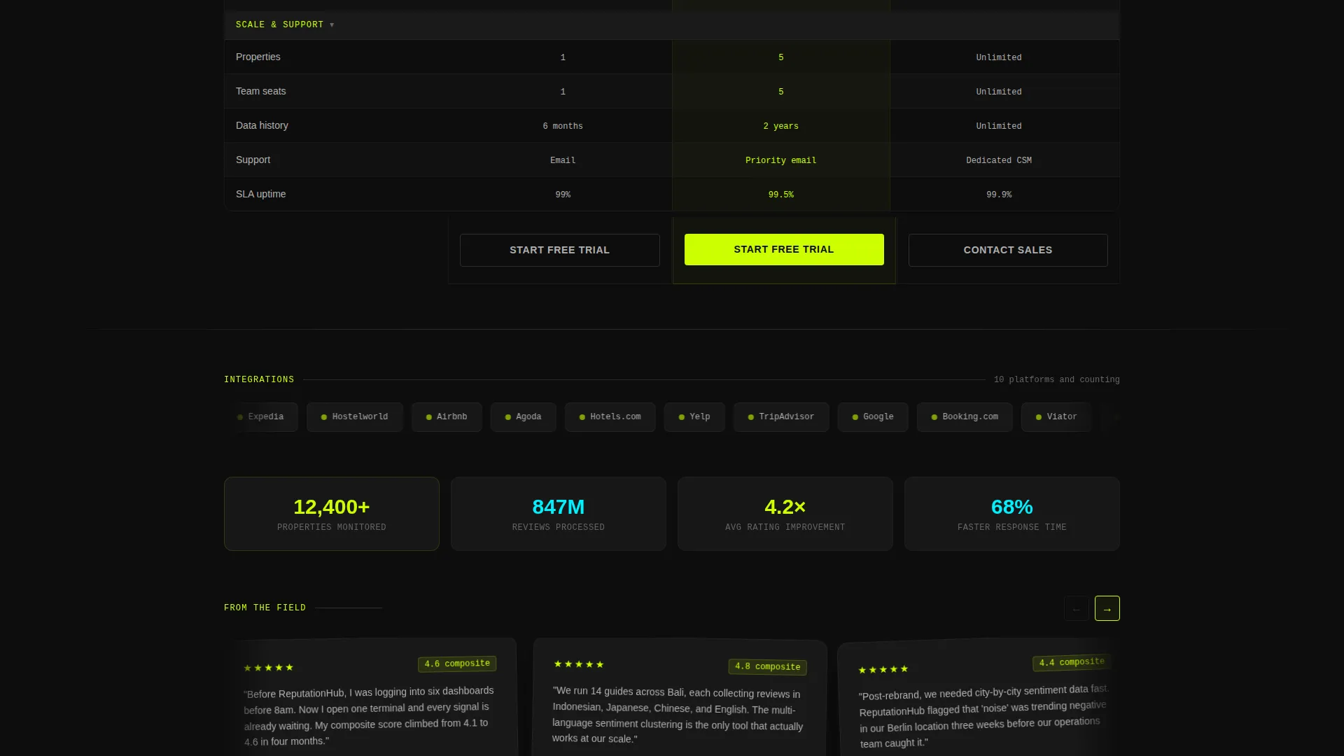
The primary call to action at the tool reads "Audit Your Property Free." It transforms to "Start Your Free Dashboard" beneath the comparison tables. Both calls to action route visitors to a free trial signup on the next page, with no form required on this page beyond the URL input field.
Acid Digital Color System
The palette uses electric chartreuse for calls to action and live data points, scanner-line cyan for interactive hover states and active filters, terminal black for the full-bleed background, and phosphor gray for body copy. The result is a dark-mode interface that feels live, data-rich, and intentional.
Directory and Discovery Theme
The overall visual direction evokes a real-time arrivals board at an international terminal. Every section competes for attention in a way that mirrors how hospitality professionals actually consume live data. The theme reinforces the platform's promise that nothing has been missed.
Page sections overview
| Section | Purpose |
|---|---|
| Dashboard Preview Hero | Shows a live reputation scorecard to create immediate product desire |
| Review Audit Tool | Delivers instant property insights to drive scroll and conversion intent |
| Comparison Tables | Stacks plan tiers with feature checks to justify upgrade decisions |
| Primary call to action Block | Pushes visitors to free trial signup with a context-matched action label |
| Secondary call to action Block | Reinforces the trial offer after full feature comparison is visible |
Design & branding system
The design follows a Directory and Discovery theme executed through the Acid Digital color system. Every color has a specific functional role, so the visual hierarchy is clear even at a glance.
- Electric chartreuse (#CCFF00) marks calls to action and live data points; deep terminal black (#0D0D0D) floods the background to create full dark-mode immersion
- Scanner-line cyan (#00F0FF) signals interactive hover states and active filter elements throughout the comparison tables
- Phosphor gray (#B0B0B0) keeps body copy and secondary labels legible without breaking the dark-mode atmosphere
Mobile & speed optimization
The template is structured for a clean, single-column flow on smaller screens. The high-contrast Acid Digital palette means text and data points remain readable without relying on color alone.
- The comparison tables are designed to scroll horizontally on narrow viewports, keeping plan-tier data intact
- The URL input field and audit tool result block are sized for comfortable thumb interaction on mobile devices
How this template helps you convert
This template is optimized as a click-through landing page. The entire page sequence is designed to move a skeptical visitor toward a single next action: starting a free trial on the following page.
- The Dashboard Preview hero creates immediate recognition. Visitors see a realistic scorecard and think about their own property before reading a single feature bullet.
- The review audit tool delivers a personalized data moment that makes the platform's value concrete and specific, lowering the psychological cost of clicking through to signup.
- The stacked comparison tables close the argument with feature-level detail, so visitors who need more proof before clicking have every question answered in one scroll.
Other information about this template
This template is part of the Travel Software and SaaS subcategory under the broader Technology category. It is designed specifically for the travel review management niche, where data density and real-time credibility are key purchase signals.
- The template style is Comparison Table, and the landing page direction is Click-Through, meaning the page goal is navigation to a separate signup or trial page rather than form submission on this page
- The creative direction is Calculator and Tool First, which means the interactive audit tool is positioned as the page's central persuasion element rather than a secondary feature block
- The header concept is Dashboard Preview, a pattern well suited to platforms where the product itself is a visual data interface
Theme
Directory & Discovery
Creative direction
Calculator/Tool First
Color system
Acid Digital
Style
Comparison Table
Direction
Click-Through
Page Sections
Dashboard Preview Hero Section
Interactive Review Audit Tool
Stacked Comparison Tables
Dual Context-matched Ctas
Acid Digital Color System
Related questions
What type of page is this template designed for?
Can I adapt the comparison tables for different review platforms?
Does the review audit tool include live data functionality?
Who is the intended visitor for this landing page?
Is this template built for dark-mode brand identities?



