Senior Care Software & SaaS Reviews Website Template
Repute is a senior care review management landing page template built for operators who need to stop losing move-ins to unanswered reviews. It pairs a live Review Health Calculator with a hub-and-spoke scroll arc, a frosted-glass Tech Glass visual identity, and a frictionless app download flow, making the cost of reputation blind spots impossible to ignore before a visitor ever scrolls.
by Rocket studio
Quick summary
Repute is a single-page, anchor-nav landing page template for senior living review management platforms. It opens with an interactive estimator that makes reputation risk feel immediate and dollar-quantifiable. From there, a structured Problem to Solution scroll arc guides visitors through five focused spoke sections before landing on a low-friction app download call to action.
Who this template is for
This template is designed for senior care software companies and review management platforms targeting the senior living industry. It speaks directly to the operators who carry the weight of reputation every day.
- Marketing directors managing dozens of assisted living facility listings across multiple review platforms
- Independent memory care owners who have experienced occupancy loss tied to a single unanswered negative review
- Regional senior living operators whose census numbers shift whenever a competitor improves their star rating
What problem this template solves
Senior care operators lose prospective residents because their reviews are scattered, unmonitored, and unanswered. A family researching facilities mid-decision will encounter a negative review with no response and move on. This template gives a review management platform a page that makes that invisible damage immediately visible.
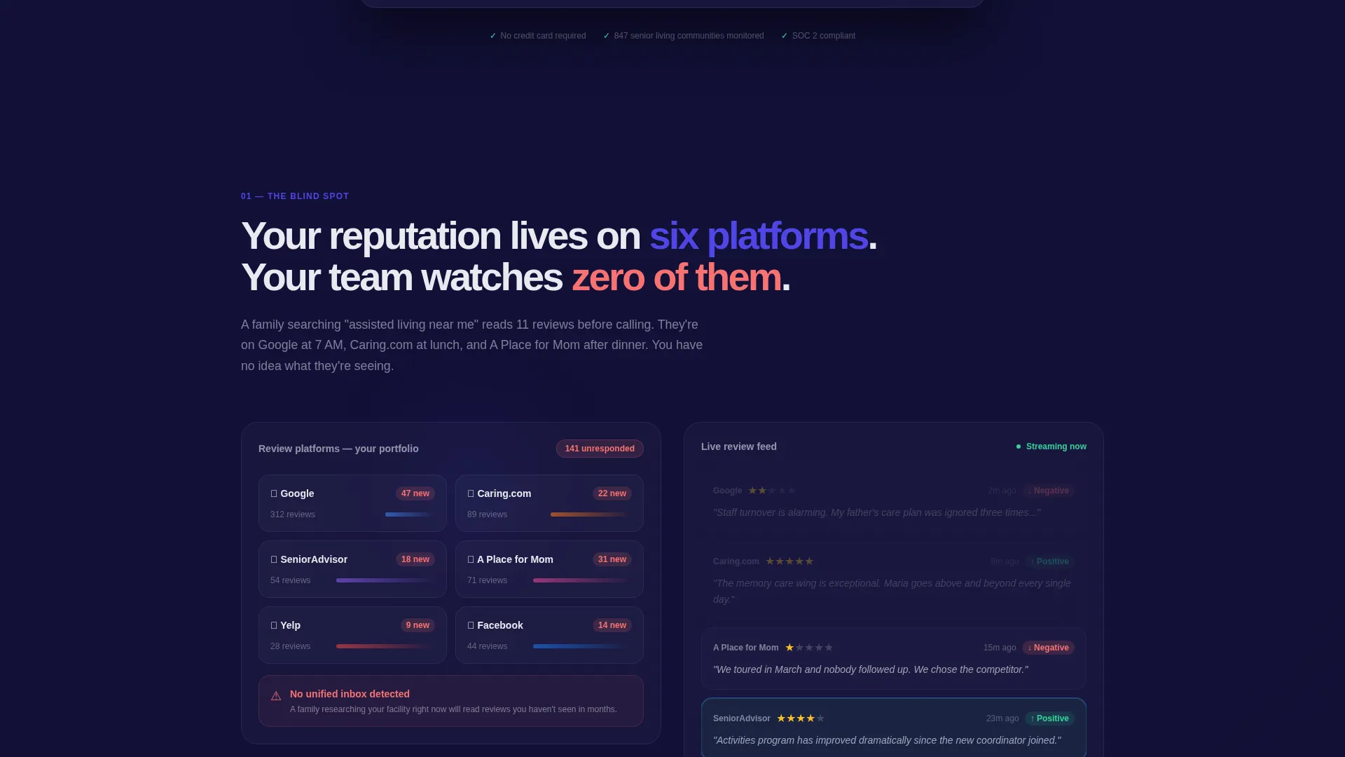
- Reviews fragment across many platforms, making it nearly impossible to track sentiment in one place
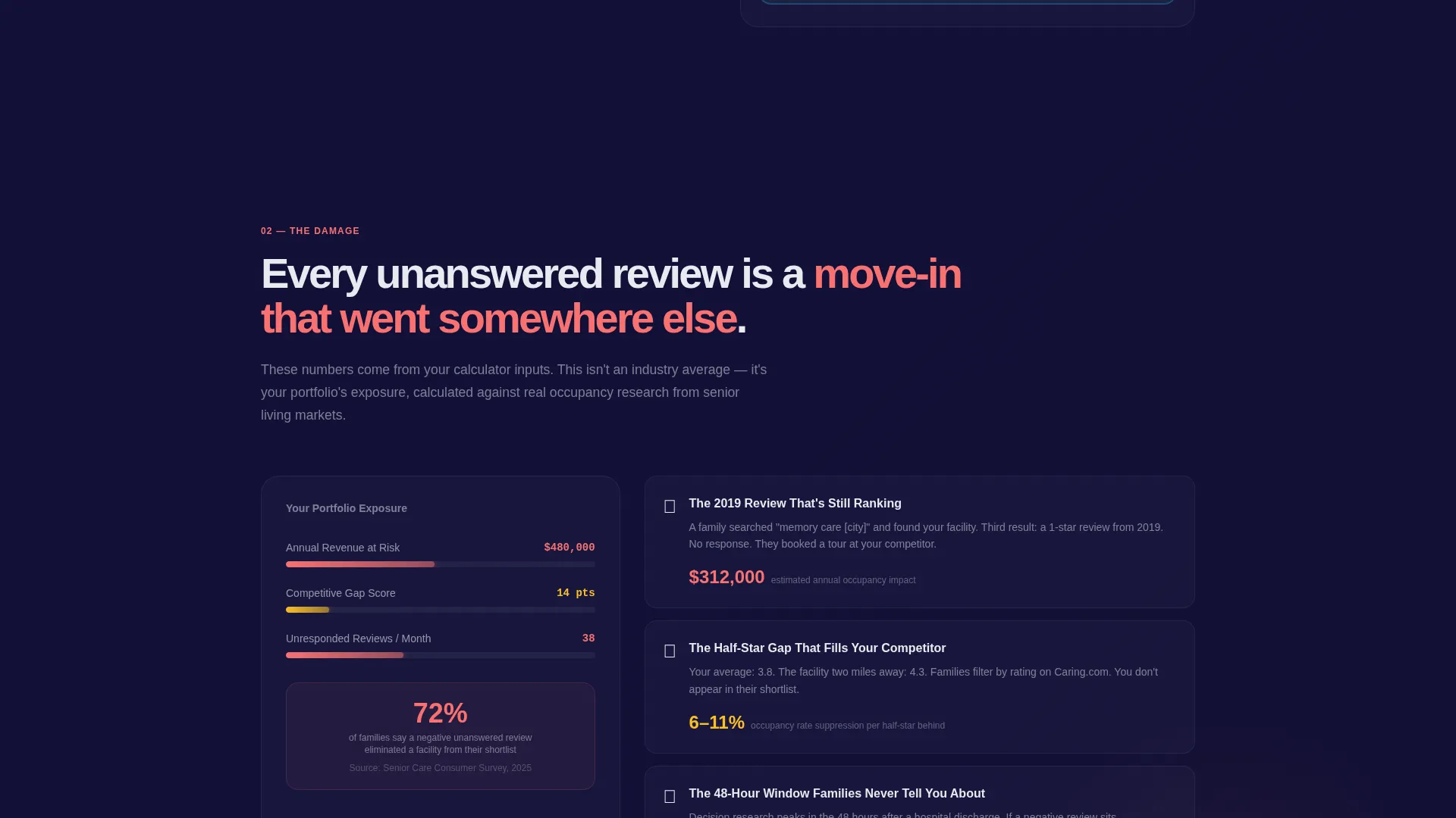
- Unanswered negative reviews directly reduce occupancy and are rarely quantified in dollar terms for operators
- Competitors who manage their ratings actively gain a measurable census advantage that is hard to counter without a clear system
What you get with this template
You get a fully structured, single-page hub-and-spoke landing page with an anchor navigation system, a live calculator header, and a five-section Problem to Solution scroll arc. Every piece is built to move a skeptical operator from vague concern to motivated action.
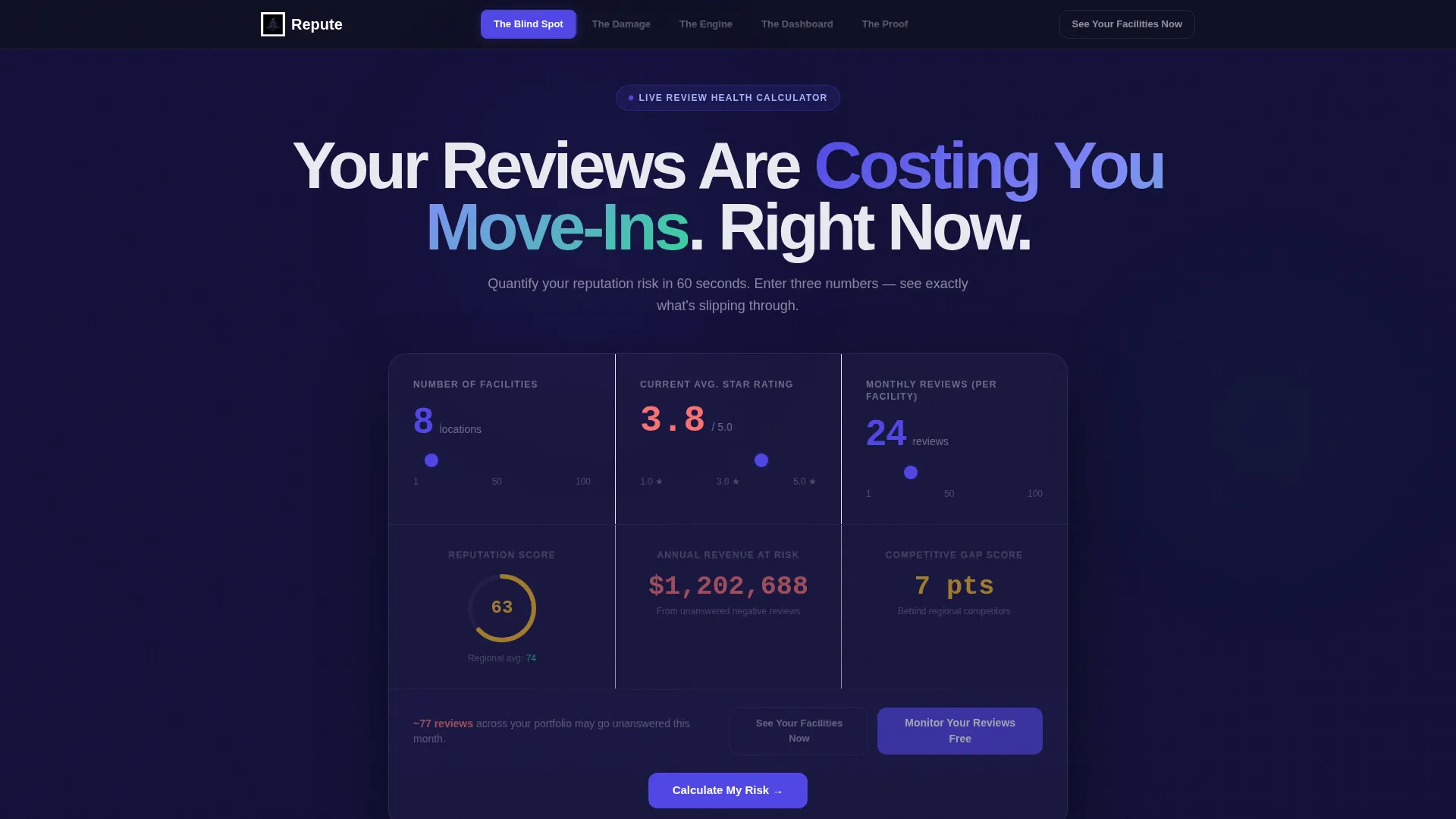
- A live Review Health Calculator in the header that renders projected reputation scores, occupancy revenue at risk, and a competitive gap analysis from visitor inputs
- Five thematically distinct spoke sections covering blind spots, occupancy damage, the platform engine, the unified dashboard, and recovery proof
- A dual call-to-action system with a primary app download flow and a secondary no-form audit link for friction-sensitive visitors
Feature list
This template packages several purpose-built components that work together to build urgency, demonstrate value, and drive app downloads.
Live Review Health Calculator
Visitors input their facility count, current star rating, and monthly review volume. The estimator instantly displays a projected reputation score, a dollar figure representing occupancy revenue at risk from unanswered negative reviews, and a competitive gap analysis against the regional average. Numbers animate upward in electric indigo with a digit-ticking effect.
Hub-and-Spoke Anchor Navigation
A sticky side navigation anchors each spoke section so visitors can jump to any part of the page at any point in the scroll. This gives busy operators a fast path to the content most relevant to them without losing the linear narrative structure.
Problem-to-Solution Scroll Arc
Five named spoke sections build narrative stakes progressively. The Blind Spot, The Damage, The Engine, The Dashboard, and The Proof each deepen the problem before resolving it, so visitors arrive at the call to action feeling the cost of inaction rather than just the cost of the tool.
Frosted-Glass user interface Dashboard Preview
The Dashboard spoke section features a frosted-glass panel preview of the platform's unified command view. Floating cards with subtle border glow and a near-black background communicate software sophistication without a single line of marketing jargon.
Dual Call-to-Action System
The primary call to action, Monitor Your Reviews Free, appears inside the calculator results panel and again as a fixed element in the navigation bar during scroll. A secondary call to action, See Your Facilities Now, deep-links into a limited free audit and bypasses the form entirely for skeptical visitors.
Two-Step App Download Flow
Tapping the primary call to action opens a two-field form collecting work email and facility count. After submission, visitors choose between iOS and Android download badges or scan a desktop-friendly QR code, reducing drop-off across device types.
Page sections overview
| Section | Purpose |
|---|---|
| Review Health Calculator | Opens with live inputs that quantify reputation risk and occupancy revenue exposure |
| Blind Spot spoke | Shows how reviews scatter across six platforms using a live-feed simulation |
| Damage spoke | Animates occupancy loss figures drawn from the visitor's own calculator inputs |
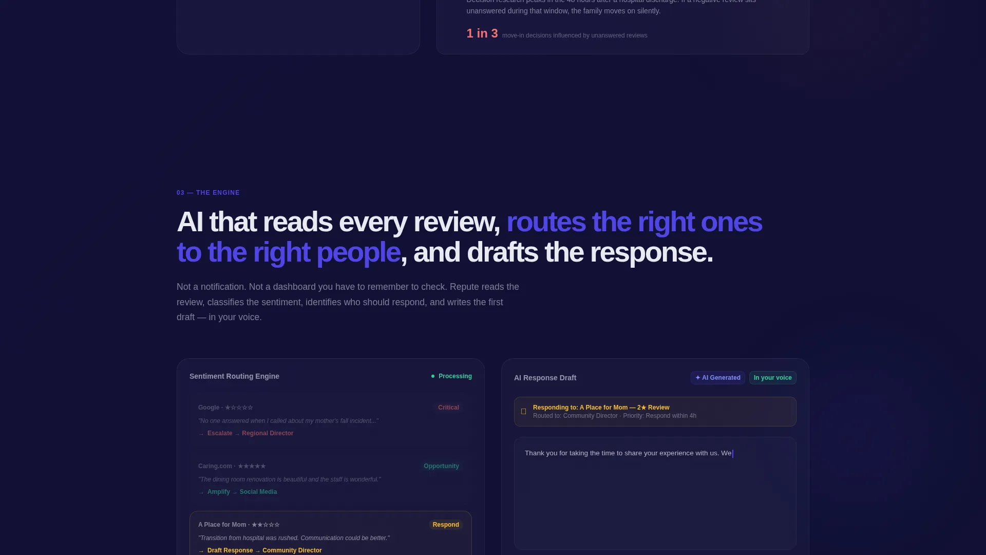
| Engine spoke | Reveals the AI-powered response drafting and sentiment routing capabilities |
| Dashboard spoke | Tours the unified review command view with a frosted-glass interface preview |
| Proof spoke | Stacks facility recovery case studies showing half-star rating gains in ninety days |
| App Download flow | Two-field form leading to iOS, Android, or QR code download paths |
Design & branding system
The template uses a Tech Glass visual identity built around an Electric Indigo color system. The overall feeling is a luxury heads-up display at dusk: dark, luminous, and information-dense without feeling cluttered.
- Core palette: deep dashboard black (#0D0F1C) for backgrounds, electric indigo (#4F46E5) for active states and data highlights, frosted glass panel white (#E8EAF0) for cards and panels, and signal green (#34D399) for positive sentiment indicators
- Cards and user interface panels float with frosted transparency and subtle border glow against near-black backgrounds, giving each data point a sense of depth and precision
- Interactive elements and animated numerals use electric indigo consistently, creating a visual hierarchy where the eye follows the data without needing instruction
Mobile & speed optimization
The template layout is built with responsive behavior in mind so the scroll arc and sticky navigation function cleanly across screen sizes. The app download flow is particularly optimized for mobile completion.
- The QR code path on the download screen serves desktop visitors, while iOS and Android badges are foregrounded on smaller screens to match the likely device context
- The two-field submission form is intentionally minimal, reducing tap-and-type friction for visitors arriving on a phone during a quick research session
- The sticky anchor navigation collapses appropriately on narrower viewports so spoke sections remain accessible without obstructing the reading area
How this template helps you convert
Every structural and design decision in this template is aimed at moving a cautious operator toward downloading the app or starting a free audit.
- The calculator makes the cost of inaction personal and immediate by turning a visitor's own inputs into a dollar figure for occupancy revenue at risk, creating emotional buy-in before any feature copy is read.
- The Problem to Solution arc withholds resolution until the visitor has felt the full weight of the problem across five spoke sections, so the call to action arrives at peak motivation rather than before it.
- The secondary See Your Facilities Now call to action removes the install barrier for skeptics by offering a proof-first path through a limited free audit, capturing visitors who would otherwise leave without converting.
Other information about this template
This template is categorized under Technology, specifically within the Senior Care Software and Software as a Service subcategory, and targets the Senior Care Review Management niche. It is purpose-built for platforms that help senior living communities monitor, respond to, and improve their online reputation across review sites like Google and Caring.com.
- The template style is Hub and Spoke with Anchor Navigation, meaning the sticky side nav links each spoke section back to the main scroll flow without requiring separate pages
- The header concept is a Calculator and Estimator, a high-intent interactive element that qualifies visitor motivation immediately and anchors the rest of the page's data narrative
- The creative direction is a Problem to Solution Arc, a proven persuasion structure where stakes are raised progressively before the resolution and call to action are revealed
- The landing page direction targets App Download as the primary conversion goal, with a secondary free audit path as a lower-commitment entry point
Theme
Tech Glass
Creative direction
Problem→Solution Arc
Color system
Electric Indigo
Style
Hub & Spoke (Anchor Nav)
Direction
App Download
Page Sections
Live Review Health Calculator
Hub-and-spoke Anchor Navigation
Problem-to-solution Scroll Arc
Frosted-glass Dashboard Preview
Dual Call-to-action System
Two-step App Download Flow
Related questions
What type of business is this template designed for?
Can I customize the calculator inputs and output metrics?
How does the dual call-to-action system work?
Does this template work well for both desktop and mobile visitors?
What does the Problem-to-Solution Arc mean in practice?



