E-Commerce Parcel Logistics Privacy Policy Website Template
Reroute is a split-screen landing page template built for reverse logistics and returns infrastructure platforms. It uses a control-room visual identity in charcoal and amber to present live recovery metrics, three procurement-style spec comparisons, and a two-field audit form. The design moves serious B2B buyers from skepticism to action by making their current process look expensive in precise, quantifiable terms.
by Rocket studio
Quick summary
Reroute is a single-page template designed for e-commerce returns platforms. It opens with a dashboard hero showing live parcel metrics, walks buyers through three side-by-side spec comparisons, and closes with an audit form. Every section is built to make the operational case row by row, before asking for any contact information.
Who this template is for
This template is built for teams selling returns infrastructure software to operations-focused buyers. It speaks the language of margin, throughput, and recovery rate, not marketing fluff.
- E-commerce operations directors processing ten thousand or more returns per month
- Third-party logistics account managers whose clients are losing margin on reverse shipping
- Direct-to-consumer brand founders watching refund rates erode quarterly profits
What problem this template solves
Most returns platform pages lead with features and ask for a demo before proving value. Ops directors and logistics buyers do not respond to that. They need numbers first, then a decision path.
- Buyers arrive skeptical and leave without converting because the page never quantifies the cost of doing nothing
- Sales cycles stall when evaluation-stage prospects cannot compare the platform against their current process in one view
- Generic SaaS landing pages fail to signal operational credibility to procurement-minded audiences
What you get with this template
You get a fully structured, desktop-first landing page that builds the case for a returns platform using real metrics and direct comparisons. Every section has a specific job, and nothing is decorative.
- A split-screen dashboard hero with a live parcel map panel and a returns recovery table panel
- Three scroll-driven spec comparison splits, each pairing a platform capability against its legacy equivalent
- A two-field audit conversion form and a secondary gated PDF download path
Feature list
This template covers every conversion stage a returns platform buyer moves through, from first impression to form submission. The sections below describe what each feature delivers and why it is built the way it is.
Split-Screen Dashboard Hero
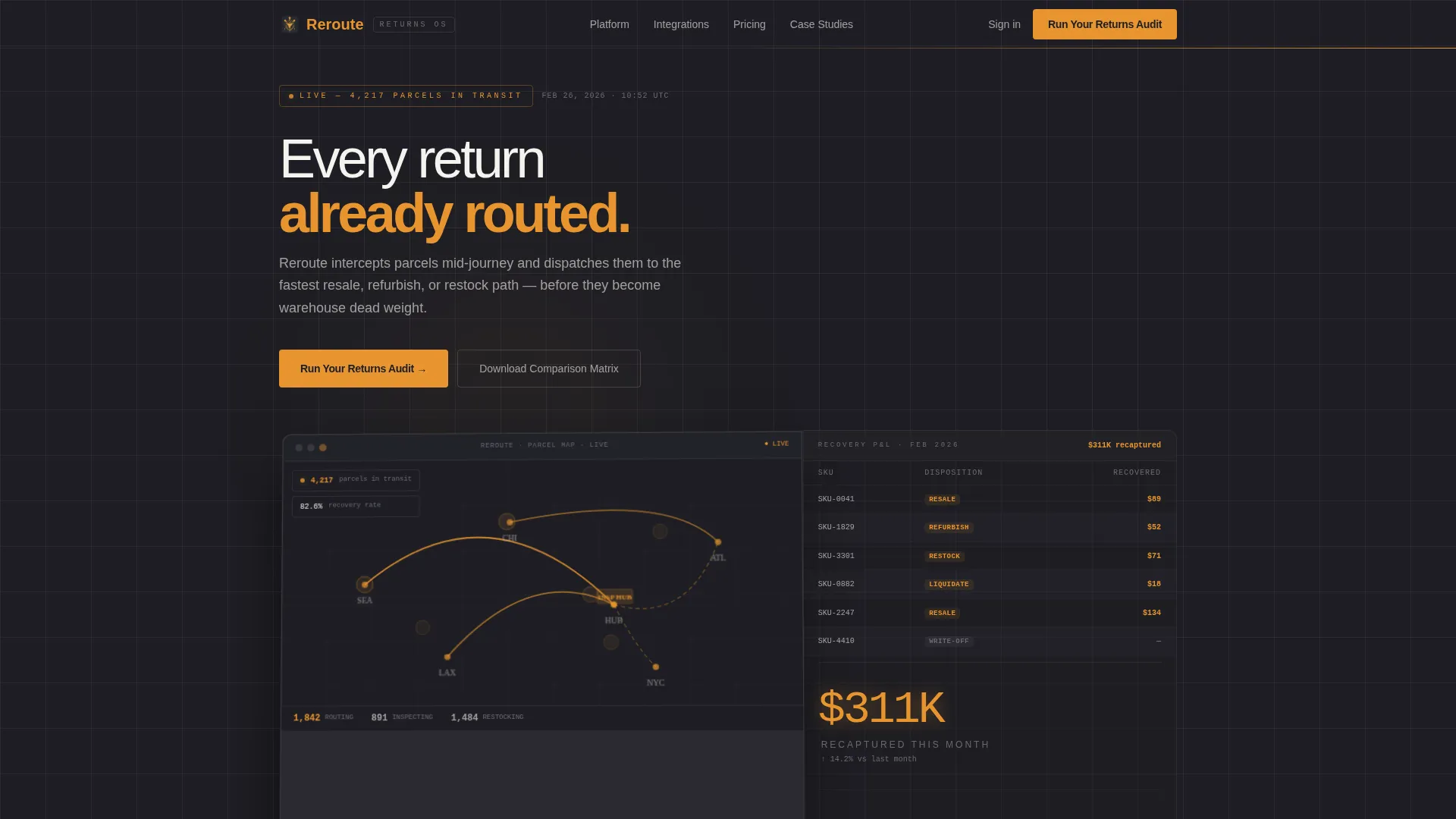
The header renders a pixel-accurate returns command center across two panels. The left panel shows a live parcel map with amber routing lines arcing between origin, inspection hub, and final disposition. The right panel displays a returns profit-and-loss table with recovered value in amber and write-off losses in muted gray. Visible metrics include 4,217 parcels in transit, an 82.6 percent recovery rate, and $311K recaptured this month. The dashboard floats on the charcoal background at a slight angle, giving it the feel of a screen you just pulled up during peak season.
Procurement-Style Spec Comparisons
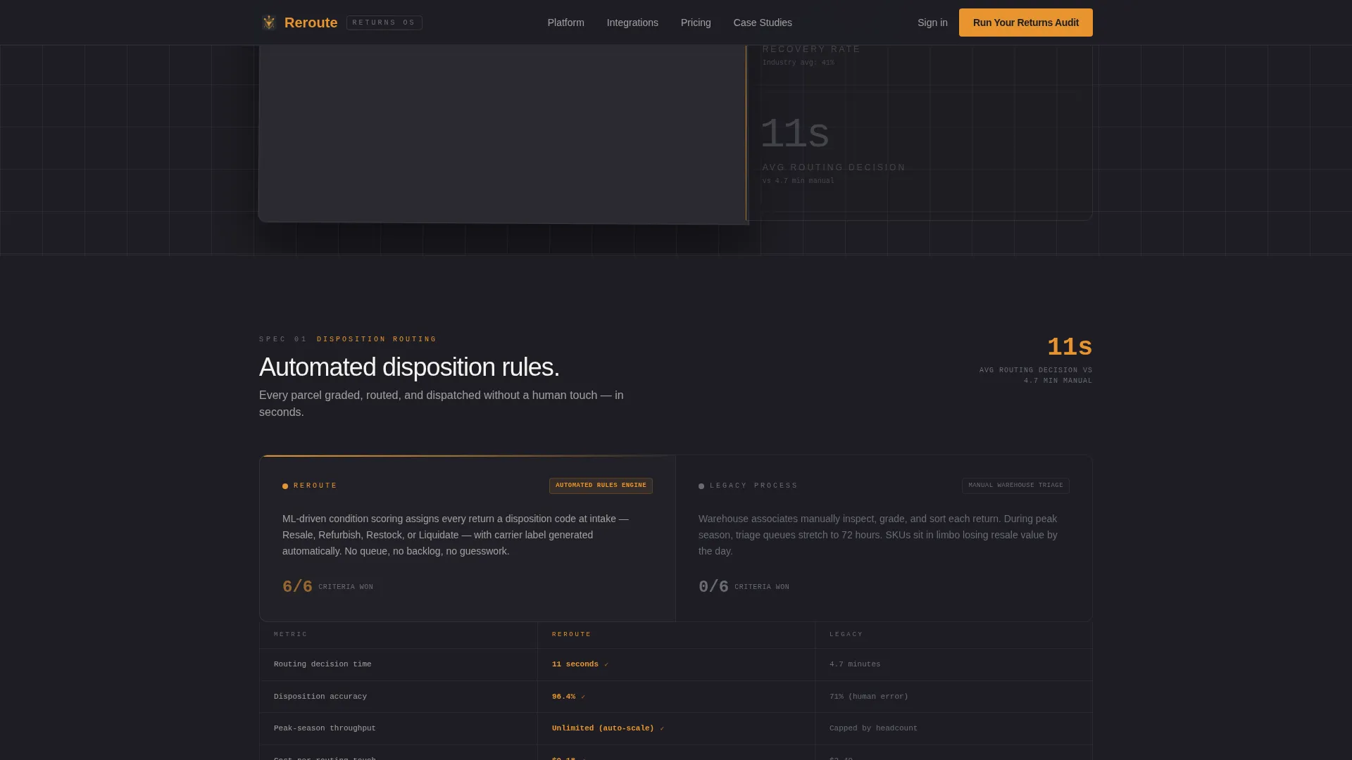
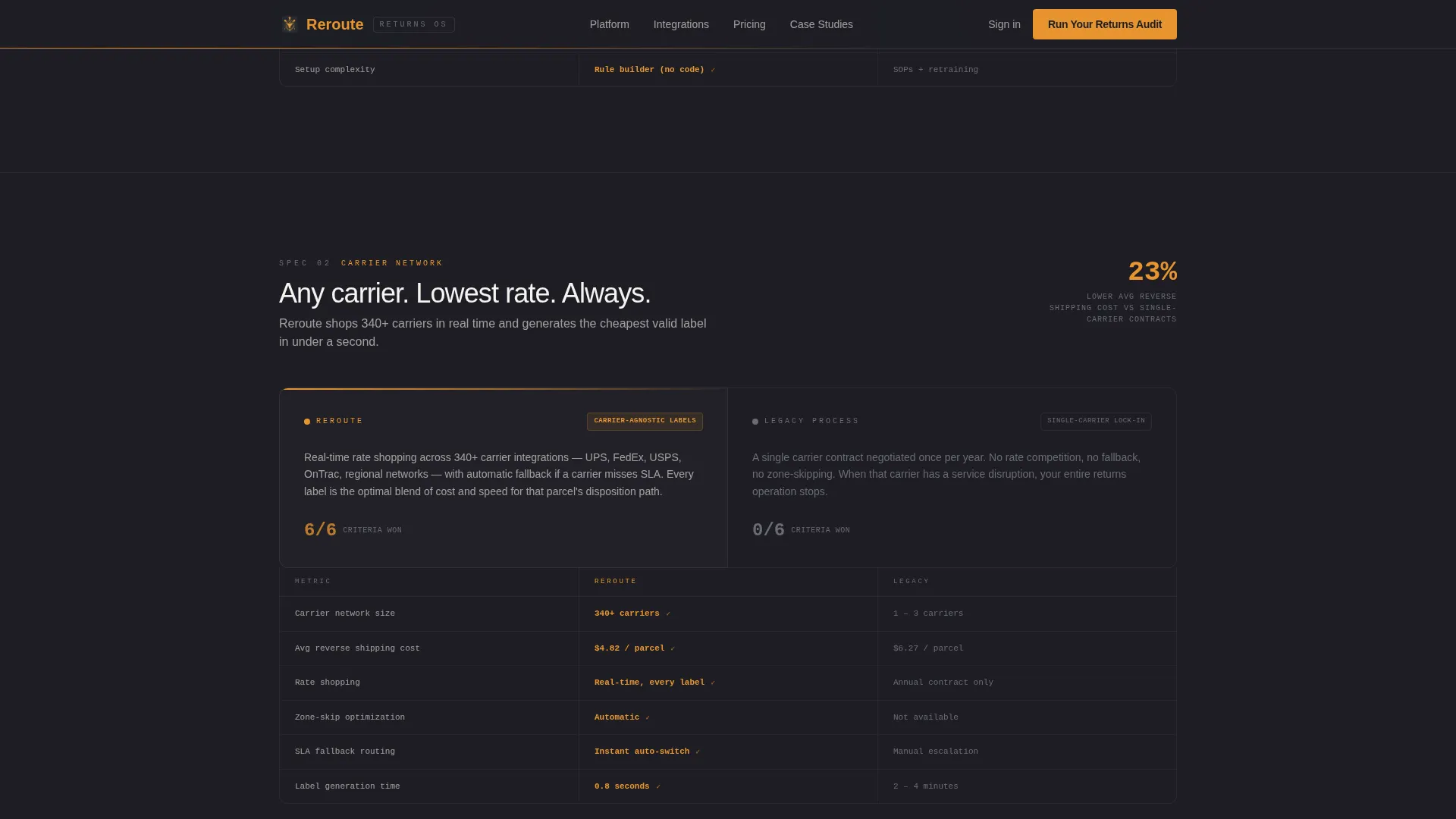
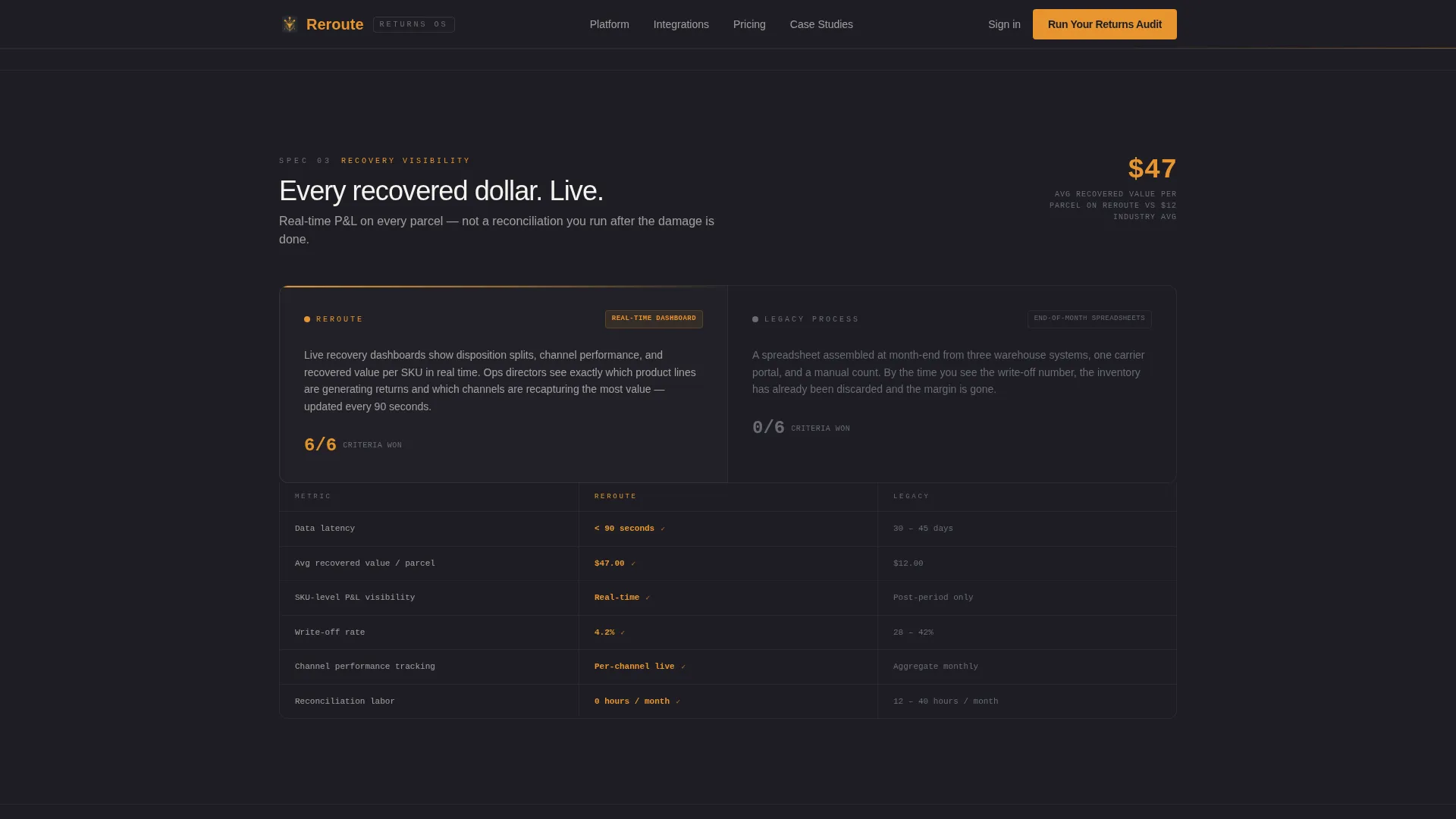
Three full-width split sections scroll like a procurement scorecard. Each split puts the platform capability on the left and the legacy process it replaces on the right. Split one covers automated disposition rules against manual warehouse triage, citing 11 seconds versus 4.7 minutes per parcel. Split two covers carrier-agnostic label generation against single-carrier lock-in, with 340-plus carriers available and a 23 percent cost reduction. Split three covers real-time recovery dashboards against end-of-month spreadsheet reconciliation, comparing $47 recovered per parcel against $12. Every section includes a specific metric so the case builds without needing editorial commentary.
Two-Field Audit Conversion Form
The primary call to action is "Run Your Returns Audit," positioned at the hero and repeated after the final spec comparison. The form collects two fields: monthly return volume via a dropdown (under 5K, 5K to 25K, 25K to 100K, 100K-plus) and current returns cost per parcel via an open field with a dollar sign pre-filled. This low-friction entry point qualifies the prospect and personalizes the audit output without demanding contact details upfront.
Gated PDF Secondary Path
A secondary conversion path offers "Download the Comparison Matrix" as a gated PDF for prospects still in evaluation mode. This gives fence-sitting buyers something concrete to take into an internal review while keeping them engaged with the platform.
Scroll-Linked Animations and Hover States
The template includes high-interactivity design behaviors: beam borders, scroll-linked section reveals, staggered card-in transitions, interactive stat hover effects, and hover states on comparison rows. Metric counters animate on entry to reinforce the live-data feel of the control-room aesthetic.
Industrial Utility Typography System
The template uses DM Sans for utility clarity across all body and label text, and JetBrains Mono for all data points, metrics, and table values. This pairing reinforces the operational tone and makes every number feel like it came from a real dashboard rather than a marketing slide.
Page sections overview
| Section | Purpose |
|---|---|
| Dashboard Hero | Opens with live parcel map and recovery metrics panel |
| Spec Split One | Automated disposition versus manual triage comparison |
| Spec Split Two | Carrier-agnostic labels versus single-carrier lock-in |
| Spec Split Three | Real-time dashboards versus end-of-month spreadsheets |
| Audit call to action Form | Two-field form qualifying return volume and cost per parcel |
| PDF Download Path | Secondary gated path for evaluation-stage prospects |
| Footer | Linear single-row footer pattern |
Design & branding system
The visual identity follows a Service Utility theme built entirely around operational function. The palette evokes a loading dock at 6 AM: amber safety lights cutting through dark steel racking, every label scannable, nothing decorative.
- Deep operations charcoal (#1E1E24) for primary backgrounds, warehouse concrete (#3A3A42) for card surfaces, signal amber (#E8952F) for all actionable elements and live data points, and clean manifest white (#F4F3EF) for text and table rows
- DM Sans handles all utility body copy; JetBrains Mono handles all metrics, data fields, and comparison values
- The overall style is industrial utility and control room: no decoration, no illustration, all function
Mobile & speed optimization
The template is built desktop-first to serve operations directors on workstations. Mobile responsiveness is included so the page holds up when prospects review it on other devices.
- Desktop-first layout prioritizes the split-screen dashboard and wide comparison table formats that ops buyers use at their desks
- Mobile-responsive structure ensures the stacked sections, metrics, and form remain readable and usable on smaller screens
- Interactive elements including the audit form, stat counters, and hover states are designed for both pointer and touch interaction
How this template helps you convert
Every layout decision in this template is calibrated to move a skeptical operations buyer toward a conversion action. The page earns the click before it asks for one.
- The hero dashboard leads with hard numbers (82.6 percent recovery rate, $311K recaptured) so buyers immediately see what a functioning platform looks like, making the gap between current state and platform output visible before any copy argues the case.
- The three spec comparison splits build a quantified operational argument row by row, assigning specific time savings, cost reductions, and revenue differences to each capability so the visitor's current process looks expensive in precise terms by the time the audit form appears.
- The dual conversion path (audit form plus gated PDF) captures buyers at two different readiness levels, reducing drop-off among prospects who are not yet ready to request a demo but are actively evaluating options.
Other information about this template
This template is part of the Logistics and Supply Chain category, sitting inside the E-Commerce Parcel Reverse Logistics and Returns niche. It is built for B2B software-as-a-service platforms operating in reverse logistics and returns infrastructure for e-commerce operations teams.
- The template style is Split Screen (50/50), with a Dashboard Preview header concept and a Comparison/Versus landing-page direction
- The creative direction is Spec Sheet: each scroll section reads like a technical evaluation row, not a feature announcement
- The color system is Charcoal and Amber, and the theme is Service Utility
- Animations are set to high intensity: beam borders, scroll-linked reveals, staggered card-in effects, interactive stat hover, and metric counters
- The footer uses Pattern 1, a linear single-row layout, keeping the exit experience clean and uncluttered
- Localization is set to English with USD currency and US date and number formatting throughout
Theme
Service Utility
Creative direction
Spec Sheet
Color system
Charcoal & Amber
Style
Split Screen (50/50)
Direction
Comparison/Versus
Page Sections
Split-screen Dashboard Hero
Three Procurement-style Spec Splits
Two-field Audit Conversion Form
Gated PDF Secondary Path
Scroll-linked Animations and Metric Counters
Industrial Utility Typography Pairing
Related questions
Who is this template designed for?
Can I change the metrics shown in the dashboard hero?
What does the audit form collect?
Is the comparison matrix PDF included with the template?
Does this template work for a product still in early stages?