Advanced Restaurant Software Comparison Website Template
Reserve is a scroll reveal landing page template built for restaurant membership management platforms. It combines an animated code terminal header, capability spec cards, and a comparison table into one persuasive single-page flow. Designed for restaurant operators and software teams, it turns complex loyalty and reservation logic into a confident, conversion-focused pitch.
by Rocket studio
Quick summary
Reserve is a single-page, scroll-driven landing page template for a restaurant membership management platform. It opens with a live-coded terminal animation, unfolds capability cards one at a time, and closes the argument with a comparison table built to convert. The layout speaks directly to operators who are tired of tracking regulars on sticky notes and spreadsheets.
Who this template is for
This template is built for teams selling or presenting restaurant membership software to hospitality operators. It works equally well as a product launch page or an outbound sales tool.
- Restaurant group operators managing multiple locations who need one dashboard for loyalty and reservations
- Independent fine-dining general managers who want a private-membership feel without legacy overhead
- Fast-casual brands testing subscription meal plans and needing a modern pitch to internal stakeholders
What problem this template solves
Most restaurant operators patch together loyalty tracking across punch cards, POS plugins, and spreadsheets. Guest history lives in three places at once, and no single view tells the host who deserves a warm greeting before they reach the podium.
- No central record of which regulars are due a comp, a tier upgrade, or a follow-up
- Churn goes undetected because no system flags members who have broken their usual visit cadence
- Prepaid credit balances and priority reservation logic require manual cross-checking across tools
What you get with this template
You get a fully structured scroll reveal landing page that builds a case section by section. Every component serves the single goal of making the status quo feel painful and the platform feel inevitable.
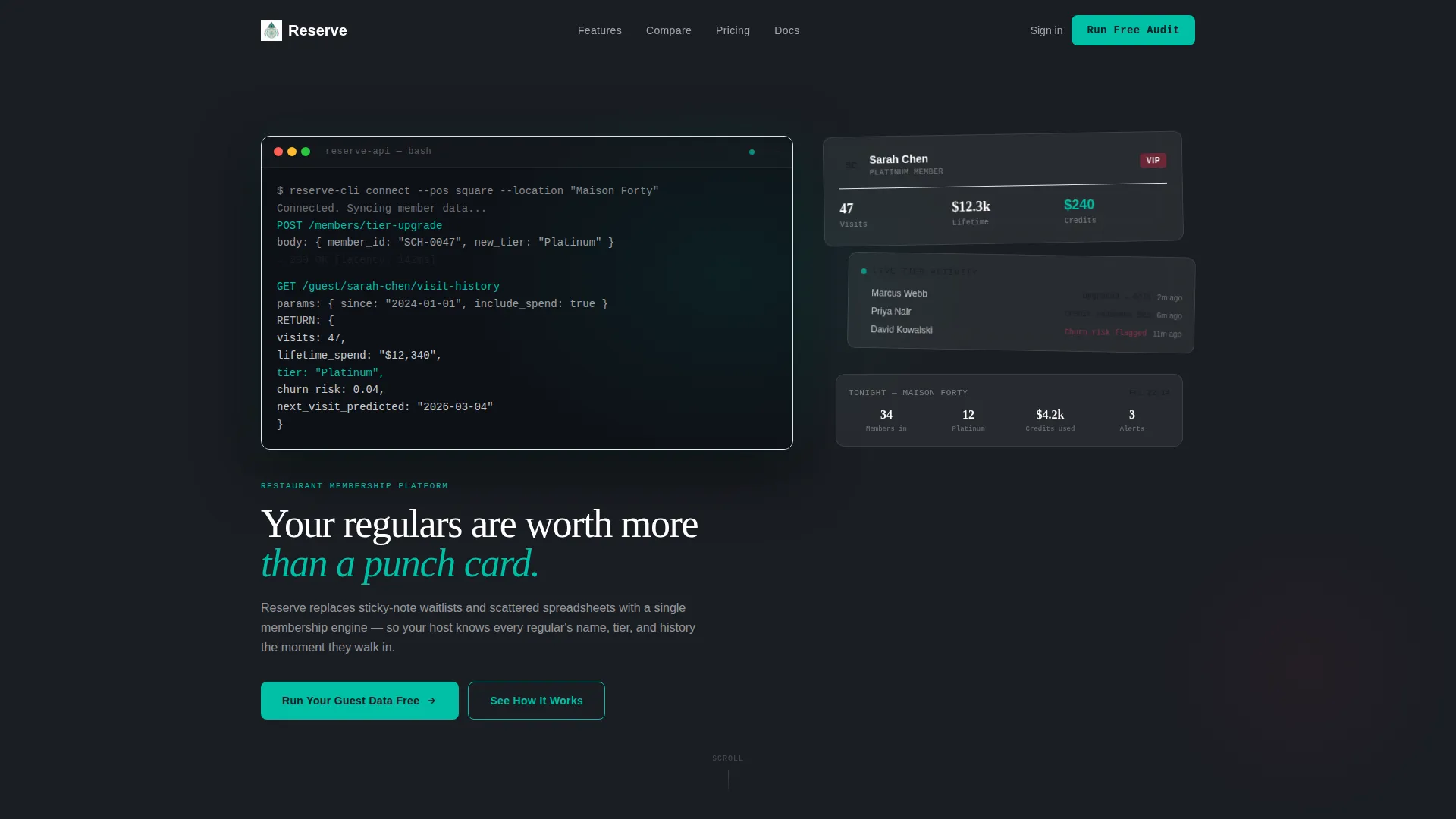
- An animated code terminal header that writes itself line by line, then docks into a dashboard mockup
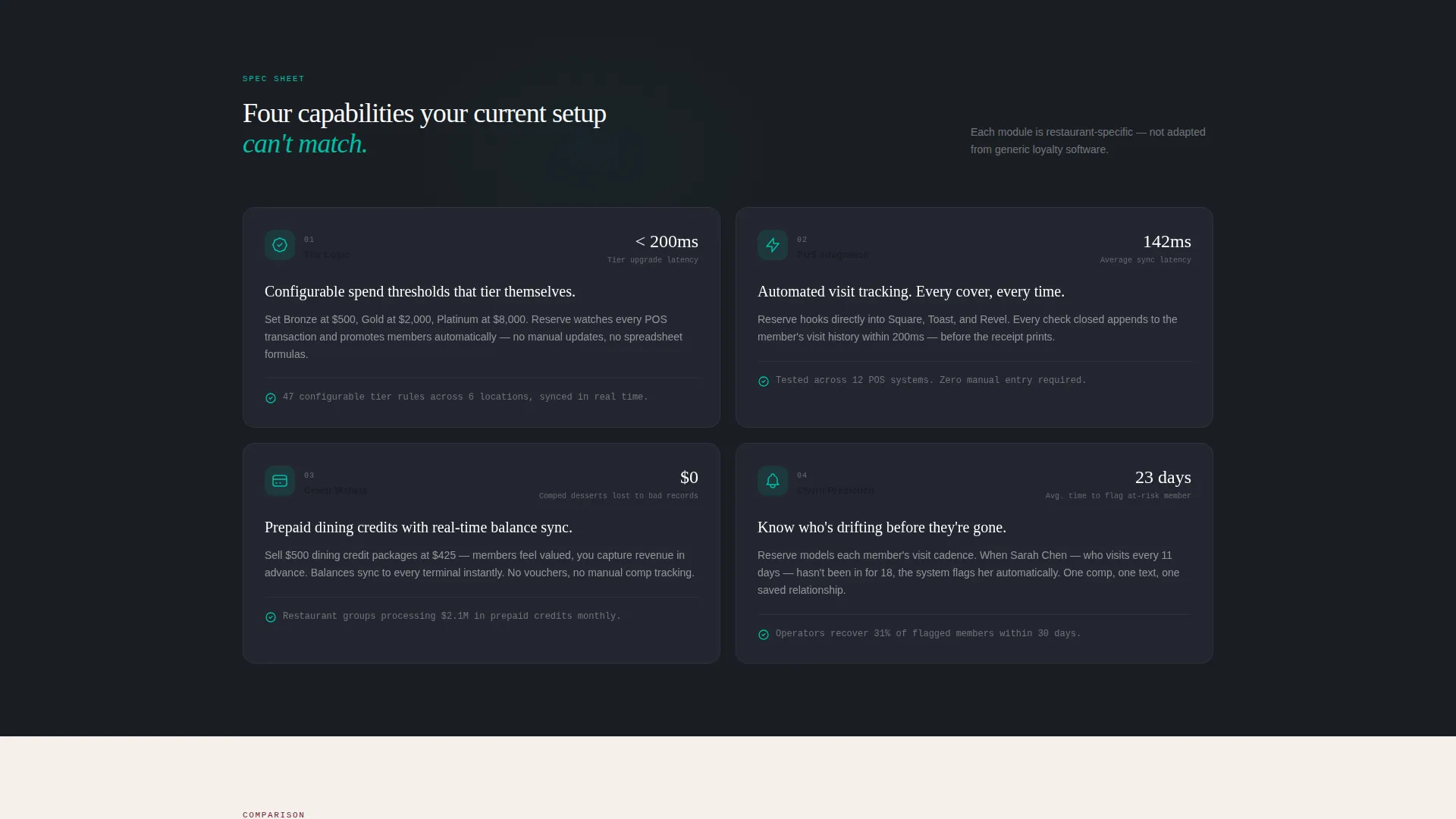
- Four progressive capability cards, each revealing one feature with its metric, mechanism, and proof point
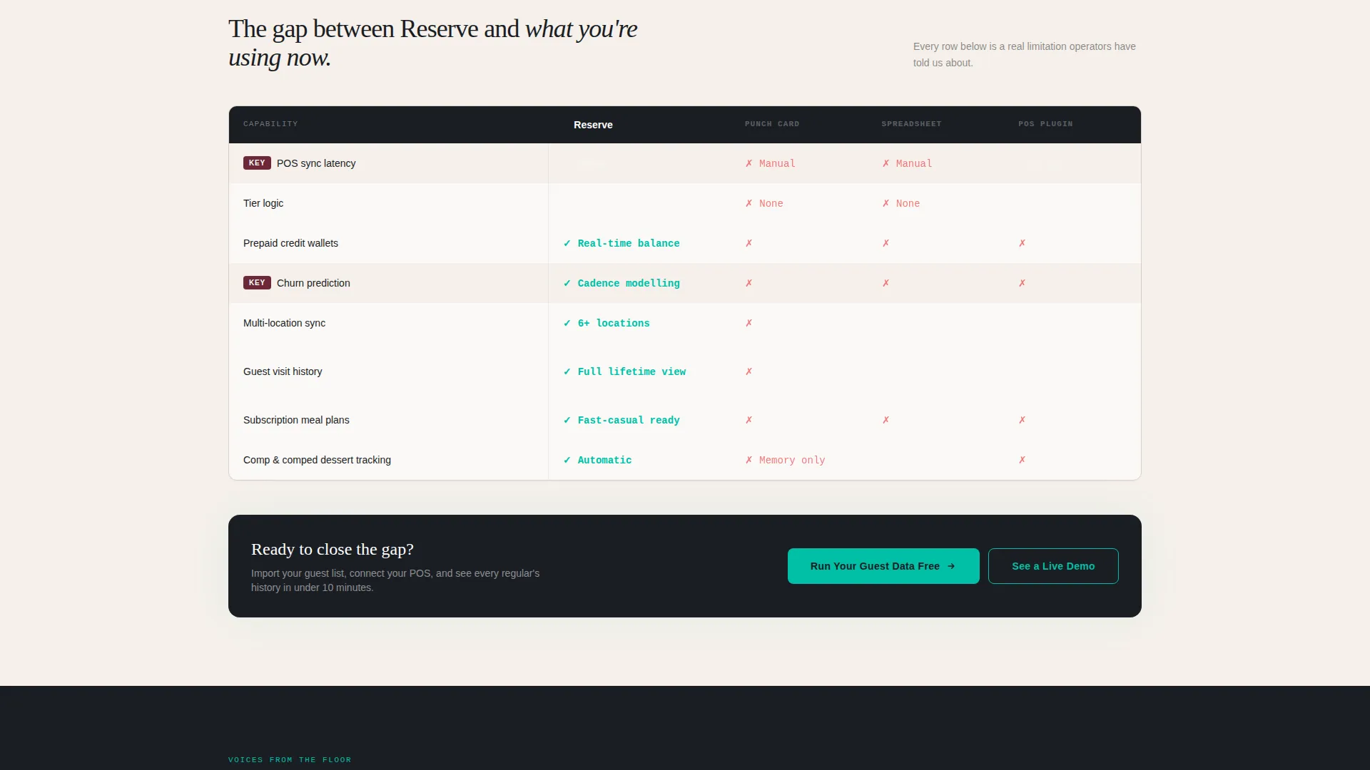
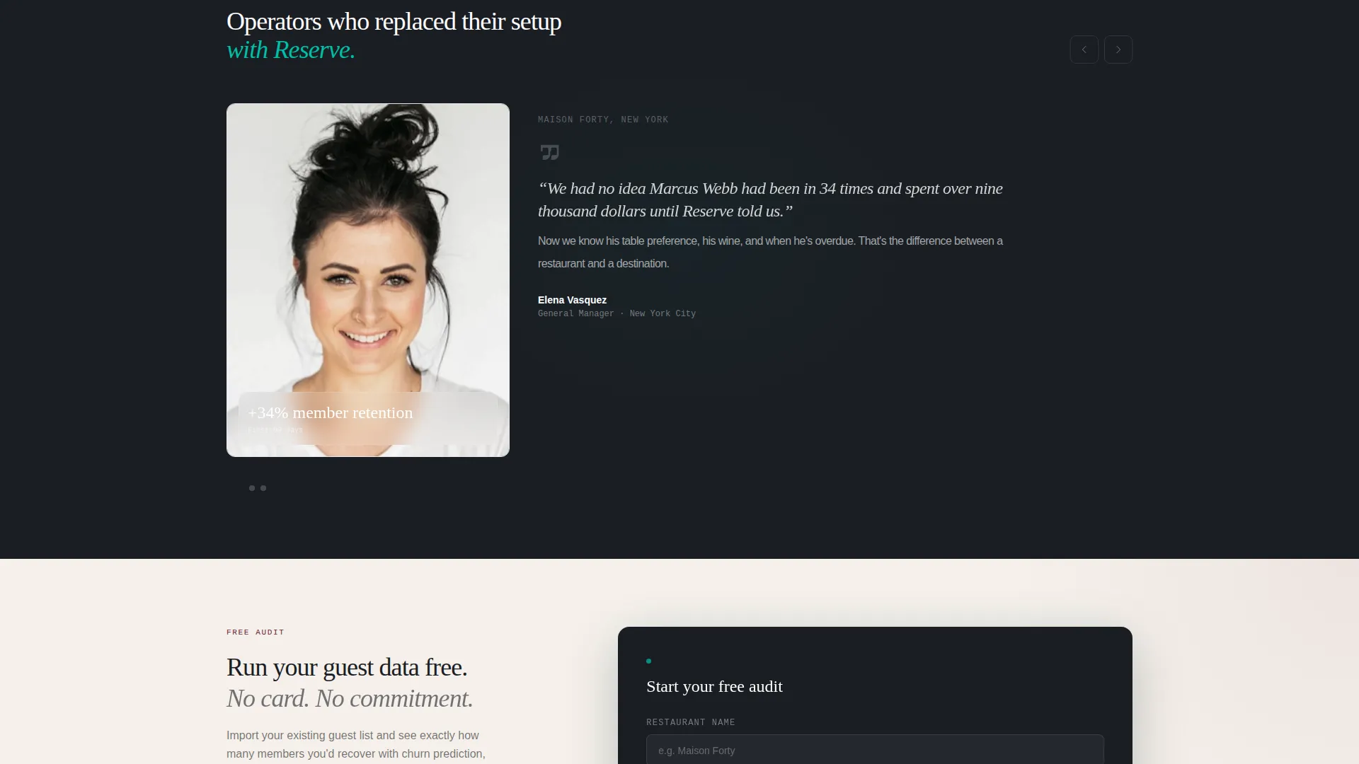
- A comparison table with per-row reveal logic and a three-field qualification form tied to the primary call to action
Feature list
This template packages six distinct design and content systems into one cohesive landing page flow. Each one is described below.
Animated Code Terminal Header
The header opens with a monospaced terminal block that animates line by line on screen. Each line is a readable API call showing real member data logic. Once complete, the terminal shrinks and docks into a full dashboard mockup that expands around it, visually proving the engine beneath the interface.
Progressive Capability Spec Cards
Four scroll-triggered cards reveal one capability at a time. Each card leads with a single metric, explains the mechanism, and closes with a proof point. Cards slide in from the right with a motion blur that sharpens on arrival, keeping the page kinetic throughout the scroll journey.
Comparison Table with Reveal Rows
Between capability cards, burgundy-highlighted rows compare this platform against generic loyalty apps, spreadsheet tracking, and legacy POS plugins. Each row appears on scroll, building cumulative pressure against the visitor's current setup and making the switching argument without a single aggressive claim.
Loyalty Tier and Spend Threshold Logic
One dedicated card covers member tier logic with configurable spend thresholds. The layout shows how the platform automatically moves guests through tiers based on real visit and spend data, replacing manual host-stand decisions with rules the operator sets once.
Churn Prediction Alert System
A dedicated capability card covers churn prediction. The platform flags members who have broken their usual visit cadence, surfacing the alert in the dashboard before the guest is already lost. The card frames this as proactive retention rather than reactive damage control.
Qualification Form with Minimal Friction
The primary call-to-action form asks for three fields only: restaurant name, number of locations, and current loyalty method via dropdown. The dropdown options mirror real operator scenarios, making qualification feel conversational rather than interrogative.
Page sections overview
| Section | Purpose |
|---|---|
| Terminal Header Animation | Opens with live-coded API lines that dock into a dashboard mockup |
| Hero Headline Block | Delivers the core message: regulars are worth more than a punch card |
| Capability Card One | Reveals member tier logic with configurable spend thresholds |
| Capability Card Two | Shows automated visit tracking via POS integration at under 200ms |
| Comparison Row Set One | Contrasts platform against generic loyalty apps on key dimensions |
| Capability Card Three | Presents prepaid credit wallets with real-time balance sync |
| Comparison Row Set Two | Contrasts platform against spreadsheet tracking |
| Primary call to action Block | Surfaces "Run Your Guest Data Free" form after third comparison row |
| Capability Card Four | Flags churn prediction for members off their usual visit cadence |
| Comparison Row Set Three | Contrasts platform against legacy POS plugins |
| Sticky Bottom Bar | Carries secondary call to action linking to the live interactive demo |
Design & branding system
The visual identity follows a Dynamic Motion theme built around the Teal Catalyst color system. The palette evokes a dimly lit dining room where the only bright point is the host-stand screen.
- Deep service-floor charcoal (#1A1D23) as the base background, warm linen (#F5F0EB) for content surfaces, and catalyst teal (#00BFA6) for interactive and hover states
- Sommelier burgundy (#6B2737) reserved for competitive differentiator rows and alert badge elements
- Monospaced type in the terminal header, with catalyst teal text on charcoal, reinforcing the precision of the underlying platform logic
Mobile & speed optimization
The scroll reveal structure and motion blur card animations are designed to work within a single-page layout that adapts across screen sizes. The progressive reveal pattern keeps long-scroll pages readable on smaller viewports.
- Capability cards and comparison rows reflow cleanly for vertical mobile reading without losing the left-to-right reveal narrative
- The sticky bottom bar remains accessible across device heights, keeping the secondary call to action visible throughout the scroll
How this template helps you convert
The page is structured as a Comparison/Versus conversion path. Every section adds evidence before asking for anything.
- The animated terminal header establishes technical credibility in the first seconds, before any marketing claim appears, setting up trust for the capability cards that follow.
- The comparison table rows build cumulative friction against the visitor's current system, so by the time the primary call-to-action form appears after the third comparison row, the visitor has already felt the cost of staying put.
- The three-field qualification form lowers commitment enough that operators who are still evaluating will submit, giving the sales team a warm lead without requiring the visitor to commit to a full demo upfront.
Other information about this template
This template is part of the Reserve design system, which pairs the Dynamic Motion theme with the Teal Catalyst color palette for hospitality technology contexts. A few additional details worth noting:
- The template style is Scroll Reveal (Progressive), meaning each section unlocks only as the visitor scrolls into it, creating a paced narrative rather than an overwhelming first view
- The header concept is classified as Code Snippet, a design pattern that leads with technical proof before transitioning to product user interface, which is particularly effective for software platforms selling to operationally minded buyers
- The creative direction follows a Spec Sheet model: short, factual capability cards that respect the reader's time and assume they already understand the problem
- The landing page direction is Comparison/Versus, a structure proven effective when the primary buyer objection is attachment to an existing workflow rather than lack of awareness about the category
Theme
Dynamic Motion
Creative direction
Spec Sheet
Color system
Teal Catalyst
Style
Scroll Reveal (Progressive)
Direction
Comparison/Versus
Page Sections
Animated Code Terminal Header
Progressive Scroll Reveal Cards
Comparison Table with Row Reveals
Churn Prediction Alert Card
Prepaid Credit Wallet Display
Three-field Qualification Form
Related questions
Who is this template designed for?
Can I customize the terminal animation lines to match my platform's actual API?
Does the template include the comparison table content, or do I supply it?
Is this a single page or a multi-page template?
What is the sticky bottom bar linked to by default?



