Reserve - High-Voltage Restaurant Landing Page Template
Reserve is a Bold Brutalist restaurant booking landing page template built for restaurant management software. It uses a modular card grid layout, a Carbon Fiber color system, and a Spec Sheet creative direction to present live operational data with conviction. The design targets restaurant GMs, hospitality group operators, and independent owners who need a high-converting click-through page that earns trust before asking for a single click.
by Rocket studio
Quick summary
Reserve is a single-page, card grid landing page template for restaurant booking software. It leads with live operational metrics inside a Dark Glass Panel header, then delivers feature proof through brutally aligned spec cards. The entire page drives visitors toward one action: launching a live interactive demo. No forms, no stock photography, no compromise.
Who this template is for
This template is built for software teams and operators who need a landing page that speaks the language of the restaurant floor, not the marketing department.
- Restaurant general managers running high-volume Friday and Saturday services who need a booking tool that can keep up
- Hospitality group operations managers standardizing reservation flows across multiple locations
- Independent restaurant owners moving off paper diaries and into a digital booking system for the first time
What problem this template solves
Most restaurant software landing pages bury the product under lifestyle imagery and vague benefit statements. Buyers who actually run a floor want proof, not polish. This template solves the credibility gap directly.
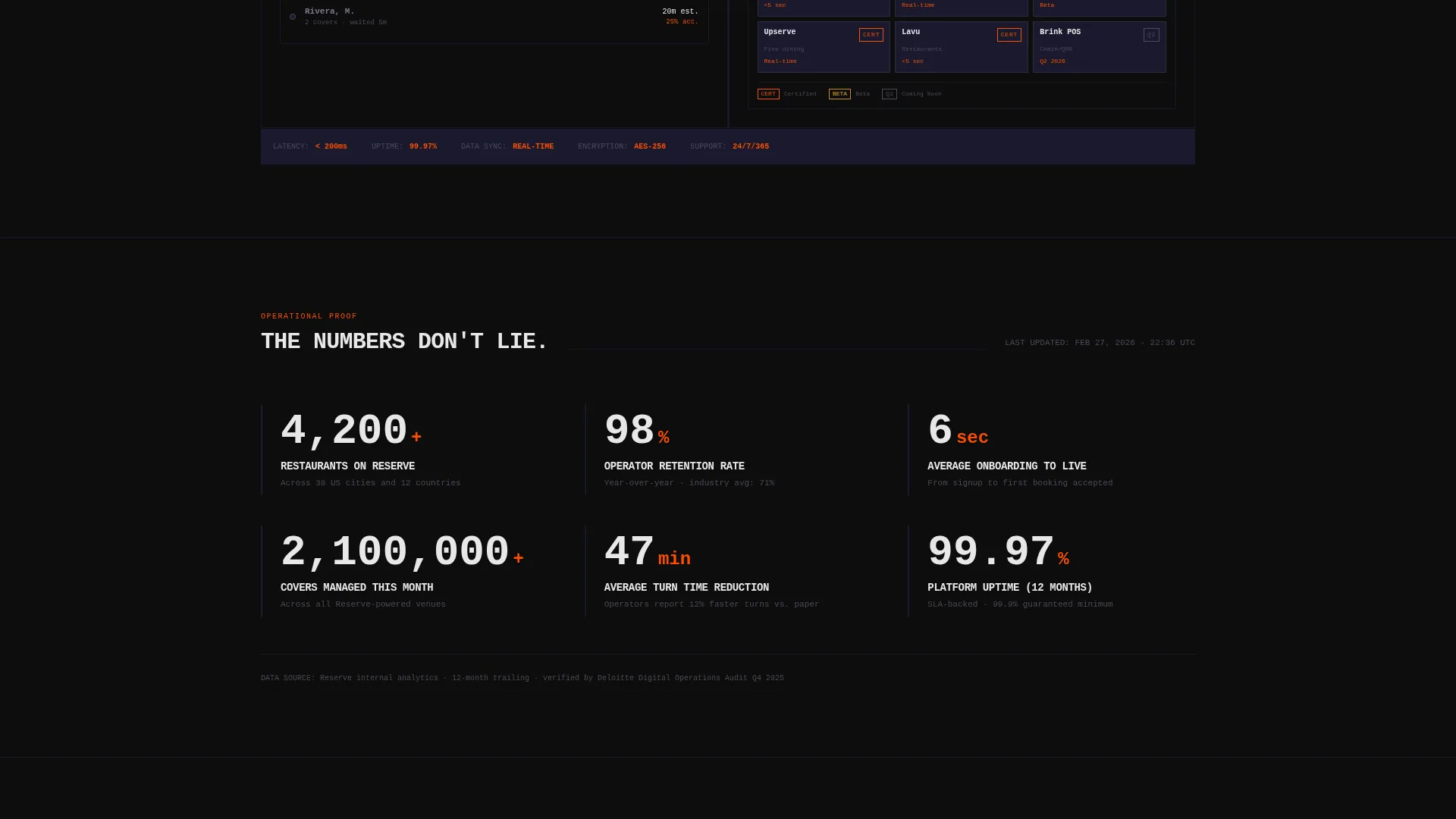
- It replaces stock photography with live data snapshots, so visitors see the product working before they ever click
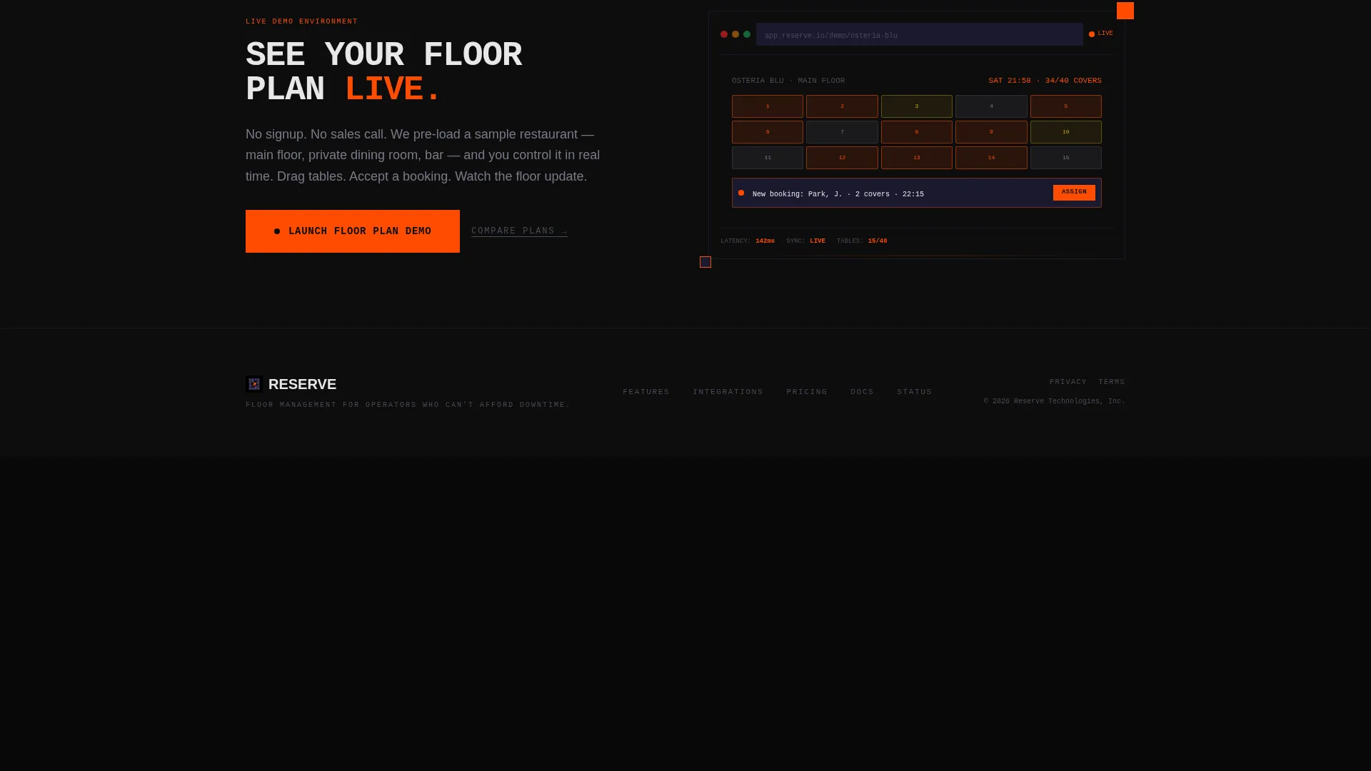
- It removes friction by skipping on-page forms entirely and routing interested buyers straight into a sandbox demo environment
- It gives hospitality operators a spec-driven layout that mirrors how they already think: covers, turn times, no-show rates
What you get with this template
You get a fully structured, single-page landing page built around a modular card grid. Every section is pre-designed and ready to populate with your product's real metrics and user interface screenshots.
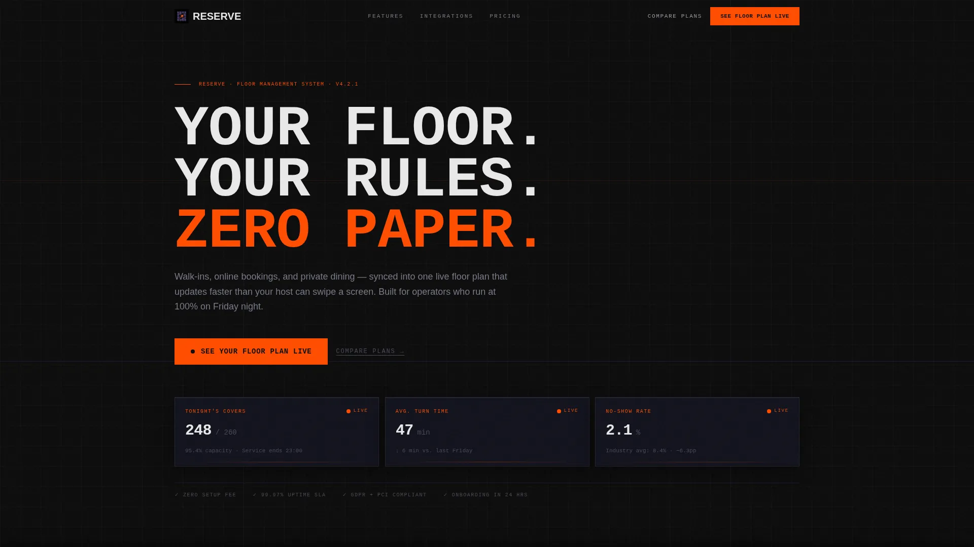
- A Dark Glass Panel header showing three live-data cards, a bold mono-type headline, and a signal orange primary call-to-action button
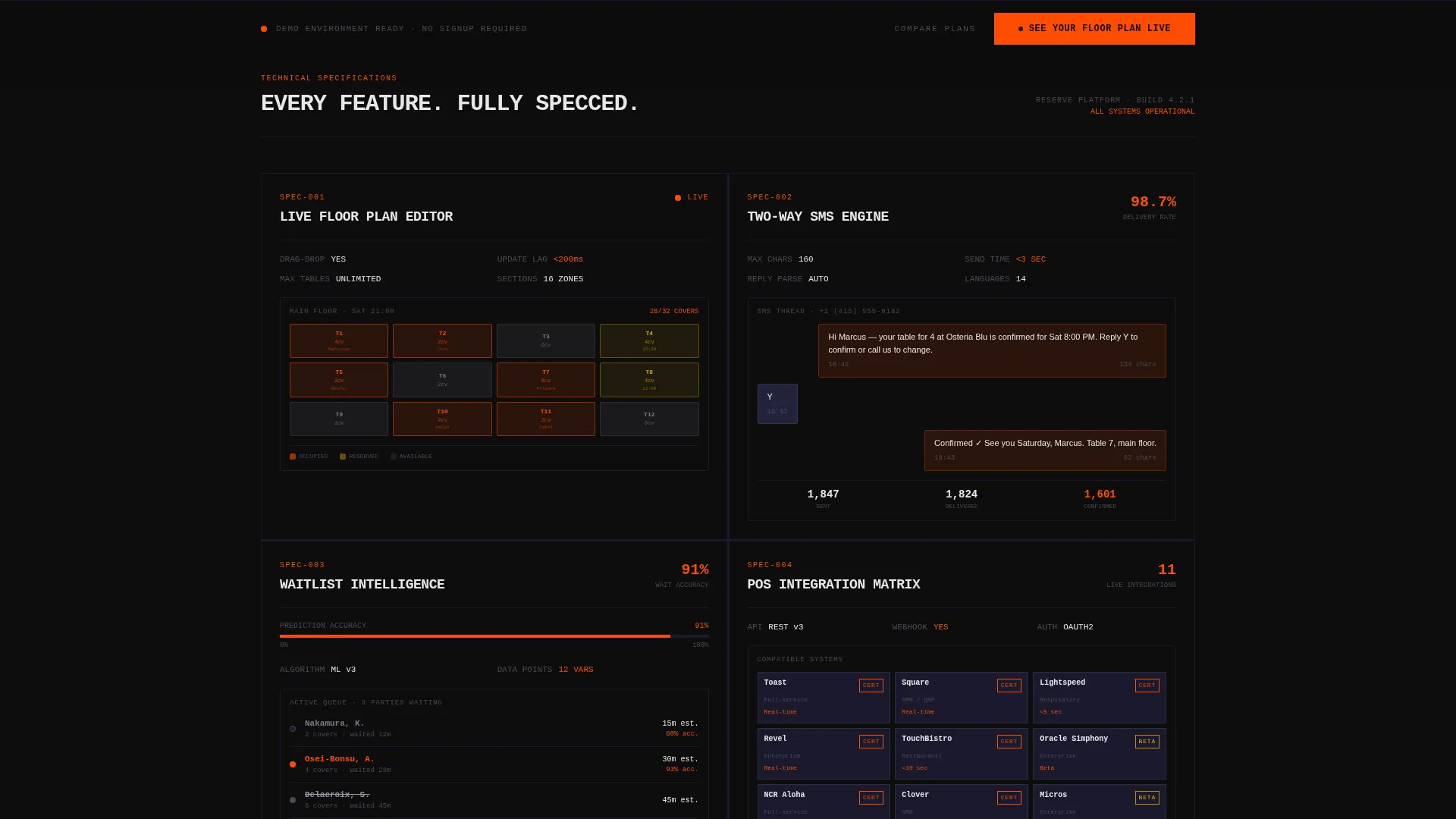
- Four feature spec cards covering floor plan editing, two-way SMS confirmations, waitlist logic, and a point-of-sale integration matrix
- A sticky bottom call-to-action bar that activates after the third card, plus a secondary "Compare Plans" text link for buyers further along in their decision
Feature list
This template is engineered around a small set of high-impact components. Each one is intentional and traceable to a real operational need.
Dark Glass Panel Header
Three frosted, semi-transparent data cards float over a pure black void. Each card displays a different live metric: tonight's covers, average turn time, and no-show rate. The smoked-acrylic refraction edge gives the header a depth that makes raw data feel like a designed object.
Modular Spec Card Grid
Each feature card below the header is uniform in size and brutally aligned. No rounded corners, no gradients, no decorative padding. Every card presents a single feature as a technical specification, paired with one user interface screenshot, so the product sells itself through clarity rather than enthusiasm.
Oversized Mono-Type Headline
A single headline in large monospaced type anchors the header section. The layout keeps it isolated and direct, giving the product a voice that feels engineered rather than advertised.
Signal Orange call to action System
The primary call-to-action, "See Your Floor Plan Live," appears first in the header and again in a sticky bottom bar after card three. Signal orange (#FF4D00) is reserved exclusively for this button and live data pulse indicators, so the eye always knows where to go next.
Sticky Bottom call to action Bar
After the visitor scrolls past the third feature card, a persistent bottom bar locks into place. It repeats the primary call-to-action and keeps conversion momentum alive without interrupting the reading flow of the spec cards above.
Secondary Compare Plans Link
A plain text link sitting beneath the primary button gives buyers who are already past the discovery stage a direct path forward. It reduces drop-off from visitors who want pricing detail before committing to a demo.
Page sections overview
| Section | Purpose |
|---|---|
| Dark Glass Header | Displays live operational metrics and primary call-to-action |
| Mono-Type Headline | Anchors the value proposition in a single direct statement |
| Floor Plan Card | Presents drag-and-drop table layout editor as a spec item |
| SMS Confirmations Card | Shows two-way messaging with character counts and delivery rates |
| Waitlist Logic Card | Communicates wait-time accuracy with a quoted percentage metric |
| POS Integration Card | Lists compatible point-of-sale systems by logo in a matrix format |
| Sticky call to action Bar | Repeats primary call-to-action after third card scroll point |
Design & branding system
The visual identity follows a Bold Brutalist theme powered by a Carbon Fiber color system. Every color decision is functional. The palette absorbs light everywhere except where action is required.
- Deep cockpit black (#0D0D0D) forms the card and page background; woven graphite (#1A1A2E) defines card borders; titanium mid-gray (#4A4A5A) carries body text against dark surfaces
- Signal orange (#FF4D00) appears only on call-to-action buttons, toggle states, and real-time booking count indicators, keeping every non-action surface visually quiet
- Typography runs in oversized monospaced type for the headline and clean, readable sans-serif for spec card body text, reinforcing the engineering aesthetic throughout
Mobile & speed optimization
The card grid layout is modular by design, which makes it naturally adaptable to smaller viewports. Each spec card is self-contained, so the reading experience holds up whether the visitor is on a desktop browser or a phone at the host stand.
- Uniform card sizing and strict alignment mean the grid reflows predictably without breaking the visual hierarchy
- No hero images, no lifestyle photography, and no background video means the page carries minimal asset weight from the start
- The sticky call to action bar is designed to remain visible and usable at mobile screen sizes, keeping the conversion path intact on any device
How this template helps you convert
This template is built as a click-through page with one goal: move qualified visitors into a live demo environment. Every structural decision supports that outcome.
- The header opens with operational data instead of a headline promise, so visitors with real floor management experience recognize the product immediately and trust it before reading a single feature card
- The spec card grid adds proof layer by layer, with each card eliminating a specific objection, covering table layout control, messaging reliability, wait accuracy, and system compatibility
- The sticky call to action bar ensures the primary action is always one thumb-tap away, removing the need to scroll back up once a visitor has made their decision
Other information about this template
This template is part of the Highvoltage template collection and sits within the Restaurant Software and Software as a Service category under the broader Technology vertical. It is specifically designed for the restaurant booking software niche, where operational credibility matters more than visual decoration.
- The page type is a single-page landing page with a click-through conversion structure, not a multi-page website
- The template style is Card Grid (Modular), meaning individual feature sections can be reordered or removed to fit different product scopes
- The creative direction is Spec Sheet, a deliberate choice that positions the software as something engineered for professionals rather than marketed to consumers
Theme
Bold Brutalist
Creative direction
Spec Sheet
Color system
Carbon Fiber
Style
Card Grid (Modular)
Direction
Click-Through
Page Sections
Dark Glass Panel Header with Live Data
Modular Spec Card Grid Layout
Signal Orange Call to Action System
Sticky Bottom Call to Action Bar
Oversized Monospaced Headline
Secondary Compare Plans Link
Related questions
Does this template include a booking form or lead capture form?
Can I replace the header metrics with my own product data?
Is this template suitable for a multi-location hospitality group?
How many feature spec cards are included in the grid?



