Reserve — Restaurant Management Landing Page Template
Ticket is a bento grid landing page template built for food and beverage point-of-sale software. It uses a dark Dashboard Pro aesthetic with a Void and Violet color system to feel like a live restaurant floor at midnight. The layout guides bar owners, restaurant managers, and franchise operators from frustration to solution, then directly to a savings calculator.
by Rocket studio
Quick summary
Ticket is a single-page bento grid template designed for food and beverage point-of-sale systems. It opens with a credibility-first logo bar, escalates through a Problem to Solution arc, and closes with a comparison tool and savings calculator. The dark Dashboard Pro theme makes every card feel like a live terminal widget still running after last call.
Who this template is for
This template is built for teams marketing point-of-sale software to the food and beverage industry. It speaks directly to the people managing real operational pain, not abstract software features.
- Bar owners frustrated by high processing fees and slow checkout flows
- Restaurant managers juggling multiple devices and disconnected workflows
- Franchise operators who need real-time sales visibility across many locations
What problem this template solves
Running a busy restaurant or bar means dealing with split checks, modifier-heavy orders, kitchen display lag, and end-of-day reconciliation gaps. Most point-of-sale landing pages describe features. This template shows them in context, tied to specific frustrations the visitor already lives with.
- Visitors leave pages that feel generic; this template names their exact pain points
- Abstract feature lists do not convert; this template pairs every problem with a visible solution
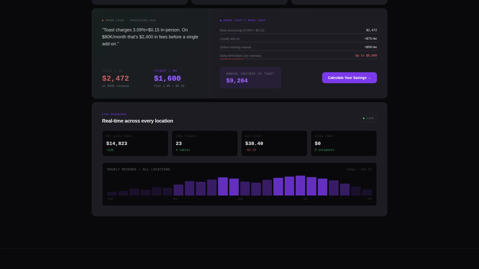
- Buyers cannot justify switching systems without knowing the cost difference; the built-in calculator makes that cost tangible
What you get with this template
You get a fully structured bento grid landing page that covers the full buyer journey from trust-building through comparison to conversion. Every section is purposeful and tied to a specific moment in the decision process.
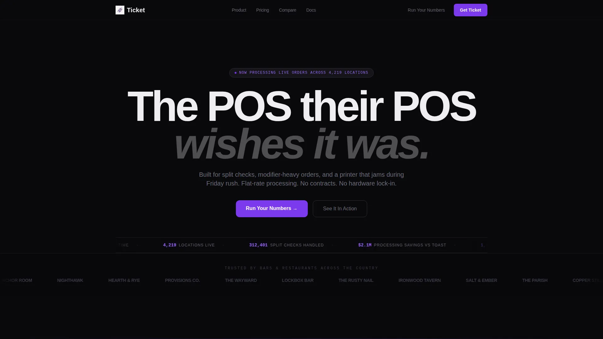
- A credibility-first header with a logo bar, animated stats ticker, and headline
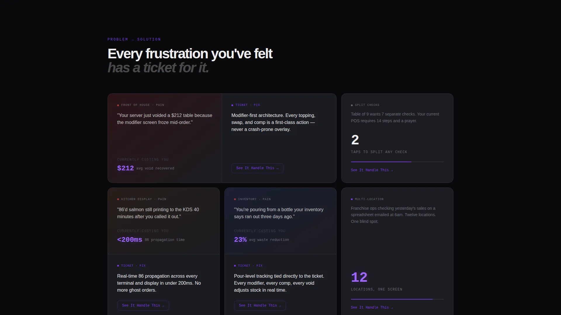
- Problem and solution bento cards covering front-of-house, back-of-house, and owner-level concerns
- A comparison slide-out, a two-field savings calculator, and contextual secondary calls to action
Feature list
This template delivers a set of purpose-built layout components. Each one serves a specific role in moving a skeptical buyer toward a confident decision.
Credibility Logo Bar Header
A horizontal scroll of recognizable restaurant and bar brand logos rendered in monochrome white against void black. Above the logos sits a bold headline in transaction white. Below, an animated ticker displays live-style stats in violet numerals, including orders processed, average ticket time, and uptime percentage.
Problem to Solution Bento Cards
Each bento card splits into two halves. The left side presents a specific, named operational frustration. The right side shows the system response as a live user interface screenshot with the exact interaction highlighted. Cards escalate from front-of-house pain through back-of-house chaos to owner-level anxiety.
Sticky Comparison Side-Tab
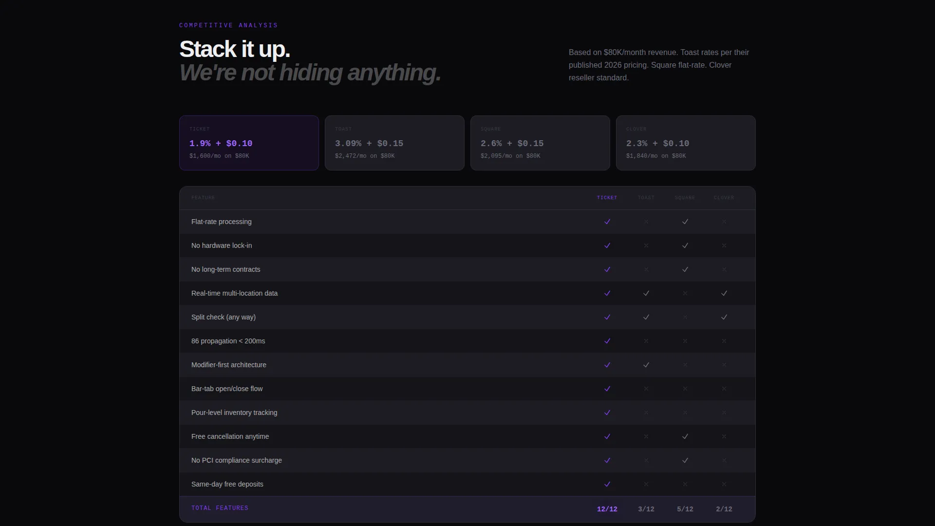
A sticky side-tab labeled "Compare" opens a slide-out table benchmarking the system against competing point-of-sale platforms. Checkmarks appear in accent violet for supported features and in muted gray for gaps, making differences immediately visible without leaving the page.
Two-Field Savings Calculator
The primary call to action leads to a calculator with two input fields: monthly revenue and current processing rate. The system instantly returns projected savings and a feature gap analysis, giving the visitor a personalized financial reason to switch rather than a generic pitch.
Secondary Per-Card Screen Recording Links
Each bento card includes a secondary call to action reading "See It Handle This." This links to a 30-second screen recording of the specific workflow shown on that card, letting skeptical buyers watch the system handle their exact scenario before committing.
Dashboard Pro Bento Grid Layout
Cards float on void black with hairline borders in muted register gray. Each module feels like a live dashboard widget. Accent violet appears on hover states, toggle states, progress bars, and call-to-action surfaces, used sparingly so every violet element draws the eye with purpose.
Page sections overview
| Section | Purpose |
|---|---|
| Logo bar header | Establish credibility with recognizable brand logos and live animated stats |
| Front-of-house cards | Show split-check, modifier, and tip-screen pain paired with system solutions |
| Back-of-house cards | Address inventory errors, 86'd item failures, and kitchen display lag |
| Owner anxiety cards | Cover reconciliation gaps, multi-location blind spots, and hidden processing fees |
| Comparison slide-out | Benchmark features against competing platforms in a scannable side-tab table |
| Savings calculator | Return projected savings based on the visitor's own revenue and processing rate |
Design & branding system
The visual identity is built on a Void and Violet color system that evokes a restaurant floor at midnight, screens still glowing, numbers still running. Every design decision reinforces precision and operational confidence.
- Core palette: true void black (#09090B), deep terminal violet (#7C3AED), muted register gray (#1C1C22), and transaction white (#EEEEF0)
- Violet appears only on active states, progress bars, toggle indicators, and call-to-action surfaces so each instance carries weight
- Card borders use hairline strokes in muted register gray, giving each bento module the feel of a live dashboard widget floating in darkness
Mobile & speed optimization
The bento grid layout is structured for clean reflow across screen sizes. Operators reviewing the page between shifts on a phone get the same hierarchy and clarity as a desktop session.
- Bento cards are modular by design, making them straightforward to stack and reorder for smaller viewports
- The dark void background reduces visual noise on mobile screens without sacrificing the dashboard aesthetic
- Calls to action and the savings calculator remain prominent at every breakpoint so the conversion path stays clear
How this template helps you convert
Every layout decision in this template is designed to reduce hesitation and increase confidence at the moment a visitor is closest to switching systems.
- The logo bar borrows trust from brands the visitor already recognizes before a single feature is described, lowering skepticism immediately.
- The Problem to Solution arc makes the visitor's current frustration visible and quantifiable, so the decision to switch feels rational rather than risky.
- The savings calculator personalizes the value proposition with the visitor's own numbers, turning a general pitch into a specific financial case for action.
Other information about this template
This template is built on the Dashboard Pro theme and is suited for any food and beverage point-of-sale software brand looking to compete in a crowded market. It is particularly well-suited for teams whose competitors include established platforms, as the comparison slide-out is already structured to benchmark directly against them.
- The template style is Bento Grid, making it straightforward to add, remove, or reorder cards as the product evolves
- The header concept is a Logo Bar, which can be updated with any set of client or partner brand marks relevant to your specific market
- The creative direction follows a Problem to Solution arc that works equally well for initial product launches and competitive repositioning campaigns
- The landing page direction is Comparison and Versus, meaning the template is engineered specifically for buyers who are actively evaluating alternatives
Theme
Dashboard Pro
Creative direction
Problem→Solution Arc
Color system
Void & Violet
Style
Bento Grid
Direction
Comparison/Versus
Page Sections
Credibility Logo Bar Header
Problem to Solution Bento Cards
Sticky Comparison Side-tab
Two-field Savings Calculator
Per-card Screen Recording Links
Dashboard Pro Bento Grid Layout
Related questions
Who is this landing page template designed for?
Can I customize the bento cards for my own product features?
What does the savings calculator section do?
How does the comparison slide-out work?
Does this template work for both single-location and multi-location operators?



