Consulting Firm Site Maintenance Trust Signal Website Template
The Uptime Elite Consulting Firm Maintenance Landing Page Template is a bento grid landing page built for professional service firms. It turns scheduled downtime into a trust signal. Visitors see live-styled system status tiles, a countdown clock, and a clear app download path. The AI Iridescent color system and Dashboard Pro theme create a modern, high-confidence presence that keeps clients and prospects engaged while core systems are upgraded.
by Rocket studio
Quick summary
This template is a single-page maintenance landing page designed for consulting firms managing planned downtime. It uses a bento grid layout, an AI Iridescent color system, and a Dashboard Pro theme to communicate control, transparency, and service continuity. Rather than showing a blank error screen, it gives every visitor a clear picture of what is happening and a direct path to staying connected via the firm's mobile app.
Who this template is for
This landing page is built for enterprise consulting firms, professional service companies, and their internal teams who need a polished, on-brand presence during scheduled website maintenance. It serves anyone who wants to manage downtime without losing trust.
- Returning clients checking project portals or pulling deliverables before a critical deadline
- Associates and internal team members who need status clarity during a system upgrade
- Prospects mid-due-diligence who arrive via a partner referral and expect a professional first impression
What problem this template solves
Consulting firm websites go offline for legitimate reasons. Servers get upgraded. Dashboards get sharpened. Systems get tuned for better performance. The problem is that a blank or generic maintenance page sends the wrong signal to clients, prospects, and partners who land on it at the wrong moment.
- It removes the risk of losing prospect trust during a planned outage by delivering a confident, branded landing page
- It solves the management challenge of communicating service continuity without requiring a developer on call
- It removes concerns around looking unprepared by presenting downtime as a deliberate, monitored, and temporary upgrade
What you get with this template
You get a fully structured bento grid maintenance landing page with every section planned, every component defined, and every interaction mapped out. The template covers the entire visitor journey from the first load to the primary conversion action.
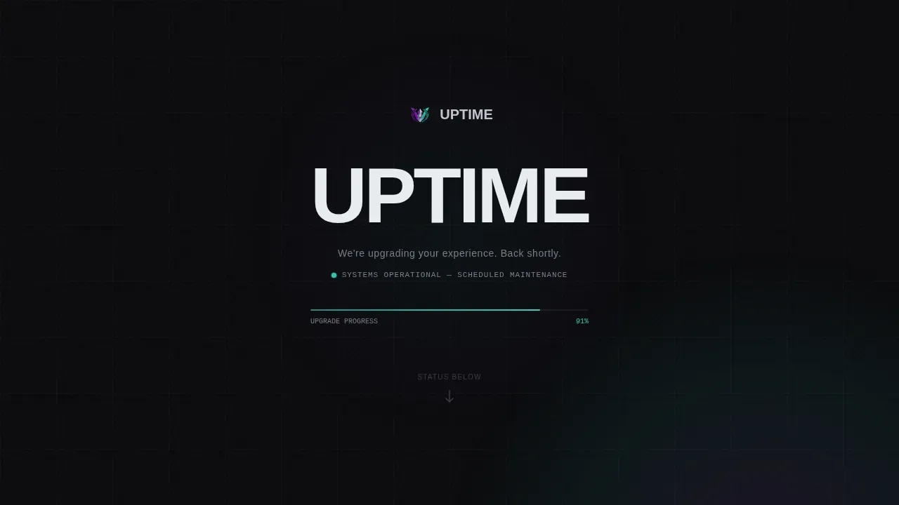
- A dark full-bleed hero section with a breathing radial glow animation and a live teal progress bar beneath the firm's wordmark
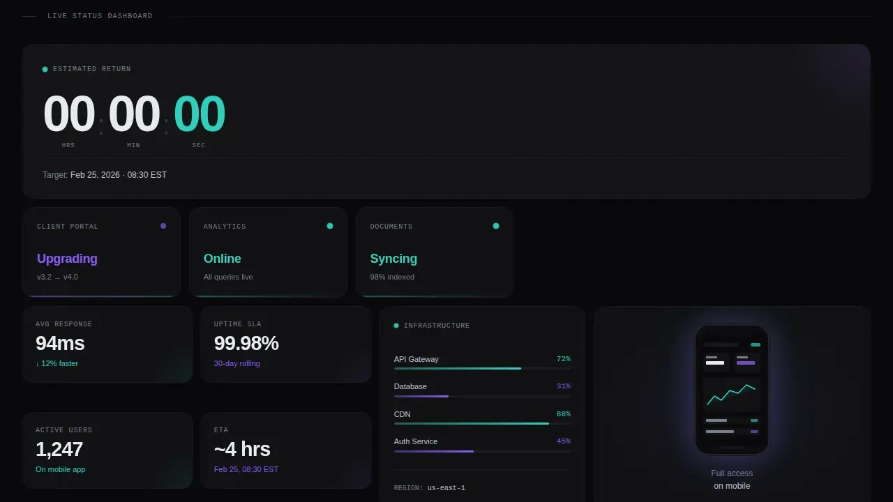
- Bento grid rows containing a countdown clock tile, system status tiles for Portal, Analytics, and Documents, a mobile app mockup tile, and an oversized app download call-to-action tile
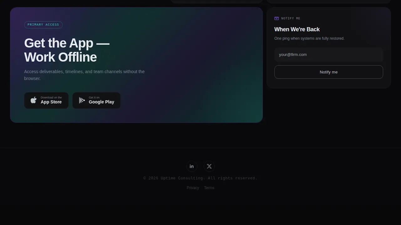
- A secondary notification tile with a single email input field and a ghost-outlined button, keeping the form simple and focused
Feature list
This landing page template ships with a focused set of features. Each one serves a specific job: communicate control, build trust, and deliver one clear conversion path.
Animated Hero with Radial Glow
The full-bleed hero section fills the entire viewport with void black and a soft radial glow pulsing from center screen. The glow cycles through a holographic violet-to-electric-teal gradient on a six-second loop. A thin, luminous teal progress bar crawls beneath the firm's chrome wordmark, making the static landing page feel actively managed rather than simply offline.
Bento Grid Layout with Staggered Fade-In
The bento grid organizes all data and status tiles into a structured, scannable layout. Each tile fades in with a staggered reveal triggered by scroll position. This keeps the landing page feeling dynamic without overwhelming visitors. The layout is a modern implementation of the Stats-First Impact creative direction, where each tile is a proof point, not a decorative element.
Live-Styled System Status Tiles
Three dedicated status tiles display Portal, Analytics, and Documents, each with a pulsing dot and a clear status label. These tiles give visitors immediate knowledge of what is operational and what is being upgraded. This approach to transparency reduces support inquiries and reinforces the firm's commitment to proactive support during maintenance windows.
Countdown Clock Tile
A dedicated bento tile displays the estimated return time as a live-styled countdown clock. It keeps visitors informed with a concrete, time-zone-anchored estimate. This is one of the most critical tools on any maintenance landing page because it transforms uncertainty into a clear, manageable plan.
Oversized App Download Call-to-Action Tile
The final row of the bento grid breaks the dark pattern with an oversized tile carrying a full iridescent gradient background. It frames dual App Store and Google Play badges alongside a single, high-contrast primary call-to-action button. The copy above the button reframes maintenance as an opportunity: "Access deliverables, timelines, and team channels without the browser." No form, no fields. The conversion is a tap.
Minimal Footer with Social Links
The footer follows the Superhuman extreme-minimal pattern. Social icons and copyright text sit centered on a single line. It keeps the landing page clean and avoids distracting visitors from the two conversion paths above it.
Page sections overview
| Section | Purpose |
|---|---|
| Dark Full-Bleed Hero | Firm wordmark, breathing glow animation, animated teal progress bar |
| Countdown Timer Tile | Estimated return time displayed as a live countdown clock |
| System Status Tiles | Portal, Analytics, and Documents tiles with pulsing status indicators |
| Mobile App Mockup Tile | Device mockup glowing on void black, reinforcing mobile-first access |
| Infrastructure Metrics Tile | "What's running" data tile showing live-styled operational context |
| App Download call to action Tile | Oversized iridescent tile with dual app badges and primary call to action button |
| Notify Me Tile | Single email input with ghost-outlined button for return notification |
| Minimal Footer | Social icons and copyright, centered, Superhuman extreme-minimal pattern |
Design & branding system
The visual identity is built on the Dashboard Pro theme and an AI Iridescent color system. Void black dominates every tile. Liquid chrome handles all typography. Holographic violet and electric teal appear only as border glows, progress indicators, and hover states. The palette is deliberate and restrained, which is exactly why it communicates expertise.
- Colors: void black (#09090B) as the dominant fill, liquid chrome (#C0C5CE) for all type, holographic violet (#8B5CF6) and electric teal (#2DD4BF) reserved for glowing accents, interactive pulses, and the final oversized call to action tile gradient
- Typography: Manrope typeface throughout, sharp, technical, and premium in weight and spacing
- Animation: radial glow pulse, hue-shift loop on a six-second cycle, staggered bento tile fade-in using IntersectionObserver, countdown clock ticking, pulsing status dots, and a crawling progress bar
Mobile & speed optimization
This landing page is built mobile-first. The primary conversion action is an app download tap, so every layout decision supports a clean, fast, one-handed experience on any device. Bento tiles reflow naturally for smaller screens.
- CSS animations are designed to run on the graphics processing unit to keep scrolling smooth even on mid-range mobile devices
- The landing page is intentionally lightweight and static so it loads quickly even when backend systems are fully offline during maintenance
- Mobile responsiveness ensures that prospects and clients on any device see a polished, functional landing page rather than a broken layout
How this template helps you convert
This template earns conversions by reframing maintenance as a signal of quality rather than a failure of service. Every design decision serves a conversion goal.
- The app download call-to-action is the single, focused primary path. Visitors are not confused by multiple offers. One oversized tile, one high-contrast button, two app badges. The conversion is a tap, not a form submission.
- The "Notify Me When We're Back" tile provides a secondary path. A single email input and a ghost-outlined button keep the form simple. Asking for only essential information increases completion rates and reduces friction for busy clients and prospects.
- System status tiles and a live countdown clock build the trust required to make either conversion feel worth doing. Visitors who can see exactly what is being upgraded and when the service returns are far more likely to take action than visitors staring at a blank page.
Other information about this template
This template is built for any consulting firm that wants to manage its digital presence with the same rigor it applies to client engagements. It is a practical solution for firms that take ownership of every client-facing touchpoint, including the ones that only appear during planned downtime.
- Comprehensive website management solutions integrate design, hosting, and maintenance to enhance user experience. This template supports that concept by covering the entire website lifecycle moment when service is temporarily paused.
- Short, deliberate downtime handled well leads to long-term stability and trust. The template makes the case for that idea visually and through the live-styled metrics it surfaces to every visitor.
- Developers and designers can customize the color tokens, wordmark, copy, and countdown target time to match any firm's existing brand standards.
- The template layout supports a vendor-neutral implementation. Teams can deploy it independently without being locked into a specific hosting partner or content management platform.
- A well-designed website serves as a lead generation engine and brand ambassador even when the main site is offline. This landing page extends that role into the maintenance window.
- OneNine offers a comprehensive, all-in-one solution that blends expert design with robust technical execution for firms that want managed website maintenance services alongside templates like this one.
- The template concept aligns with best practices for service website design: clear messaging, strategic call-to-action placement, and a seamless user experience that guides visitors through one focused path.
- AI-powered website development tools now enable users to create and launch production-ready websites quickly. This template is compatible with that no-code and low-code world, where non-technical users build and launch pages from natural-language prompts without traditional programming skills.
- The template uses the same calm, professional language concept that mirrors consulting expertise, reinforcing credibility at every scroll depth.
- Sales teams and partner-referred prospects who land on this page during due diligence will find a page that conveys control, transparency, and high standards, even while the main site is inactive.

Theme
Dashboard Pro
Creative direction
Stats-First Impact
Color system
AI Iridescent
Style
Bento Grid
Direction
App Download
Page Sections
Animated Full-bleed Hero with Glow Loop
Bento Grid with Staggered Tile Reveals
Live-styled System Status and Countdown Tiles
Oversized App Download Conversion Tile
Secondary Email Notification Tile
Minimal Footer with Social Icons
Related questions
Can I customize the colors and wordmark to match my firm's brand?
Does this template work if my backend systems are completely offline?
How does the Notify Me tile work?
Is this template suitable for enterprise consulting firms with large client bases?
Can this landing page support a secondary lead generation path alongside the app download?



