Resilience — SRE Monitoring Landing Page Template
Uptime is a bento grid landing page template built for site reliability engineering platforms. It combines a dark terminal aesthetic, animated capability cards, and a progressive lead generation flow to help SRE tools earn trust fast. The design speaks directly to on-call engineers and platform leads who need to see real product proof before they commit.
by Rocket studio
Quick summary
Uptime is a single-page bento grid template designed for site reliability engineering platforms. It leads with a product screenshot hero, escalates through animated capability cards, and closes with an inline lead capture form. The visual language is dark, focused, and instantly familiar to engineers who live in terminals and dashboards.
Who this template is for
This template is built for technical teams and platform-focused businesses that need to earn engineer trust quickly. It works best when the audience already knows what good tooling looks like and needs to see evidence, not pitch decks.
- On-call site reliability engineers (SREs) who are overwhelmed by alert noise and need a clearer incident picture
- Platform engineering leads making the case for reliability investments to senior leadership
- DevOps teams at growth-stage startups who have just crossed the traffic threshold where system failures become frequent and unpredictable
What problem this template solves
Most reliability tool landing pages feel generic. They list features without showing the product, and they speak to buyers instead of practitioners. Engineers scroll right past them. Uptime solves this by centering the actual product interface and letting the design do the convincing.
- Alert fatigue makes it hard for SRE tools to stand out, this template leads with a real incident timeline view to prove the product works before a word is read
- Platform leads struggle to justify observability spend, the bento grid surfaces concrete capabilities like error budget tracking and automated post-incident reviews in a format that is easy to share upward
- Generic hero sections waste the first scroll, the product screenshot header immediately establishes credibility with a technical audience
What you get with this template
You get a fully structured bento grid landing page with a clear visual hierarchy, a lead generation flow built for progressive disclosure, and a design system tuned for dark-mode technical audiences. Every section has a defined purpose and contributes to moving a visitor toward the primary call to action.
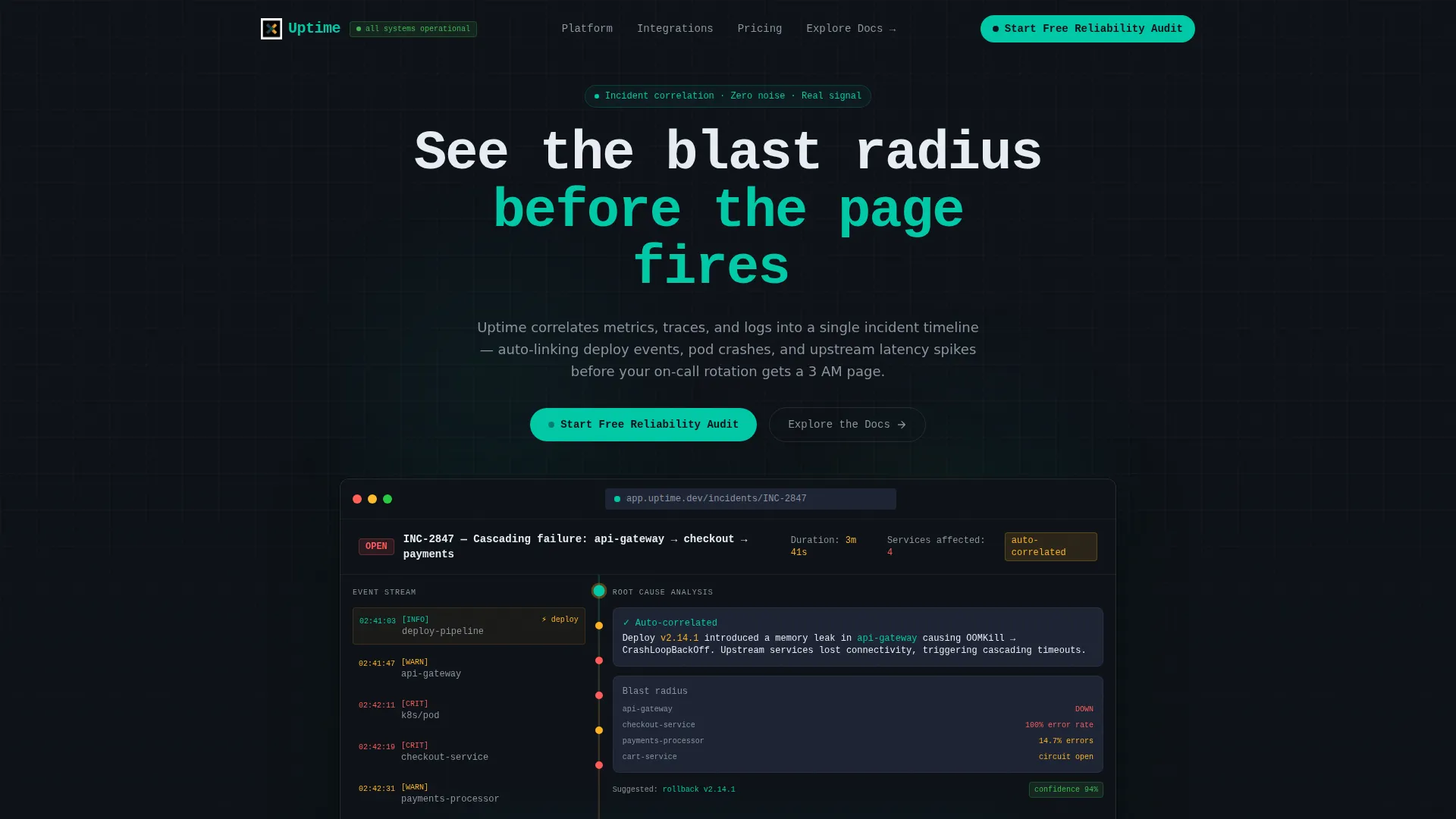
- A product screenshot hero section with browser chrome framing, a pulsing teal status indicator, and a monospace headline positioned above the interface capture
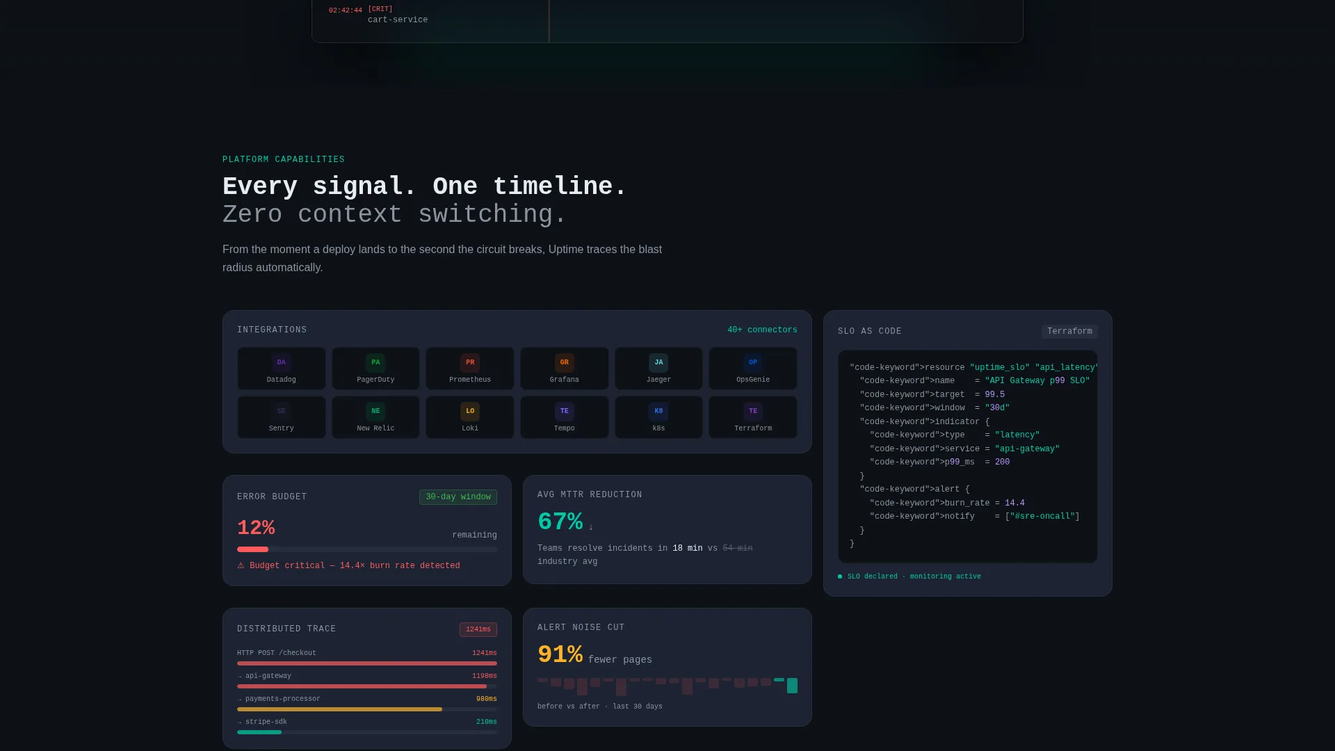
- An animated bento grid body where cards reveal capabilities in a staggered sequence, including integration logo tiles, a live error budget animation, a Terraform config snippet, and a full auto-generated post-incident review card
- A dual call-to-action structure: a persistent nav pill for the primary lead form and a secondary path for documentation-first engineers who need to vet the tool before recommending it
Feature list
This template includes purpose-built components that reflect how SRE practitioners actually evaluate tools. Each element earns its place by serving a specific moment in the buyer journey.
Product Screenshot Hero
The hero section displays a pixel-perfect incident timeline screenshot inside a browser chrome frame. A teal dot pulses in the browser tab to suggest a live system. A single monospace headline above the screenshot reads "See the blast radius before the page fires," setting the tone for the entire page.
Animated Bento Grid Layout
The bento grid body uses a staggered card reveal animation styled like services booting up in sequence. Cards range from small utility tiles to a wide feature card, creating a natural escalation of detail as the visitor scrolls deeper into the page.
Progressive Lead Capture Form
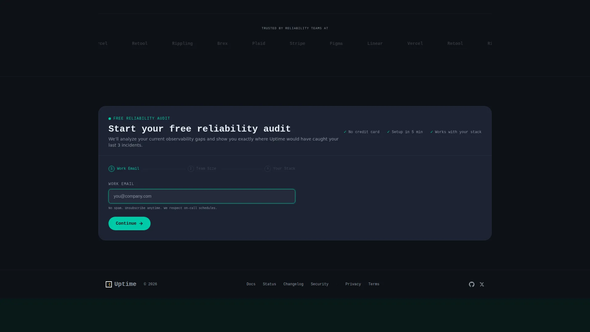
The primary call to action opens an inline form with three steps: a work email field, a company size selector with three tiers, and a multi-select for the visitor's current observability stack. This sequence qualifies leads without feeling like a survey.
Integration Logo Mosaic Card
One bento card displays a tight mosaic of integration logos, showing at a glance which tools the platform connects with. This card is designed to resolve integration questions early, reducing friction for engineers who evaluate based on ecosystem fit.
Live Error Budget Card
A dedicated card animates an error budget burning down in real time. This interactive element speaks directly to SRE practitioners who track service level objectives (SLOs) and need to see that the platform understands their operating model.
Auto-Generated Post-Incident Review Card
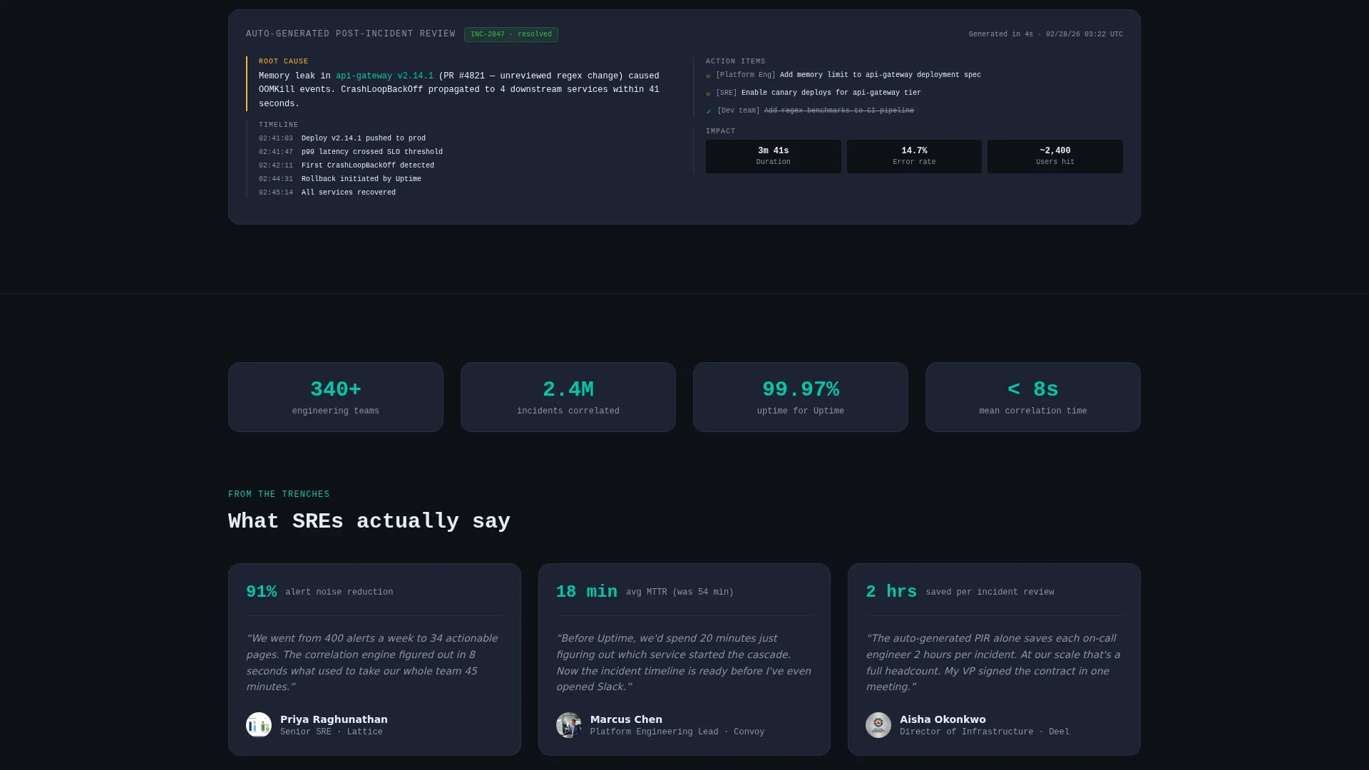
The widest card in the grid shows a full post-incident review generated by the platform. This proves the tool does more than detect problems, it produces structured narrative output that engineering teams can act on and share.
Page sections overview
| Section | Purpose |
|---|---|
| Persistent Nav Pill | Keeps the primary call to action visible at all times during scroll |
| Screenshot Hero | Establishes product credibility immediately with a real incident timeline view |
| Bento Grid Body | Surfaces capabilities through animated, progressively revealed cards |
| Integration Logos Card | Signals ecosystem compatibility for engineers evaluating tool fit |
| Error Budget Card | Demonstrates SLO-aware functionality with a live-style animation |
| Terraform Snippet Card | Shows infrastructure-as-code alignment for platform engineering teams |
| Post-Incident Review Card | Proves narrative output capability beyond detection and alerting |
| Lead Capture Card | Converts engaged visitors through a centered, full-width inline form |
| Docs Secondary Path | Provides an exit ramp for engineers who vet before they recommend |
Design & branding system
The design system uses the Teal Catalyst color palette, which is built specifically for dark-mode technical interfaces. Every color choice has a defined role, and the overall effect feels like a well-configured monitoring dashboard rather than a marketing page.
- Core palette: deep terminal black (#0D1117) for the page background, primary teal (#00C9A7) for active indicators and primary actions, cool slate (#1C2333) for card surfaces, and warning amber (#FFB224) reserved strictly for interactive hotspots and hover states
- Typography uses a monospace weight for the hero headline, reinforcing the terminal-native feel that resonates with an SRE audience
- The Directory and Discovery theme organizes content into discrete, scannable cards that feel like a well-labeled tool inventory rather than a scrolling brochure
Mobile & speed optimization
The bento grid layout is structured to adapt cleanly across screen sizes. Card sizing and stagger animations are designed with viewport constraints in mind so the escalating reveal sequence reads correctly on smaller displays.
- Card grid reflows to a single-column stack on mobile, preserving the logical order of capability disclosure without breaking the visual hierarchy
- The inline lead capture form collapses gracefully on touch screens, keeping the three-step input sequence usable without horizontal scrolling
How this template helps you convert
This template is engineered around the reality that SRE practitioners are skeptical buyers. They need to see the product working, understand the ecosystem fit, and find a low-friction path to getting started, all before they hand over a work email.
- The product screenshot hero removes the "show me the product" objection in the first viewport, building immediate credibility with an audience that trusts interfaces over marketing claims
- The bento grid's staggered reveal creates a controlled escalation of proof points, moving a visitor from curiosity to conviction through concrete capability cards rather than abstract feature lists
- The dual call-to-action structure serves two distinct buyer modes: the decision-ready lead who fills out the inline form, and the evaluation-mode engineer who clicks through to documentation before recommending upward
Other information about this template
The Uptime template sits within the Technology category and the Site Reliability Engineering Platform niche. It is designed as a single landing page rather than a multi-page site, making it fast to deploy and easy to hand off between design and engineering teams.
- The template style is a bento grid, a layout pattern that is well-suited to platforms with multiple distinct capabilities that each deserve visual attention
- The creative direction is Launch Energy, which informs the stagger animation timing and the sense of progressive disclosure as the page scrolls
- The header concept is a Product Screenshot, meaning the hero is built around a real interface capture rather than an illustration or abstract graphic
- The lead generation direction means every section is oriented toward a single conversion goal, with no distracting secondary navigation or off-page links except the documentation path
- This template is a strong fit for site reliability engineering tools, incident management platforms, observability products, and any technical SaaS that needs to earn practitioner trust before closing a lead
Theme
Directory & Discovery
Creative direction
Launch Energy
Color system
Teal Catalyst
Style
Bento Grid
Direction
Lead Generation
Page Sections
Product Screenshot Hero Section
Staggered Bento Grid Animation
Progressive Inline Lead Form
Live Error Budget Animation
Auto-generated Post-incident Review Card
Dual Call-to-action Structure
Related questions
Who is this template designed for?
Can I customize the bento grid card layout?
What does the lead capture form collect?
Does this template include the product screenshots and integration logos?
Is this template suitable for a product that is still in early access?



