Resolve - Autonomous Ecommerce Landing Page Template
Resolve is a hub and spoke landing page template built for an AI-powered e-commerce customer service platform. It opens with a live savings calculator, guides visitors through a Problem to Solution narrative arc, and closes with competitor comparison tables and ROI case studies. The design follows a Data Command aesthetic in deep carbon blacks, graphite, and reactive cyan.
by Rocket studio
Quick summary
Resolve is a single-page, anchor-nav landing page template designed for an AI customer service platform targeting e-commerce operations. It leads with an interactive savings calculator, walks visitors through five focused spoke sections, and builds a financial case with comparison tables and case studies. The carbon fiber visual identity makes every data point feel engineered and alive.
Who this template is for
This template speaks directly to people who feel the weight of a ticket backlog every morning. It is built for operators who need to make a fast, data-backed case for switching to AI-powered support.
- E-commerce operations directors managing thousands of support tickets during peak season
- Direct-to-consumer brand founders whose customer satisfaction scores are slipping after product launches
- Marketplace sellers juggling support queues across multiple storefronts from one overwhelmed inbox
What problem this template solves
High-volume e-commerce support teams face a specific crisis: ticket queues that grow faster than human agents can clear them. The problem is not just operational, it is financial. Every slow response is a measurable cost, and most landing pages fail to show that cost in real time.
- Visitors cannot immediately quantify what slow support is costing them, so they stay unconvinced
- Generic platform pages rely on vague promises instead of showing the visitor their own numbers
- Competitor comparisons are buried or absent, leaving buyers without a clear reason to switch
What you get with this template
You get a fully structured, single-page layout built around a hub and spoke anchor navigation system. The template is ready to be populated with your platform's actual data, copy, and user interface mockups.
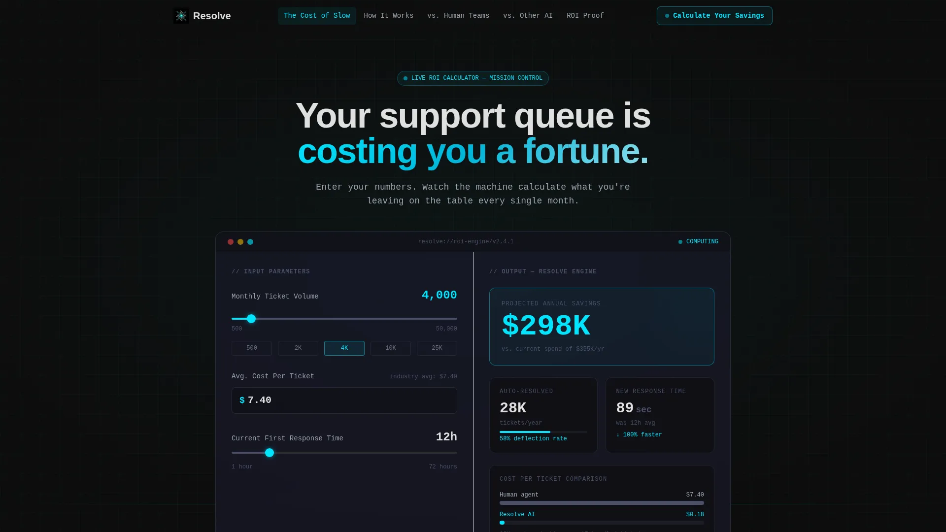
- A live interactive calculator in the header that recalculates projected savings in real time as inputs change
- Five anchor-linked spoke sections covering ticket cost, platform mechanics, team comparisons, competitor comparisons, and return on investment proof
- Contextual call-to-action elements tied to each comparison row and a low-friction sign-up block at the close
Feature list
This template ships with a set of purpose-built components. Each one serves the Comparison and Versus conversion strategy the brief calls for.
Live Savings Calculator Header
The header fills the full viewport width with a dark interface containing three visitor inputs: monthly ticket volume via slider, average cost per ticket with a pre-filled editable value, and current first-response time in hours. The right half recalculates projected annual savings, touchless resolution rate, and new average response time in real time. Numbers animate like a trading terminal, with digits rolling and cyan highlights flashing on each update.
Anchor Navigation Bar
After the visitor scrolls past the header, a sticky anchor nav pins to the top of the screen. The five labelled spokes give visitors direct access to any section without losing context. This keeps the calculator hub always reachable and the conversion path short.
Problem to Solution Spoke Sections
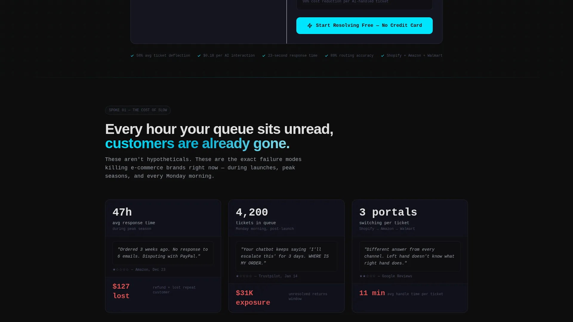
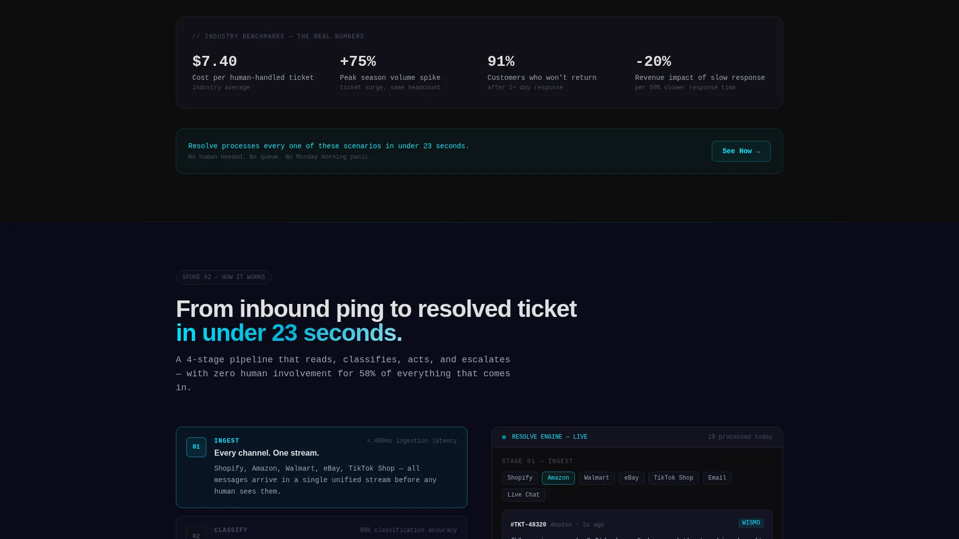
Each of the five spoke sections opens with a specific, painful e-commerce support scenario, such as a screenshot showing a 47-hour response time or a one-star review about an ignored return. The section then immediately resolves the problem with a live user interface mockup of the platform's answer. The scroll arc escalates from individual ticket pain to full operational cost, building the financial argument step by step.
Competitor Comparison Tables
Dedicated comparison tables sit within the spoke sections, showing feature-by-feature breakdowns against competing tools. Present features appear with checkmarks highlighted in reactive cyan. Missing features render in muted graphite. Each table ends with a contextual call-to-action specific to the competitor in that row.
ROI Proof Case Studies
The final spoke section presents three case studies with exact dollar savings figures. This section anchors the financial argument before the closing sign-up block, giving the visitor concrete social proof at the highest-intent moment of the page.
Low-Friction Sign-Up Block
The closing section reduces sign-up to a single email field and a connected store selector. There is no credit card requirement and no call booking step. The friction is stripped to the authentication layer only, matching the brief's conversion intent.
Page sections overview
| Section | Purpose |
|---|---|
| Calculator Hero Header | Capture attention and show real-time projected savings |
| Sticky Anchor Nav | Keep all five spokes and the calculator hub reachable |
| The Cost of Slow | Open with the financial pain of delayed ticket responses |
| How It Works | Show the platform resolving tickets through live user interface mockups |
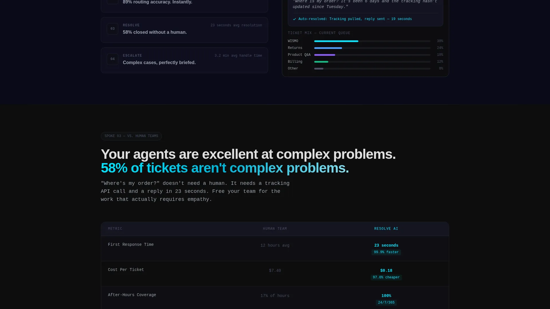
| versus. Human Teams | Compare AI resolution speed and cost against human agents |
| versus. Other AI | Feature table against competing tools with contextual calls to action |
| ROI Proof | Present three case studies with specific dollar savings |
| Sign-Up Close | Collect email and store connection with minimal friction |
Design & branding system
The visual identity is built on a Data Command theme using a Carbon Fiber color system. The palette is engineered to feel precise and alive, with color used as a functional signal rather than decoration.
- Backgrounds stay within a deep carbon black (#0D0D0D) to woven graphite (#1A1A2E) range, with titanium mid-tone (#4A4E69) for layering and structure
- Typography and body text use signal white (#E0E0E0) to stay readable against dark backgrounds
- Reactive cyan (#00E5FF) is reserved exclusively for interactive states, live data pulses, counter animations, and call-to-action elements
Mobile & speed optimization
The template layout is structured to translate cleanly from wide desktop viewports to smaller screens. The full-width calculator header and sticky anchor nav are the two most critical components to retain on mobile.
- The calculator inputs and real-time output panel are designed to reflow for narrower viewports without losing the live interaction behavior
- The anchor nav remains accessible on scroll across screen sizes, keeping the hub reachable from any spoke section
- No stock photography or illustration is used anywhere in the template, which keeps the visual weight low and the layout fast to render
How this template helps you convert
This template is built around a Comparison and Versus conversion strategy. Every design and content decision pushes a skeptical buyer toward a specific action.
- The calculator header turns passive visitors into active participants the moment they land. Entering their own ticket volume and cost-per-ticket makes the savings projection feel personal, not generic.
- The Problem to Solution arc builds trust section by section. Each spoke resolves a real operational pain before asking for anything, so by the time the visitor reaches the comparison tables, they already feel the problem is understood.
- The low-friction close removes the last objection. A single email field and store selector, with no credit card and no call required, makes the first step feel safe and immediate.
Other information about this template
This template is categorized under Technology, within the AI for E-Commerce subcategory. It is purpose-built for the e-commerce AI customer service niche and scores a strong intersection match across theme, creative direction, template style, and conversion direction.
- The hub and spoke structure with anchor navigation is well suited to platforms that need to address multiple buyer objections in a single scroll session
- The Problem to Solution creative direction and Comparison and Versus landing page strategy work together to move visitors from awareness to decision without requiring a second page
- For teams evaluating alternatives to tools such as Gorgias or Zendesk AI, the comparison table spoke provides the direct feature contrast buyers typically look for before switching platforms
Theme
Data Command
Creative direction
Problem→Solution Arc
Color system
Carbon Fiber
Style
Hub & Spoke (Anchor Nav)
Direction
Comparison/Versus
Page Sections
Live Real-time Savings Calculator
Sticky Hub and Spoke Anchor Nav
Problem to Solution Spoke Sections
Feature Comparison Tables with Contextual Ctas
ROI Proof Case Study Section
Low-friction Email Sign-up Close
Related questions
What type of page is this template?
Can I edit the calculator inputs and default values?
Do I need design experience to use this template?
Is this template suitable for a product launch or a long-running campaign page?
What makes the design feel different from a standard SaaS landing page?



