AIOps Technology Advanced Professional Website Template
Resolve is a scroll-reveal AIOps landing page template built for managed service providers that compress millions of raw alerts into a single root-cause verdict. The Tech Glass visual identity, a Problem-to-Solution animated arc, and a signal-green call to action flow guide infrastructure leaders from chaos to clarity, ending with a clear app download prompt.
by Rocket studio
Quick summary
Resolve is a single-page, scroll-driven landing page template for an AIOps managed service. It opens with a credibility logo bar, walks visitors through a live alert-compression animation, and closes with an app download call to action. The Monochrome Steel color system and Tech Glass theme make the experience feel as precise and quiet as a stable production environment.
Who this template is for
This template is built for teams that sell or operate intelligent AIOps platforms. It speaks directly to the people who feel the cost of alert fatigue most acutely.
- VP-level infrastructure leaders at mid-market SaaS companies who need to justify AIOps investment upward
- Site-reliability engineers drowning in on-call noise who want a faster path to root-cause clarity
- IT directors at hospitals and logistics firms who cannot afford unplanned four-AM incident war rooms
What problem this template solves
Most AIOps service pages describe their platform using technical jargon. They list feature bullet points while the visitor still cannot picture how thousands of alerts become one actionable answer. Resolve fixes that gap visually.
- Raw alert volume overwhelms NOC teams, and static landing pages fail to convey the compression benefit in a convincing way
- Visitors leave before reaching the call to action because the emotional case for the product was never made
- A generic page design signals a generic product, which erodes trust with technically sophisticated buyers
What you get with this template
You get a fully structured, scroll-reveal landing page that guides technically sophisticated buyers from problem recognition to app download without a single moment of visual clutter. Every panel reveals only what the visitor is ready to process.
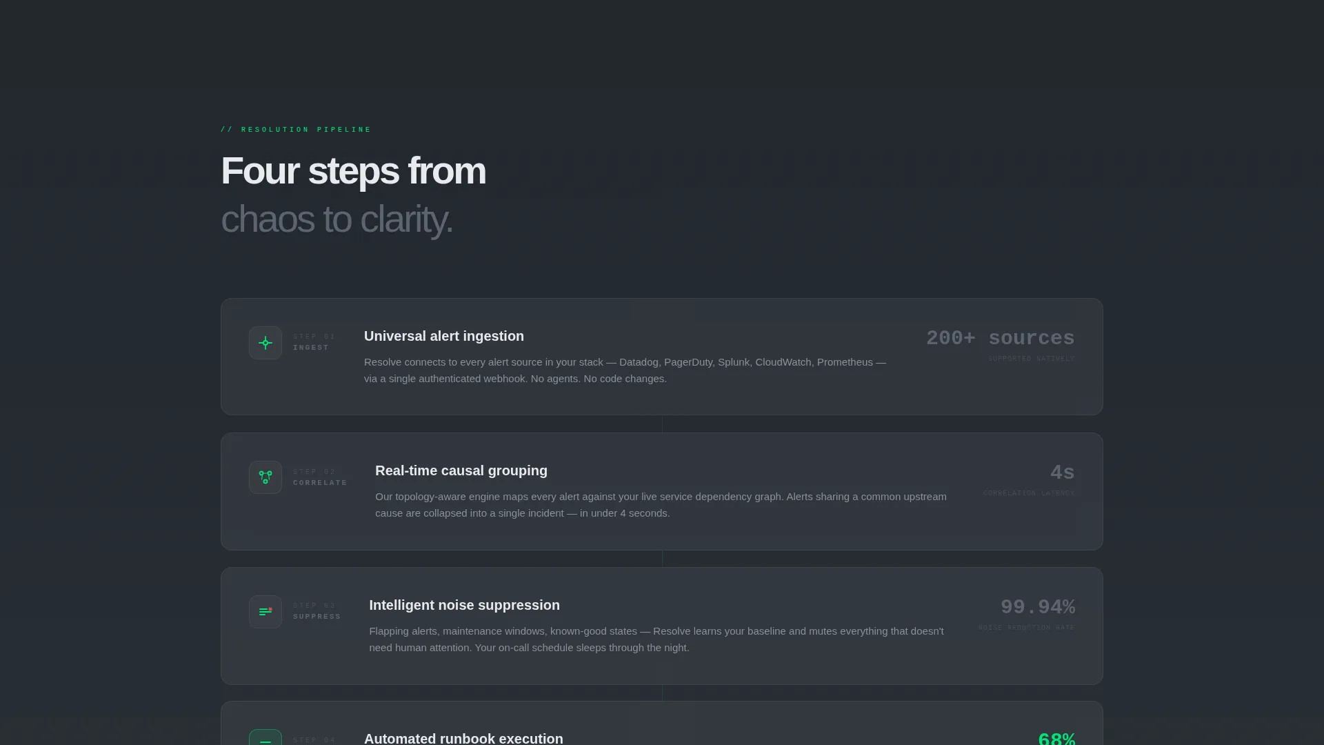
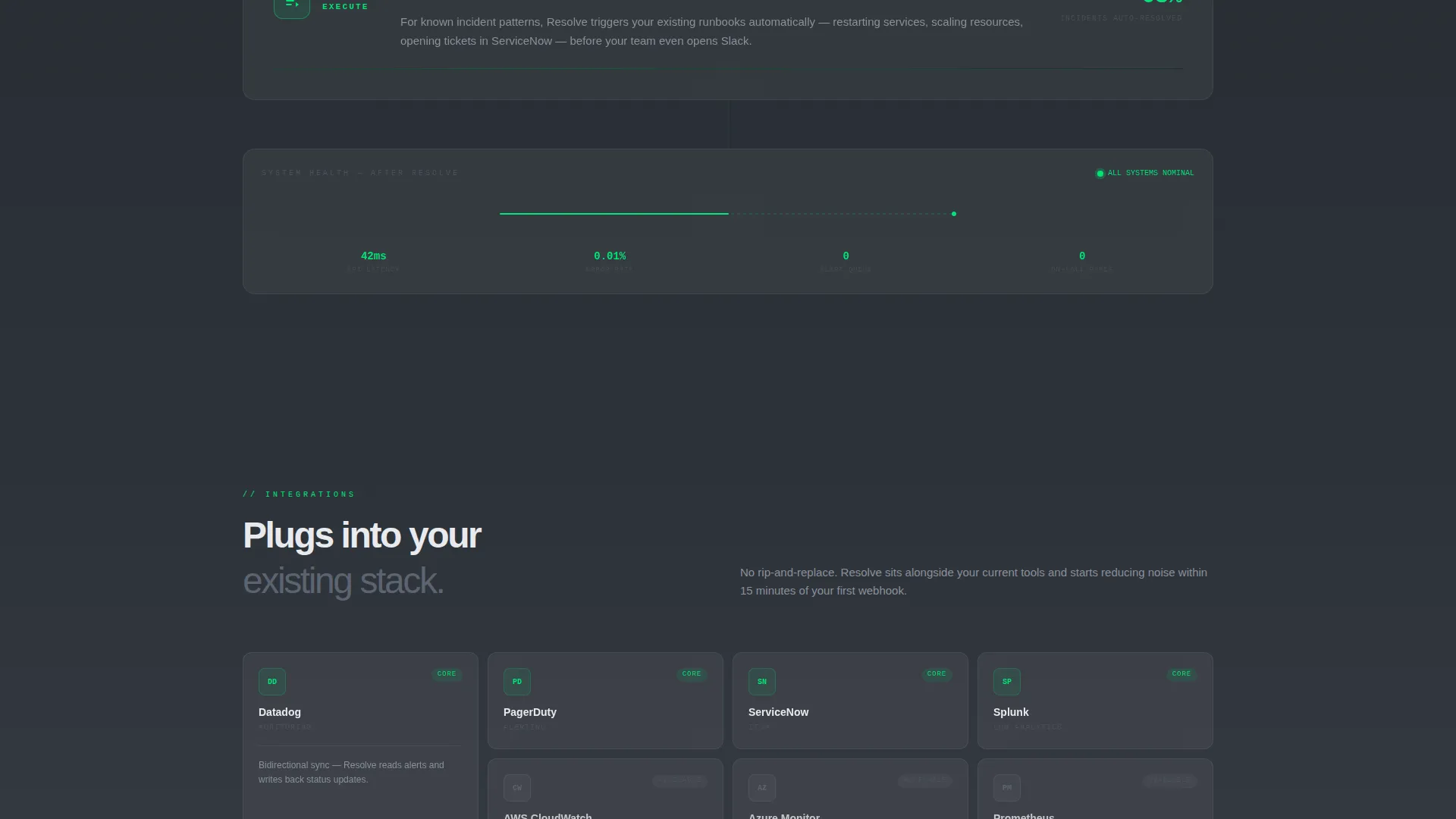
- A credibility logo bar header, an animated alert-compression visualization, and four progressive solution panels covering ingestion, correlation, noise suppression, and automated runbook execution
- A dual conversion path: a primary app download call to action with App Store and Google Play badges and a secondary email-first trial flow with progressive field disclosure
- A complete Tech Glass design system using a four-color Monochrome Steel palette with signal-green reserved exclusively for healthy-state indicators and call-to-action moments
Feature list
This template includes components and behaviors drawn directly from the brief. Each one serves a specific role in moving a skeptical infrastructure buyer toward a confident download.
Scroll-Reveal Progressive Layout
Each section slides into view only after the previous panel completes. This mimics the sequential logic of an incident-resolution pipeline and keeps the visitor focused on one idea at a time.
Animated Alert-Compression Visualization
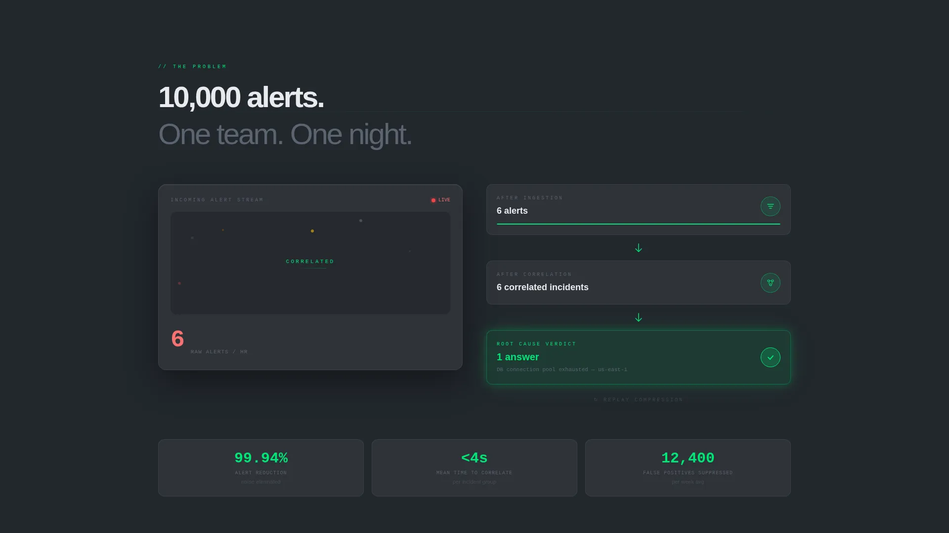
The opening section counts 10,000 raw alerts down to six correlated incidents and then to one root cause in real time as the visitor watches. The animation makes the core value proposition tangible before any paragraph is read.
Monochrome Steel Logo Bar Header
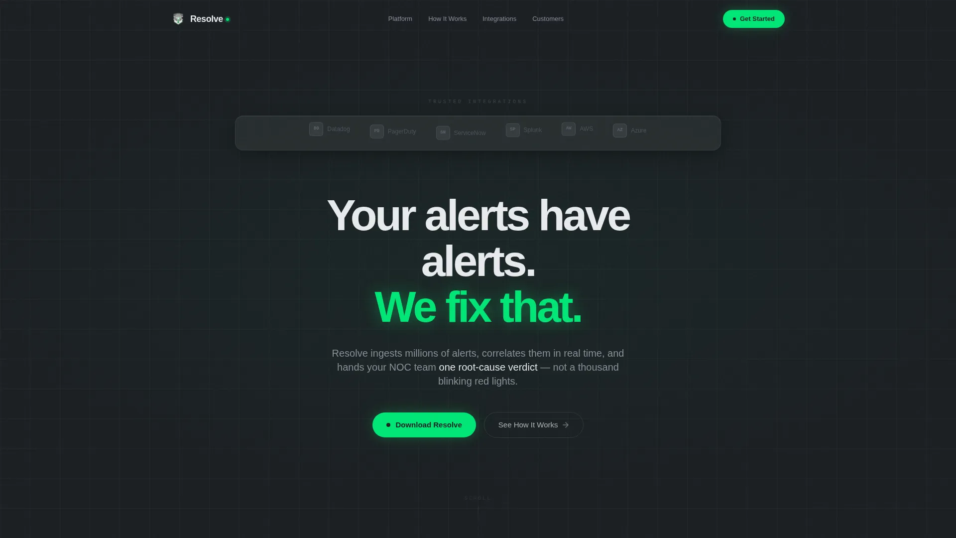
A horizontal strip of client and integration logos floats above a dark gunmetal field with a gentle parallax effect. The logos are rendered in monochrome steel on frosted glass panels, establishing credibility instantly without a hero image or stock photography.
Progressive Disclosure Trial Form
The secondary conversion path starts with a single email input field. Company name and infrastructure size fields appear only after the email is entered. This lowers the perceived commitment at first glance while still capturing qualified lead data.
Signal-Green call to action System
The primary call-to-action button and App Store and Google Play badges render in monochrome steel at rest and flip to signal-green on hover. This keeps the palette disciplined while making the conversion moment unmistakable.
Background Lightness Arc
Page backgrounds transition from deep gunmetal at the top through brushed-alloy mid-gray to frosted-panel white as the visitor scrolls, mirroring the emotional shift from chaotic alert noise to resolved clarity.
Page sections overview
| Section | Purpose |
|---|---|
| Logo Bar Header | Establishes credibility with integration and client logos before any copy |
| Headline Fade-In | Delivers the core message with a single restrained sans-serif statement |
| Alert Compression Animation | Visualizes 10,000 alerts collapsing into one root cause in real time |
| Ingestion Panel | Explains how the platform ingests alert volume at scale |
| Correlation Panel | Shows how alerts are grouped and linked to related incidents |
| Noise Suppression Panel | Demonstrates the reduction from raw noise to meaningful signal |
| Runbook Execution Panel | Covers automated response actions triggered after root-cause identification |
| App Download call to action | Primary conversion section with App Store and Google Play badges |
| Trial Email Flow | Secondary conversion path with progressive field disclosure |
Design & branding system
The Monochrome Steel palette creates a visual language that feels machined and precise. Every color choice has a functional role, and no decorative color is used.
- Four core colors: deep gunmetal (#1B1F23) for backgrounds, brushed-alloy mid-gray (#5C6370) for secondary surfaces, frosted-panel white (#E8EAED) for foreground panels, and signal-green (#00E676) reserved exclusively for positive-state indicators and calls to action
- Tech Glass aesthetic uses frosted glass panel treatments, parallax-floating logo strips, and zero ornamental imagery, keeping the visual weight on data and motion rather than decoration
- Typography uses clean sans-serif faces throughout, with the opening headline fading in as the single most prominent typographic moment on the page
Mobile & speed optimization
The scroll-reveal structure and progressive disclosure form are designed to translate cleanly to smaller screens. Sequential panel reveals work naturally on a touch-scroll interaction model.
- Each section is self-contained and reveals independently, which keeps the mobile scroll experience coherent without requiring horizontal navigation or nested menus
- The single-field email input with progressive disclosure reduces friction on mobile keyboards by asking for only one value at a time
- The App Store and Google Play badge pair is the primary call to action, making the mobile use case a natural and direct path for visitors already on a phone or tablet
How this template helps you convert
The page is engineered so the visitor has already seen the core value demonstrated before they reach any ask. Conversion is the natural conclusion of a resolved emotional arc, not a cold interruption.
- The animated alert-compression sequence builds conviction visually. By the time the visitor finishes watching 10,000 alerts collapse into one answer, the product benefit is already understood without a word of explanation.
- The dual call to action structure meets two different buyer mindsets. The app download path serves decision-ready visitors, while the email trial path captures evaluators who need a lower-commitment first step.
Other information about this template
This template is a strong fit for AIOps managed service providers who want a visually distinct market presence. A few additional details worth noting:
- The template is built as a single-page scroll experience, not a multi-page site, keeping the visitor journey linear and free of navigation distractions
- The integration logo bar references recognizable enterprise monitoring and operations tools, signaling ecosystem compatibility to technically literate buyers
- The page style is well suited for product launches, conference campaign landing pages, or paid acquisition landing pages where a focused, no-escape conversion flow is valuable
- The progressive background lightness arc is a deliberate narrative device, not a decorative choice; it earns its meaning by mirroring the emotional resolution of a real incident
Theme
Tech Glass
Creative direction
Problem→Solution Arc
Color system
Monochrome Steel
Style
Scroll Reveal (Progressive)
Direction
App Download
Page Sections
Scroll-reveal Progressive Layout
Animated Alert-compression Visualization
Monochrome Steel Logo Bar Header
Signal-green Call to Action with App Badges
Progressive Disclosure Trial Form
Background Lightness Arc
Related questions
What type of business is this template designed for?
Can I replace the logo bar with my own client and integration logos?
How does the progressive disclosure form work?
Is this template suitable for a paid advertising campaign?
Does the animated alert counter come included with the template?



