AIOps Technology Portfolio Website Template
Resolve is a comparison table landing page template built for AIOps consulting firms. It guides enterprise IT buyers through a data-driven journey: a hard-hitting stat, a twelve-row comparison matrix, anonymized case studies, and a four-stage methodology timeline. The design uses a dark-mode Data Command palette to signal trust, authority, and operational clarity from the first scroll.
by Rocket studio
Quick summary
Resolve is a single-page landing page template designed for AIOps consulting services. It leads with a full-width product screenshot header, moves into a side-by-side comparison table, and builds a prosecutorial case for managed machine learning operations. Every section escalates the evidence, ending with two conversion paths that feel like a natural next step.
Who this template is for
This template is built for technology consulting firms that sell machine learning-powered IT operations services to enterprise buyers. It speaks directly to the people who sign the contracts and feel the pain.
- VP-level infrastructure leaders at mid-market SaaS companies evaluating observability spend
- NOC (Network Operations Center) managers drowning in overnight alert escalations
- CTOs preparing board presentations that justify a doubled monitoring budget
What problem this template solves
Enterprise IT buyers are skeptical. They have seen vendor slides before, and they do not convert on promises alone. This template replaces soft claims with structured evidence, guiding a technical buyer from frustration to conviction in a single scroll.
- Visitors arrive doubting whether managed AIOps actually outperforms their current stack
- No clear visual proof separates one approach from another without a head-to-head comparison
- High-intent buyers leave without converting because the call to action feels premature
What you get with this template
The template delivers a complete, ready-to-adapt landing page structure. Every section is purpose-built for a comparison-led buying journey.
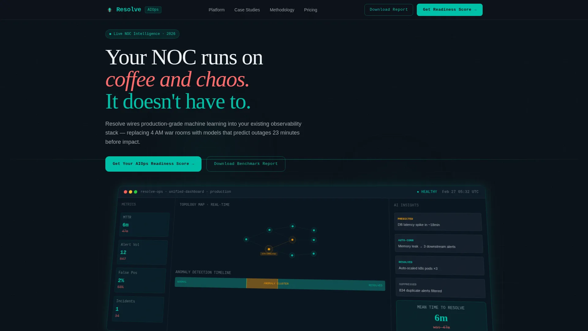
- A full-width isometric product screenshot header with headline overlay and dark-mode operations aesthetic
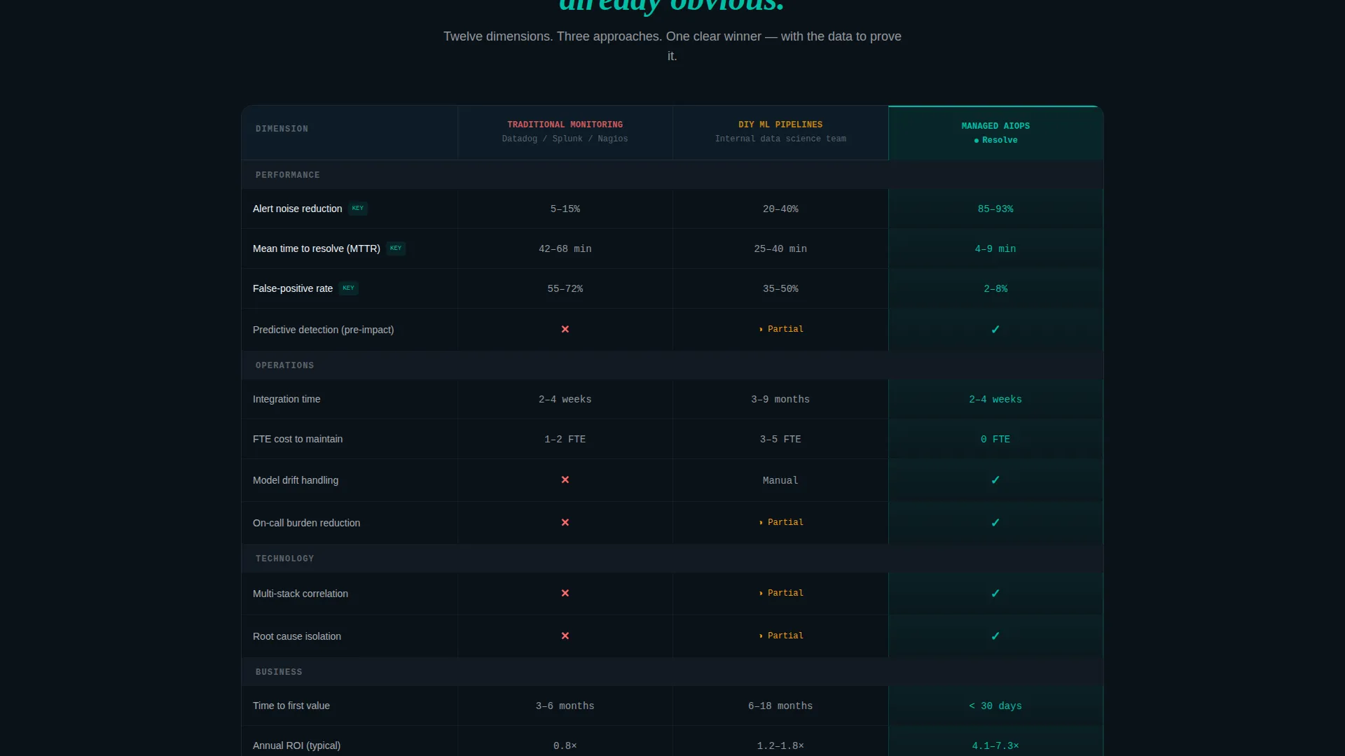
- A twelve-row comparison table pitting three approaches side by side, with teal checkmarks and coral indicators for instant visual verdict
- Two progressive conversion paths: a three-step readiness assessment form and a gated benchmark report download
Feature list
This section covers the core components built into the Resolve template.
Full-Width Dashboard Screenshot Header
The header renders a pixel-perfect AIOps dashboard on a slight isometric tilt against an operations-black background. It shows a real-time topology map, an anomaly detection timeline, and a mean-time-to-resolve (MTTR) metric drop from 47 minutes to 6. A single headline overlays the top-left corner, immediately framing the visitor's pain.
Twelve-Row Comparison Table
The comparison matrix places Traditional Monitoring, do-it-yourself machine learning pipelines, and Managed AIOps Consulting side by side across twelve evaluation rows. Rows include alert noise reduction, MTTR, integration time, model drift handling, full-time employee cost, and time-to-value. Teal checkmarks and coral indicators make the winning column obvious without a single sentence of explanation.
Anchored Stat Section with Citation
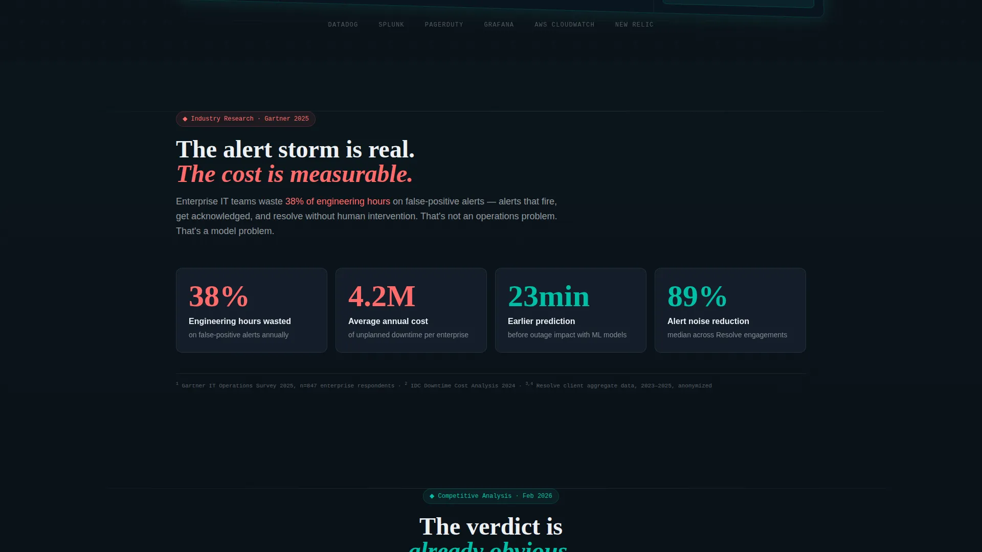
Section one opens with a hard enterprise stat: IT teams waste 38% of engineering hours on false-positive alerts. The figure is sourced and footnoted in the layout, establishing the analyst-report tone that carries through every subsequent section.
Anonymized Case Study Mini-Reports
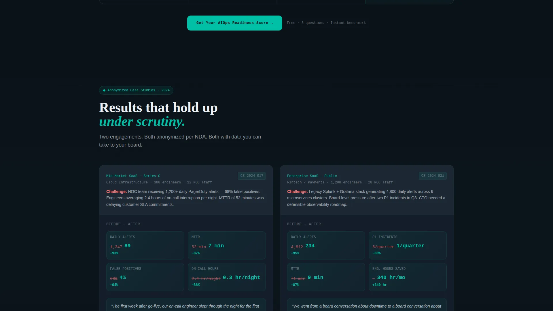
Two case study blocks present before-and-after metric strips for anonymized enterprise clients. Each reads like a condensed analyst brief, giving skeptical buyers tangible proof without requiring named client approval.
Four-Stage Methodology Timeline
A horizontal timeline walks buyers through the consulting engagement: Discovery, Instrumentation, Model Training, and Feedback Loop. It clarifies exactly what the engagement looks like and removes the ambiguity that stalls high-value consulting deals.
Dual Conversion Path System
A sticky navigation bar keeps the primary call to action visible throughout the entire scroll. A three-step progressive form captures monitoring stack, alert volume, team size, name, and work email in stages. A secondary gated download offers a lower-commitment entry point for higher-funnel visitors.
Page sections overview
| Section | Purpose |
|---|---|
| Sticky Nav Bar | Keeps primary call to action visible throughout scroll |
| Dashboard Screenshot Header | Establishes pain and frames the solution immediately |
| Hard Stat Block | Opens with a sourced industry figure to anchor credibility |
| Comparison Table | Delivers the side-by-side verdict across twelve evaluation rows |
| Case Study Strip | Presents before-and-after proof from anonymized engagements |
| Methodology Timeline | Shows the four-stage consulting process in a horizontal layout |
| Primary call to action Block | Repeats the readiness assessment prompt after key evidence sections |
| Gated Report Download | Offers a lower-friction secondary conversion for higher-funnel visitors |
Design & branding system
The visual identity follows a Data Command theme built on the Teal Catalyst color system. The palette is clinical and purposeful. Every color carries a specific meaning, trained into the visitor's eye across the scroll.
- Deep operations black (#0B1219) as the base, muted slate (#3B4A5A) for secondary surfaces, and signal white (#EDF1F5) for text-dense areas
- Catalyst teal (#00BFA6) used for every positive indicator: checkmarks, resolved states, and healthy metrics
- Accent coral (#FF6B6B) reserved exclusively for "before" states, legacy pain indicators, and downtime figures, teaching the eye that coral means broken and teal means fixed
Mobile & speed optimization
The template is structured for clean rendering across screen sizes. Its layout prioritizes legibility and scrollability on smaller displays where enterprise buyers often review materials between meetings.
- The comparison table adapts its column structure so rows remain readable without horizontal scrolling
- The sticky call-to-action bar remains functional on mobile, keeping the conversion entry point accessible throughout the scroll
How this template helps you convert
The entire page is engineered around a Comparison/Versus conversion strategy. Every section adds a layer of evidence before asking for anything in return.
- The hard stat section and comparison table deliver analyst-grade insight upfront, so visitors feel they have already received value before the form appears.
- The primary call to action, "Get Your AIOps Readiness Score," is repeated after the comparison table and after the case studies, catching visitors at two natural conviction peaks.
- The secondary gated report offers a lower-commitment path for visitors not yet ready for the assessment, capturing email and company name without friction.
Other information about this template
This template is categorized under Technology, specifically the AIOps Technology subcategory, and is designed for the AIOps consulting service niche. It is a strong fit for firms positioning managed machine learning operations against self-managed or legacy monitoring approaches.
- The creative direction follows an Industry Report style, making the page feel like a trusted analyst briefing rather than a typical vendor sales page
- The template style is a Comparison Table layout, purpose-built for buyers who evaluate options before committing to a consulting engagement
- The header concept is a Product Screenshot, grounding the abstract promise of AIOps in a concrete, visual demonstration of outcomes
Theme
Data Command
Creative direction
Industry Report
Color system
Teal Catalyst
Style
Comparison Table
Direction
Comparison/Versus
Page Sections
Full-width Isometric Dashboard Header
Twelve-row Comparison Matrix
Sourced Stat Opening Section
Before-and-after Case Study Blocks
Four-stage Methodology Timeline
Dual Progressive Conversion System
Related questions
Who is this landing page template designed for?
Can I adapt the comparison table rows to match my own service?
What are the two conversion paths included in this template?
Does this template include the case study content or just the layout?
How does the color system support the comparison message?



