Complete Consulting Firm Software Comparison Website Template
Resolve is a single-page comparison table landing page built for consulting firm help desk and ticketing platforms. It uses a dark Tech Glass visual theme with iridescent color accents, a tiered plan comparison table, and a click-through call to action flow designed to move operations managers and IT leads from first scroll to pilot signup without friction.
by Rocket studio
Quick summary
Resolve is a landing page template built for consulting firm help desk and ticketing platforms. It opens with a vivid product screenshot, escalates through a staggered three-tier comparison table, and closes with a sticky pilot call to action. The Tech Glass design and iridescent color system make it feel precise, modern, and immediately credible to operations-focused buyers.
Who this template is for
This template is built for consulting firms that need to present a help desk and ticketing platform to a technically literate, results-driven audience. It speaks directly to the people who live inside service agreements and client deadlines every day.
- Operations managers at mid-size consultancies juggling service-level agreement (SLA) deadlines across many active client engagements
- IT leads who handle routine requests while managing larger infrastructure projects in parallel
- Consulting partners who need to demonstrate that their support function drives client retention, not just cost
What problem this template solves
Most help desk landing pages feel generic. They were built for internal IT departments, not firms where every support ticket has a billable implication and a client relationship attached to it. This template solves the credibility gap between a consulting firm's actual support workflow and the pages they use to sell it.
- Visitors arrive skeptical; the comparison table earns trust row by row before asking for a commitment
- Consulting-specific features like billable-hour auto-tagging and per-engagement SLA matrices have no obvious home on generic help desk pages
- A sticky call to action with no on-page form removes signup friction and keeps the buyer moving forward
What you get with this template
You get a complete, single-page landing page structured around a three-tier plan comparison table. Every section is designed to build confidence and move a specific type of buyer toward starting a trial.
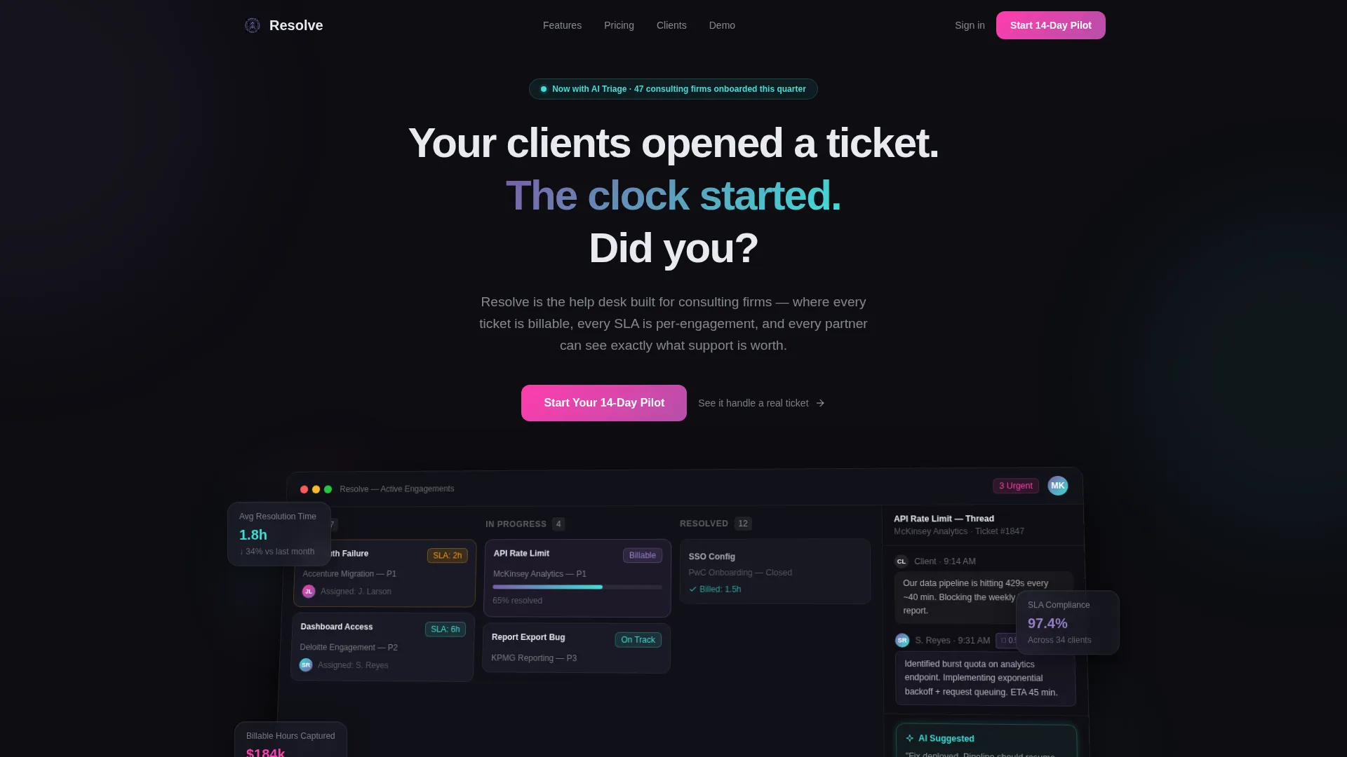
- A full-width product screenshot header with a 3D tilt effect, iridescent light leak edges, and a timed headline fade-in
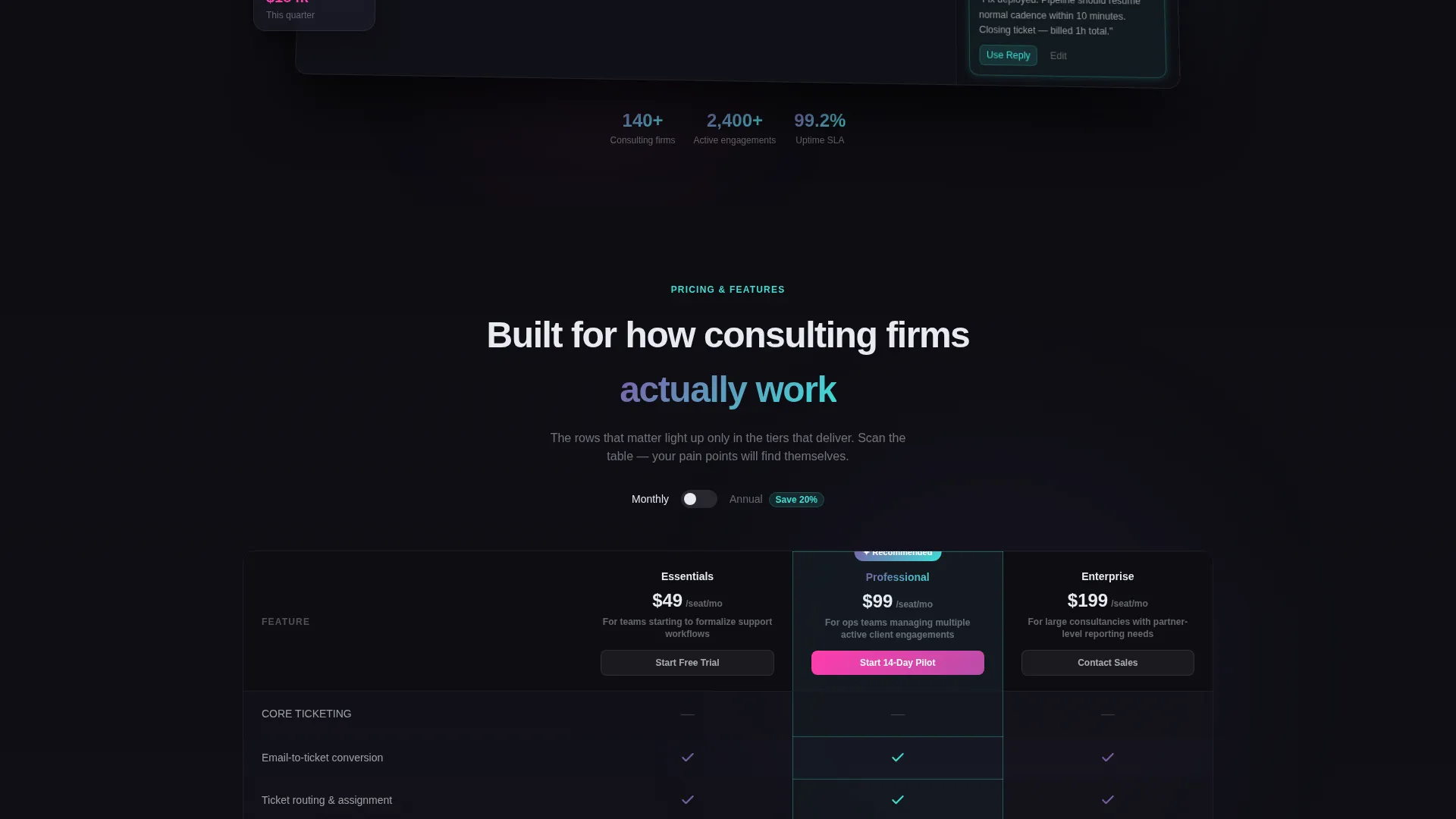
- A staggered-reveal comparison table with three plan columns, tooltip-enabled feature rows, and a pulsing recommended-tier border
- A sticky bottom call to action bar with a secondary demo link, plus a testimonial strip grounding the page in real-world proof
Feature list
This section covers the core built-in components and interaction patterns included in the Resolve template.
Three-Tier Comparison Table
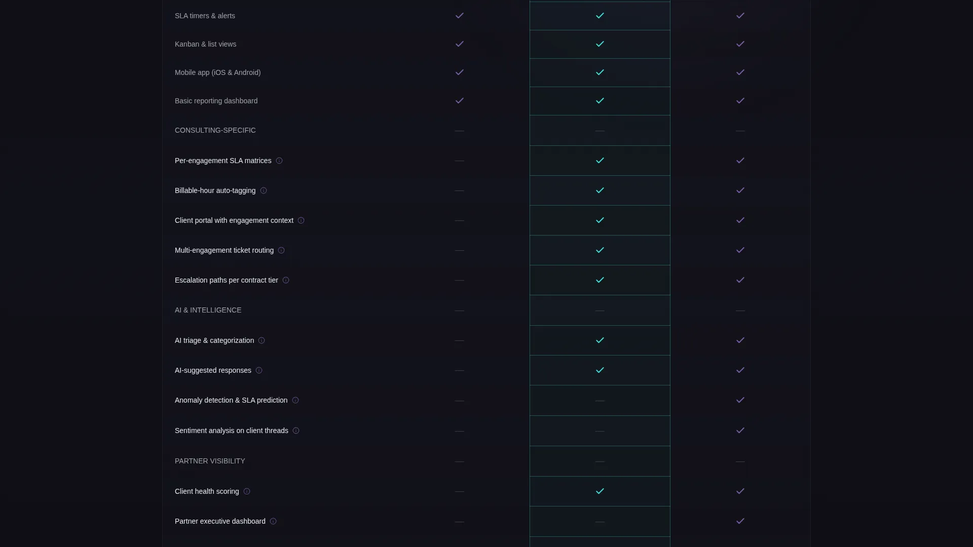
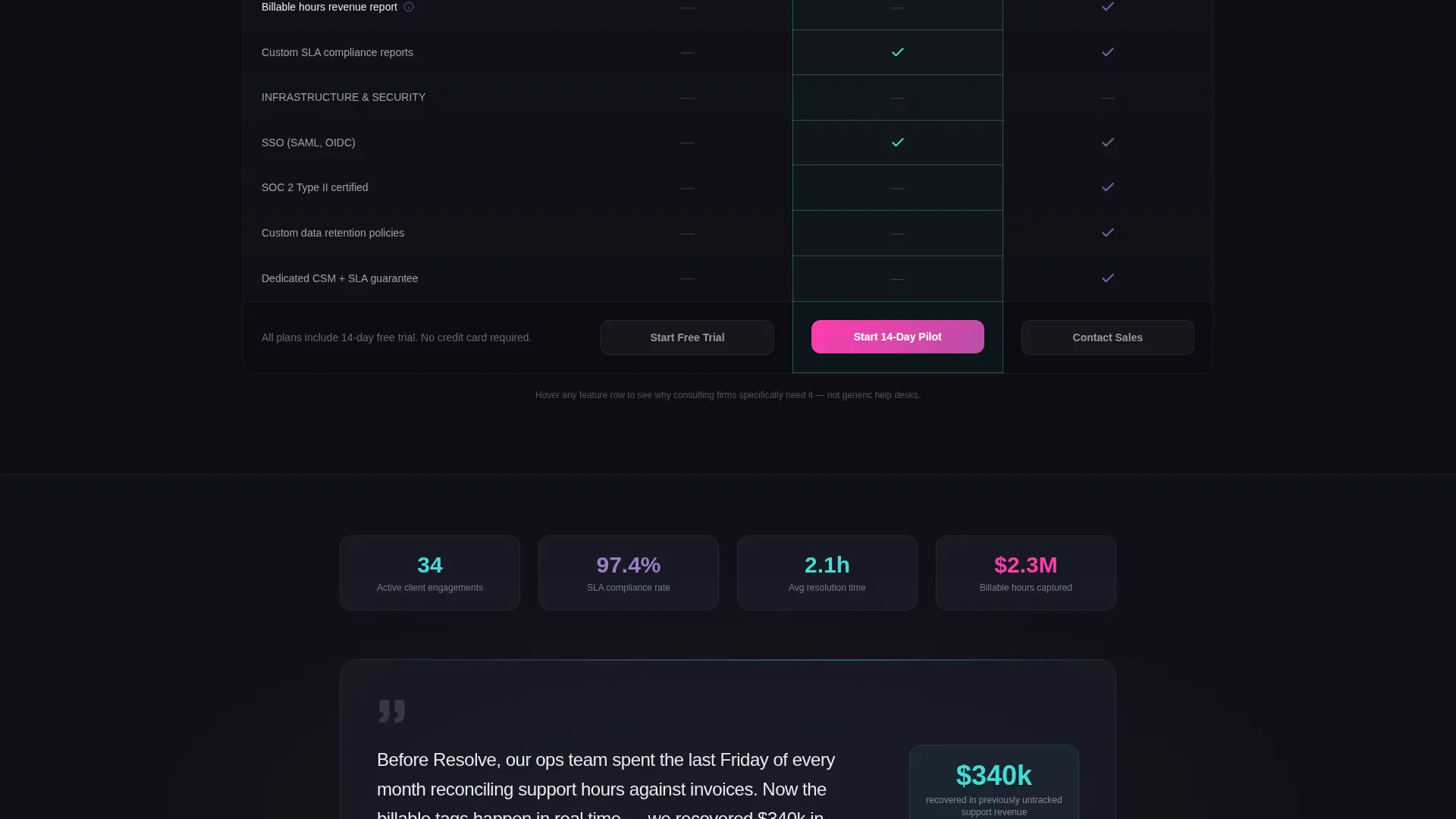
The table displays three plan tiers side by side with rows that cascade into view on scroll. Early rows show universal checkmarks to build rapport. Later rows reveal consulting-specific capabilities that light up only in the higher tiers, making the upgrade decision feel logical rather than forced.
Hover Tooltips on Feature Rows
Each feature row includes a one-line tooltip that appears on hover. The tooltip explains why that specific feature matters to consulting firms, not generic help desk users. This keeps the page self-explanatory without adding visual clutter.
Sticky call to action Bottom Bar
A "Start Your 14-Day Pilot" bar anchors to the bottom of the viewport after the visitor scrolls past the header. It intensifies in color as the visitor reaches the comparison table, reinforcing urgency at exactly the right moment.
Product Screenshot Header
The header features a pixel-perfect ticketing dashboard screenshot shown mid-workflow. It includes a kanban view with three visible tickets, an open client thread with a billable flag, and a faintly glowing AI-suggested reply. The screenshot sits on a 3D tilt with iridescent edge light leaks.
Launch Energy Scroll Animation
The page uses a launch sequence scroll mechanic. As the visitor moves past the header, the screenshot compresses upward and the comparison table rises into view. Each table row reveals with a staggered cascade, making the page feel kinetic and purposeful rather than static.
Testimonial Strip
A single focused testimonial from an operations director at a 140-person consultancy with 34 active clients appears below the comparison table. It grounds the page in a real operational context and adds credibility at the moment the visitor is closest to deciding.
Page sections overview
| Section | Purpose |
|---|---|
| Header screenshot | Establishes platform credibility with a live-workflow dashboard view |
| Headline fade-in | Anchors urgency with a time-sensitive consulting framing |
| Comparison table | Differentiates plan tiers across consulting-specific feature rows |
| Feature row tooltips | Explains consulting relevance for each capability on hover |
| Recommended tier highlight | Draws attention to the best-fit plan with an iridescent pulsing border |
| Testimonial strip | Provides social proof from a named-scale consulting operation |
| Sticky call to action bar | Keeps the pilot signup action visible throughout the scroll journey |
| Demo text link | Offers a lower-commitment next step beneath the primary call to action |
Design & branding system
The visual identity follows a Tech Glass theme built on an AI Iridescent color palette. The result feels like a precision instrument: dark, controlled, and then suddenly alive with refracted color when an element responds to interaction.
- Background surfaces stay in the deep obsidian range (#0D0D12), with frosted glass white (#E8EAF0) used for card surfaces and body text
- Gradients shift from spectral violet (#7B5EA7) into holographic teal (#3EDFD7) on column headers, hover states, and the recommended tier border
- Signal pink (#FF3CAC) is reserved exclusively for notification badges and primary call to action buttons, giving those elements maximum contrast against the dark background
Mobile & speed optimization
The Resolve template is built with a scroll-driven experience that adapts across screen sizes. The comparison table and sticky call to action are central to conversion, so both are structured to remain clear and functional on smaller viewports.
- The three-column comparison table is designed to reflow on narrow screens so plan tiers remain scannable without horizontal scrolling
- The sticky call to action bar and its secondary demo link maintain their position and sizing across device widths, keeping the primary action always reachable
How this template helps you convert
The page is built around a deliberate escalation strategy. By the time a visitor reaches the call to action, the comparison table has already done the convincing.
- The product screenshot header establishes immediate platform credibility. A real workflow view with billable flags and SLA timers signals to operations buyers that this tool understands their environment before a single word of copy is read.
- The comparison table builds momentum through strategic row sequencing. Universal features appear first to create agreement. Consulting-specific capabilities appear later, lighting up only in the recommended tier and making the upgrade feel like the obvious move.
- The sticky call to action with no on-page form removes the biggest conversion barrier. The visitor clicks through to a signup flow rather than filling out a form mid-scroll, keeping intent high and drop-off low.
Other information about this template
Resolve is categorized under Technology and Consulting Firm Software, making it a focused fit for platforms targeting mid-size professional services firms. A few additional details worth knowing before building with this template:
- The template style is a Comparison Table landing page, ideal for platforms with multiple pricing tiers or plan-based feature differentiation
- The creative direction is Launch Energy, a scroll mechanic that pairs well with platforms making a strong first impression on analytically minded buyers
- The header concept is a Product Screenshot, which works best when the platform has a visually compelling dashboard worth showcasing
- The landing-page direction is Click-Through, meaning the page is designed to carry qualified intent to an external signup or demo flow rather than capture leads directly on the page
- The color system is AI Iridescent, a palette that signals modern, intelligent software to a tech-forward consulting audience
Theme
Tech Glass
Creative direction
Launch Energy
Color system
AI Iridescent
Style
Comparison Table
Direction
Click-Through
Page Sections
Three-tier Comparison Table
Hover Tooltips on Feature Rows
Sticky Call to Action Bottom Bar
Product Screenshot Header
Launch Energy Scroll Animation
Testimonial Strip
Related questions
Is this template designed for a single page or multiple pages?
Can I adapt the comparison table to my own plan names and feature rows?
Does the page capture leads directly, or does it link out to a signup flow?
Who is the target visitor this page is designed for?
Can the color system be adjusted to match a different brand palette?



