Software & SaaS Professional Website Template
Resolve is a bento grid landing page template built for customer support software. It follows a Problem to Solution arc, opening with a full-width product screenshot and guiding visitors through a visual story of inbox chaos resolved. The Tech Glass design, electric chartreuse calls to action, and app download flow make it ideal for SaaS teams ready to convert support leaders fast.
by Rocket studio
Quick summary
Resolve is a single-page bento grid template designed to sell customer support software. It opens with a pixel-perfect product screenshot, walks visitors through a clear Problem to Solution narrative, and closes with a platform-specific app download call to action. The Tech Glass visual theme and Acid Digital color system make the page feel like a live dashboard, not a brochure.
Who this template is for
This template is built for teams and founders who sell customer support software and need a landing page that earns trust quickly. It speaks directly to buyers who manage real support operations and feel the pain of fragmented conversations.
- VP-level support leaders running large teams with daily ticket backlog pressure
- Solo founders handling live chat, email, and social direct messages on their own
- E-commerce operations managers tracking customer satisfaction scores during high-volume periods
What problem this template solves
Most software landing pages describe features without showing them. Visitors leave before they understand the value. This template solves that by putting the product front and center from the first scroll, then building a visual case through structured bento cards.
- Support teams lose trust when a landing page lists capabilities without proving them
- Fragmented channel messaging makes it hard to communicate a unified inbox story clearly
- Generic SaaS templates fail to match the polished, dashboard-native look buyers expect
What you get with this template
You get a fully structured, single-page bento grid layout built around a conversion-focused narrative arc. Every section is designed to carry a specific job, from proof to feature education to download prompt.
- A full-width product screenshot header with headline, frosted-glass browser frame, and floating depth shadow
- A multi-row bento grid that shifts from pain-state cards to solution-state cards with feature zoom rows
- A dual-path app download section with platform toggles for macOS, Windows, iOS, and Android, plus a browser version fallback
Feature list
This template ships with purpose-built layout components tied directly to how support software buyers make decisions.
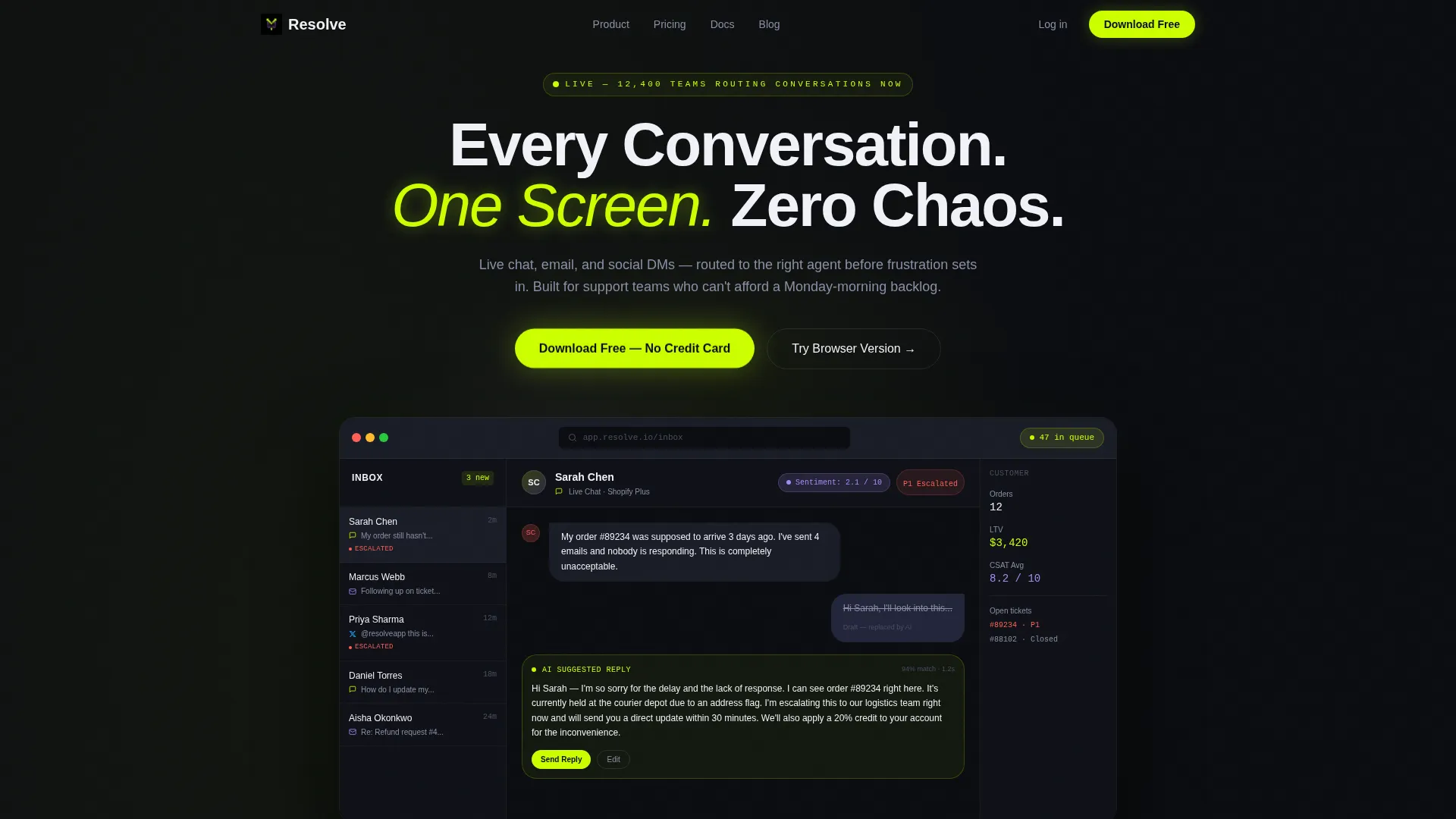
Full-Width Product Screenshot Header
The header places a pixel-perfect inbox screenshot inside a frosted-glass browser frame. It shows three simultaneous conversations across channels, an artificial intelligence suggested reply highlighted in chartreuse, a sentiment score badge in lilac, and a live queue counter. The headline "Every Conversation. One Screen. Zero Chaos." fades in above it.
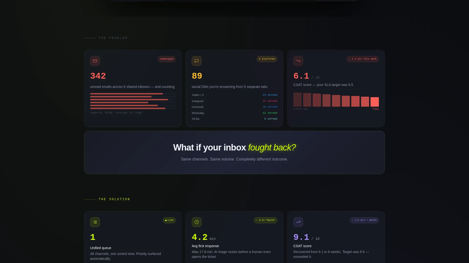
Problem to Solution Bento Arc
The first bento row presents the pain state visually. Cards show an overflowing email counter, a stacked social direct message notification list, and a declining customer satisfaction score graph. Each card pulses faintly. A full-width divider card transitions the narrative, and the grid below it mirrors the same metrics now unified and glowing.
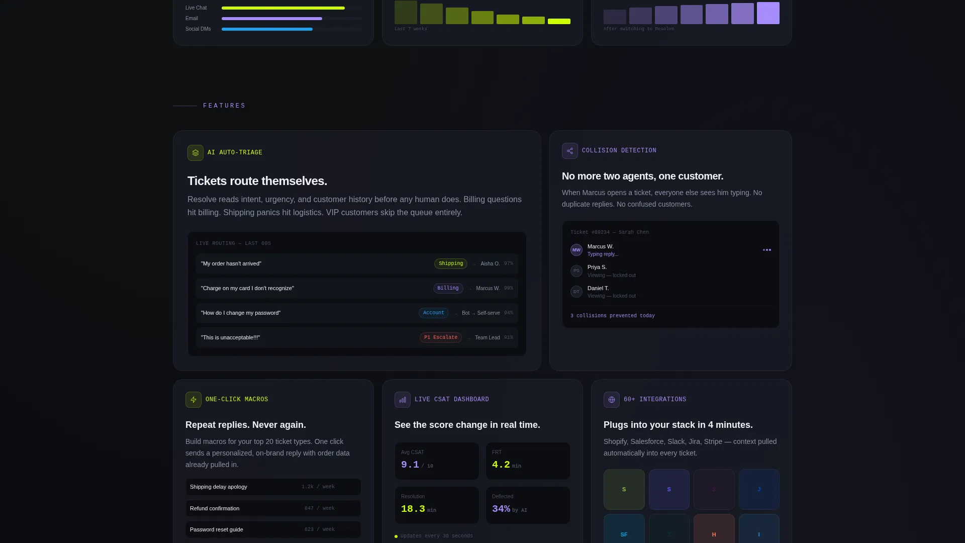
Feature Zoom Bento Rows
After the transition, each subsequent bento row isolates one feature. Artificial intelligence auto-triage, collision detection, one-click macros, and real-time customer satisfaction dashboards each get their own card grouping. Large hero cards carry flagship features while small square cards hold stats and integration marks, creating visual rhythm as the visitor scrolls.
Floating and Anchored call to action System
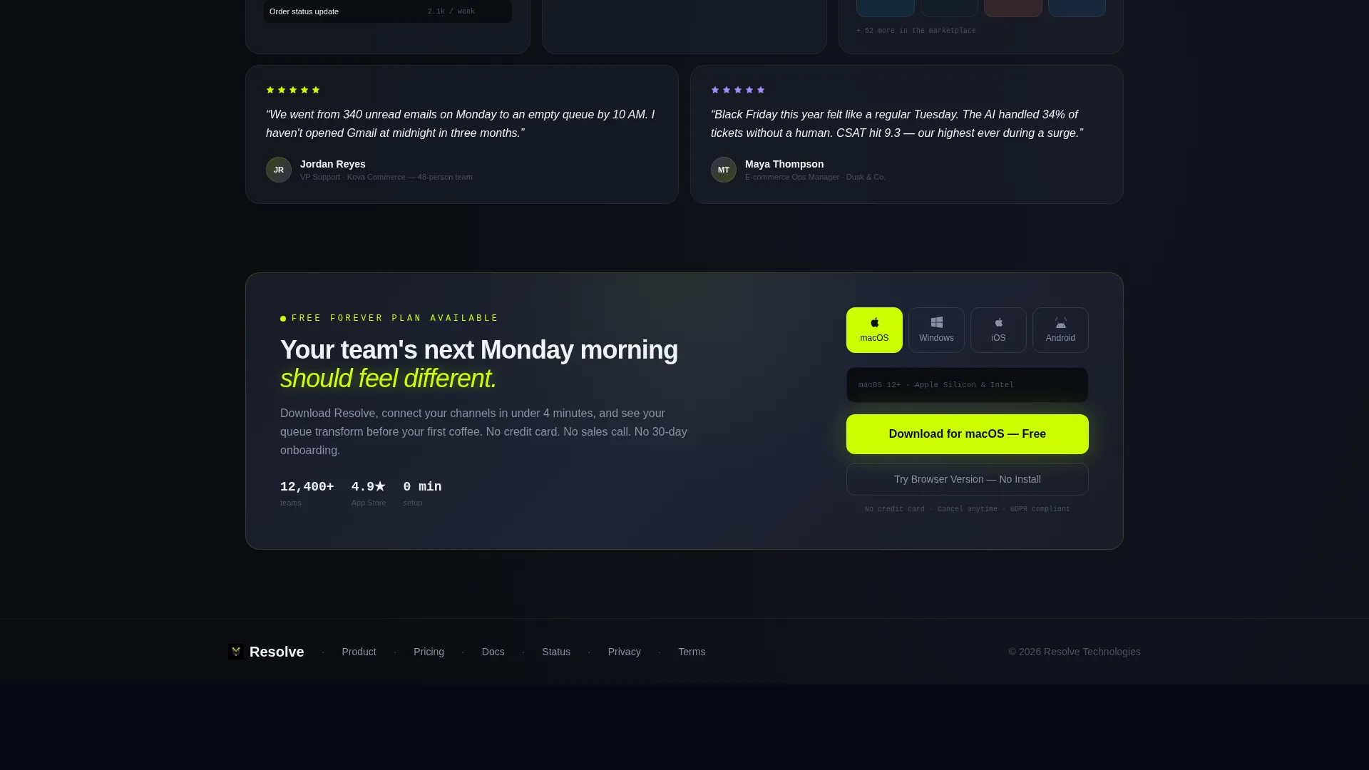
The primary call to action, "Download Free - No Credit Card," appears first as a floating pill button after the header screenshot. It returns as a full-width bento card near the bottom of the page. This repetition ensures the download prompt is never more than a glance away throughout the scroll.
Platform Toggle Download Block
The bottom download section includes platform toggles for macOS, Windows, iOS, and Android. A secondary option labeled "Try the Browser Version" gives hesitant visitors an alternative path. Both options serve different intent levels without forcing a single decision.
Acid Digital Color System
Electric chartreuse (#CCFF00) marks every call to action and live status indicator. Cool interface lilac (#A78BFA) signals secondary badges and hover states. Void black (#0B0D11) fills the background and translucent panel gray (#1A1D27) with frosted-glass blur covers each bento card.
Page sections overview
| Section | Purpose |
|---|---|
| Hero Screenshot Header | Opens with product proof and headline |
| Pain State Grid | Shows fragmented inbox problems visually |
| Narrative Divider Card | Transitions from problem to solution |
| Solution State Grid | Mirrors pain cards in resolved, unified form |
| AI Triage Feature Row | Highlights automatic ticket routing capability |
| Collision Detection Row | Shows agent overlap prevention feature |
| One-Click Macros Row | Demonstrates reply speed feature |
| CSAT Dashboard Row | Presents real-time satisfaction monitoring |
| Floating call to action Pill | Keeps download prompt visible mid-scroll |
| Platform Download Block | Delivers final conversion with platform choice |
Design & branding system
The visual identity runs on the Tech Glass theme combined with the Acid Digital color system. The result feels like a live dark-mode dashboard, clinical but alive, built for the kind of buyer who trusts data displays over marketing copy.
- Void black (#0B0D11) background, translucent panel gray (#1A1D27) bento cards with frosted-glass blur effect
- Electric chartreuse (#CCFF00) on all calls to action and live status indicators, cool interface lilac (#A78BFA) on secondary badges and hover states
- Frosted-glass browser frame around the header screenshot with a subtle depth shadow, creating a floating depth effect above the background
Mobile & speed optimization
The bento grid layout is structured to reflow naturally across screen sizes. Mobile visitors encounter the same narrative arc without losing the visual hierarchy that drives the conversion story.
- Bento cards stack into a single-column flow on smaller screens, preserving the Problem to Solution reading order
- The floating call-to-action pill remains accessible throughout the scroll on both mobile and desktop viewports
- Platform toggle buttons in the download block adapt to touch targets for iOS and Android visitors
How this template helps you convert
This template is built around one principle: show the product working before asking the visitor to do anything. By the time the download button appears, the visitor has already seen the inbox in action and understood the value.
- The product screenshot header acts as an immediate proof point, reducing the need for the visitor to imagine how the software works
- The bento arc moves the visitor emotionally from pain recognition to solution clarity, making the download feel like a logical next step rather than a sales ask
Other information about this template
This template is built specifically for the customer support software category within the Software and SaaS segment of the Technology space. It is a strong fit for teams evaluating how to present a unified inbox or omnichannel support product to a technically literate audience.
- The bento grid style is well-suited for presenting multiple support channels, including live chat, email, and social direct messages, in a single coherent layout
- The app download direction makes this template appropriate for products that offer native desktop or mobile clients alongside a browser-based option
- The template's Problem to Solution arc is especially effective for support software categories where the buyer already feels the pain and just needs to see a credible solution
- Teams building pages for help desk platforms, ticketing tools, or customer communication platforms will find the narrative structure and visual system directly applicable
Theme
Tech Glass
Creative direction
Problem→Solution Arc
Color system
Acid Digital
Style
Bento Grid
Direction
App Download
Page Sections
Product Screenshot Hero Header
Problem to Solution Bento Arc
Feature Zoom Bento Rows
Floating and Anchored Call to Action System
Platform Toggle Download Block
Acid Digital Color System
Related questions
Can I adapt this template for a help desk or ticketing tool?
Does this template include the actual product screenshot or do I supply my own?
What is the primary call to action in this template?
Who is the intended audience reading this landing page?
Can I remove the platform toggles if my product is web-only?


