Restaurant Software Privacy Policy & Terms Website Template
SafeServ is a bold, brutalist-styled restaurant safety management landing page built for multi-unit operators who need to replace paper audits with digital control. It features a Feature Tab Switcher header, anchor navigation, animated compliance metrics, and a single click-through path to a live product demo. Every section is designed to demonstrate the product before asking for commitment.
by Rocket studio
Quick summary
SafeServ is a hub and spoke landing page template built for restaurant safety management platforms. It uses a Bold Brutalist visual theme with a Slate and Sky color system to communicate authority and precision. The page drives visitors toward a live product demo through a tab-switching header, escalating proof sections, and a fixed bottom call-to-action bar.
Who this template is for
This template is built for software companies and platform teams selling compliance and inspection tools to food service operations. It speaks directly to the people who feel the pressure of audit day and inspection scores.
- Multi-unit restaurant operators managing compliance across many locations
- Kitchen managers and franchise directors responsible for health code scores
- Restaurant software teams who need a click-through landing page that lets the product sell itself
What problem this template solves
Paper-based audit systems create chaos for restaurant operations. Clipboards get lost. Temperature logs written on sticky notes disappear. Inspection day becomes a crisis instead of a routine.
- Operators have no real-time visibility across locations before an inspector arrives
- Franchise directors cannot confirm compliance without visiting each site in person
- There is no fast, credible way to show prospects the product value before asking for a sign-up
What you get with this template
You get a fully structured, single-page hub and spoke layout with anchor navigation linking each major spoke section. The template delivers a complete visual and structural system ready to be customized for your restaurant safety platform.
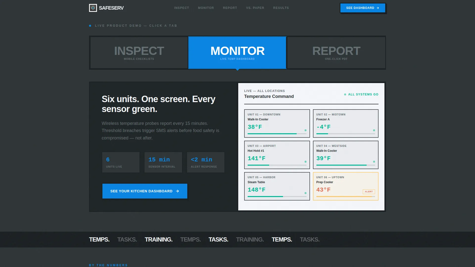
- A Feature Tab Switcher header showing three product states: INSPECT, MONITOR, and REPORT
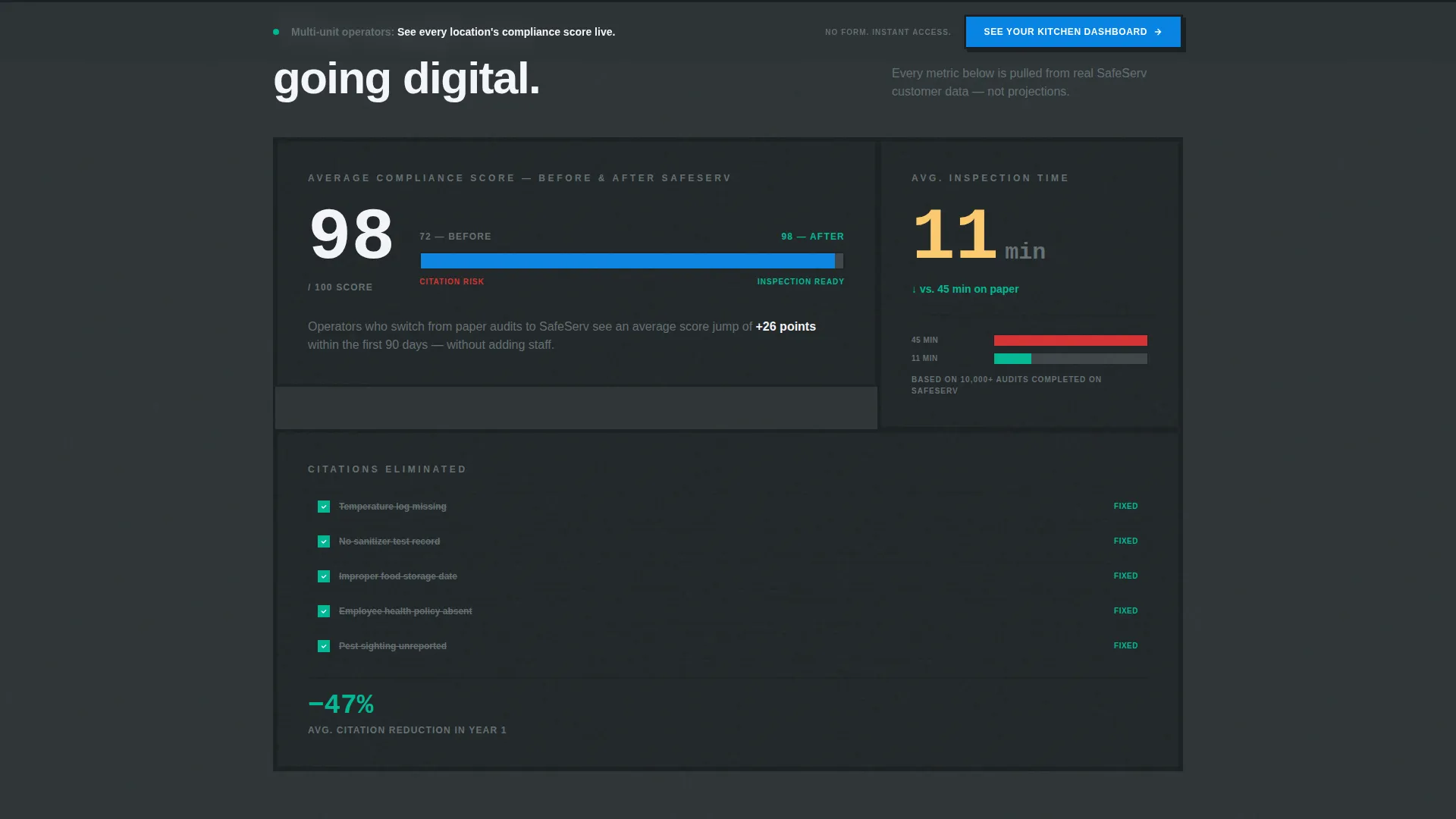
- Animated proof sections including a speed counter, a compliance score animation, and a citation comparison
- A fixed bottom call-to-action bar and a secondary comparison anchor section labeled versus Paper Audits
Feature list
This template is built around six intentional design and structural decisions that serve one goal: turning a skeptical restaurant operator into a confident demo requester.
Feature Tab Switcher Header
Three brutalist tabs labeled INSPECT, MONITOR, and REPORT span the full viewport width. Each tab snaps in a different product screenshot when clicked, showing a mobile checklist mid-audit, a live temperature dashboard with six sensor readings, and a one-click compliance report generating in real time. The product is the hero before a single word of body copy is read.
Anchor Navigation Hub and Spoke Layout
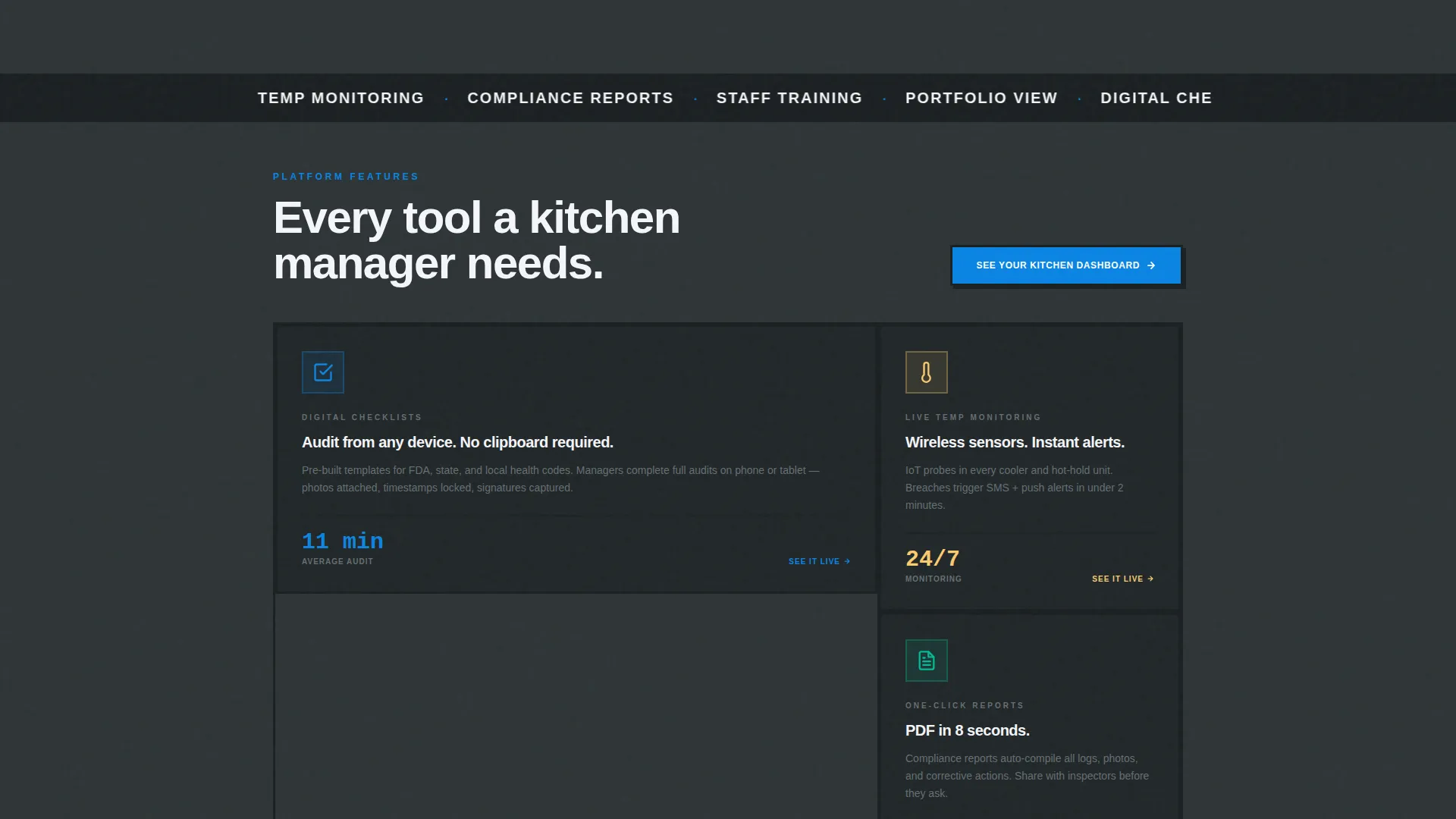
A persistent anchor navigation bar connects each section spoke to the hub header. Visitors can jump directly to the features, metrics, comparison table, or testimonial section without scrolling past content that does not apply to them. This structure keeps high-intent visitors moving fast.
Animated Compliance Metrics
An inspection speed counter shows "Average inspection completed in 11 minutes." A compliance score counter animates from 72 to 98. A side-by-side view shows a citation list shrinking to zero. These three proof elements build trust through visible, specific numbers rather than marketing language.
Brutalist Section Dividers
Thick black divider bars stamped with bold slab-serif labels, specifically TEMPS, TASKS, and TRAINING, separate each content spoke. The rhythm feels like ticket printers firing during a dinner rush, creating forward momentum that keeps visitors scrolling.
Paper Audit Comparison Section
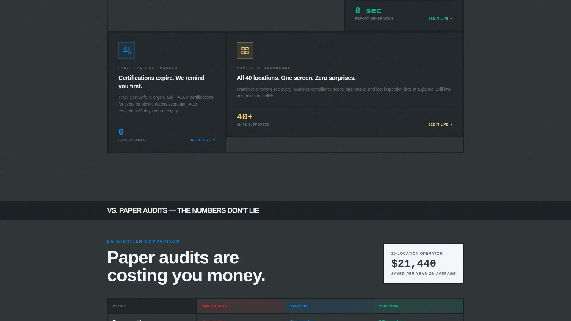
A brutalist data table anchored by the secondary navigation path compares digital compliance against paper audits. Time savings and cost savings appear in a structured format that ends with the primary call-to-action, giving hesitant visitors a logical second path to the demo.
Fixed Bottom Call-to-Action Bar
After the second spoke section, a fixed bottom bar displaying "See Your Kitchen Dashboard" stays visible throughout the rest of the page scroll. The primary call-to-action appears first inside the header tabs and repeats in this bar, reinforcing the click path without interrupting the reading experience.
Page sections overview
| Section | Purpose |
|---|---|
| Feature Tab Switcher | Introduce the product through three interactive screenshot tabs |
| Anchor Navigation Bar | Connect every spoke section for fast in-page movement |
| Speed Counter Spoke | Show inspection time proof with an 11-minute average stat |
| Compliance Score Animation | Animate a score climb from 72 to 98 to show improvement |
| Citation Comparison Spoke | Display a side-by-side view of citations shrinking to zero |
| TEMPS Divider Section | Reinforce temperature monitoring focus with brutalist typography |
| TASKS Divider Section | Signal task and checklist coverage as a core product pillar |
| TRAINING Divider Section | Mark training accountability as a platform capability |
| Paper Audits Comparison | Present a data table proving time and cost savings over paper |
| Video Testimonial Spoke | Feature an ops director managing forty locations as social proof |
| Fixed call to action Bar | Persist the demo call-to-action after the second spoke |
Design & branding system
The visual identity is Bold Brutalist, built to feel like a stainless-steel prep table under fluorescent light: hard, clean, and without ambiguity. Every color and typographic choice reinforces operational authority.
- Color palette: poured-concrete charcoal (#2D3436), industrial slate (#636E72), open-sky blue (#0984E3), emergency-alert white (#F5F6FA), and caution amber (#FDCB6E) for interactive states and notification badges
- Typography: oversized slab-serif type on concrete-textured card surfaces for headers, with high-contrast body text for readability
- Interactive accents: caution amber marks hover states, active tabs, and notification badges to guide attention without breaking the industrial palette
Mobile & speed optimization
The template is structured for fast loading and clear readability on smaller screens. The tab switcher and anchor navigation are built to remain functional and scannable on mobile viewports.
- The Feature Tab Switcher adapts to touch interaction so mobile visitors can tap through INSPECT, MONITOR, and REPORT screenshots
- The fixed bottom call-to-action bar stays anchored on mobile, keeping the demo path visible without requiring a scroll back to the top
- Section dividers and brutalist typography scale down without losing their visual rhythm or directional impact
How this template helps you convert
This landing page is engineered as a click-through funnel with no form friction. Every structural decision moves a visitor closer to clicking into the live demo environment.
- The tab switcher lets the product demonstrate itself before any marketing copy asks for commitment, reducing resistance from skeptical operators
- Animated metrics and the paper audit comparison table provide two separate proof moments that address both emotional and rational objections before the call-to-action repeats
Other information about this template
This template is categorized under Technology and Restaurant Software, making it well-suited for teams building in the restaurant safety management space. It is a single-page hub and spoke layout, not a multi-page website, so all content and navigation live within one scrollable experience.
- The template is built with the Bold Brutalist theme and Slate and Sky color system as defined by the matched intersection context
- The creative direction is Launch Energy, meaning the visual pace and structural momentum are intentional design features, not decoration
- The header concept is a Feature Tab Switcher, which is a specific interactive component defined in the template structure
- The landing page direction is Click-Through, meaning there is no lead capture form on the page itself
Theme
Bold Brutalist
Creative direction
Launch Energy
Color system
Slate & Sky
Style
Hub & Spoke (Anchor Nav)
Direction
Click-Through
Page Sections
Feature Tab Switcher Header
Anchor Navigation Hub and Spoke
Animated Compliance Proof Metrics
Paper Audit Comparison Table
Brutalist Section Dividers
Fixed Bottom Call-to-action Bar
Related questions
Does this template include a contact form or sign-up form?
Can I replace the tab switcher screenshots with my own product images?
Is this template designed for single-location restaurants or multi-unit operators?
How many page sections does this landing page template include?
Can the brutalist color palette be updated to fit a different brand?



