Dental Inventory Management Landing Page Template
Restock is a split-screen landing page template built for dental inventory management platforms. It pairs a Dashboard Pro visual theme with a Slate and Sky color system, an interactive Cost Waste Calculator, and a two-step free-trial signup flow. The template speaks directly to practice managers, associate dentists, and dental group operations directors who need smarter supply tracking across every operatory.
by Rocket studio
Quick summary
Restock is a single-page, split-screen landing page template designed for dental inventory software. It opens with a product screenshot header, drops visitors into an interactive savings calculator, and walks them through feature sections in an alternating screenshot-left/copy-right rhythm. Every layout decision is built to move a practice manager from "we keep running out of things" to "Start Counting Free."
Who this template is for
This template was built for SaaS founders, product marketers, and developers launching or relaunching a dental inventory management platform. It speaks the language of clinical operations without over-explaining the technology.
- Office managers handling multiple supplier accounts and inconsistent stock counts across operatories
- Associate dentists and practice owners tired of mid-procedure shortages and handwritten shortage notes
- Dental Service Organization (DSO) operations directors standardizing purchasing across many locations
What problem this template solves
Running out of bonding agent during a procedure is not a supply chain problem in theory. It is a real interruption that costs time, trust, and revenue. This template addresses the communication gap between what a dental inventory platform does and why a busy practice manager should care right now.
- Practices lack a compelling, visual entry point that connects supply waste to a real dollar figure
- Potential users cannot quickly see how the platform handles par levels, reorder rules, and expiration tracking in one view
- High-friction signup forms lose qualified leads before they ever experience the product
What you get with this template
The template delivers a fully structured, single-page layout with every section pre-built and logically sequenced. The visual system, calculator interaction, and call-to-action (call to action) flow are all defined so that a design or development team can build directly from the spec.
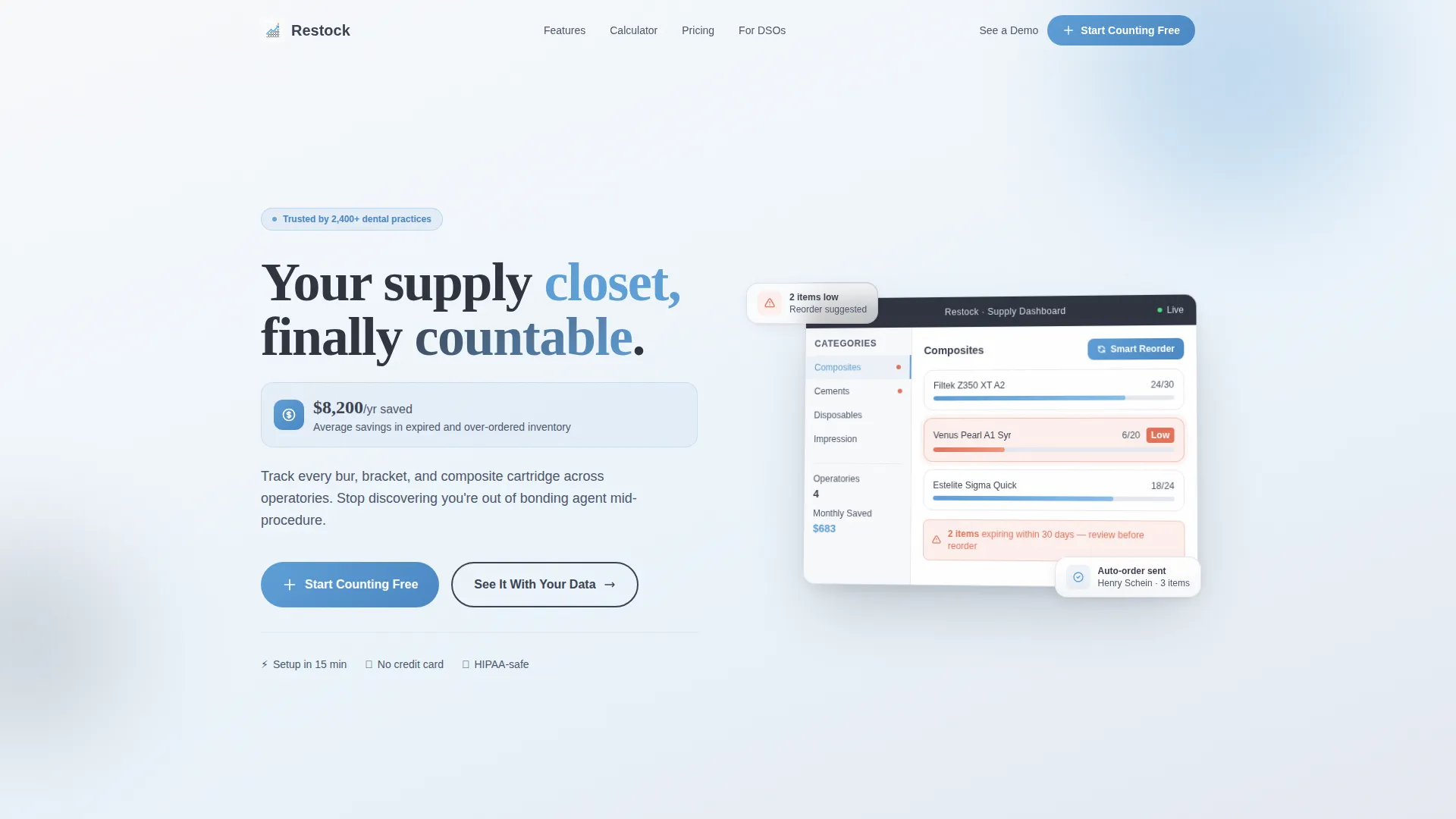
- A 50/50 split-screen layout with a pixel-perfect dashboard screenshot in the hero header and a live savings figure in the headline area
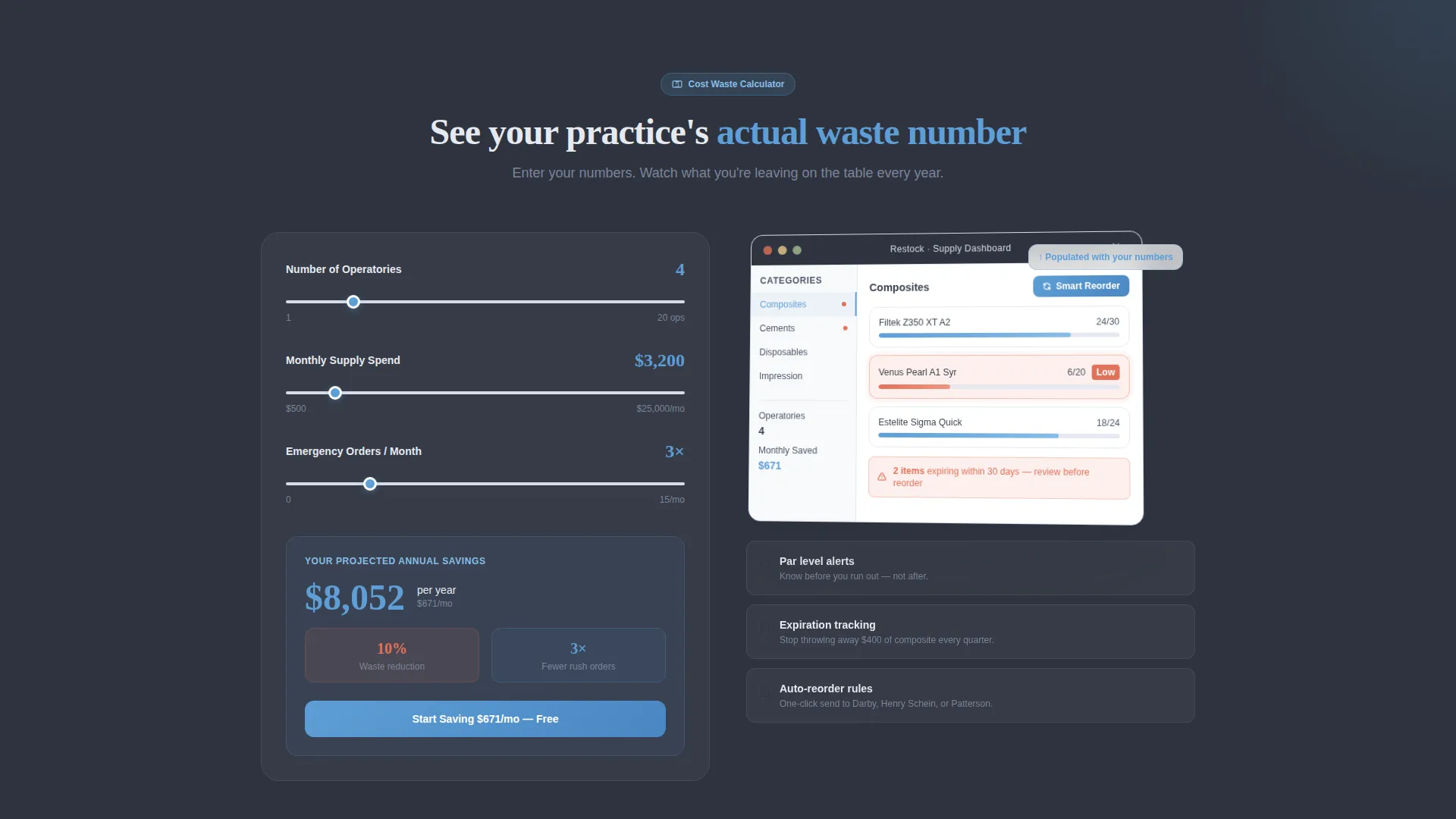
- An interactive Cost Waste Calculator placed immediately below the fold, with inputs for operatory count, monthly spend, and emergency order frequency
- A two-step signup form with low-friction qualification fields and a secondary demo path for larger group practice leads
Feature list
This section describes the distinct functional and design components built into the Restock template.
Split-Screen Hero with Product Screenshot
The header divides the viewport evenly. The left panel carries the headline "Your supply closet, finally countable" and a live savings subline showing a projected annual figure. The right panel shows a real dashboard screenshot with inventory categories, par-level progress bars, coral low-stock flags, and an active Smart Reorder button. The screenshot sits at a slight rotation on a subtle shadow, close enough that visitors can read individual SKU names.
Interactive Cost Waste Calculator
Placed directly below the hero, this calculator asks three inputs: number of operatories, monthly supply spend, and emergency order frequency. It instantly renders a projected annual savings figure and a waste-reduction percentage. A mini dashboard mockup on the right side of the calculator populates with the visitor's own numbers, making the value concrete before they scroll any further.
Alternating Feature Sections
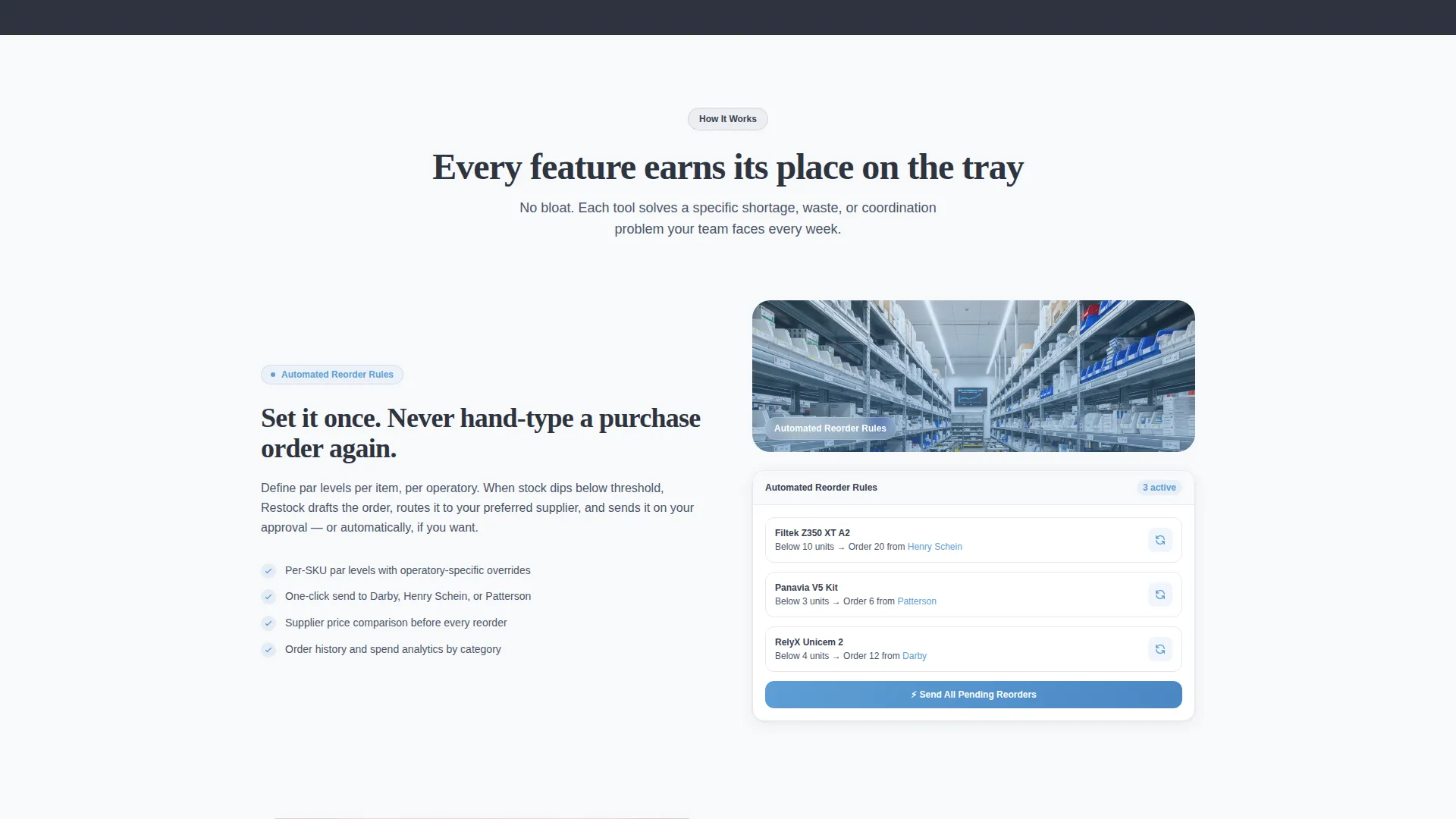
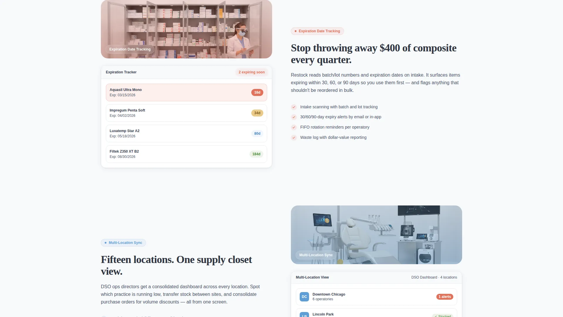
Each major feature, including automated reorder rules, expiration tracking, multi-location sync, and supplier price comparison, gets its own alternating split-screen section. Sections switch between screenshot-left/copy-right and copy-left/screenshot-right, building a product tour that feels progressive and visual rather than text-heavy.
Freemium call to action System
The primary call to action, "Start Counting Free," is pinned in the navigation bar and repeated after the calculator result and at the page bottom. A secondary call to action, "See It With Your Data," targets DSO-qualified leads who want a guided demo. Both paths are built into the layout so no lead type is left without a next step.
Two-Step Qualification Form
The signup flow uses two steps to reduce friction. Step one asks for practice name and number of operatories. Step two asks for email address and preferred supplier. This structure qualifies leads without overwhelming them at the point of highest intent.
Alert-Driven Color System
The Slate and Sky color palette is designed to carry functional meaning. Instrument-tray gray dominates content panels for a clinical, focused feel. Clinical sky blue activates call to action buttons and data highlights. Alert coral appears only on low-stock warnings, so when it does appear, it earns immediate visual attention.
Page sections overview
| Section | Purpose |
|---|---|
| Navigation Bar | Pins "Start Counting Free" call to action persistently as visitors scroll |
| Split-Screen Hero | Combines headline, savings subline, and dashboard screenshot side by side |
| Cost Waste Calculator | Lets visitors input their own data and see projected annual savings instantly |
| Calculator Results Panel | Displays personalized savings figure and waste-reduction percentage with a mini dashboard |
| Reorder Rules Section | Shows automated reorder logic with a zoomed feature screenshot |
| Expiration Tracking Section | Highlights expiry visibility with alternating screenshot and copy layout |
| Multi-Location Sync Section | Demonstrates cross-operatory and multi-site inventory alignment |
| Supplier Price Comparison Section | Shows how practices compare supplier pricing within the platform |
| Bottom call to action Block | Repeats primary and secondary calls to action to close the page |
Design & branding system
The visual identity follows a Dashboard Pro theme built on a Slate and Sky color system. Every color carries a specific role, and the palette is applied consistently so the layout feels clinical, organized, and immediately trustworthy to anyone who works in a dental practice.
- Instrument-tray gray (#3B4252) for primary background panels, autoclave steel (#E5E9F0) for cards and surface areas, and clinical sky (#5E9ED6) for active states, call to action buttons, and data highlights
- Alert coral (#E2725B) is reserved exclusively for low-stock warning indicators, ensuring that when it appears, it commands immediate attention rather than blending into the layout
- The split-screen rhythm reinforces the color story: gray dominates left-side content panels while sky blue activates right-side product frames, creating a visual pattern visitors can follow without instruction
Mobile & speed optimization
The template layout is designed with responsive behavior in mind. The 50/50 split-screen sections are structured to reflow cleanly on smaller viewports without losing the visual hierarchy that makes the product tour legible.
- Split-screen columns are structured to stack vertically on mobile, keeping headline, subline, and screenshot in a logical reading order
- The calculator inputs and results panel are sized for touch interaction, so a practice manager checking the page on a phone can still complete the savings estimate without pinching or zooming
- The navigation call to action remains accessible as a sticky element so the primary conversion path is never more than one tap away
How this template helps you convert
The conversion architecture in this template is built around one core insight: buyers trust a number they calculated themselves far more than a number a vendor gave them. Every layout decision flows from that principle.
- The Cost Waste Calculator creates personal investment before a single feature is explained. Once a visitor sees their own projected savings on screen, the free trial feels like the obvious next step rather than a risk.
- The two-step form reduces abandonment by separating low-friction qualification questions from the email ask, capturing intent at the moment it is highest.
- The secondary "See It With Your Data" path ensures that larger group practice leads who are not ready for a self-serve trial still have a clear, low-pressure route into the funnel.
Other information about this template
This template is a strong fit for teams building in the dental software and SaaS space who need a polished, conversion-focused landing page without starting from scratch. The layout reflects the operational reality of modern dental practice management.
- The template is categorized under Technology and the Dental Software and SaaS subcategory, making it relevant to platforms serving independent practices and larger dental groups alike
- The structured supplier preference field in step two of the signup form acknowledges the real purchasing landscape that practice managers navigate daily
- The overall page feel is described in the brief as "a supply closet where everything is labeled, leveled, and exactly where you left it," which translates into a layout that is clean, predictable, and easy to scan even for time-pressed clinical staff
- This template is a strong starting point for teams looking to build or refine a dental inventory management landing page with a tool-first persuasion model
Theme
Dashboard Pro
Creative direction
Calculator/Tool First
Color system
Slate & Sky
Style
Split Screen (50/50)
Direction
Freemium/Trial
Page Sections
Split-screen Hero with Dashboard Screenshot
Interactive Cost Waste Calculator
Alternating Feature Section Layout
Pinned Freemium Call to Action with Dual Paths
Two-step Qualification Signup Form
Functional Alert Color System
Related questions
Who is this landing page template designed for?
Can I customize the calculator inputs and results display?
Does the two-step form support different lead paths?
How does the color system communicate urgency without visual noise?
Is this template suitable for a multi-location dental group?



