Restock - Powerful Veterinary Landing Page Template
Restock is a veterinary inventory management landing page template built for practice managers, group CFOs, and solo practitioners who need to stop losing money to expired stock and emergency reorders. It combines a dark Startup Velocity visual identity, a live-coded header, a Problem-to-Solution card arc, and a progressive lead-capture form into one focused, conversion-ready layout.
by Rocket studio
Quick summary
Restock is a single-page, card-grid landing page template designed for veterinary inventory management platforms. It opens with an animated code snippet header, walks visitors through a Problem-to-Solution Arc using modular cards, and closes with a progressive lead generation form. The design uses a dark Teal Catalyst palette that feels precise, urgent, and built for clinic operators who think in data.
Who this template is for
This template is built for SaaS founders and product teams launching veterinary inventory management tools to a clinical audience. The messaging is calibrated for decision-makers who understand the real cost of supply mismanagement.
- Veterinary practice managers dealing with expired medication write-offs and stock count errors
- Group-level CFOs trying to standardize purchasing across multiple clinic locations
- Solo practitioners who have run out of a critical medication mid-appointment and never want it to happen again
What problem this template solves
Running a veterinary clinic's supply room on spreadsheets creates three predictable failure points: expired medications no one caught in time, emergency reorders placed at premium prices, and inventory counts that simply do not match reality. A landing page that leads with product screenshots and feature lists fails to close this audience. They need to feel the cost of inaction before they consider a solution.
- Visitors leave without converting because generic SaaS pages do not speak the language of clinic operations
- Pain points are abstract until they are tied to specific dollar figures lost annually
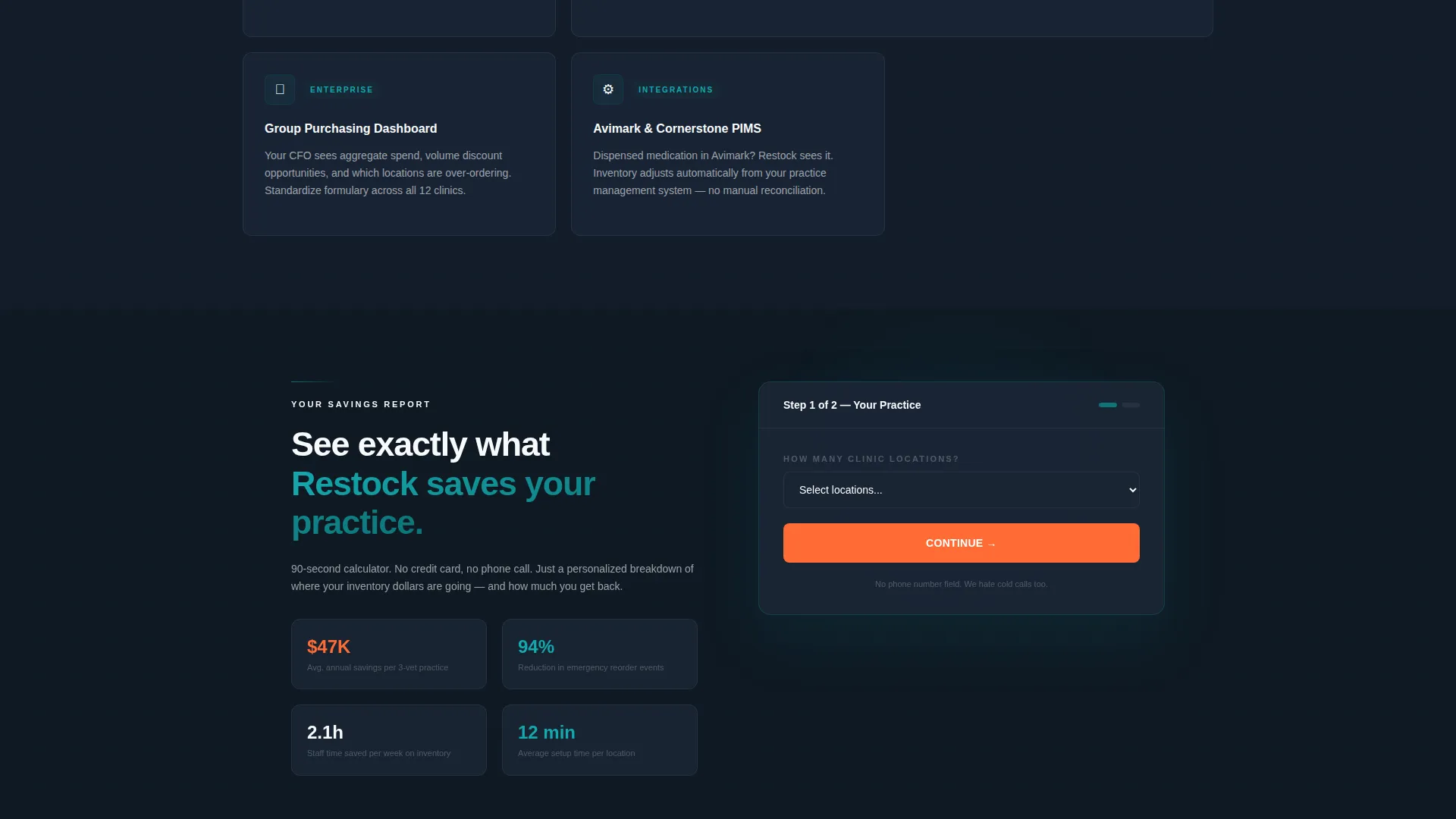
- Progressive forms with phone number fields kill completion rates for this audience
What you get with this template
This template delivers a fully structured, modular card-grid landing page ready to adapt for any veterinary inventory management platform. Every section is purposeful and ordered to move a skeptical clinic operator from recognition to action.
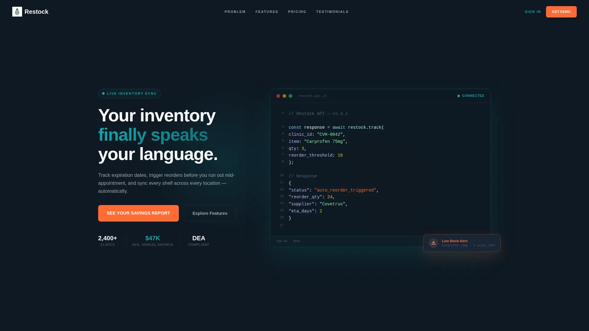
- An animated code snippet header showing a real API call with a live JSON response, demonstrating product capability before a single word of copy is read
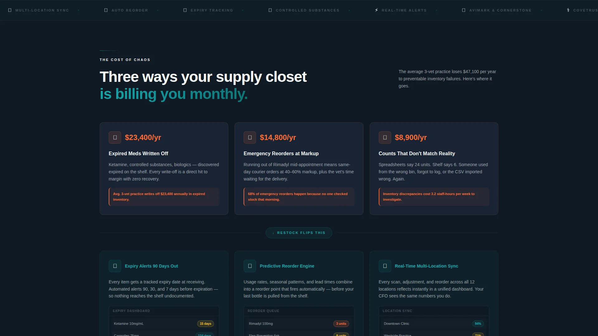
- A three-row Problem-to-Solution card arc, starting with orange-coded pain-point cards showing annual dollar losses and pivoting to teal solution cards with live dashboard previews
- A full modular feature card grid with hover-expand micro-demo screenshots, plus a progressive lead form and a gated PDF secondary conversion path
Feature list
This template packs a deliberate set of interactive and structural components. Each one is grounded in the source brief and serves the landing page's core conversion goal.
Animated Code Snippet Header
The header opens with a syntax-highlighted API call floating over a dark navy background. The code appears as if typed live, with a blinking cursor, showing restock.track() returning "status": "auto_reorder_triggered". It establishes product credibility immediately, without stock photography.
Problem-to-Solution Card Arc
Three rows of modular cards guide the visitor through a clinical diagnosis structure. The first row uses catalyst orange icons to surface pain points with specific annual cost figures. The second row flips those same scenarios to teal, showing automated resolutions with live dashboard previews. The contrast between the two rows is the persuasive engine of the page.
Hover-Expand Feature Grid
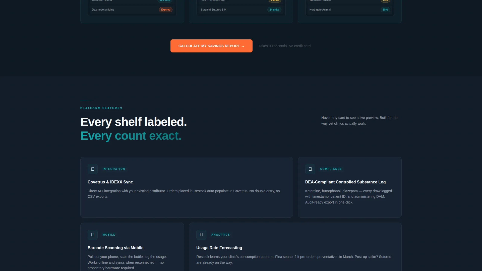
The third card row is a full modular grid of deep-feature cards. Each card expands on hover to reveal a micro-demo screenshot. Cards cover automated tracking, predictive reordering, real-time multi-location sync, controlled substance logging, barcode scanning, and platform integrations.
Progressive Lead Capture Form
The lead form is designed to reduce friction at every step. The first field is a low-friction dropdown asking only for number of clinic locations. Subsequent fields reveal progressively, collecting current inventory system, estimated monthly supply spend, and work email. There is no phone number field.
Gated PDF Secondary Conversion
A secondary conversion path offers a downloadable report titled "The $47K Problem: What Expired Inventory Actually Costs a 3-Vet Practice." It is gated behind email only, giving visitors who are not ready to book a demo a low-commitment way to stay in the funnel.
Catalyst Orange Alert System
The color orange is used exclusively for alerts, low-stock warnings, and primary calls to action. Its scarcity is intentional. When it appears, it commands attention in the same way a real low-stock notification does inside a clinic dashboard.
Page sections overview
| Section | Purpose |
|---|---|
| Animated Code Header | Opens with live API demo to prove product capability instantly |
| Pain-Point Cards | Three orange-coded cards showing specific annual dollar losses per problem |
| Solution Cards | Three teal cards showing the same scenarios resolved, with dashboard previews |
| Feature Card Grid | Modular hover-expand cards covering deep platform capabilities |
| Primary call to action Block | "See Your Savings Report" call to action placed after the dollar-figure pain arc |
| Progressive Lead Form | Low-friction multi-step form collecting clinic data without a phone field |
| Gated PDF Offer | Secondary email-only conversion path for the $47K report download |
Design & branding system
The Teal Catalyst color system is built around contrast and intention. Every color has a specific job, and none of them overlap. The overall feel is a startup pitch deck viewed in a dim conference room: dark, focused, and electric only where it matters.
- Deep operational teal (#0D7377) handles navigation, interactive states, and solution-state card surfaces; near-black dashboard navy (#0F1923) anchors all dark backgrounds and data-dense sections; clinical white (#F7F9FA) keeps card surfaces clean and readable
- Catalyst orange (#FF6B35) is used exclusively for alerts, low-stock indicators, pain-point card icons, and primary call-to-action buttons, making every orange element feel urgent and intentional
- The typographic and layout approach channels Startup Velocity energy, with a modular grid structure that mirrors the organized, labeled-shelf feel the brief calls for
Mobile & speed optimization
The card grid layout is modular by design, which means it adapts naturally to smaller screens without breaking the visual hierarchy. The Problem-to-Solution Arc retains its narrative logic whether a visitor is on a desktop browser or a phone.
- Card rows reflow gracefully on mobile, keeping pain-point and solution cards in a readable stacked sequence
- The progressive lead form is structured so each step reveals cleanly on smaller viewports, reducing abandonment from cluttered field layouts
- The animated header is contained to a defined visual block, so the page loads its core message efficiently without requiring the animation to complete before content is visible
How this template helps you convert
This template is structured to earn trust before it asks for anything. The persuasion arc is sequential and deliberate, and every element earns its place by reducing a specific objection.
- The animated code header proves the product is real and technical before the visitor reads a single headline, eliminating the credibility gap that kills SaaS conversions with skeptical clinical buyers
- The dollar-figure pain cards create a quantified cost of inaction, positioning the "See Your Savings Report" call to action as the logical next step rather than a generic sign-up prompt
- The progressive form and email-only gated PDF create two conversion paths for two different levels of buying intent, capturing both ready-to-act leads and early-stage researchers in the same page flow
Other information about this template
This template is designed to work as a complete launch asset for veterinary inventory management SaaS products. It covers the full awareness-to-conversion journey for a technically literate, cost-conscious clinical audience.
- The template is built around a card-grid modular structure, making individual sections easy to rearrange, duplicate, or extend without breaking the overall layout
- The brief references integrations with platforms such as Covetrus and Idexx, as well as compatibility with clinic management systems including Avimark and Cornerstone, as example use-case contexts for feature card content
- DEA-compliant controlled substance logging and barcode scanning via mobile are included as feature card topics within the hover-expand grid, reflecting the regulatory and operational realities of veterinary supply management
Theme
Startup Velocity
Creative direction
Problem→Solution Arc
Color system
Teal Catalyst
Style
Card Grid (Modular)
Direction
Lead Generation
Page Sections
Animated Code Snippet Header
Problem-to-solution Card Arc
Hover-expand Feature Grid
Progressive Lead Capture Form
Gated PDF Secondary Conversion
Catalyst Orange Alert System
Related questions
Can I adapt this template for a single-location practice rather than a multi-clinic group?
Does the template include a functioning API integration or just the visual code snippet?
Is the gated PDF document included with the template?
Why does the lead form not include a phone number field?
Can I update the feature cards to reflect my platform's actual integrations?



