Grocery Delivery Landing Page Template
Restock is a dashboard-style grocery delivery landing page built around data-first persuasion. It leads with live delivery stats, a side-by-side price comparison grid, and an inline cart comparison tool. Deep navy visuals and signal green indicators give it the authority of a logistics command center, designed to convert skeptical shoppers into first-time orderers.
by Rocket studio
Quick summary
Restock is a single-page grocery delivery landing page that converts through evidence, not promises. A full-width app screenshot opens the experience, followed by scrollable comparison data cards covering delivery speed, basket price, and freshness timing. The visual system uses deep navy, slate, and signal green to create a calm, instrument-lit command center feel.
Who this template is for
This template fits grocery delivery services that compete on measurable performance. It works best when you have real numbers to show and a clear advantage over other services.
- Grocery delivery startups that want to lead with proof over persuasion
- Last-mile logistics operators serving time-pressed households and small food businesses
- Delivery brands ready to let data do the selling
What problem this template solves
Most grocery delivery pages rely on lifestyle imagery and vague promises. Potential customers still wonder: Is it actually faster? Is it cheaper? Will my cold items arrive cold? This template replaces those doubts with visible, cited benchmarks.
- Visitors leave because no clear comparison exists between competing services
- Shoppers distrust claims that are not backed by specific numbers or sourced data
- Busy households and small business operators need to make a fast, confident decision
What you get with this template
You get a structured, scroll-driven landing page where every section escalates the evidence. The layout is built as a dashboard grid, meaning information is organized in cards and data blocks rather than long paragraphs.
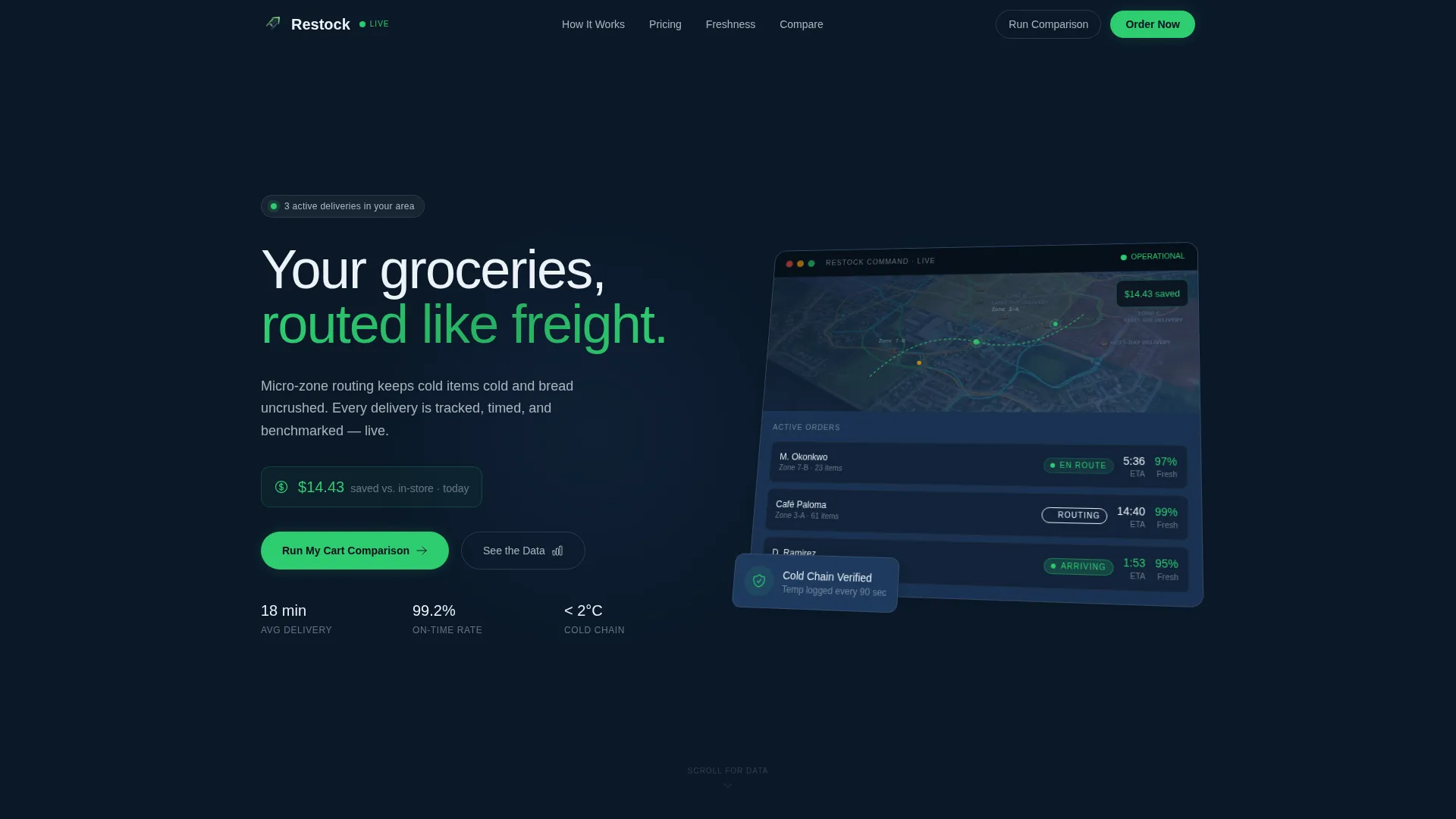
- A full-width isometric app screenshot header with live-dashboard styling
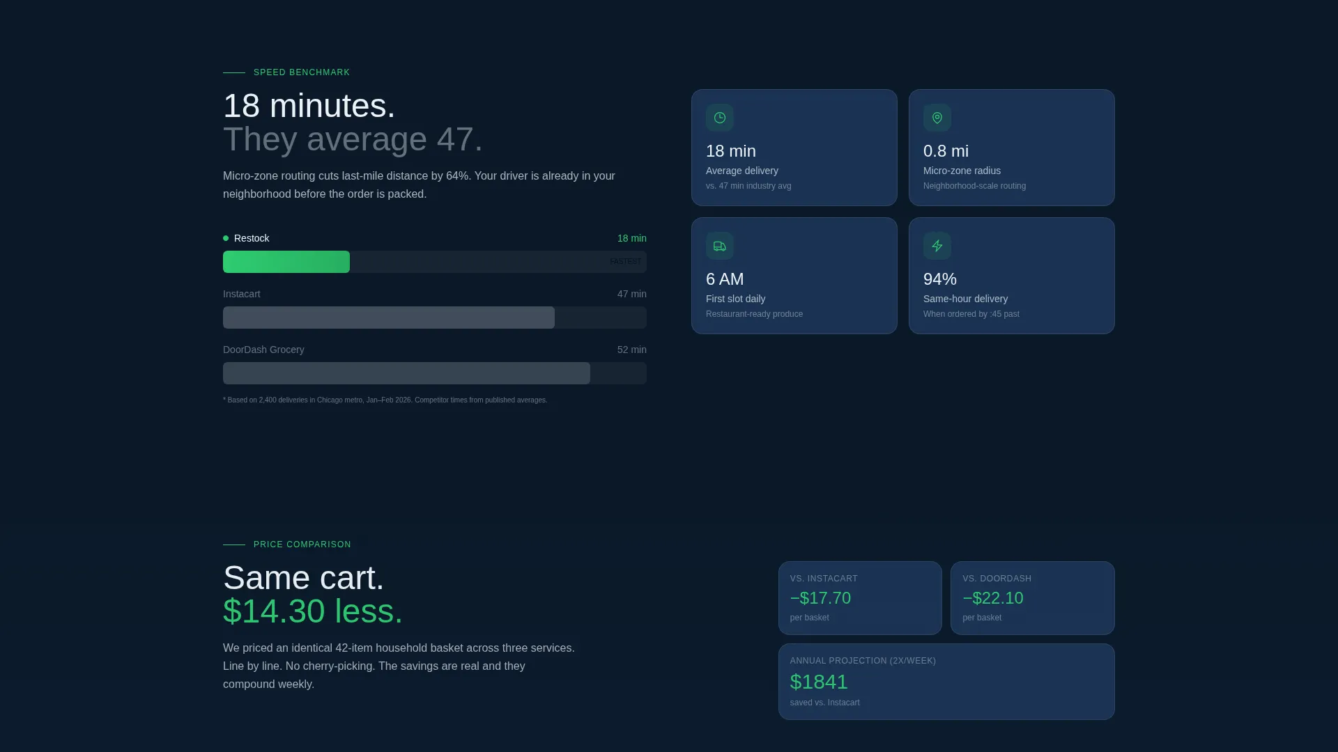
- A horizontal bar race card comparing delivery times across services
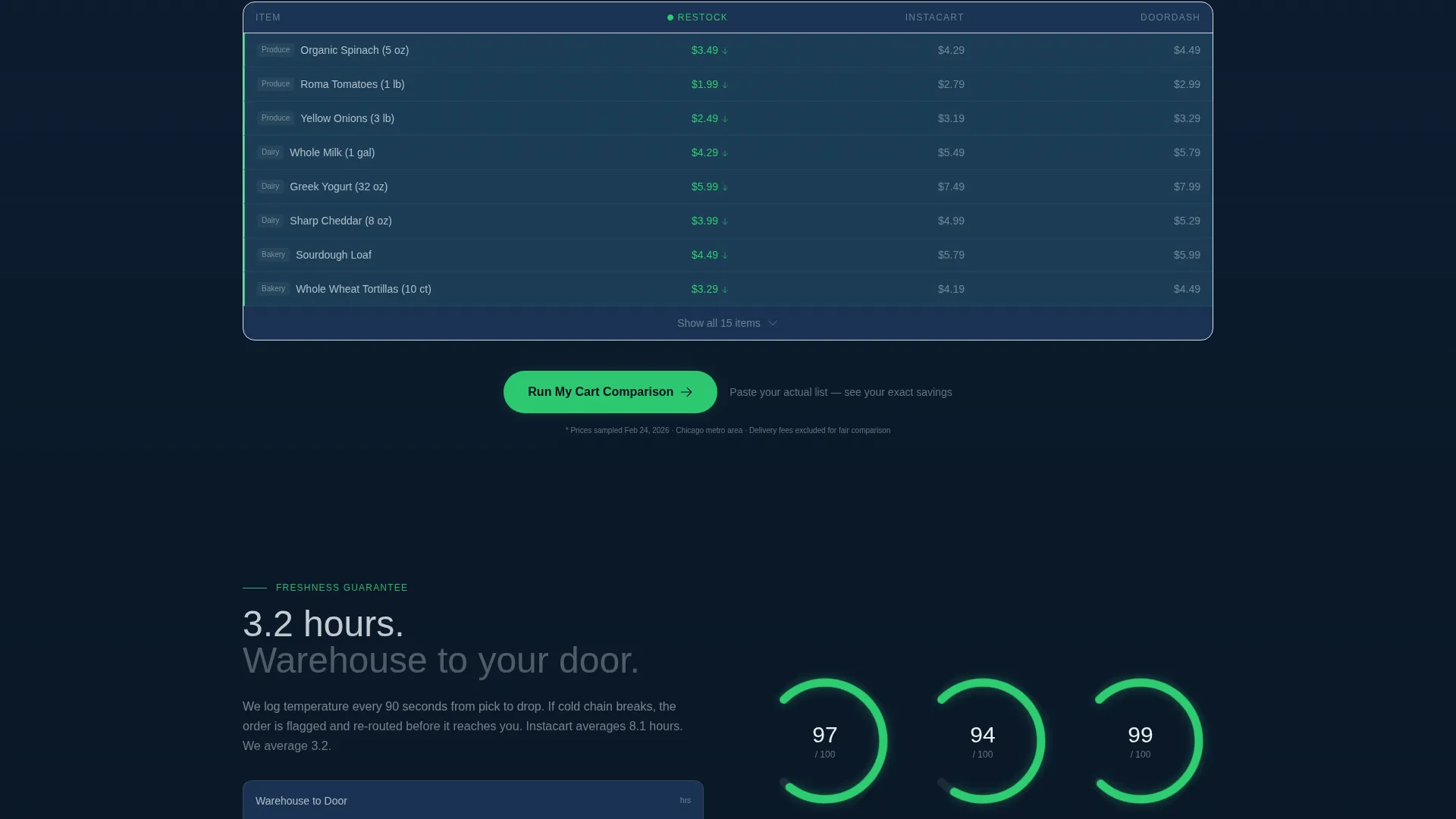
- A line-by-line price-per-basket grid for a 42-item cart, with savings highlighted in signal green
- A radial gauge showing hours from warehouse to doorstep as a freshness metric
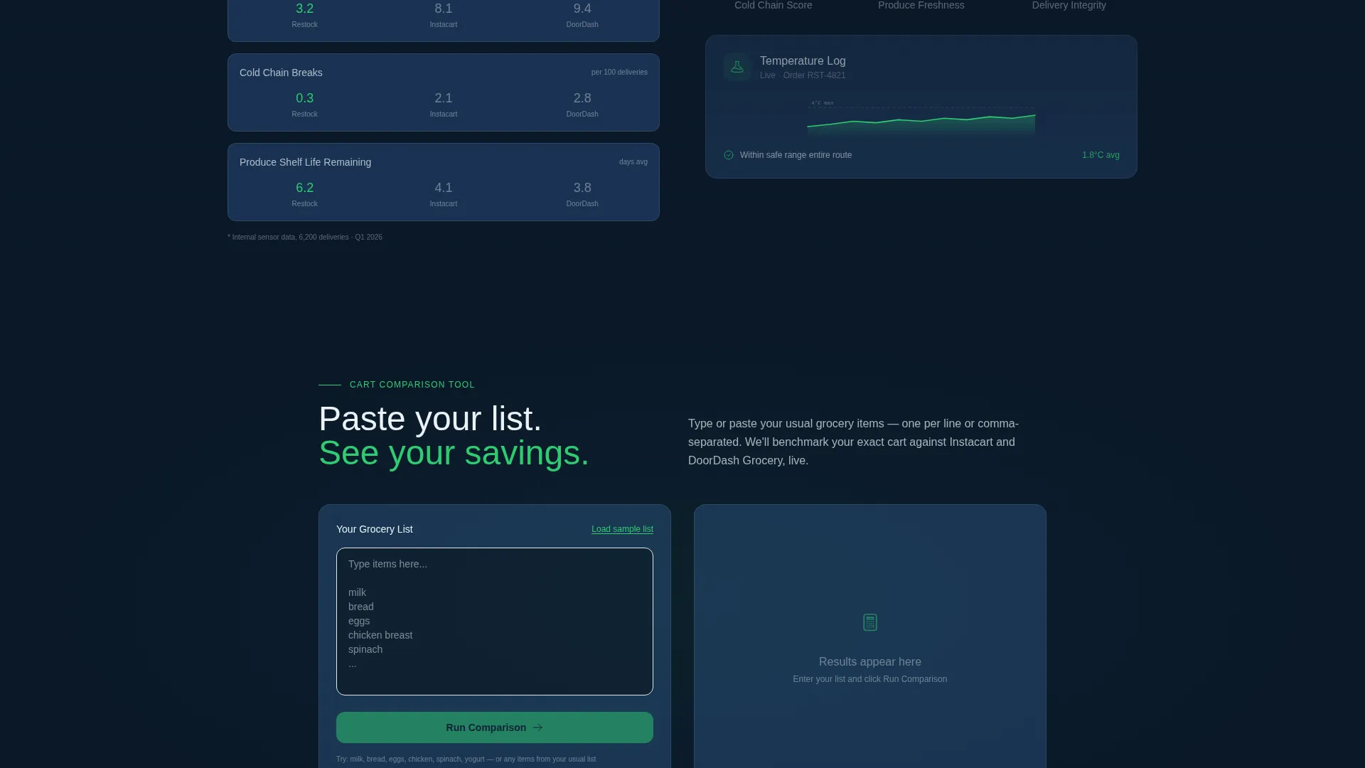
- An inline cart comparison tool where visitors input their grocery list and see projected cost, delivery window, and freshness rating
- A persistent bottom bar call to action for visitors ready to book a delivery slot immediately
Feature list
This template is built around a tight set of purpose-built components. Each one supports the comparison-and-conversion goal directly.
Isometric App Screenshot Header
The header renders a pixel-perfect app dashboard mid-operation. It shows three active orders on a neighborhood map, live countdown ETAs, a freshness score badge per bag, and a savings ticker. It sits on a slight isometric tilt against the deep navy background, creating a live-terminal effect without animation claims.
Horizontal Bar Race Comparison Card
The first data card after the header presents average delivery time as a horizontal bar race graphic. Your service appears alongside two competitor benchmarks, letting visitors read the advantage instantly without any written persuasion.
Price-Per-Basket Grid
A structured grid displays an identical 42-item cart broken down line by line across three services. Savings cells are highlighted in signal green, turning a price comparison into a clear, scannable proof point.
Freshness Radial Gauge
A circular gauge shows hours from warehouse shelf to doorstep. The visual format makes a freshness claim feel measurable rather than marketing-speak, giving time-sensitive buyers a specific number to evaluate.
Inline Cart Comparison Tool
Visitors paste or type their usual grocery list into an inline tool. The tool returns a projected cost, estimated delivery window, and freshness rating compared to two named competitor services. This is the primary conversion mechanism on the page.
Persistent Delivery Slot call to action Bar
A floating bottom bar labeled "See Tonight's Delivery Slots" stays visible as visitors scroll. It captures buyers who are already convinced and want to skip the research and place an order immediately.
Page sections overview
| Section | Purpose |
|---|---|
| Header screenshot | Establishes live-dashboard credibility with app visuals |
| Delivery time card | Shows speed advantage via horizontal bar comparison |
| Price basket grid | Compares 42-item cart costs line by line |
| Freshness gauge | Displays warehouse-to-door hours as a radial metric |
| Cart comparison tool | Lets visitors verify savings with their own grocery list |
| Persistent call to action bar | Keeps a booking action visible at all times |
Design & branding system
The visual identity follows a Data Command theme. The palette references the instrument-lit bridge of a cargo ship at night: dark, purposeful, and structured. Every color does a specific job.
- Deep operational navy (#0B1929) dominates backgrounds, and tactical slate (#1E3A5F) structures the grid cards
- Cold interface white (#EDF2F7) handles all data text and labels for maximum legibility against dark surfaces
- Signal green (#2ECC71) is used only for live-status indicators, savings highlights, and call-to-action elements
Mobile & speed optimization
The dashboard grid layout is designed to stack cleanly when viewport width decreases. Data cards reflow into single-column blocks, preserving the hierarchy of information on smaller screens.
- Comparison cards and data grids are structured to remain readable at mobile widths without horizontal scrolling
- The persistent bottom call to action bar is particularly effective on mobile, where thumb-reach access to the booking action reduces drop-off
How this template helps you convert
Every layout decision on this page is built to move a skeptical visitor toward a first order. The sequence is deliberate: show the data before asking for the click.
- The stats-first scroll order means visitors encounter hard comparisons before any persuasive copy, making their decision feel self-directed rather than sold
- The inline cart comparison tool personalizes the value proposition, turning abstract savings figures into numbers tied to the visitor's actual shopping list
- The persistent bottom bar call to action ensures the booking action is never more than one tap away, regardless of how deep into the data a visitor has scrolled
Other information about this template
This template sits at the intersection of logistics technology and consumer-facing delivery services. A few practical notes for teams evaluating it.
- The template is categorized under Logistics and Supply Chain, specifically the Last-Mile and Delivery subcategory, making it a strong fit for grocery delivery service brands
- The Data Command theme and Navy Authority color system are designed to project operational credibility, which suits services that want to position on reliability rather than lifestyle
- The Comparison/Versus landing page direction means the template assumes you have benchmark data to populate the comparison cards and grid; placeholder values are included for layout reference
- The dashboard and data grid template style works well for services targeting dual-income households, elderly customers, and small restaurant operators placing regular produce orders
Theme
Data Command
Creative direction
Stats-First Impact
Color system
Navy Authority
Style
Dashboard/Data Grid
Direction
Comparison/Versus
Page Sections
Isometric App Screenshot Header
Horizontal Bar Race Comparison Card
Line-by-line Price Grid
Freshness Radial Gauge
Inline Cart Comparison Tool
Persistent Delivery Slot Call to Action Bar
Related questions
What type of business is this template designed for?
Do I need real competitor data to use the comparison sections?
How does the inline cart comparison tool work within the template?
Can I update the color system to match my existing brand?
Is this a single-page template or a multi-page site?