Bold FinTech Recovery Landing Page Template
Reclaim is a Bold Brutalist financial services abandoned cart email landing page template built for fintech growth leads, regional bank marketers, and insurance ops managers. It uses a Stats-First comparison layout, an AI Iridescent color system, and a live interactive email preview to show exactly how much revenue abandoned applications cost, and what a compliance-native recovery engine can do about it.
by Rocket studio
Quick summary
Reclaim is a single-page comparison landing page template designed for a financial services abandoned cart email automation platform. It opens with a live interactive email preview, drops into a brutal revenue-loss counter, then runs a column-by-column benchmark table. The page closes with a persistent revenue recovery calculator and a compliance documentation path for risk-averse buyers.
Who this template is for
This template is built for B2B financial services teams watching pipeline dissolve nightly through abandoned applications. It speaks directly to the people who own the problem and need to justify a new tool to a compliance-cautious organization.
- Fintech growth leads and marketing directors at regional banks, mortgage lenders, and insurance brokerages who track lost revenue from abandoned applications
- Compliance officers and ops managers who need regulatory proof before they engage sales conversations
- Platform founders and product marketers selling financial email automation tools who need a comparison-first landing page that earns trust before it asks for a click
What problem this template solves
Cart abandonment in financial services is not the same problem as cart abandonment in retail. Mortgage pre-approvals stall at 60%. Insurance quotes get saved but never bound. Investment account sign-ups freeze at Know Your Customer verification. Generic cart recovery tools were not built for regulated money, and they show it.
- Most abandoned cart emails from generic platforms ignore compliance pre-screening, sending messages that can create regulatory exposure for financial firms
- Legacy CRM drip sequences treat a stalled KYC form the same as an abandoned shopping cart, producing irrelevant follow up email cadences that destroy trust
- Financial marketing teams have no clear way to show a compliance-wary executive the revenue gap between a generic tool and a purpose-built abandoned application recovery engine
What you get with this template
This template delivers a fully structured, high-interactivity single-page layout. Every section is built around one goal: making the gap between generic cart abandonment tools and a compliance-native platform impossible to ignore.
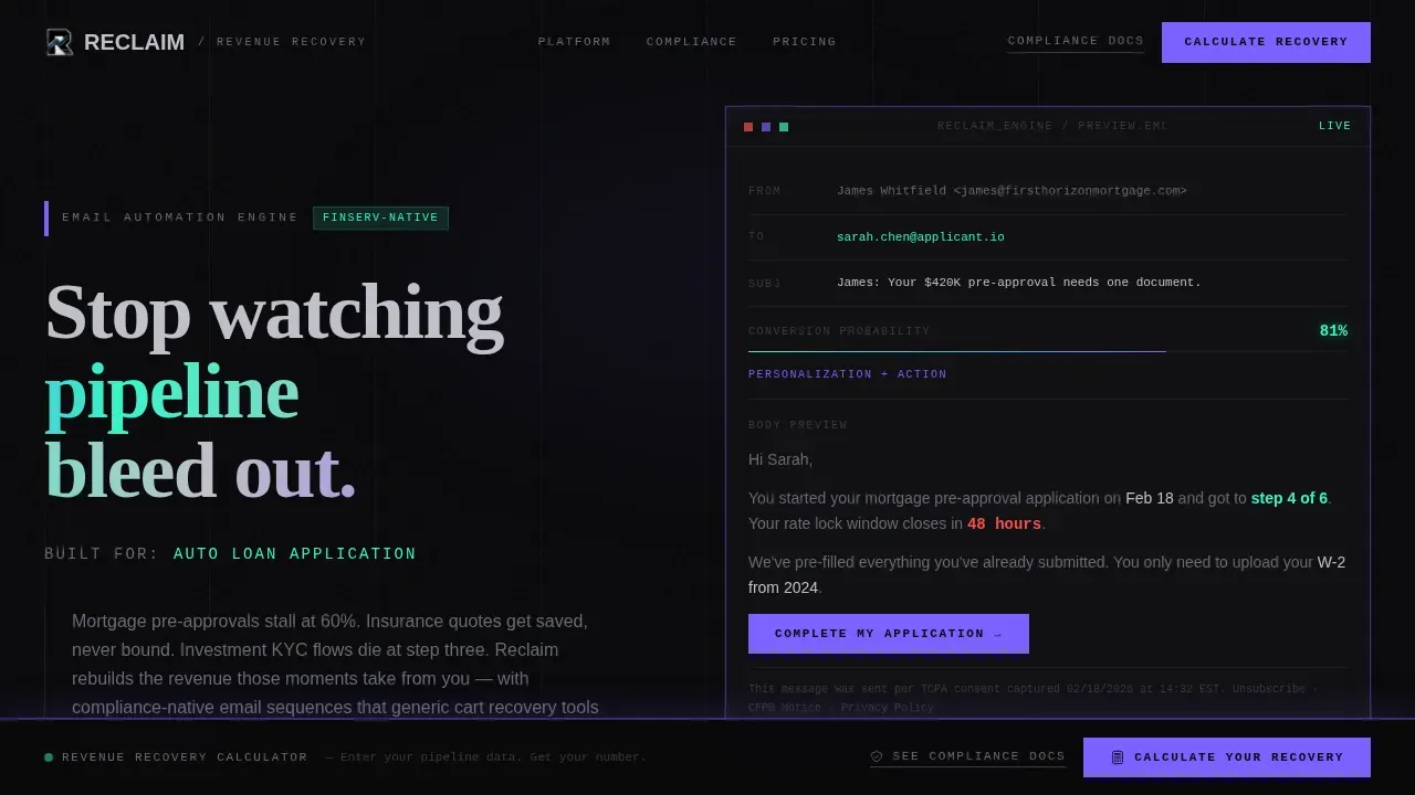
- An interactive hero that renders a live abandoned cart email preview inside a brutalist wireframe, with a rotating subject line and a conversion probability score ticking upward in real time
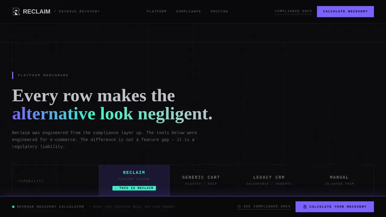
- A brutalist comparison table benchmarking the platform column by column against generic tools, legacy CRM sequences, and manual follow-up across rows including compliance pre-screening, dynamic personalization, send-time optimization, and financial regulation guardrails
- A persistent bottom-bar revenue calculator that expands into three fields, monthly abandoned applications, average product value, and current recovery rate, and outputs a personalized revenue recovery projection in iridescent gradient type
Feature list
This template is structured around a specific set of built-in capabilities that directly serve the comparison-first conversion goal.
Interactive Abandoned Cart Email Preview Hero
The header renders a functioning abandoned cart email live in the viewport. The addressee field auto-populates based on the visitor's industry vertical. The subject line rewrites itself in real time through three AI-generated variants while a conversion probability score advances beside each option. The preview sits inside a brutalist wireframe with no rounded corners and a blinking cursor that invites direct interaction. This approach puts real abandoned cart email examples in front of the buyer the moment they land on the page.
Stats-First Revenue Hemorrhage Section
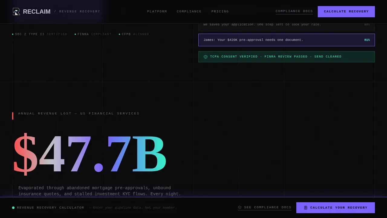
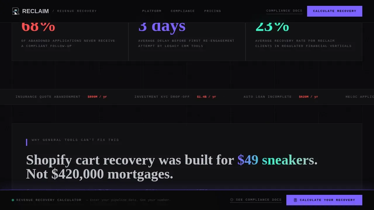
The scroll opens with a single large animated counter showing average annual revenue lost to abandoned financial applications. A scrolling marquee lists financial verticals bleeding money in real time. This section functions as the emotional proof that cart abandonment is not a minor inconvenience. The stat-first creative direction is designed to create urgency before the buyer ever reaches the comparison table. A bold, flickering countdown element reinforces the cost of inaction.
Brutalist Comparison Table with Scroll-Reveal Rows
The comparison table is the commercial heart of the page. It benchmarks the platform against generic cart recovery tools, legacy CRM drip sequences, and manual follow-up across every capability row that matters to a compliance-wary financial buyer. Rows include compliance pre-screening, dynamic content personalization, send-time optimization, and financial regulation guardrails. Each row reveals its data on scroll using brutalist wipe transitions, so the narrative builds as the buyer reads downward. The table is desktop-first and built for horizontal space, consistent with how financial services buyers evaluate tools.
Compliance Architecture Proof Section
A dedicated section provides regulatory guardrails proof for risk-averse buyers. It references relevant US financial regulatory context including FINRA, CFPB, and SOC 2 to give compliance officers and ops managers something concrete to evaluate. This section converts the secondary buyer path into a first-class experience rather than a footnote. Prominent trust signals are placed near the call to action to reinforce security perceptions without interrupting the visual flow.
Persistent Revenue Recovery Calculator
A fixed bottom bar stays visible throughout the entire scroll journey. When activated, it expands into a three-field calculator: monthly abandoned applications, average product value, and current recovery rate. The output is a personalized revenue recovery projection displayed in iridescent gradient type. This is the primary conversion mechanism. The calculator makes the value of the platform specific to each visitor's numbers, turning abstract claims about cart recovery into a concrete dollar figure.
AI Iridescent Visual System with Brutalist Typography
The template uses a four-color AI Iridescent system: void black (#09090B) for primary surfaces, chrome silver (#C0C0C8) for secondary elements, shifting violet (#7B61FF) for accent blocks, and electric teal (#36F5C7) reserved for data highlights and hover states. Typography pairs Fraunces serif display for large devastating numbers, DM Sans for body and interface copy, and JetBrains Mono for data and code-style elements. This template mimics mid-century brutalist architecture, emphasizing trust and raw materials rather than corporate polish.
Page sections overview
| Section | Purpose |
|---|---|
| Interactive Email Hero | Live abandoned cart email preview with rotating subject line and conversion score |
| Revenue Hemorrhage Counter | Animated stat counter showing annual cost of abandoned financial applications |
| Comparison Benchmark Table | Column-by-column comparison across compliance, personalization, and regulatory rows |
| Compliance Architecture Proof | Regulatory guardrails section for risk-averse compliance officers and ops managers |
| Recovery Calculator Bar | Persistent three-field calculator outputting a personalized revenue recovery projection |
| Footer Pattern | Horizontal flow footer with social media links and navigation |
Design & branding system
The design follows a Bold Brutalist visual language. Raw grid exposure, no rounded corners, monolithic dark surfaces, and iridescent data highlights define the experience. The aesthetic prioritizes raw honesty and unfiltered functionality over traditional corporate polish, a deliberate choice for financial services buyers who distrust marketing gloss.
- Color system: void black (#09090B) primary, chrome silver (#C0C0C8) secondary, shifting violet (#7B61FF) accent, electric teal (#36F5C7) for data highlights and hover states; the palette shifts as the user scrolls through prismatic gradient zones
- Typography system: Fraunces for large serif display numbers that hit hard, DM Sans for clean interface and body copy, JetBrains Mono for data table values and code-style elements; high-contrast color pairings and thick borders define every structural boundary
- Animation and interactivity: scroll-linked counter animations, brutalist wipe transitions on comparison table rows, iridescent gradient shifts, a blinking cursor in the email preview hero, and a live subject line rotation cadence throughout the page
Mobile & speed optimization
The template is designed desktop-first. Financial services buyers evaluate complex tools on desktop, and the comparison table requires horizontal space to function correctly. The interactivity stack is built with performance in mind, using modern browser APIs to keep animations smooth without penalizing load time.
- Scroll animations use Intersection Observer so elements only activate when they enter the viewport, preventing unnecessary processing on page load
- Counter animations run on requestAnimationFrame for smooth number ticking without layout thrashing
- CSS custom properties drive the iridescent color shift effects, keeping visual complexity in the stylesheet rather than in JavaScript runtime; the layout remains readable on mobile devices even though desktop is the priority
How this template helps you convert
The conversion architecture is layered. Every section adds pressure in a specific direction before handing off to the next. The result is a page that earns the calculator click rather than demanding it.
- The interactive email preview hero shows real abandoned cart email examples immediately, so the buyer understands the product before reading a single line of body copy; the rotating subject line and conversion score create active engagement in the first ten seconds
- The comparison table makes every alternative, generic tools, legacy CRM sequences, manual follow-up, look insufficient by design; each scroll-reveal row adds one more reason why a general-purpose cart abandonment email template cannot meet the compliance requirements of a regulated financial firm; the clear call to action anchored in the persistent bottom bar is always one tap away
- The revenue recovery calculator converts abstract positioning into a specific dollar figure tied to the buyer's own numbers, which is the most powerful social proof a B2B landing page can deliver; the secondary path to compliance documentation captures the risk-averse buyer who will not engage sales without regulatory evidence first
Other information about this template
This section covers additional practical details about the template's context, content approach, and how it fits within the broader world of abandoned cart email strategy and financial email marketing.
The template draws on well-established abandoned cart email strategy principles and applies them to the financial services context. The average cart abandonment rate across industries sits at approximately 69.82%, and more than 70% of online shopping carts are abandoned before a sale completes. In financial services, the equivalent figure is similarly high, but the stakes per abandoned application are far greater. Abandoned cart emails can recover 10 to 30% of lost sales when deployed correctly, translating directly to recovered revenue at meaningful scale.
The recommended content sequence for a recovery email program includes a helpful nudge sent within one to three hours of abandonment, a follow up email that creates urgency or surfaces a scarcity signal, and a final closers email that may introduce a discount incentive or coupon code. This template's comparison table is built to demonstrate that compliance-native abandoned cart emails follow this same sequence logic while adding layers that generic tools legally cannot provide.
The first email in an abandoned cart sequence should be sent within one to three hours after abandonment for maximum effectiveness. Personalization in abandoned cart emails can increase open rates by as much as 26%. The average open rate for abandoned cart emails across categories is around 45%, making them one of the highest-performing email campaigns available to any marketing team. Testing different subject line variants is one of the most reliable ways to improve performance across cart abandonment campaigns.
Generic abandoned cart email examples from retail brands often include a product image of the abandoned item, a clear call to action to return to the checkout page, and sometimes a discount code or coupon code to reduce purchase hesitation. In financial services, the equivalent of a product image is a visual reference to the application stage the prospect reached. The equivalent of a free shipping offer or hassle free returns guarantee is a compliance assurance or a friendly reminder that the application can be resumed securely.
Well-known abandoned cart email examples from brands like Dollar Shave Club use humor and personality to re-engage cart abandoners. That approach works well for subscription boxes and direct-to-consumer products where cart value is low and the emotional stakes are minimal. The Reclaim template is designed for the opposite end of the spectrum, where the cart value is a mortgage application, an insurance policy, or an investment account, and the tone must project authority rather than charm.
Other practical notes about working with abandoned cart email templates in this category:
- Abandoned cart email templates should be customizable to support personalization across different financial verticals; this template's design system uses CSS custom properties that make color and typography adjustments straightforward
- The template supports a brand logo placement in the email preview wireframe hero, maintaining visual consistency between the landing page and the actual abandoned cart emails a buyer would send
- Pre built templates like this one reduce the time required to go from concept to a working proof of concept; a financial services team can use this as a presentation layer while building the underlying email service provider integration in parallel
- The two-column grid in the comparison section divides product details and benefit copy clearly, following best practices for layouts where the user needs to compare options without losing context
- Including social proof such as customer testimonials and vertical-specific recovery metrics alongside the comparison table strengthens the case for buyers who evaluate tools by outcome evidence rather than feature lists
- Cart recovery rates vary by vertical; the template's social proof section is structured to surface specific mortgage, insurance, and investment recovery metrics rather than generic ecommerce brand benchmarks
- Abandoned cart messages in financial services must navigate regulatory constraints that do not apply to a standard online store; this is the core differentiation the comparison table communicates
- The reclaim bold brutalist financial services abandoned cart email landing page template is available as a single-page layout optimized for the comparison-first buyer journey described throughout this page
Theme
Bold Brutalist
Creative direction
Stats-First Impact
Color system
AI Iridescent
Style
Comparison Table
Direction
Comparison/Versus
Page Sections
Live Abandoned Cart Email Preview Hero
Stats-first Revenue Loss Counter
Brutalist Scroll-reveal Comparison Table
Compliance Architecture Proof Section
Persistent Revenue Recovery Calculator
AI Iridescent Brutalist Design System
Related questions
What makes this template different from a standard cart abandonment email template?
Who is the primary target audience for this landing page template?
Can the comparison table rows be customized for different financial verticals?
How does the revenue recovery calculator work on the page?
Is this template itself an abandoned cart email, or a landing page for an email platform?



