Spa & Wellness Center Specialist Booking Website Template
Restore is a hub-and-spoke landing page template built for spa and wellness centers that need to help visitors choose the right treatment before they book. Structured like a clinical wellness directory, it organizes massage, facial, and body treatment options into side-by-side comparison cards, a sticky anchor navigation, and guided booking micro-forms, turning research into confident action.
by Rocket studio
Quick summary
Restore is a single-page, anchor-navigated landing page template designed for spa and wellness centers. It replaces vague, atmosphere-heavy booking pages with a structured comparison directory. Visitors can evaluate treatments side by side, read therapist-backed rationale, and book through a slim slide-out form, all without leaving the page.
Who this template is for
This template is built for spa owners and wellness center managers who know their visitors arrive with real questions, not just a mood. If your treatment menu is deep and your clients are discerning, Restore gives them the structure to decide with confidence.
- Spa and wellness centers offering multiple treatment categories such as massage, facials, and body wraps
- Practitioners who want to guide clients through contraindications, durations, and pressure levels before a booking call
- Wellness businesses catering to specific groups including post-surgical patients, bridal parties, and corporate wellness clients
What problem this template solves
Most spa booking pages describe an atmosphere. They rarely answer the practical question a visitor is actually asking: which treatment is right for me, given my situation? That gap creates hesitation, abandoned pages, and phone calls that could have been avoided.
- Visitors comparing lymphatic drainage versus deep tissue have no neutral reference point on a typical spa page
- Bridal clients building a group package cannot see all options side by side without clicking through multiple pages
- Burnt-out professionals weighing session lengths and pressure levels leave without booking because the page never helped them decide
What you get with this template
Restore delivers a complete, single-page hub-and-spoke layout organized around four core spoke sections. Each section is a self-contained comparison chapter that deepens visitor confidence rather than repeating atmospheric copy.
- A sticky anchor navigation rail that lets visitors jump directly to the treatment category most relevant to them
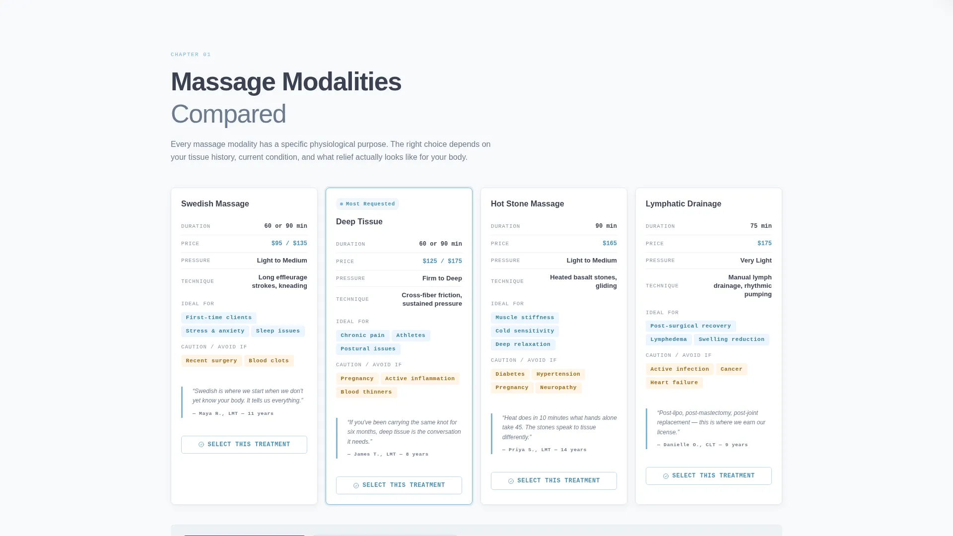
- Side-by-side comparison cards for every treatment, each showing duration, pressure level, contraindications, and ideal-for tags
- A slide-out booking micro-form with a medical considerations dropdown and a free-text field so visitors can communicate their needs before arrival
Feature list
This template is built around one idea: the comparison architecture should do the persuading, so the booking form feels like a confirmation rather than a commitment. Every feature below serves that goal.
Sticky Anchor Navigation Rail
A persistent left-rail navigation keeps all four spoke sections reachable at all times. The active spoke indicator pulses in open-sky blue so visitors always know where they are. Jumping between "Massage Modalities Compared" and "Package Builder" takes a single click.
Side-by-Side Treatment Comparison Cards
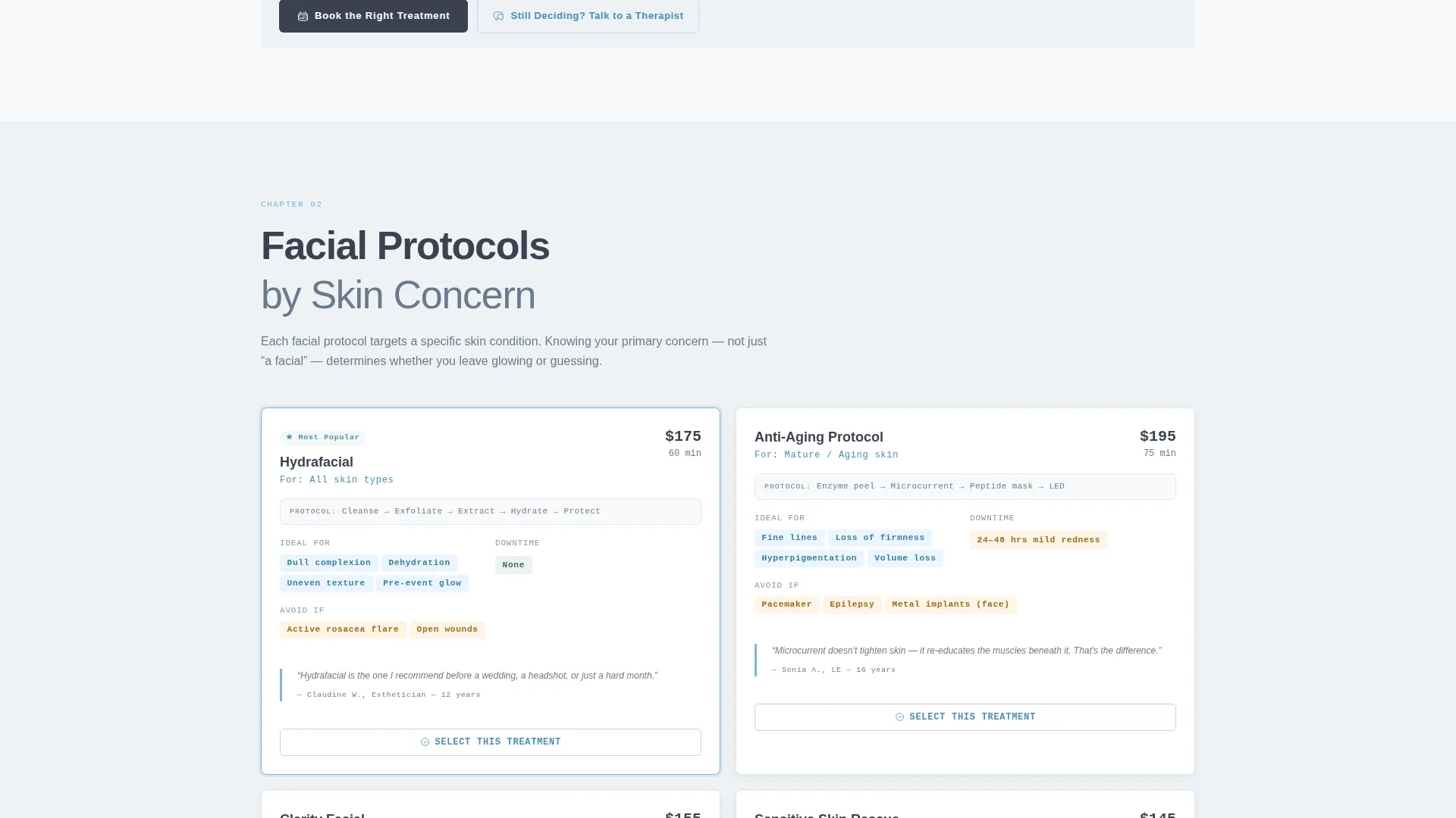
Each spoke section presents treatments in parallel cards. Cards display duration, pressure level, contraindications, and ideal-for tags in a consistent layout. The quiet, clinical format lets visitors compare options without needing to hold information in their head.
Therapist Pull-Quote Panels
Between comparison card rows, single pull-quote testimonials from therapists explain why they recommend one modality over another. These are not generic reviews. They read like whispered recommendations from someone who has seen the full menu.
Slide-Out Booking Micro-Form
Every comparison card carries a "Select This Treatment" micro-call to action. Clicking it opens a slim slide-out form asking for a preferred date, a medical considerations dropdown (pregnancy, recent surgery, chronic pain, or none), and a free-text field labeled "Tell us what relief looks like for you."
Pinned Section Call-to-Action Bar
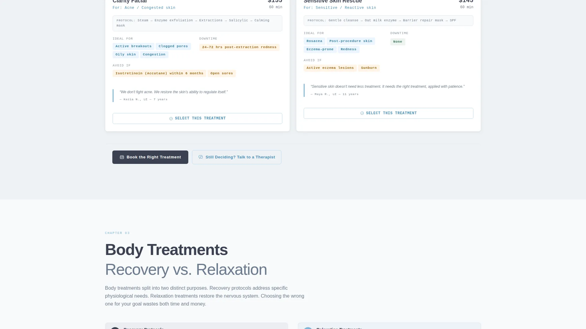
At the bottom of every spoke section, two calls to action appear together: "Book the Right Treatment" as the primary action and "Still Deciding? Talk to a Therapist" as a lower-commitment alternative. The pairing removes pressure without removing momentum.
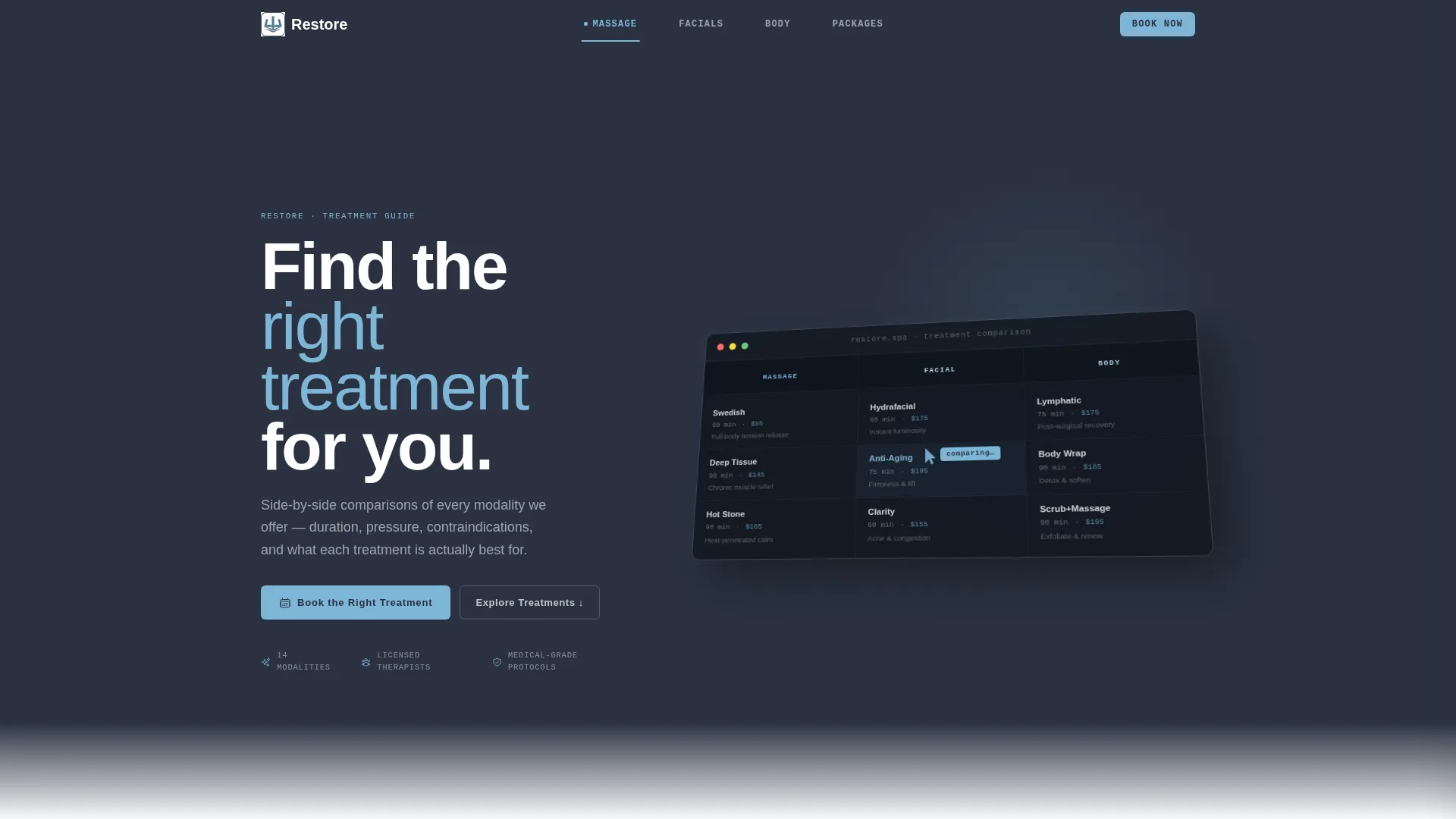
Product Screenshot Header
The header uses a high-fidelity, isometric-tilted screenshot of the spa's booking interface rather than lifestyle photography. Three treatment columns are visible at a glance, each showing price, duration, and a single-line benefit. A soft sky-blue cursor hovers mid-comparison to signal the page's research-first intent.
Page sections overview
| Section | Purpose |
|---|---|
| Sticky Header Nav | Anchors visitors to treatment categories |
| Isometric Screenshot Header | Establishes research-first credibility |
| Massage Modalities Compared | Side-by-side massage treatment cards |
| Facial Protocols Section | Comparison by skin concern |
| Body Treatments Section | Recovery versus relaxation options |
| Package Builder Section | Bridal, corporate, and solo packages |
| Pinned call to action Bar | Drives booking or therapist consultation |
| Slide-Out Booking Form | Captures treatment selection and context |
Design & branding system
The Slate and Sky color system is built to feel calm before the visitor consciously understands why. Deep treatment-room charcoal grounds every structural element. Clinical slate carries body text with quiet authority. The overall effect is a polished river stone, cool, still, and deliberately unhurried.
- Deep charcoal (#3B4252) dominates the sticky navigation rail and section backgrounds; clinical slate (#6B7B8D) carries all body text; open-sky blue (#7EB6D8) marks every anchor link and hover state; white linen (#F8F9FB) floats across card backgrounds with barely-there box shadows
- Linen cards lift off the slate canvas with a subtle shadow that mimics steam lifting off water, maintaining visual depth without decoration
- The active spoke indicator pulses in sky blue; charcoal and linen alternate across spoke sections to create visual rhythm without disrupting the calm, directory-style tone
Mobile & speed optimization
The hub-and-spoke structure is designed to stay navigable on any screen size. The sticky anchor rail compresses cleanly on smaller viewports so visitors can still jump between treatment categories without scrolling back to the top.
- Comparison cards reflow into a single-column stack on mobile, preserving all key data points without horizontal scrolling
- The slide-out booking form is sized for thumb-friendly interaction, keeping the medical considerations dropdown and free-text field fully accessible on phone screens
How this template helps you convert
Restore is built around a single conversion insight: uncertainty kills bookings, and comparison architecture dissolves uncertainty. The page is structured so that by the time a visitor reaches the booking form, the comparison work is already done.
- The spoke sections guide visitors through every relevant treatment category in sequence, building knowledge and confidence with each scroll so the "Book the Right Treatment" call to action feels earned rather than forced.
- The micro-form attached to each comparison card lowers commitment friction by letting visitors select a specific treatment and share medical context before a full booking interaction, making the first contact feel like a conversation rather than a transaction.
Other information about this template
Restore fits naturally within the broader category of spa and wellness center website templates designed for contact and booking-focused pages. It is particularly well suited for wellness centers that serve clients with specific clinical or personal considerations.
- The template follows a Directory and Discovery theme, meaning the visual and structural language prioritizes clarity and informed choice over lifestyle aspiration
- The Industry Report creative direction shapes every spoke section like a structured wellness brief, alternating data tables with therapist commentary to reward careful readers
- The Comparison and Versus conversion approach makes this template a strong fit for any wellness business where treatment differentiation is a key part of the client relationship
- The template is delivered as a ready-to-customize layout; copy, treatment names, pricing, and therapist quotes should be replaced with your own verified service details before publishing
Theme
Directory & Discovery
Creative direction
Industry Report
Color system
Slate & Sky
Style
Hub & Spoke (Anchor Nav)
Direction
Comparison/Versus
Page Sections
Sticky Anchor Navigation Rail
Side-by-side Comparison Cards
Therapist Pull-quote Panels
Slide-out Booking Micro-form
Pinned Section Call to Action Bar
Isometric Product Screenshot Header
Related questions
Can I add or remove treatment spoke sections?
Is this template suitable for a solo practitioner or a small spa?
What goes in the medical considerations dropdown?
Does the template include a live booking system?
How does the isometric header screenshot work?



