Cloud-Native Enterprise Software Reviews Website Template
Resolve is a hub-and-spoke landing page template built for cloud-native IT service management platforms. It pairs an interactive browser-rendered service desk preview with a feature matrix layout, anchor navigation, and a Dynamic Motion visual system. The result is a focused, high-momentum page that lets visitors touch the product before they ever click a call to action.
by Rocket studio
Quick summary
Resolve is a single-page template designed for cloud-native IT service management (ITSM) platforms. It opens with a live, browser-rendered service desk preview, then guides visitors through capability clusters via a pinned anchor navigation. The Slate and Sky color system and Dynamic Motion theme create the feeling of a predawn operations center coming online.
Who this template is for
This template is built for teams selling or showcasing complex, cloud-native ITSM platforms to enterprise buyers. It speaks directly to audiences who evaluate software with technical depth before committing.
- IT directors managing overloaded service desks and workaround-heavy workflows
- Enterprise operations leads migrating off legacy service management platforms
- Platform engineering teams who need incident management with native container orchestration support
What problem this template solves
Most ITSM marketing pages rely on static screenshots and vague benefit claims. Buyers who manage real service desks need to see the system behave before they trust it. This template closes that gap.
- It replaces passive screenshots with a functioning interactive preview rendered directly in the browser
- It structures complex feature sets into scannable, anchor-navigated capability clusters instead of one scrolling list
- It builds buyer confidence progressively, so the final call to action feels earned rather than pushed
What you get with this template
The template delivers a complete, production-ready landing page structure for a cloud-native ITSM platform. Every section is intentionally sequenced to move a technical buyer from awareness to action.
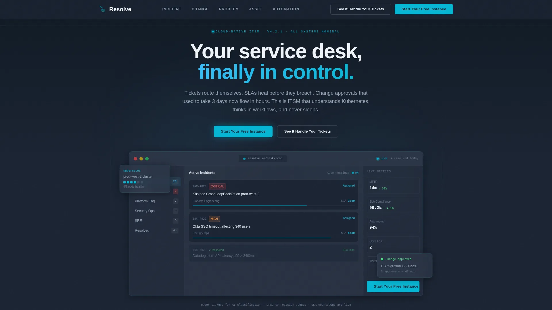
- An interactive header preview showing ticket auto-classification, queue routing, and a live SLA countdown
- A hub-and-spoke anchor navigation system with five capability spoke sections: Incident, Change, Problem, Asset, and Automation
- A click-through conversion layout with a primary call to action fixed in the navigation and a secondary guided demo overlay trigger
Feature list
This template is built around a tightly integrated set of interactive and structural capabilities grounded in the source brief.
Interactive Browser-Rendered Service Desk Preview
The header section renders a miniature, functioning version of the platform's service desk directly in the browser. A simulated ticket appears, auto-classifies itself, routes to the correct team, and resolves with a visible SLA countdown ticking green. Visitors can hover tickets to see suggested categories, drag them between queues, and watch priority recalculate in real time.
Parallax Panel Depth Effect
The interactive header uses subtle parallax depth so that individual panels feel layered like actual application windows. This effect reinforces the sense of a real, multi-surface interface rather than a flat illustration or static mockup.
Hub-and-Spoke Anchor Navigation
A pinned navigation bar serves as the hub, with spoke links pointing to five capability cluster sections. The anchor nav stays visible throughout the scroll and hosts the primary call-to-action button at all times, keeping conversion opportunity persistent.
Per-Spoke Module Micro-Animations
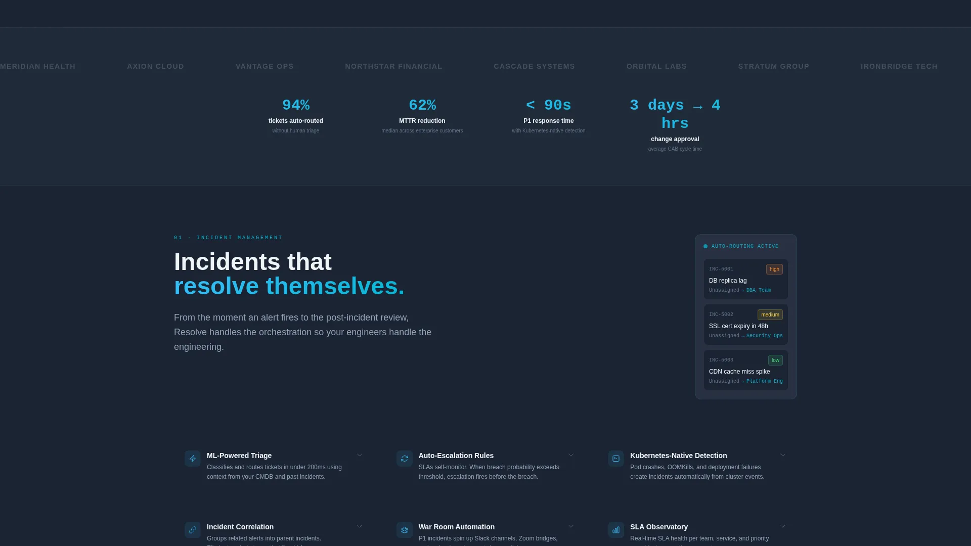
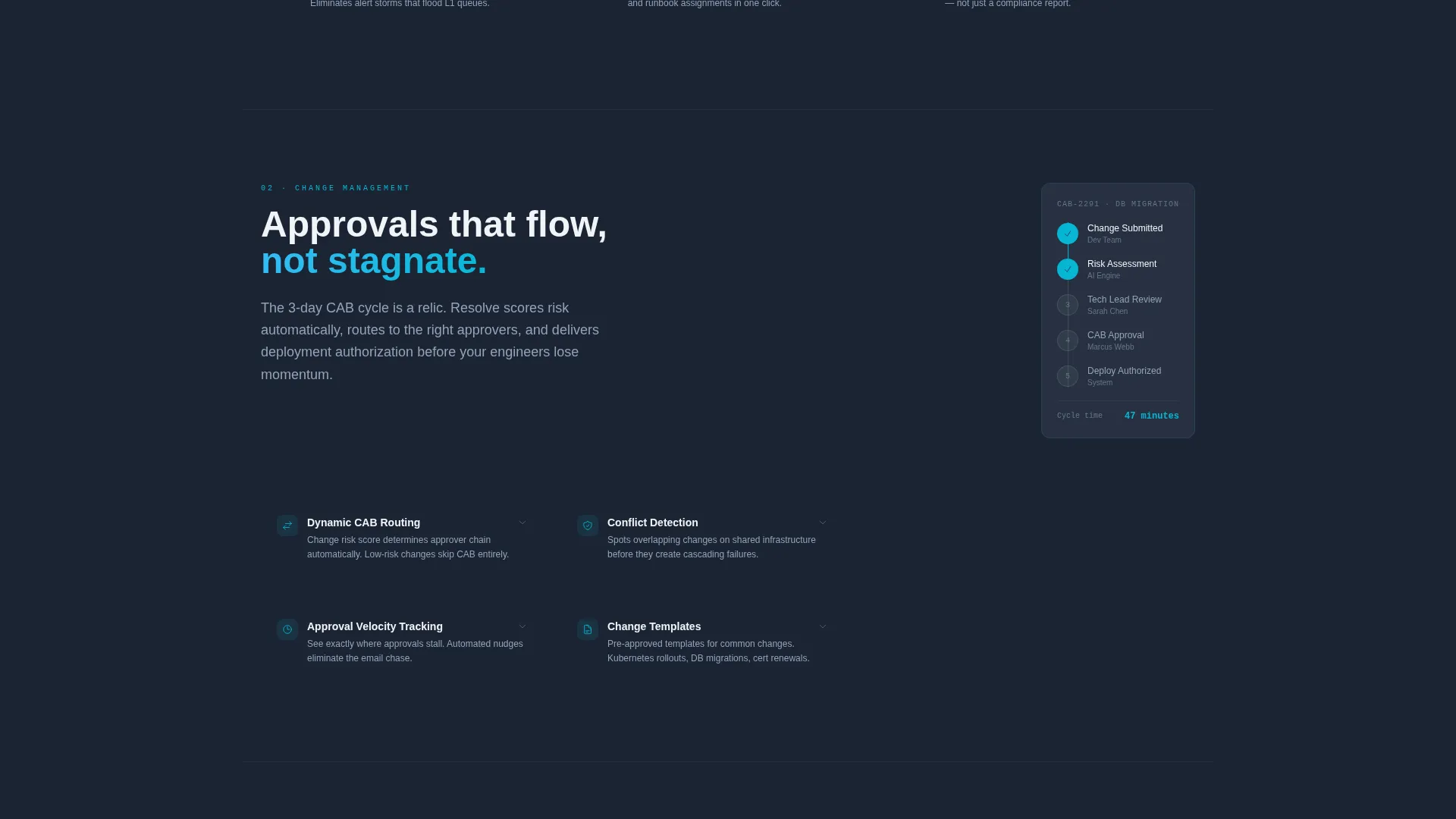
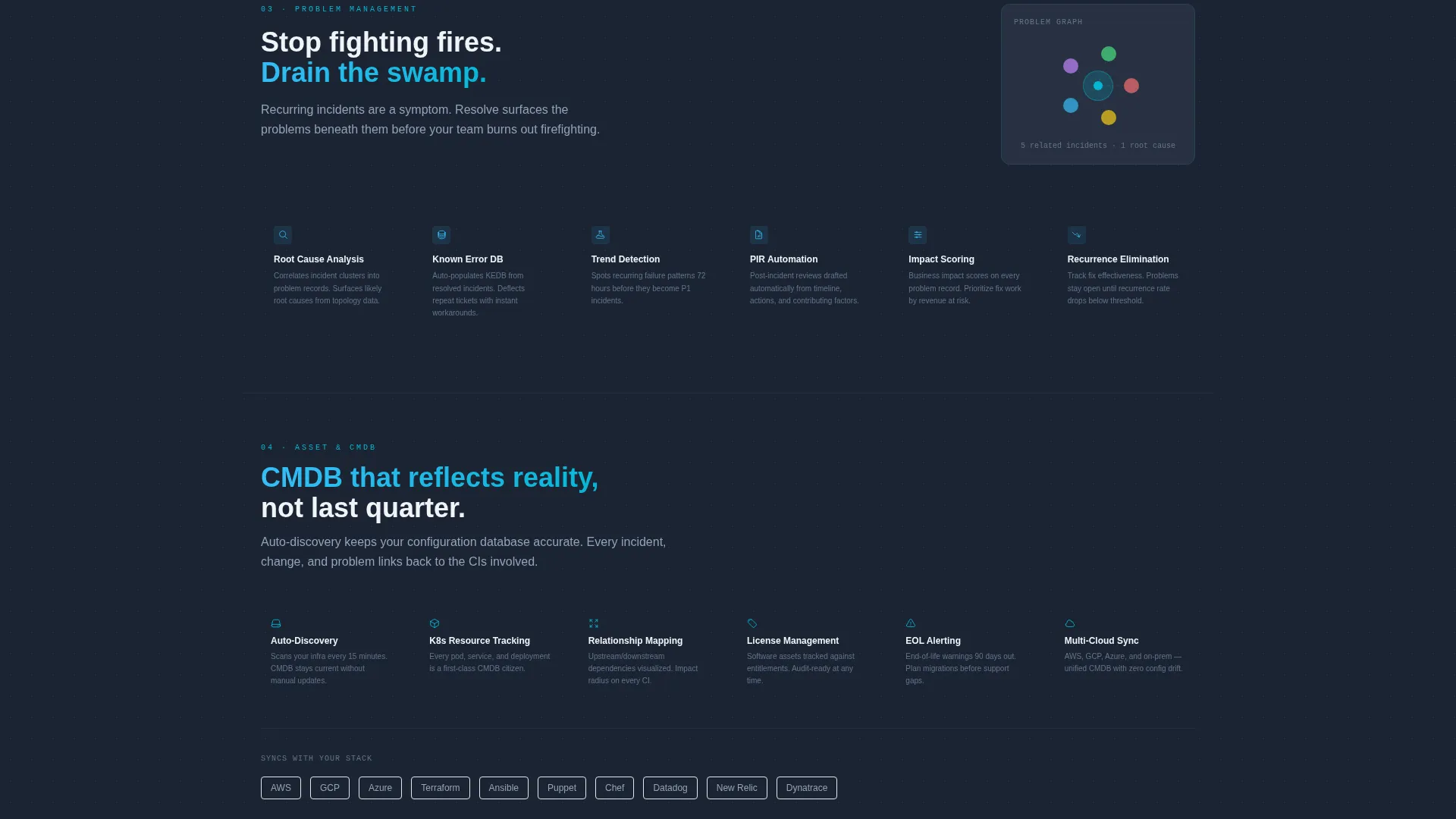
Each capability spoke section opens with a module-specific micro-animation. Tickets cascade for Incident, approval chains branch for Change, and CMDB graphs spin into focus for Asset. These animations resolve into a tight feature grid with iconography and expandable detail drawers.
Scroll Velocity Progression
The page's pacing is intentional. Early sections scroll slowly with generous whitespace. Later sections compress, stack denser, and move faster, mimicking the operational velocity the platform delivers and building momentum toward the final call to action.
Guided Demo Overlay
A secondary call-to-action button triggers a guided interactive demo overlay. This gives visitors a structured walkthrough of the platform without leaving the page, adding a second conversion path for buyers who want more context before signing up.
Page sections overview
| Section | Purpose |
|---|---|
| Interactive Header Preview | Renders live service desk with SLA countdown and draggable ticket queue |
| Anchor Navigation Hub | Pins capability links and primary call to action throughout full-page scroll |
| Incident Spoke | Showcases ticket routing, auto-classification, and incident feature grid |
| Change Spoke | Demonstrates approval chain flow and change management capabilities |
| Problem Spoke | Highlights root-cause tracking and problem management feature set |
| Asset Spoke | Displays CMDB graph animation and asset management features |
| Automation Spoke | Presents automation rules, triggers, and workflow builder features |
| Demo Overlay Trigger | Secondary call to action launching guided interactive demo without page exit |
Design & branding system
The visual identity follows a Dynamic Motion theme built on the Slate and Sky color system. Every color choice serves a functional role, referencing the logic of a live operations dashboard rather than decorative aesthetics.
- Deep operations slate (#1B2433) and dashboard charcoal (#2D3748) form the base layers, creating a calm, focused dark environment
- Clear-sky blue (#38BDF8) marks active states and data flow indicators, while signal cyan (#06B6D4) pulses on hover states and live system indicators
- Horizon white (#F0F4F8) provides content surface contrast, ensuring text and feature grids remain readable against the dark base
Mobile & speed optimization
The template is structured to deliver a coherent experience across viewport sizes. Interactive elements and the anchor navigation adapt to narrower screens without breaking the core page logic.
- The anchor navigation adjusts from a pinned left-rail layout to a top-pinned bar on smaller viewports
- Micro-animations and the interactive preview are scoped to render within the browser without requiring external video assets or embedded iframes
- The scroll velocity progression and feature grids reflow cleanly so the hub-and-spoke structure remains navigable on touch devices
How this template helps you convert
This template is designed around a click-through conversion goal. Every structural decision reduces friction and builds confidence before asking for a commitment.
- The interactive header preview lets visitors experience the platform's core behavior before reading a single feature claim, making the product case through direct interaction rather than copy alone
- The primary call-to-action button ("Start Your Free Instance") appears inside the interactive preview first, then remains fixed in the anchor nav throughout the entire scroll, ensuring it is always reachable without hunting
- The secondary call-to-action ("See It Handle Your Tickets") triggers an in-page guided demo overlay, capturing buyers who need more evidence before clicking through to the signup flow
Other information about this template
This template is categorized under Technology, with a subcategory of Cloud-Native Enterprise Software and a niche focus on cloud-native ITSM. It is designed as a single-page, section-led structure using a hub-and-spoke layout with anchor navigation.
- The template style is Hub and Spoke with an anchor nav, making it well suited for platforms with multiple distinct capability modules that each need dedicated presentation space
- The header concept is Interactive Preview, a browser-rendered simulation rather than a video or screenshot, which is particularly effective for enterprise software buyers who distrust static marketing visuals
- The creative direction is Feature Matrix, organizing capabilities into a structured grid with expandable detail drawers rather than long prose descriptions
- The landing page direction is Click-Through, meaning there is no form on this page; the primary conversion action is a click that routes to an external signup flow
Theme
Dynamic Motion
Creative direction
Feature Matrix
Color system
Slate & Sky
Style
Hub & Spoke (Anchor Nav)
Direction
Click-Through
Page Sections
Interactive Browser-rendered Service Desk
Hub-and-spoke Anchor Navigation
Per-spoke Micro-animations
Scroll Velocity Progression
Guided Interactive Demo Overlay
Expandable Feature Detail Drawers
Related questions
Does this template include actual backend ITSM functionality?
Can I adapt the five capability spokes to match different module names?
Is the interactive header preview built with video or embedded media?
Who handles the signup flow that the primary call to action links to?
Does the anchor navigation stay visible on mobile screens?



