Complete Retail Software & SaaS Professional Website Template
Stockpulse is a hub-and-spoke anchor-nav landing page template built for retail inventory management platforms. It uses a Dynamic Motion design theme, a Void and Violet color system, and an Industry Report creative direction to walk visitors through the real cost of inventory loss before presenting the app download call to action. The result is a dark, high-signal page that earns every tap.
by Rocket studio
Quick summary
Stockpulse is a single-page, anchor-navigated landing page template designed for retail inventory management software. It opens with three animated Dark Glass Panels and a typewriter headline, then guides visitors through four evidence-led chapters before presenting the app download prompt. The tone is disciplined and data-forward, built to convert regional retail operators and enterprise loss prevention teams.
Who this template is for
This template is built for software teams and product marketers who need a high-impact landing page for a retail inventory management platform. It suits businesses that sell to mid-size and large retail operators who respond to data and credibility before they respond to features.
- Regional retail chain operators managing forty to four hundred store locations
- Loss prevention directors and operations vice presidents who need hard evidence before committing to a new platform
- Software teams launching or repositioning a retail inventory or stock-tracking app
What problem this template solves
Retail software landing pages often lead with features before the visitor understands the cost of doing nothing. This template flips that order. It spends four full content sections establishing the scale of the problem, using sourced statistics and animated charts, so by the time the product appears, the visitor already feels the gap.
- Visitors leave before converting because the value is not established early enough
- Enterprise buyers skip generic pages but stay on pages that feel like proprietary research
- App download prompts feel weak when they are not preceded by compelling, data-backed context
What you get with this template
You get a fully structured, single-page layout with anchor navigation that links a central hub to each spoke section. Every section is purpose-built and ready to be populated with your platform's real data, copy, and download links.
- A Dark Glass Panels header with three animated data visualization zones and a typewriter headline
- Four industry-report-style content chapters, each with animated chart placeholders and a product feature pivot
- A conversion footer with an email input field, app store badge placements, and a secondary enterprise demo request path
Feature list
This template is built around a set of design and structural decisions that work together to move a skeptical retail buyer from curiosity to download.
Dark Glass Panel Header
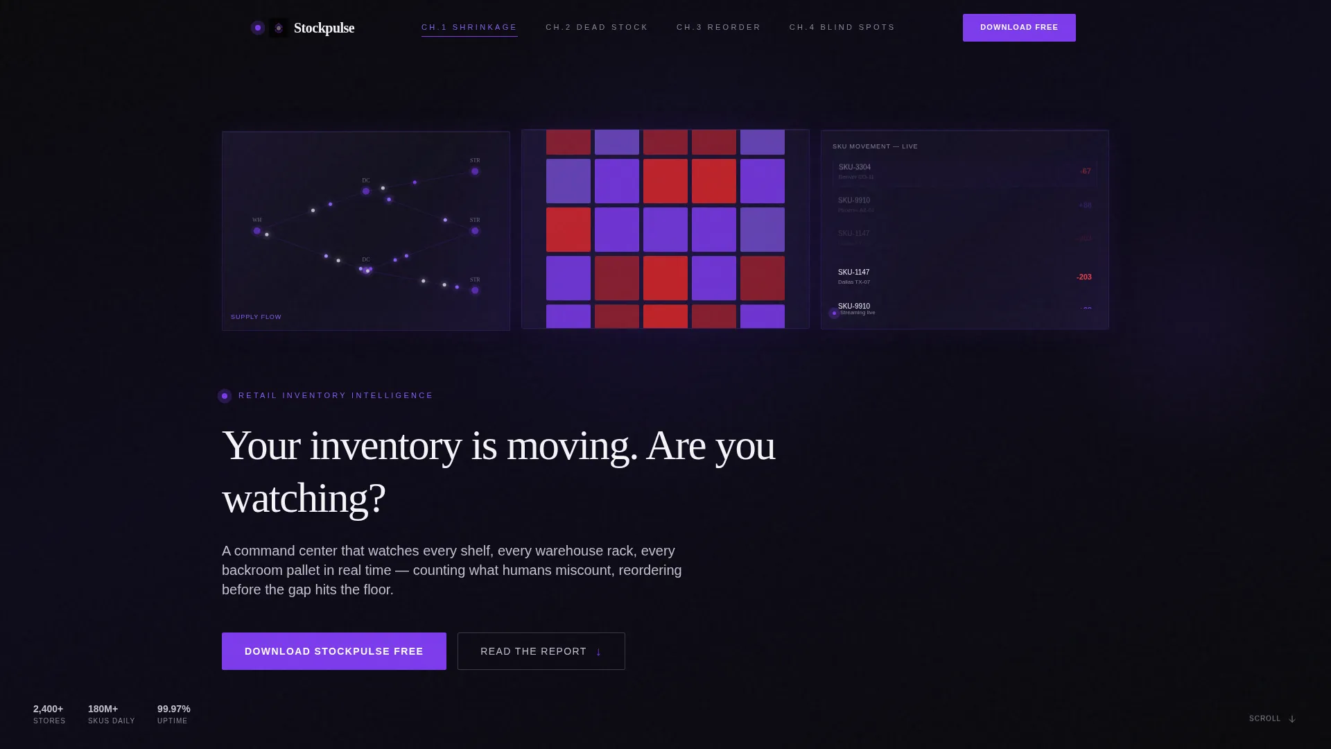
Three translucent, frosted-glass rectangles float against the void-black background. The left panel shows inventory units flowing through a supply chain diagram, the center panel displays a store heatmap where stock levels pulse from violet to red, and the right panel renders a real-time SKU movement ticker. Subtle parallax drift and violet light refractions at panel edges reinforce the control-room aesthetic.
Typewriter Headline Animation
A single headline types itself letter by letter beneath the panels: "Your inventory is moving. Are you watching?" This motion-triggered text draws the visitor's eye downward and sets the editorial tone before any body copy appears.
Hub and Spoke Anchor Navigation
A persistent anchor navigation bar links the central hub to each chapter spoke. Visitors can jump directly to any chapter or scroll through in sequence. This structure mirrors the format of a proprietary research document, keeping enterprise readers oriented throughout a long page.
Industry Report Chapter Sections
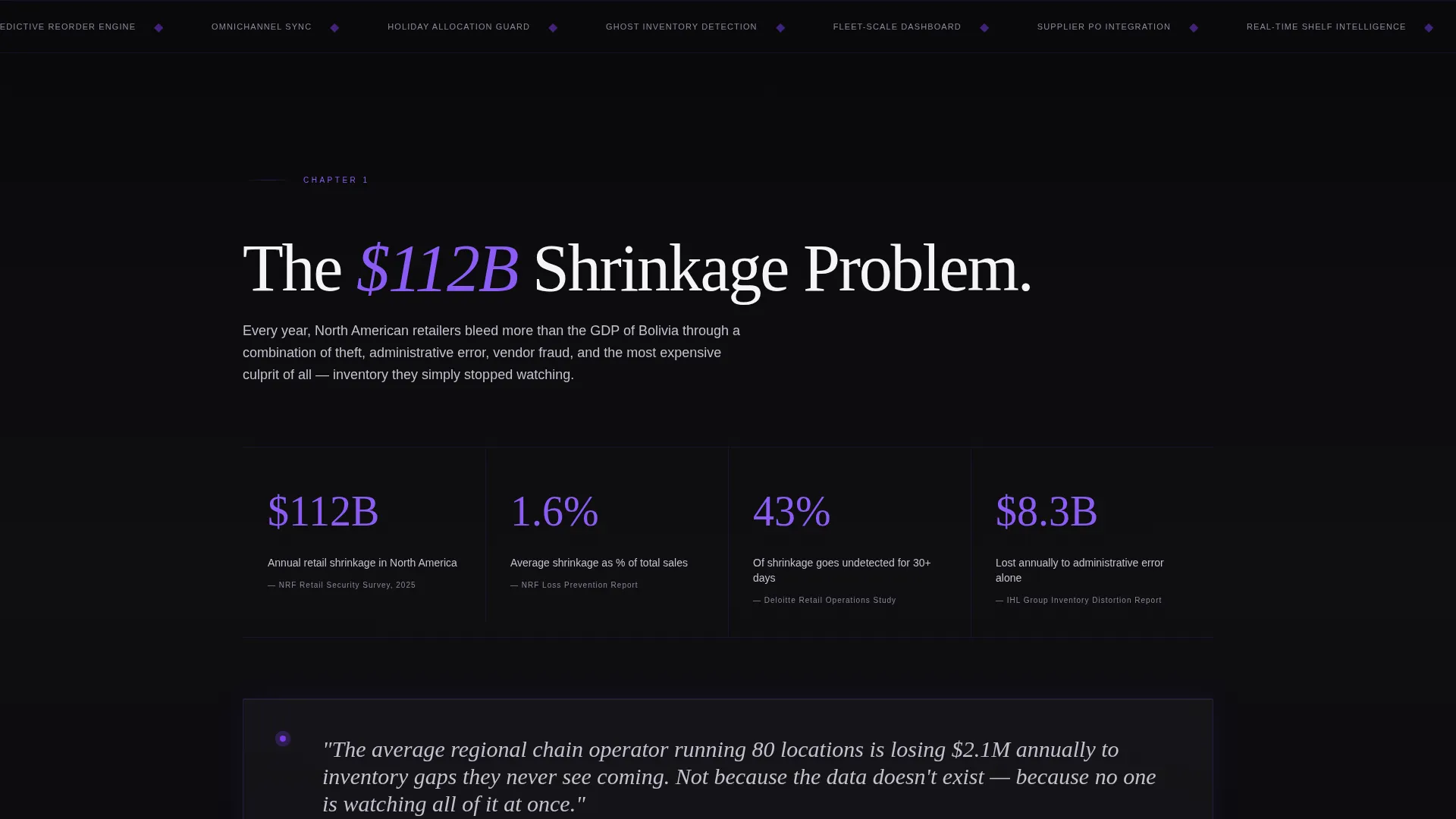
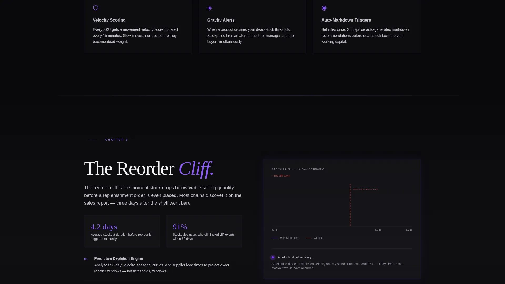
Each of the four spoke sections reads like a chapter in a research report. Chapter titles such as "The $112B Shrinkage Problem" and "The Reorder Cliff" open with animated counters and sourced statistics, then pivot to the specific product feature that addresses the data. Charts animate as the visitor scrolls into view.
Scroll-Triggered Chart Animations
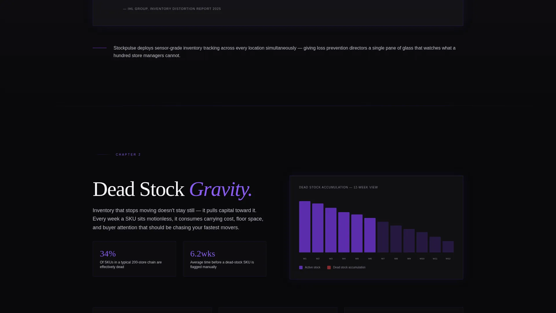
Animated charts build progressively as the user scrolls into each chapter. This keeps the page feeling live and responsive, and it paces the information delivery so visitors absorb one idea before the next data point appears.
App Download Conversion Block
The conversion section pairs a single email input field with App Store and Google Play badge placements. Submitting the email sends the download link directly to the visitor's phone. A secondary call to action, "Request a Fleet Demo," gives enterprise buyers a guided path without interrupting the primary flow.
Page sections overview
| Section | Purpose |
|---|---|
| Dark Glass Header | Establishes the control-room aesthetic and introduces the typewriter headline |
| Anchor Nav Bar | Lets visitors jump to any chapter or scroll in sequence |
| Chapter 1: Shrinkage Problem | Opens with an animated counter and sourced shrinkage statistics |
| Chapter 2: Dead Stock Gravity | Presents data on dead stock cost and pivots to the stock-tracking feature |
| Chapter 3: The Reorder Cliff | Illustrates reorder failure risk with an animated chart before showing the reorder feature |
| Chapter 4: Omnichannel Blind Spots | Covers multi-location visibility gaps and links to the relevant platform capability |
| App Download Block | Email input, app store badges, and secondary enterprise demo request |
Design & branding system
The visual identity uses a Void and Violet color system that feels like a server room lit by status LEDs. Darkness is used as a structural choice, not a default, and every electric violet pulse carries meaning.
- Core palette: absolute void black (#09090B) for backgrounds, deep gravitational purple (#2D1B69) for section fills, electric violet (#7C3AED) for interactive elements and data highlights, and cool phantom silver (#C4C1CF) for body text and secondary interface elements
- Motion language: parallax drift on glass panels, scroll-triggered chart builds, and a typewriter headline animation work together under the Dynamic Motion theme
- Typography and tone follow an Industry Report creative direction, with section headers styled as chapter titles and body copy written at a research-document register
Mobile & speed optimization
The template is designed so its motion-heavy components remain navigable and legible on smaller screens. The anchor navigation bar is accessible on mobile, and the conversion block with the email input and badge placements is laid out to work within a single thumb-reach zone.
- Glass panel header adapts its three-column layout for narrower viewports without losing the core visual impact
- Scroll-triggered animations are structured to fire at natural scroll points on touch devices
- The single-field email input and app store badge placement are sized and spaced for comfortable mobile interaction
How this template helps you convert
The conversion strategy in this template is built around earned trust, not early asks. The page delays the product reveal deliberately so the visitor arrives at the download prompt already convinced of the problem's scale.
- Four consecutive data chapters establish industry-level credibility before the product is named, so the visitor's frame shifts from "should I download this?" to "why haven't I already?"
- The email-to-phone delivery mechanic removes friction from the download moment: the visitor types one field and the link arrives on the device they will actually use to install the app
- The "Request a Fleet Demo" secondary path captures enterprise buyers who are not ready for a self-serve download but are ready for a conversation, keeping both buyer types on the same page without confusion
Other information about this template
This template is built inside a hub-and-spoke structure where the anchor navigation acts as a table of contents for the page. Each spoke section is self-contained and can be read independently if a visitor jumps directly from the nav.
- The template is categorized under Technology, specifically within the Retail Software and Software as a Service subcategory, targeting the retail inventory management niche
- The Void and Violet palette and Dynamic Motion theme are matched intersection design choices, meaning they were selected specifically for the retail software and app download use case
- The Industry Report creative direction is intentional for enterprise sales cycles: decision-makers in operations and loss prevention are accustomed to reading reports, and this format lowers their resistance before they reach the product section
- The template supports two distinct buyer journeys on one page: a self-serve app download path for individual operators and an enterprise fleet demo request path for larger accounts
Theme
Dynamic Motion
Creative direction
Industry Report
Color system
Void & Violet
Style
Hub & Spoke (Anchor Nav)
Direction
App Download
Page Sections
Dark Glass Panel Header
Typewriter Headline Animation
Hub and Spoke Anchor Navigation
Industry Report Chapter Sections
Scroll-triggered Chart Animations
App Download Conversion Block
Related questions
Who is this landing page template designed for?
Can I edit the chapter content and statistics?
Does the template support two different calls to action?
How does the email input connect to the app download?
Is this template suited for short product pages?



