Internal Knowledge Base Comparison Website Template
Retain is a single-page comparison landing page built for customer success platforms. It opens with animated KPI counters, then scrolls into a clinical spec-sheet table that stacks your platform against the competition row by row. The result is a page that makes the alternative look incomplete before the visitor ever clicks a call to action.
by Rocket studio
Quick summary
Retain is a conversion-focused comparison landing page template for customer success platforms. It leads with three animated KPI counters, then unfolds a granular spec-sheet table across three columns. Every design decision reinforces one message: the right platform is already obvious. The layout earns the click before the visitor reaches the form.
Who this template is for
This template is built for teams that need to communicate operational advantage clearly and quickly. It speaks directly to decision-makers who live inside customer data every day.
- Customer success directors managing large account books who need to justify platform investment
- VP-level leaders building the case for net revenue retention in board-level reviews
- Individual customer success managers who need a faster way to identify which accounts need attention today
What problem this template solves
Most customer success platform pages describe features in isolation. They fail to show the operational gap between doing nothing, using a generic tool, and using the right purpose-built platform. Buyers leave without a clear frame of reference.
- No structured way to compare churn response, onboarding coverage, and automation depth side by side
- No immediate proof that the numbers move after switching platforms
- No low-friction path for buyers who are ready to evaluate but not yet ready to book a demo
What you get with this template
The template delivers a complete single-page layout with every section wired for comparison-driven conversion. Nothing is decorative. Every element earns its place by moving the visitor one step closer to a decision.
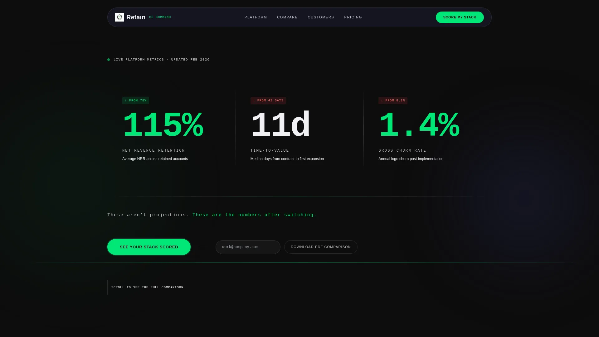
- An animated KPI counter header with three live-climbing metrics separated by razor-thin silver dividers
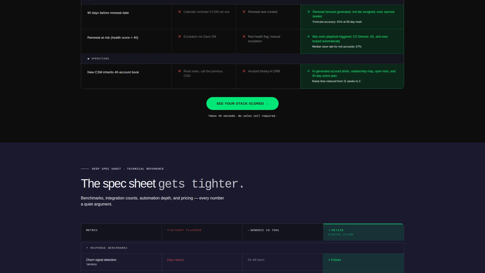
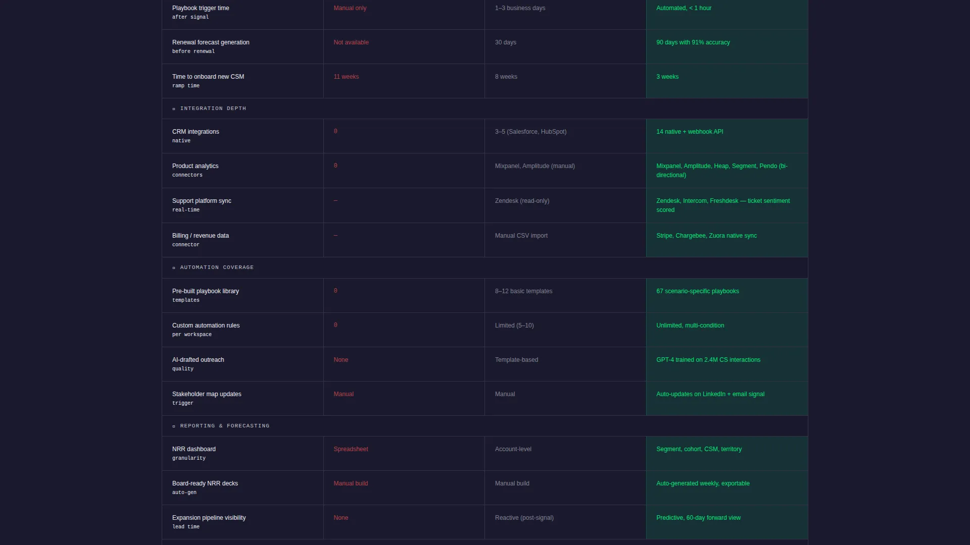
- A three-column spec-sheet comparison table covering high-level capabilities, response time benchmarks, integration depth, automation coverage, and pricing transparency
- A primary call-to-action bar that pins to the top of the viewport once scrolling begins, plus a secondary PDF download path that captures intent at lower commitment
Feature list
This section walks through the core built-in components that give Retain its operational edge as a landing page template.
Animated KPI Counter Header
Three massive counters animate upward in real time against a pure black background. The metrics displayed are net revenue retention climbing past 115%, time-to-value dropping from 42 days to 11, and churn rate collapsing from 8.2% to 1.4%. A single line in tactical silver anchors the section: "These aren't projections. These are the numbers after switching."
Three-Column Comparison Table
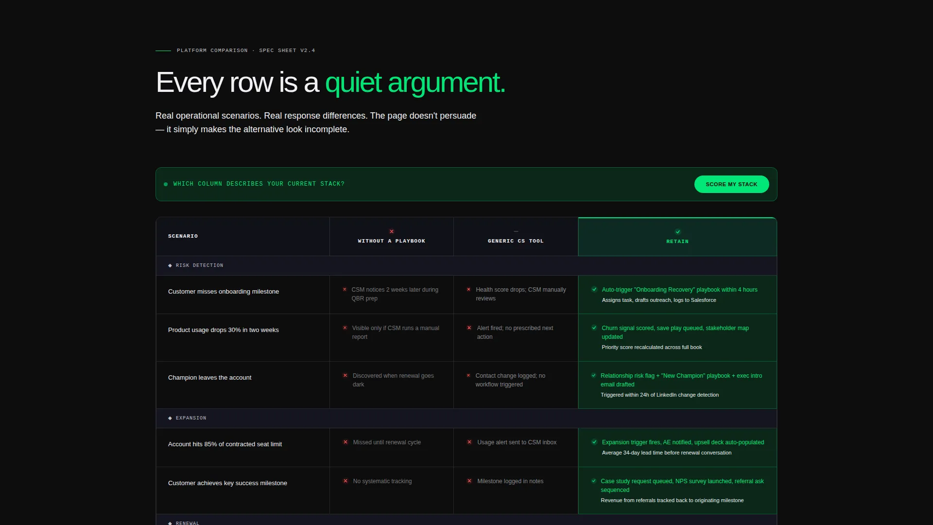
The core of the page is a scrolling spec-sheet table with three columns: "Without a Playbook," "Generic CS Tool," and "This Platform." Each row maps a specific operational scenario to a response in each column. The winning column is highlighted in ignition green. As the visitor scrolls, the table tightens from high-level capability gaps down to response time benchmarks and pricing transparency.
Floating call to action Bar
The primary call to action, "See Your Stack Scored," sits at the top of the comparison table and pins as a floating bar once the visitor begins scrolling. The qualifier form behind the button collects three fields: current platform selection from a dropdown, number of managed accounts, and work email. The form is designed to feel like a natural next step, not a cold interrupt.
PDF Download Path
A secondary conversion path lets visitors download the full comparison as a PDF by entering only their email address. This lower-commitment exchange captures intent from buyers who are not yet ready for a live qualifier but still want to take the data away.
Scenario-Based Table Rows
Every table row is built around a real operational scenario rather than a generic feature label. Examples include "Customer misses onboarding milestone," "Usage drops 30% in two weeks," and "Champion leaves the account." Each row is a quiet argument. The page does not persuade with adjectives. It persuades with specificity.
Data Command Visual System
The Carbon Fiber color system gives the entire page a technical, zero-fat feel. Deep cockpit black (#0D0D0D) forms the base. Woven carbon gray (#1A1A2E) provides structural depth. Tactical silver (#C0C0C8) handles data text and table borders. Ignition green (#00E676) marks winning-column highlights and pulses on the primary call to action. Monospaced typeface throughout reinforces the spec-sheet aesthetic.
Page sections overview
| Section | Purpose |
|---|---|
| KPI Counter Header | Opens with three animated metrics to establish immediate credibility |
| Tagline Strip | Anchors the header with a single line of tactical silver proof copy |
| High-Level Comparison | Introduces three-column table with scenario-based capability rows |
| Deep Spec Table | Tightens the comparison to benchmarks, integration counts, and pricing |
| Floating call to action Bar | Pins the primary call to action once the visitor begins scrolling |
| Stack Scorer Form | Three-field qualifier behind the primary call to action button |
| PDF Download Path | Secondary email-only capture for lower-commitment visitors |
Design & branding system
The visual identity follows a Data Command theme built on a Carbon Fiber color system. The aesthetic is engineered to make information feel like power rather than noise.
- Color palette: deep cockpit black (#0D0D0D) as the base, woven carbon gray (#1A1A2E) for structural layers, tactical silver (#C0C0C8) for data text and table borders, and ignition green (#00E676) for winning-column highlights and call to action pulses
- Typography: monospaced typeface used throughout to reinforce the spec-sheet and instrument-panel aesthetic
- No hero images or illustrations are used; the data itself is the visual
Mobile & speed optimization
The layout is designed to remain readable and scannable on smaller screens. The comparison table is the most complex element on the page, and the template accounts for that.
- The floating call to action bar is built to remain accessible and non-intrusive across viewport sizes
- Table rows are structured so that scenario labels and column responses stay legible without horizontal scrolling on mobile
- The PDF download path is a lightweight, single-field form that renders cleanly on any screen size
How this template helps you convert
The page is structured so that every scroll adds one more reason to act. The conversion logic is sequential and deliberate.
- The animated KPI header creates immediate belief by showing real outcome numbers before any feature claim is made
- The scenario-based comparison table reframes the evaluation process, making the visitor feel they have already done the analysis by the time they reach the call to action
- The two-path conversion structure, a three-field qualifier and a one-field PDF download, meets buyers at different stages of readiness without weakening the primary offer
Other information about this template
Retain was designed specifically for the customer success playbook niche, where buyers are operationally sophisticated and skeptical of vague platform promises. The template respects that sophistication by leading with data and letting structure do the persuasion.
- The template fits naturally within the Documentation and Support category and the Internal Knowledge Base subcategory, making it relevant for teams building or evaluating structured CS operational systems
- The comparison table format is well suited for teams evaluating dedicated customer success platforms alongside broader tools, including spreadsheet-based tracking workflows
- The three-column table structure can be adapted to reflect any competitive landscape relevant to the platform being marketed
- The "See Your Stack Scored" qualifier dropdown includes platform options such as Gainsight, Totango, ChurnZero, Vitally, spreadsheets, and none, making it immediately relevant to buyers across the full spectrum of current tooling maturity
Theme
Data Command
Creative direction
Spec Sheet
Color system
Carbon Fiber
Style
Comparison Table
Direction
Comparison/Versus
Page Sections
Animated KPI Counter Header
Three-column Comparison Table
Floating Primary Call to Action Bar
Low-commitment PDF Download Path
Scenario-based Table Rows
Carbon Fiber Visual System
Related questions
What type of page is Retain?
Can I update the comparison table rows to match my platform?
Does the template include more than one conversion path?
Who is this landing page template designed for?
Is the KPI counter content editable?



