Construction Software & SaaS Reviews & Social Proof Website Template
Reviewclear is a bento grid landing page template built for construction review management platforms. It uses a Tech Glass visual identity with frosted glassmorphic panels, a Feature Tab Switcher header, and an Industry Report creative direction. The layout guides general contractors, project managers, and owners' reps toward a lead generation form with clarity and confidence.
by Rocket studio
Quick summary
Reviewclear is a single-page bento grid template designed for construction review management software. It opens with a Feature Tab Switcher showing Submittals, RFIs (Requests for Information), and Punch Lists. Deep navy, frosted glass cards, cyan indicators, and amber alerts create a dark, luminous visual system that feels built for the job site.
Who this template is for
This template speaks directly to people who live inside construction workflows every day. It was built with their specific frustrations in mind, not a generic software audience.
- General contractors managing dozens of open submittals and trade coordination items across an active project
- Project managers tracking RFI response windows and worried about unanswered items going overdue
- Owners' representatives who need a single dashboard view to gauge whether a large-scale build is on schedule
What problem this template solves
Construction projects lose time and money when review items fall through the cracks. Submittals go unacknowledged, RFIs sit unanswered past contractual deadlines, and punch list deficiencies pile up with no clear owner. This template gives a platform the right landing page to show buyers that chaos has a solution.
- Open items scatter across emails, spreadsheets, and disconnected tools, making status invisible
- Overdue RFIs and missed submittal windows escalate into claims and costly schedule delays
- Owners and project managers lack one clear view to assess real project health at a glance
What you get with this template
The template delivers a fully structured, conversion-ready landing page for a construction review management platform. Every section earns attention before asking for it.
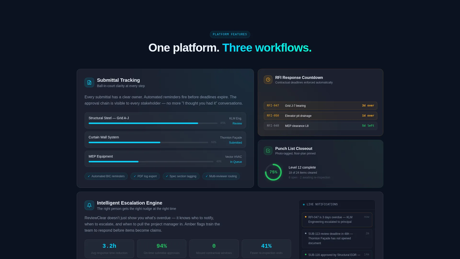
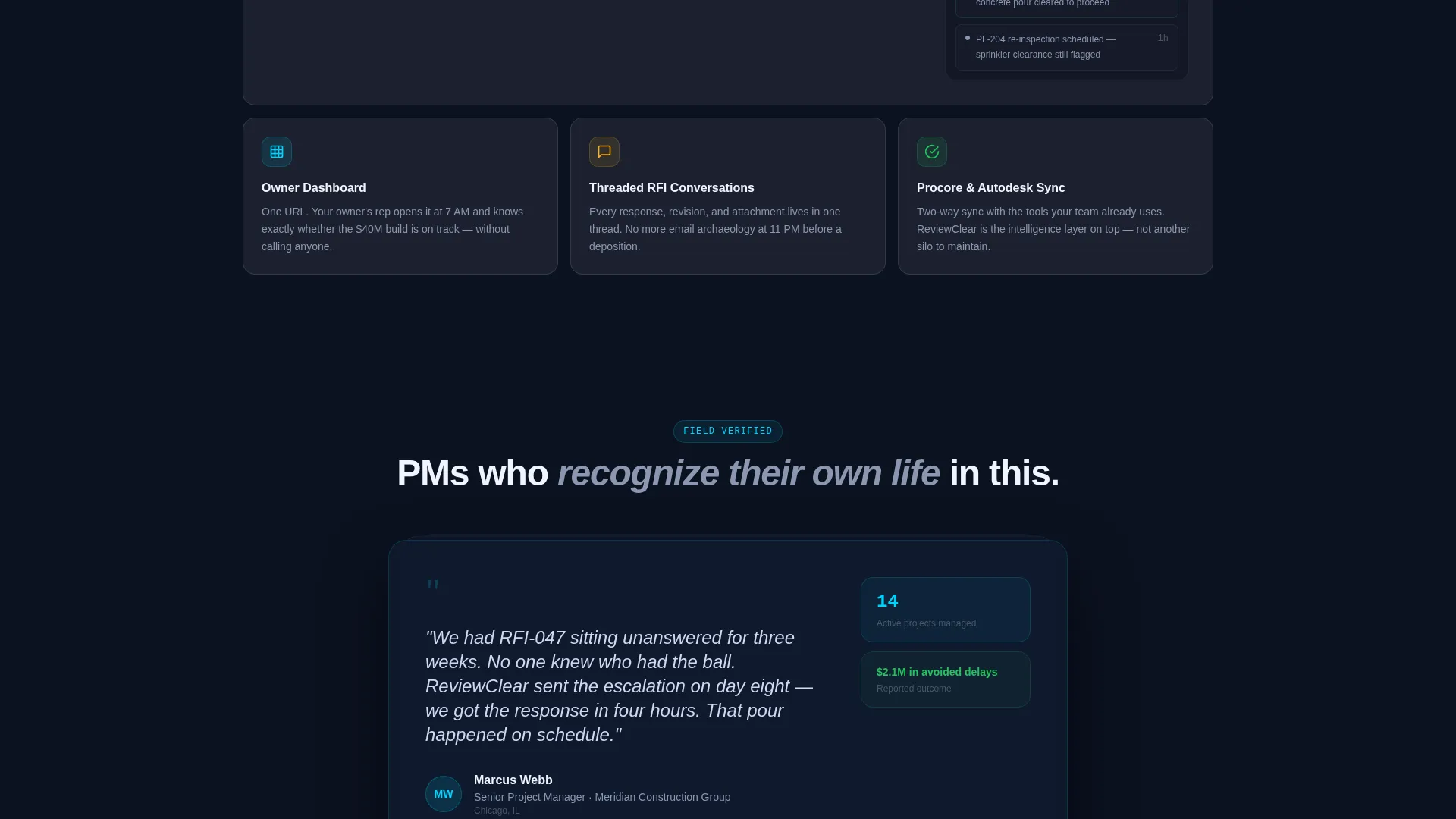
- A bento grid layout with alternating wide data-visualization panels and tight feature snapshot cards
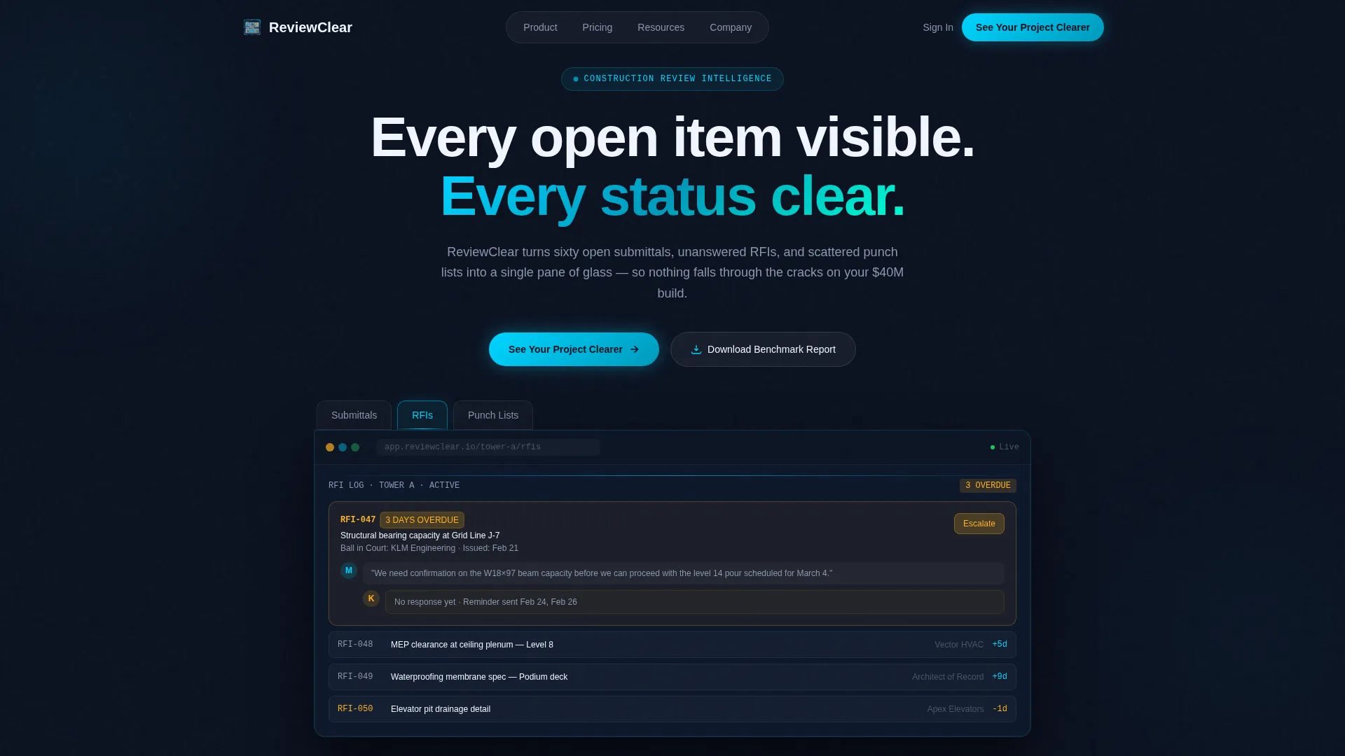
- A Feature Tab Switcher header with three interactive tabs that transform the dashboard mockup below
- Two conversion paths: a lead qualification form and a gated PDF download for researchers not yet ready to request a demo
Feature list
This template includes purpose-built components that reflect the real complexity of construction review workflows.
Feature Tab Switcher Header
Three frosted glass tabs labeled "Submittals," "RFIs," and "Punch Lists" sit above a live-feeling dashboard mockup. Each tab transforms the bento grid below it: Submittals shows a Gantt-style approval timeline with trade names and ball-in-court indicators, RFIs reveals a threaded conversation view with response countdowns, and Punch Lists displays a photo grid of tagged deficiencies overlaid on a floor plan.
Realistic Dashboard Data Mockup
The dashboard displays specific, recognizable content such as "RFI-047: Structural bearing capacity at Grid Line J-7, Ball in Court: KLM Engineering, 3 days overdue." This level of detail helps a project manager immediately recognize their own workflow in the template, building trust before a single word of copy is read.
Industry Report Bento Grid Layout
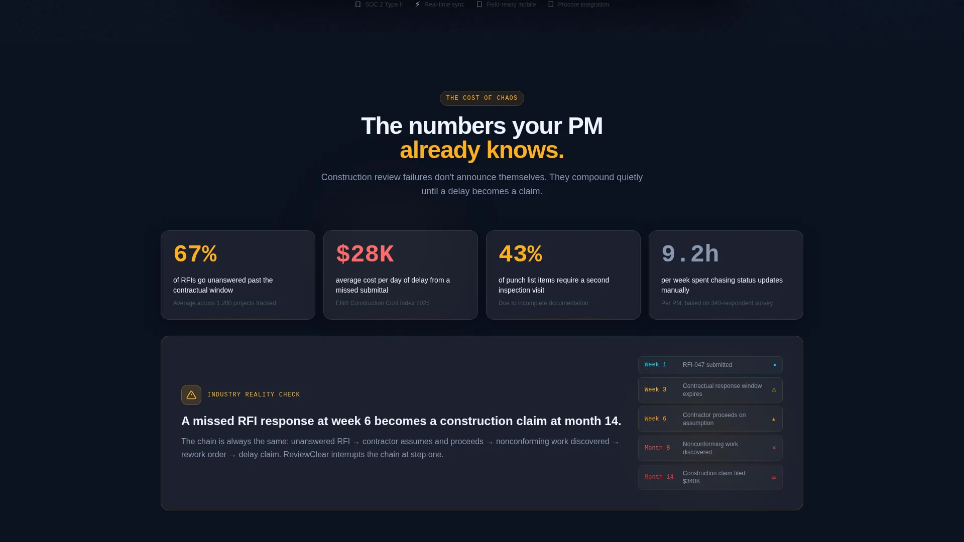
Each bento section pairs a hard industry statistic with a frosted glass card showing how the platform addresses it. The grid builds a methodical, evidence-first case by escalating the stakes: missed submittal, delayed RFI, failed inspection, and then a claim, each followed by the feature that prevents it.
Dual Conversion Path Design
The primary call to action reads "See Your Project Clearer" and anchors to a short qualification form. Fields include company name, number of active projects via dropdown, and primary pain point via radio buttons. A secondary path offers a downloadable benchmark report gated behind an email field alone, capturing researchers who are not yet ready to demo.
Glassmorphic Status Color System
Cyan (#00D4FF) drives progress indicators and active states. Amber (#FFB020) appears only for overdue flags, training the eye to trust silence and respect warnings. Frosted panel white at 12% opacity (#FFFFFF1F) floats cards over the deep site-plan navy (#0B1120) background, creating a layered, luminous depth.
Active Tab Glow and State Indicators
The active tab in the header switcher glows cyan at its edge. Ball-in-court labels and response countdown timers make item ownership and urgency visible at a glance, reflecting the way a real project manager would scan a whiteboard in a job trailer.
Page sections overview
| Section | Purpose |
|---|---|
| Tab Switcher Header | Introduces the three core review categories with a live dashboard mockup |
| Submittals Tab View | Shows Gantt-style approval timeline with trade names and ball-in-court indicators |
| RFIs Tab View | Displays threaded conversation view with response countdowns and overdue flags |
| Punch Lists Tab View | Presents photo grid of tagged deficiencies overlaid on a floor plan |
| Industry Stat Cards | Pairs hard statistics with frosted glass cards showing platform solutions |
| Escalating Stakes Grid | Walks through missed submittal to claim scenario, section by section |
| Lead Qualification Form | Captures company name, active project count, and primary pain point |
| Benchmark Report Gate | Offers downloadable PDF gated behind an email field for early-stage researchers |
Design & branding system
The visual identity follows a Tech Glass theme built on a Glassmorphic color system. The palette is intentionally dark and luminous, evoking a rain-streaked window looking out at a night-lit tower crane.
- Core colors: deep site-plan navy (#0B1120) background, frosted panel white at 12% opacity (#FFFFFF1F) for cards, status-active cyan (#00D4FF) for progress and active states, and alert amber (#FFB020) reserved strictly for overdue flags
- Frosted glass cards use subtle backdrop blur and light-catching borders that reference condensation on safety glasses
- Typography and layout follow the Industry Report creative direction, making the page feel like an interactive white paper built for construction professionals
Mobile & speed optimization
The bento grid layout is structured to reflow cleanly across screen sizes so field staff and site supervisors can engage with the page from any device. The design choices support lean rendering without sacrificing the visual depth of the glassmorphic system.
- Frosted glass cards and backdrop blur are applied in a way that does not rely on heavy asset loading
- The tab switcher and dashboard mockup are designed as contained layout units that adapt to narrower viewports
How this template helps you convert
The page earns the click before it ever asks for one. Conversion is built into the structure, not bolted on at the end.
- The Industry Report content strategy leads with hard statistics and real-world RFI scenarios, establishing platform credibility before any call to action appears.
- The dual conversion path captures both high-intent buyers ready to request a demo and early-stage researchers willing to share only an email for a useful resource.
Other information about this template
This template sits at the intersection of construction technology and software-as-a-service marketing. It is suited for teams positioning a construction review management platform to a professional audience with high domain expectations.
- The template style is Bento Grid, making it straightforward to adapt individual cards for different feature emphases or reorder sections during customization
- The lp_direction is Lead Generation, so every structural decision, from the qualification form fields to the gated PDF, serves that primary business goal
- The creative direction is Industry Report, meaning the tone stays evidence-first and methodical rather than promotional
- This template is a strong fit for platforms focused on submittal tracking, RFI response management, and punch list closeout workflows
Theme
Tech Glass
Creative direction
Industry Report
Color system
Glassmorphic
Style
Bento Grid
Direction
Lead Generation
Page Sections
Feature Tab Switcher Header
Realistic Dashboard Data Mockup
Industry Report Bento Grid Layout
Dual Conversion Path Design
Glassmorphic Status Color System
Active State and Ball-in-court Indicators
Related questions
Who is this landing page template designed for?
Can I customize the tab content and dashboard mockup data?
What are the two conversion paths included in this template?
Does the color system have rules for when to use amber versus cyan?
Is this template suitable for a construction software product launch?



