ReviewHub - Powerful EducationReputation Landing Page Template
Reviewhub is a modular card-grid landing page template built for education reputation management platforms. It combines a Tech Glass visual identity with Launch Energy pacing to move enrollment directors, charter network leaders, and higher-ed administrators from first scroll to qualified lead. A live dashboard screenshot, animated review counters, and a single-step audit form make the value impossible to miss.
by Rocket studio
Quick summary
Reviewhub is a lead-generation landing page template designed for education review management platforms. It uses a Tech Glass aesthetic, a Teal Catalyst color system, and a modular card-grid layout to showcase platform capabilities. The page guides school administrators from curiosity to conversion through a structured visual flow and a frictionless single-step form.
Who this template is for
This template is built for SaaS platforms and software products that help schools manage their online reputation. It speaks directly to the people who lose sleep over a two-star review showing up right before enrollment season.
- Enrollment directors at private K-12 schools tracking parent reviews across multiple channels
- Charter network chief marketing officers (CMOs) overseeing reputation across many campuses
- Higher education deans and admissions teams monitoring faculty review platforms
What problem this template solves
Schools live and die by online reviews, but most reputation tools are built for retail, not education. This template solves the messaging gap between a powerful platform and the educators who need it most.
- Enrollment leaders struggle to communicate the ROI of review management to decision-makers
- Platforms lack a focused landing page that speaks the language of school administrators
- Generic SaaS templates do not reflect the urgency of a two-star review tanking an open house
What you get with this template
You get a fully structured, single-page layout with every section purpose-built for education software lead generation. Each component is ready to populate with your platform's real content.
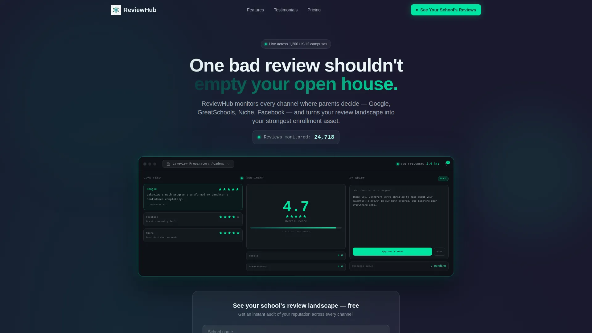
- A hero section with a product screenshot, animated review counter, and primary call-to-action button
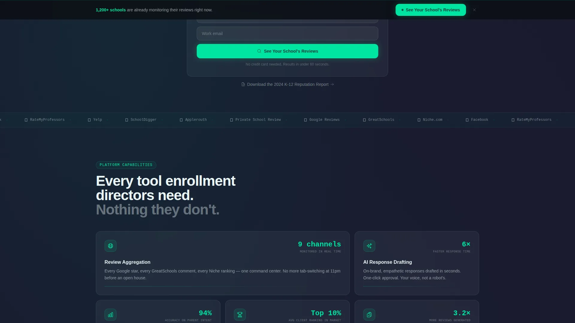
- A modular card grid showcasing platform capabilities with icons, stats, and one-line explanations
- A testimonial carousel, live comparison card, single-step qualifier form, and sticky conversion bar
Feature list
This template ships with a focused set of design and layout features that align directly with the brief. Each one serves a specific conversion or communication goal.
Animated Hero with Product Screenshot
The header centers a detailed dashboard screenshot of a fictional school, "Lakeview Preparatory Academy," showing a live review feed, a climbing sentiment score, and an AI-drafted response awaiting approval. A soft teal glow edges the screenshot to create a backlit device effect that grounds the value proposition immediately.
Modular Capability Card Grid
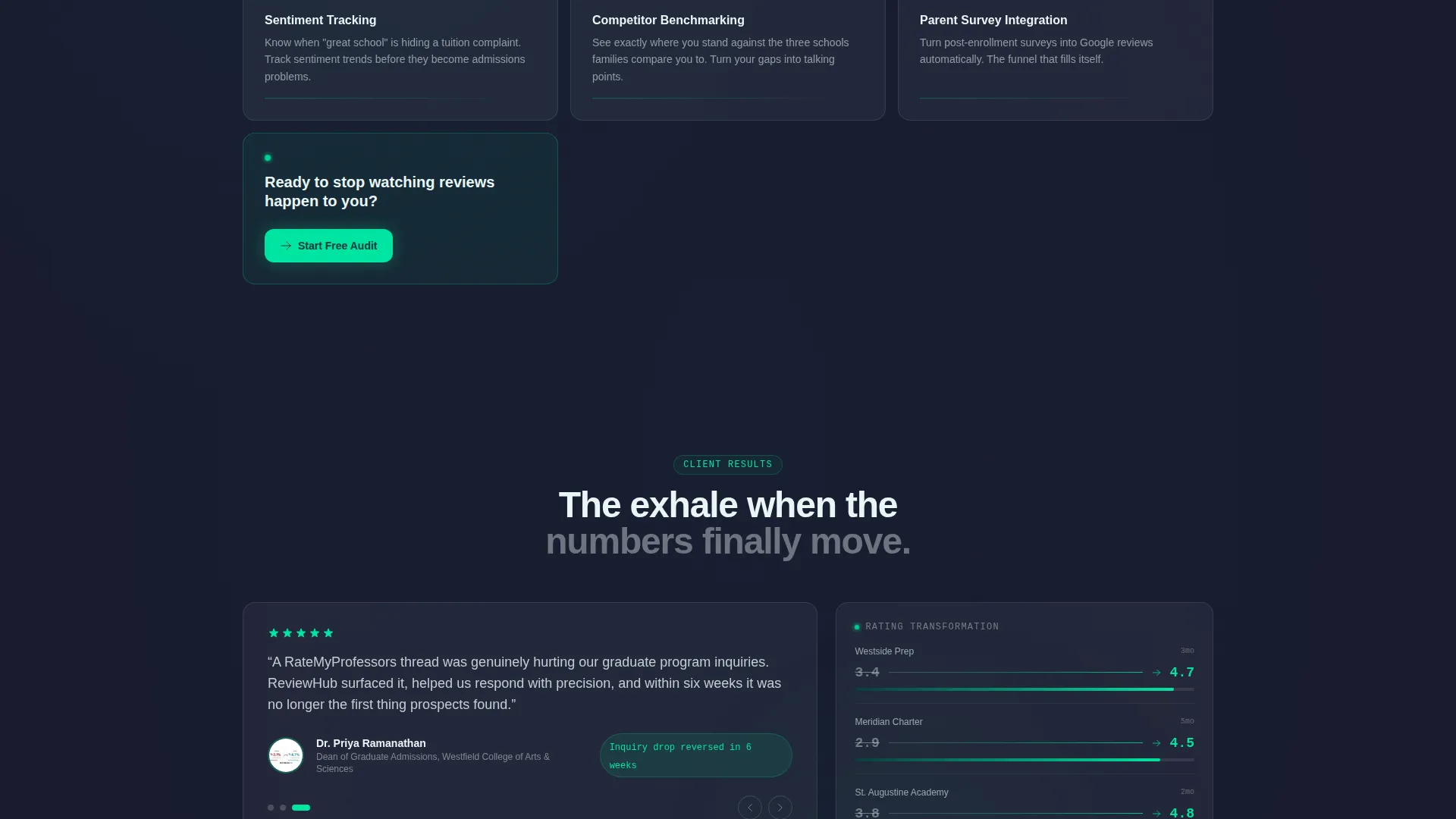
Five capability cards stagger-load with a rise-and-fade animation. Each card is self-contained with an icon, a single statistic such as "Respond 6x faster," and a one-line explanation. The modules cover Review Aggregation, AI Response Drafting, Sentiment Tracking, Competitor Benchmarking, and Parent Survey Integration.
Live Review Counter
An animated counter ticks upward as the page loads, creating immediate visual momentum. This launch-energy mechanic signals platform activity and draws the visitor into the page before a single line of copy is read.
Single-Step Lead Qualifier Form
The primary conversion form asks for school name, role via a dropdown, and email address. Submitting the form triggers an instant audit preview that shows the visitor a teaser of their actual review landscape, converting curiosity into commitment before a sales conversation begins.
Sticky Bottom Conversion Bar
After the third card row, a sticky bottom bar keeps the primary call-to-action, "See Your School's Reviews," visible at all times. This ensures the conversion path is never more than one tap or click away regardless of scroll depth.
Testimonial Carousel and Comparison Card
A testimonial carousel features real role titles such as "Director of Enrollment, Cristo Rey Network." A live before-and-after comparison card shows star-rating improvements, giving prospective buyers social proof and a visual outcome in the same scroll session.
Page sections overview
| Section | Purpose |
|---|---|
| Hero Header | Anchor attention with dashboard screenshot and animated review counter |
| Primary call to action Block | Drive clicks to the lead qualifier form with catalyst green button |
| Capability Card Grid | Present five platform features as self-contained proof points |
| Testimonial Carousel | Build trust with role-specific social proof from education professionals |
| Before/After Comparison | Show tangible star-rating outcomes in a visual side-by-side card |
| Lead Qualifier Form | Capture school name, role, and email with instant audit preview trigger |
| Gated PDF Offer | Provide a secondary conversion path for visitors not ready to submit their school name |
| Sticky call to action Bar | Keep the primary call-to-action visible after the third card row |
| Keynote Closer Card | End the page with a full-width high-energy closing statement |
Design & branding system
The template uses a Tech Glass theme built on the Teal Catalyst color system. Every color and surface decision serves the control-center mood of an education reputation dashboard.
- Deep command-center teal (#0D3B40) and dark interface charcoal (#1A1A2E) form the base layer, creating depth behind frosted card surfaces
- Reactive catalyst green (#00E5A0) fires on hover states, live counters, and all call-to-action buttons to signal action and confirmation
- Frosted glass panel white (#EAF6F6) fills card surfaces at reduced opacity so the dark charcoal bleeds through like depth behind a pane of glass
Mobile & speed optimization
The modular card-grid structure adapts naturally to smaller screens without sacrificing the layered glass aesthetic. Each card is a self-contained unit, which keeps reflow clean and predictable.
- Stagger-load animations are scoped to individual card modules so the page remains responsive as cards enter the viewport
- The sticky bottom conversion bar is built as a fixed-position element, keeping lead capture accessible on both desktop and mobile without interrupting scroll flow
How this template helps you convert
The page is engineered as a lead-generation funnel, not just a feature showcase. Every design and layout decision pushes a qualified visitor closer to submitting their school name or downloading the reputation report.
- The animated review counter and dashboard screenshot create immediate recognition for enrollment professionals, reducing the time needed to establish relevance and trust.
- The single-step qualifier form with an instant audit preview lowers commitment anxiety by giving value before asking for a sales conversation.
Other information about this template
This template is categorized under Technology, specifically within the Education Software and Software as a Service (SaaS) subcategory. It is purpose-built for the education review management niche and reflects a high intersection match between the template style, theme, and landing-page direction.
- The template style is Card Grid (Modular), the theme is Tech Glass, and the creative direction is Launch Energy
- The header concept is Product Screenshot and the landing-page direction is Lead Generation
- The Teal Catalyst color system is exclusive to this template's visual identity and is not a generic palette
Theme
Tech Glass
Creative direction
Launch Energy
Color system
Teal Catalyst
Style
Card Grid (Modular)
Direction
Lead Generation
Page Sections
Animated Hero with Dashboard Screenshot
Modular Capability Card Grid
Animated Live Review Counter
Single-step Lead Qualifier Form
Sticky Bottom Conversion Bar
Testimonial Carousel and Comparison Card
Related questions
Who is the target audience for this template?
Can I customize the dashboard screenshot in the hero section?
What conversion paths does this template include?
Is the card grid layout flexible enough to add or remove capability cards?
What makes this template different from a generic SaaS landing page?



