Bakery Vertical SaaS Professional Website Template
Rise is a bakery CRM landing page template built for wholesale managers, bakery owners, and head bakers who are done with notebooks and spreadsheets. It features a glowing dark comparison table layout that contrasts old tools against Rise across order tracking, invoicing, and production scheduling, driving qualified leads through a focused, momentum-built conversion flow.
by Rocket studio
Quick summary
Rise is a single-page lead generation template for a bakery CRM platform. It uses a dark, electric indigo visual system and a bold comparison table to show bakery operators exactly why their current tools are failing them. The page builds momentum from a glowing hero through metric cards to a coral-accented conversion form, fast, focused, and built to qualify leads.
Who this template is for
This template is designed for bakery businesses that have outgrown informal tools and need a smarter command center. It speaks directly to operators who manage real volume and complexity every week.
- Bakery owners scaling from one storefront to multiple locations who need centralized order visibility
- Wholesale managers handling restaurant accounts and farmers market pre-orders across multiple channels
- Head bakers who need production lists generated from actual sales data, not estimated from memory
What problem this template solves
Running a growing bakery on notebooks and spreadsheets creates gaps that cost time and money. Missed wholesale orders, manual invoicing, and production guesswork stack up fast when the business grows beyond a single counter.
- Wholesale orders fall through the gaps when tracked across disconnected tools
- Production scheduling relies on memory rather than real order data, leading to waste or shortfalls
- Custom cake inquiries and reorder prompts get lost without a single system managing all client touchpoints
What you get with this template
This template gives you a complete, single-page lead generation layout built specifically for a bakery CRM platform pitch. Every section is structured to earn the visitor's trust before asking for their information.
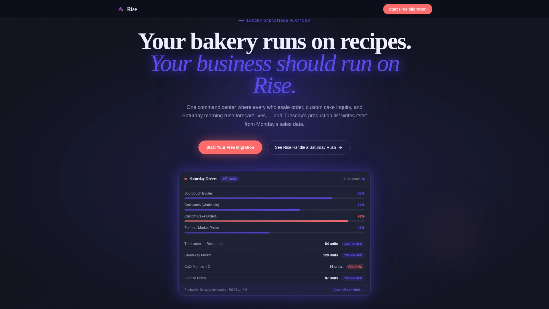
- A full-bleed dark hero with a glowing order dashboard user interface element and a headline designed to stop the scroll
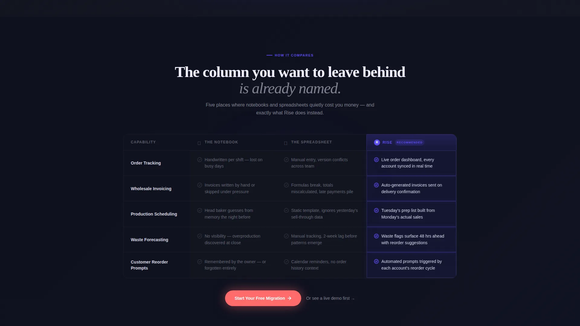
- An animated comparison table contrasting three tools across five operational rows, with scroll-triggered micro-interactions
- Three metric cards, a qualifying lead capture form, and a sticky bottom call-to-action bar that stays visible throughout the page
Feature list
The Rise template is built around one purpose: converting bakery operators into qualified leads by showing them their own pain before offering the solution.
Glowing Hero with Live Dashboard user interface
The header is a full-bleed dark field with a floating order dashboard element showing production status bars in indigo and coral. No stock photography is used. The visual communicates operational scale immediately, with a fade-in headline above the dashboard glow.
Animated Comparison Table
Three columns compare "The Notebook," "The Spreadsheet," and "Rise" across rows covering order tracking, wholesale invoicing, production scheduling, waste forecasting, and customer reorder prompts. Each Rise column cell glows faintly on scroll-enter with micro-interactions that reward reading.
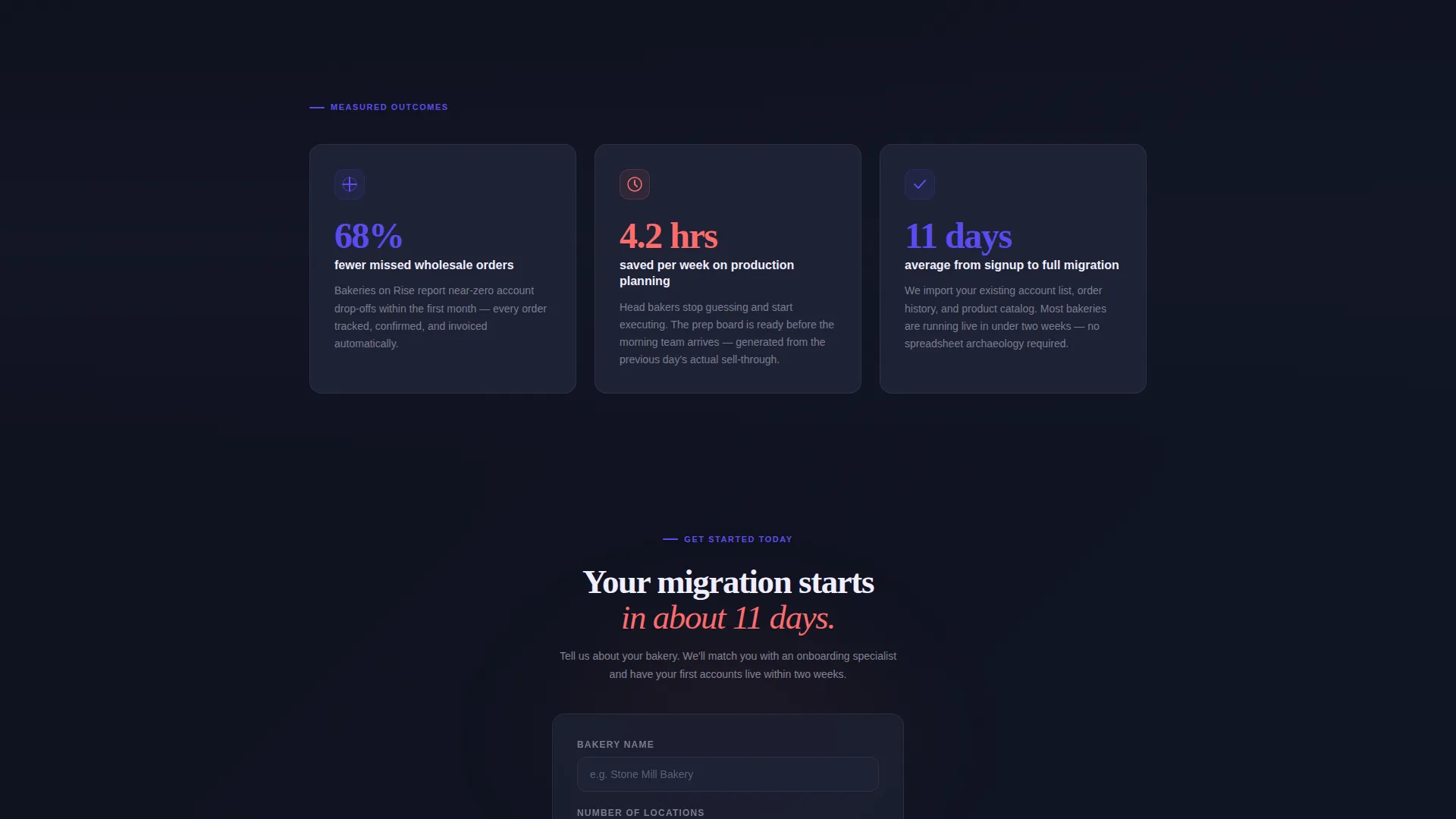
Momentum Metric Cards
Three cards display hard performance numbers pulled from the brief: 68% fewer missed wholesale orders, 4.2 hours saved per week on production planning, and an 11-day average from signup to full migration. These cards are placed immediately after the comparison table to build conversion momentum.
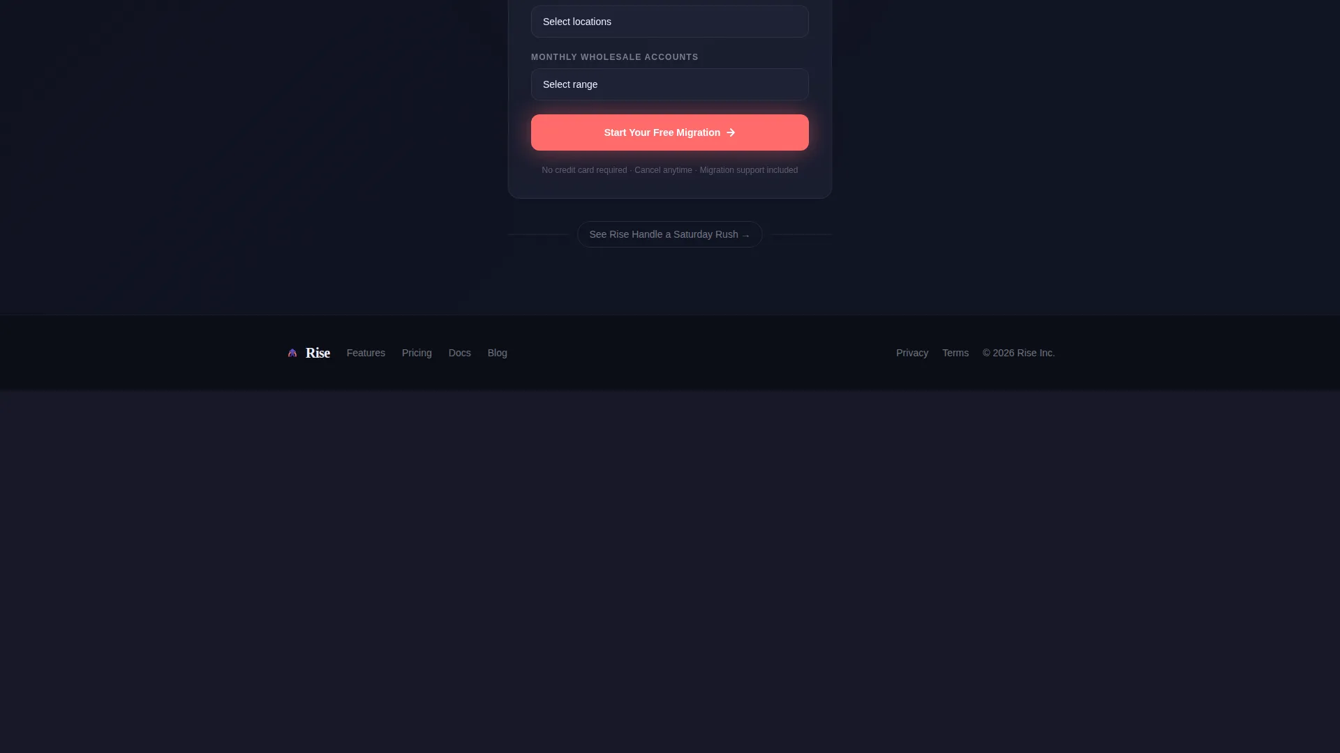
Qualifying Lead Capture Form
The form collects three fields in a deliberate order: bakery name, number of locations, and monthly wholesale accounts. This sequence qualifies the lead without interrogating the visitor, keeping friction low while gathering operationally meaningful data.
Sticky Bottom Conversion Bar
A persistent coral call-to-action bar stays anchored at the bottom of the viewport as the visitor scrolls. It repeats the primary action "Start Your Free Migration" so the conversion path is always one tap or click away.
Secondary Interactive Demo Path
A secondary call to action labeled "See Rise Handle a Saturday Rush" links to an interactive demo. This path serves visitors who want proof before committing to the form, reducing drop-off among high-intent but cautious prospects.
Page sections overview
| Section | Purpose |
|---|---|
| Dark Hero Header | Establish scale with a glowing order dashboard user interface and fade-in headline |
| Comparison Table | Show three-column tool contrast across five operational rows with scroll animations |
| Metric Cards Row | Build conversion momentum with three specific performance figures |
| Lead Capture Form | Qualify prospects with three low-friction fields in a dark-field layout |
| Sticky call to action Bar | Keep the primary conversion action visible throughout the entire scroll |
| Secondary Demo Link | Offer a lower-commitment path to an interactive Saturday rush demo |
Design & branding system
The visual identity follows a Startup Velocity theme built on an Electric Indigo color system. Every color decision is intentional and tied to a functional role on the page.
- Deep void black (#0B0E17) as the page background, cool slate (#1E2235) for card and table row surfaces, and hot white (#F0EEFF) for body text that reads as backlit rather than printed
- Electric indigo (#5B4CF0) for active states, glows, and production status bars, with accent coral (#FF6B6B) reserved for alerts, overdue order indicators, and every primary call-to-action element
Mobile & speed optimization
The layout is designed with a mobile-first scrolling experience in mind. The section-by-section acceleration pattern works naturally on smaller screens where vertical momentum is the primary navigation mode.
- The sticky bottom call-to-action bar is especially effective on mobile, where thumb-reach to a persistent element is faster than scrolling back to a form
- The three-column comparison table is structured to reflow cleanly on narrower viewports, keeping the Rise column prominent without losing the contrast context of the other two columns
How this template helps you convert
The page is engineered so that trust is built before any ask is made. The conversion architecture follows a deliberate sequence that moves visitors from recognition to action.
- The comparison table names the visitor's current pain in the first two columns, making the third column feel like relief rather than a sales pitch
- The metric cards immediately following the table replace abstract claims with specific numbers, so the form that appears next feels like the logical next step rather than an interruption
- The sticky coral call-to-action bar and the secondary demo link give every visitor a conversion path that matches their readiness level, reducing the chance of leaving without engaging
Other information about this template
This template sits at the intersection of vertical SaaS marketing and food and beverage operations technology. It is purpose-built for the bakery CRM platform niche and reflects the operational vocabulary that bakery operators actually use.
- The template style is a comparison table landing page, a format particularly effective for SaaS products competing against non-software incumbents like spreadsheets and notebooks
- The creative direction is Launch Energy, meaning every section is shorter and faster than the one before it, accelerating the visitor toward the conversion point rather than asking them to read at length
- The header concept is Dark Full-Bleed with Glow, a visual approach that signals modern software confidence and sets the tone for the Electric Indigo color system used throughout
Theme
Startup Velocity
Creative direction
Launch Energy
Color system
Electric Indigo
Style
Comparison Table
Direction
Lead Generation
Page Sections
Glowing Hero with Order Dashboard User Interface
Animated Three-column Comparison Table
Performance Metric Cards
Three-field Qualifying Lead Form
Sticky Coral Conversion Bar
Secondary Demo Call to Action
Related questions
Who is the Rise template designed for?
What makes the comparison table effective for this use case?
What fields does the lead capture form collect?
Can the secondary demo link be updated or replaced?
Is this template only suitable for bakery CRM platforms?



