Changelog & Release Notes Reviews Website Template
Roadmap is a dashboard-style feature planning landing page built for product teams who need to show what ships next, and when. It combines swim-lane timelines, a live-data dashboard preview, a sticky comparison grid, and a conversion-focused form into one high-momentum single-page experience styled in deep void black and electric violet.
by Rocket studio
Quick summary
Roadmap is a dynamic feature planning landing page template designed for product-led teams. It pairs a scrolling logo bar with a live dashboard preview, an animated drag-and-drop timeline, and a head-to-head comparison grid. The Void and Violet color system gives every active state a mission-control glow that keeps visitors reading and moving toward the sign-up form.
Who this template is for
This template is built for teams and builders who ship product on a schedule and need stakeholders to trust the plan. It suits anyone presenting a roadmap tool to a technical or investment-aware audience.
- Startup product managers juggling investor commitments against engineering capacity
- Enterprise product leads coordinating multiple squads around a single quarterly theme
- Founding CTOs and technical co-founders who still triage issues late at night
What problem this template solves
Most roadmap tool pages bury the product under marketing language. Visitors arrive, scroll once, and leave without understanding what they would actually get. This template solves the credibility gap by putting a live-looking dashboard front and center and answering the "why switch" question before the visitor has to ask.
- Teams cannot visualize the tool in action without a demo, which slows sign-up decisions
- Comparison shoppers leave when there is no direct side-by-side answer to their current tool
- Product-savvy visitors distrust vague claims and need proof through motion and specificity
What you get with this template
You get a complete single-page layout that moves from social proof to live product preview to structured comparison to a targeted conversion form. Every section is connected by a scroll-driven momentum narrative that builds from stillness to acceleration.
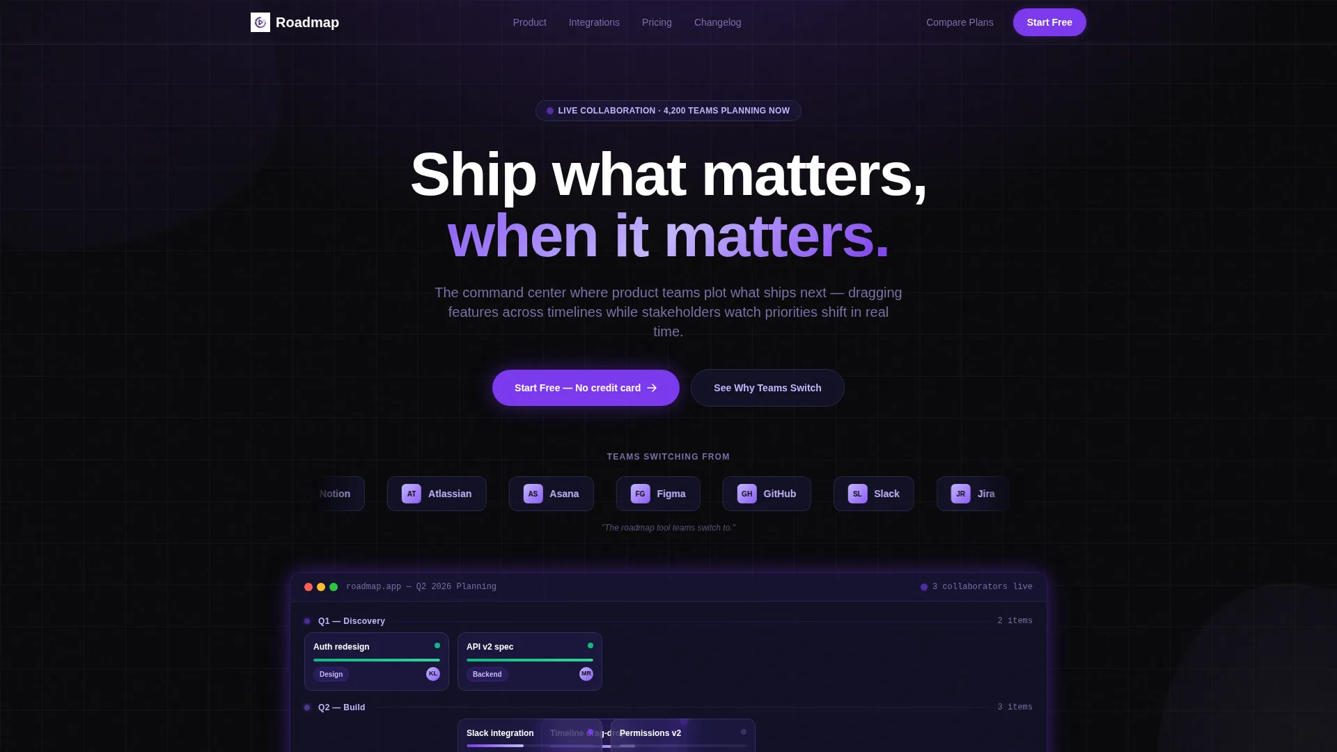
- A scrolling logo bar, animated swim-lane dashboard, and drag-ghost timeline preview in the hero
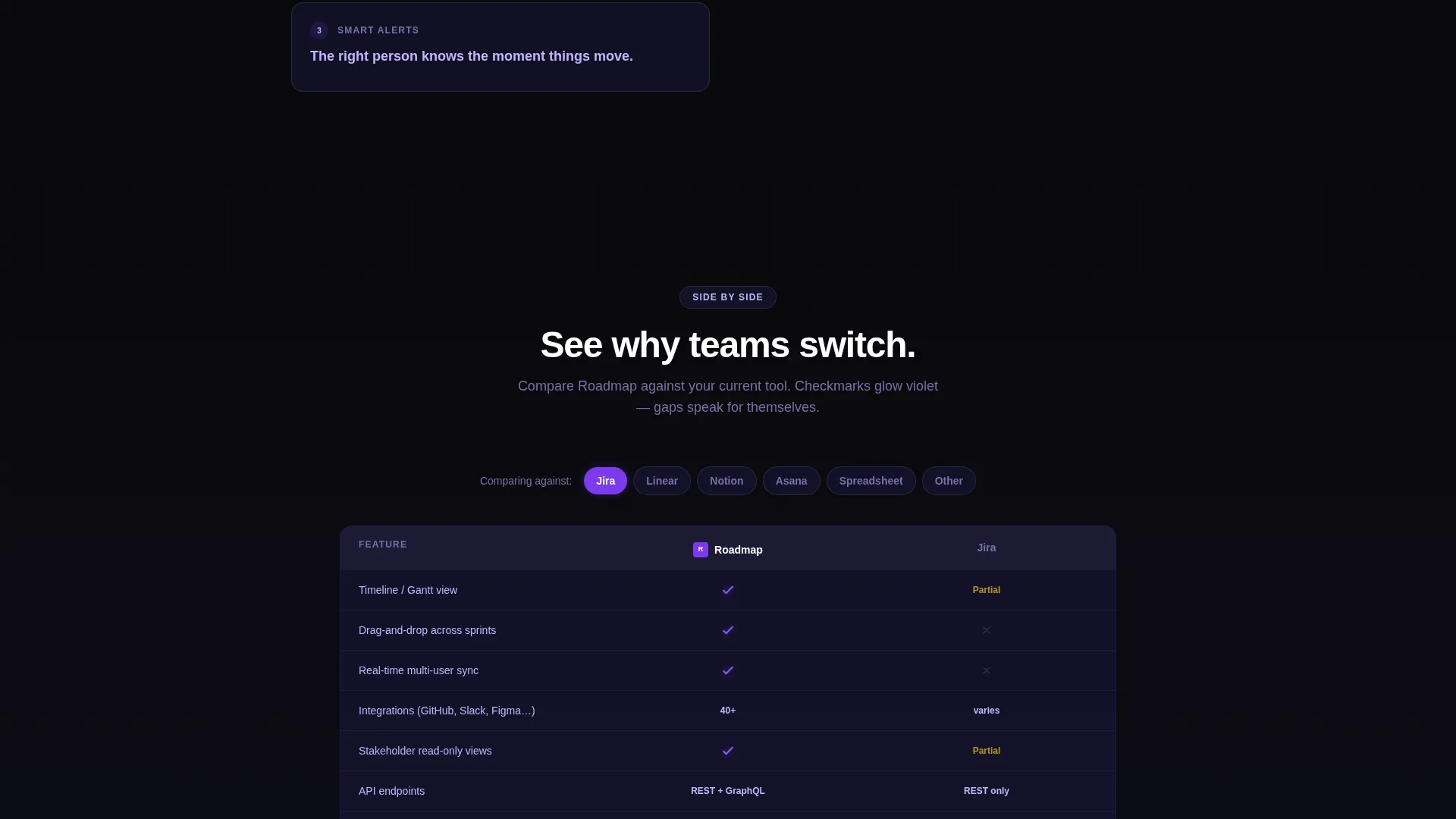
- A sticky two-column comparison grid with togglable rows and glowing violet checkmarks
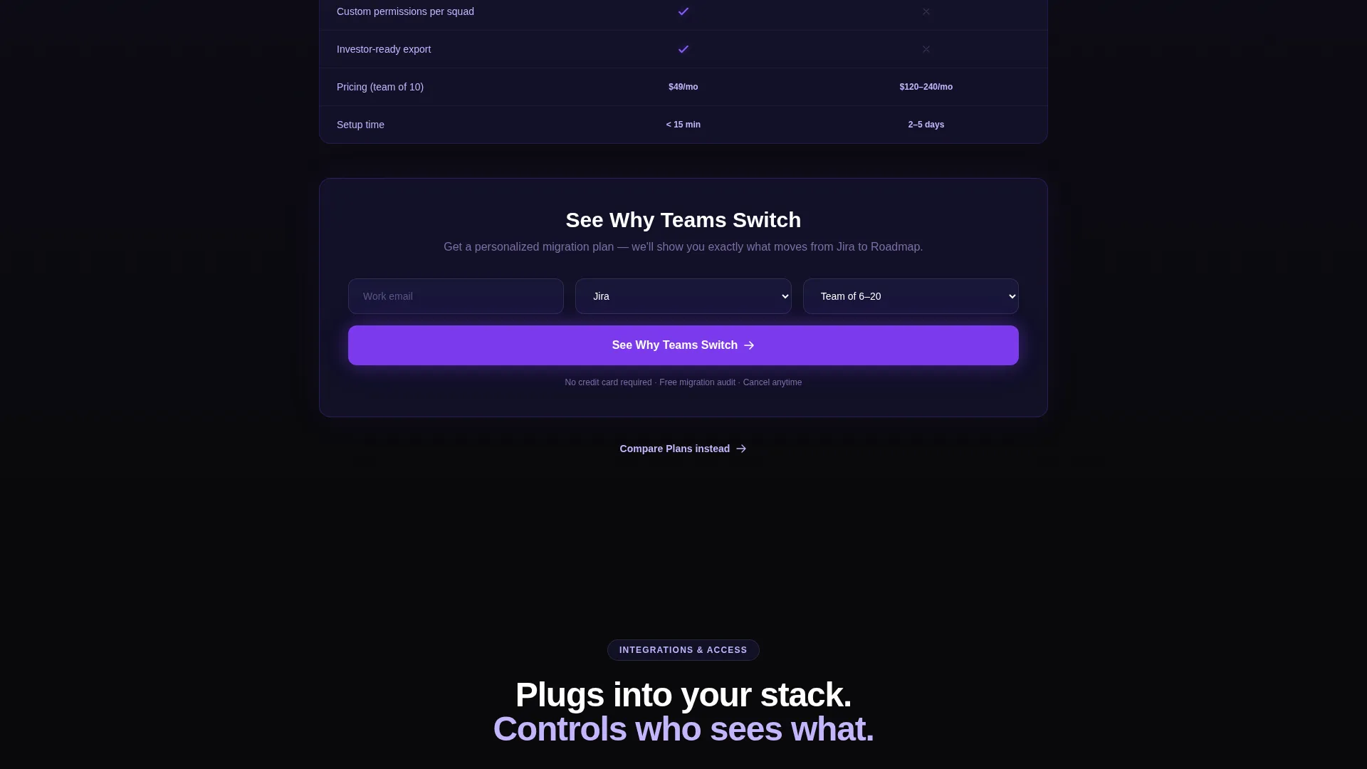
- A short sign-up form with work email, current-tool dropdown, and team-size field
Feature list
This template ships with six purpose-built sections and a set of motion-driven components that work together to move visitors toward conversion.
Scrolling Social Proof Header
A horizontal logo ribbon drifts across the top of the page with a zero-gravity scroll effect. A single confident headline stays fixed above it. The contrast between moving proof and still copy creates immediate authority.
Live Dashboard Hero Preview
A swim-lane timeline fades in below the header and scrubs forward automatically. Feature cards populate the lanes, and drag ghosts appear mid-flight as if a real planner is working. The preview makes the tool feel active before a visitor reads a single feature bullet.
Launch-Energy Scroll Narrative
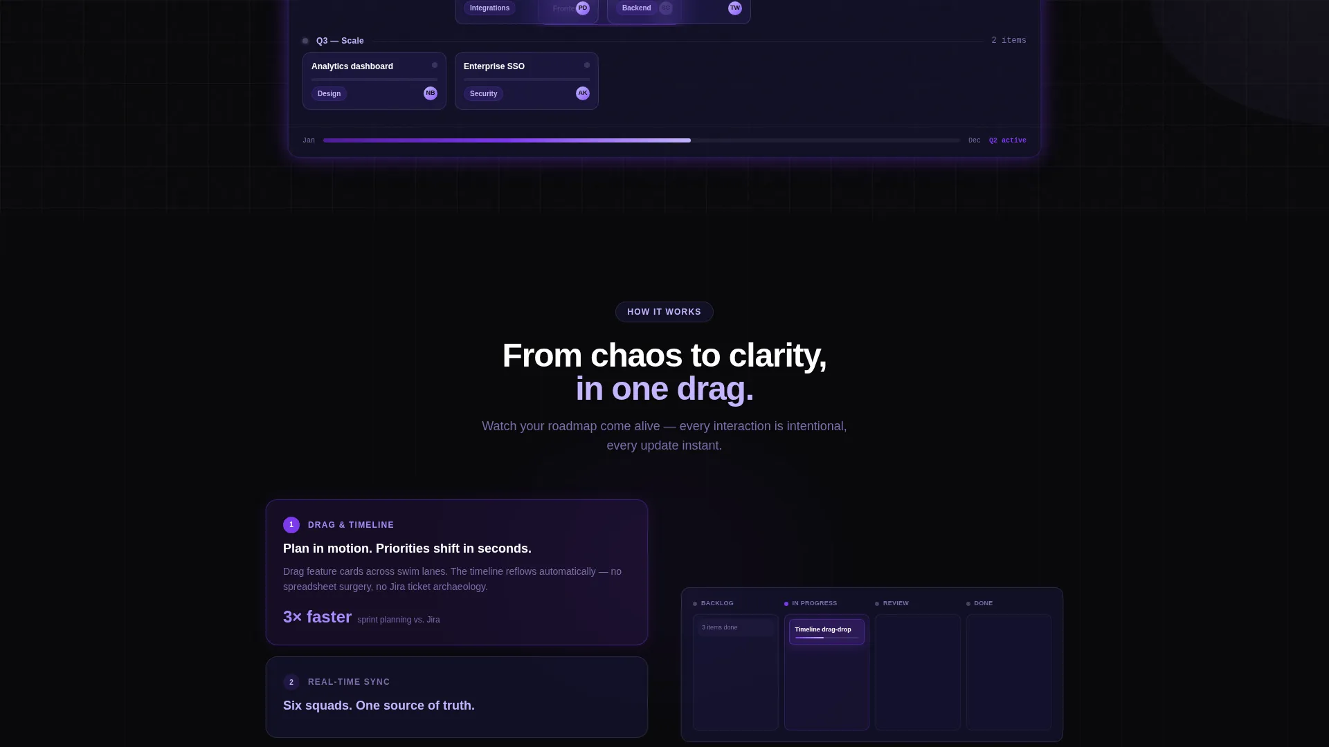
Scroll-triggered animations escalate section by section. A feature card moves from Backlog to In Progress. The timeline reflows. A notification pops. Motion increases as the visitor descends, so the page itself feels like it is building toward liftoff.
Sticky Comparison Grid
A two-column data grid pins this tool against a placeholder labeled "Your Current Tool." Rows cover timeline views, integrations count, real-time collaboration, API endpoints, and pricing tiers. Checkmarks glow in electric violet; missing features show void. The grid stays anchored mid-scroll so visitors can evaluate without losing context.
Dual call to action Architecture
The primary call to action, "See Why Teams Switch," appears both above and below the comparison grid. It links to a short intake form collecting work email, current tool selection from a dropdown, and team size. A secondary "Compare Plans" path serves visitors who are already decided and need budget justification.
Integrations and Analytics Sections
Below the comparison grid, an integrations display and analytics charts with violet trend lines continue the capability escalation. Each section adds evidence without repeating claims already made above it.
Page sections overview
| Section | Purpose |
|---|---|
| Logo Bar Header | Establish social proof and anchor the headline |
| Dashboard Hero Preview | Show the product live before any feature copy |
| Animated Feature Transition | Demonstrate drag-and-drop workflow in motion |
| Integrations Grid | Display ecosystem breadth at a glance |
| Permissions Matrix | Show access-control depth for enterprise buyers |
| Analytics Charts | Provide data-trend evidence with violet visuals |
| Comparison Data Grid | Answer the switch question directly and visually |
| Primary call to action Block | Drive sign-up above and below the comparison |
| Sign-Up Intake Form | Capture email, current tool, and team size |
| Secondary Compare Plans | Serve budget-focused visitors with a softer path |
Design & branding system
The Void and Violet palette is built for dark-environment legibility. Every color choice has a defined role: backgrounds recede, violet concentrates where something is alive or clickable.
- Absolute void black (#09090B) and deep space indigo (#1E1B4B) hold all backgrounds and grid structures
- Electric violet (#7C3AED) pulses across active states, progress bars, checkmarks, and primary buttons
- Spectral lilac (#C4B5FD) carries secondary text, grid lines, and supporting labels at readable contrast
Mobile & speed optimization
The template layout is structured so that the scroll-driven motion narrative adapts to smaller viewports without losing its core impact. The dashboard preview and comparison grid are the most visually complex elements, and both are designed to remain scannable at mobile widths.
- Swim-lane timelines stack vertically on narrow screens so feature cards stay readable
- The sticky comparison grid collapses gracefully so togglable rows remain tappable on touch devices
How this template helps you convert
The page is engineered around a single conversion insight: product-savvy visitors convert when they understand, compare, and believe. Every layout decision supports one of those three stages.
- The hero dashboard preview creates immediate understanding by showing the tool in motion before the visitor reads a word of feature copy.
- The sticky comparison grid handles the compare stage directly, letting visitors toggle rows against their current tool without leaving the page.
- The dual call to action placement and short intake form reduce friction at the belief stage, giving visitors two natural moments to act and a form that asks only what is needed to qualify intent.
Other information about this template
This template sits at the intersection of product documentation and release communication. It is designed for the Feature Roadmap niche within the Documentation and Support category, specifically where changelog and release-note visibility matters to buyers.
- The template style is Dashboard and Data Grid, optimized for data-rich product tools that need visual credibility fast
- The Dynamic Motion theme and Launch Energy creative direction make it well-suited for product-led growth landing pages where momentum drives sign-up behavior
- The Comparison and Versus layout direction is a recognized high-intent pattern for SaaS tools competing against established names like Jira, Linear, Notion, Asana, and spreadsheet-based planning setups
- The header concept, a Logo Bar, is a proven social-proof mechanic that works especially well when the target audience includes enterprise product leads who recognize peer brands on sight
Theme
Dynamic Motion
Creative direction
Launch Energy
Color system
Void & Violet
Style
Dashboard/Data Grid
Direction
Comparison/Versus
Page Sections
Scrolling Logo Bar with Fixed Headline
Live Swim-lane Dashboard Preview
Scroll-driven Launch Energy Narrative
Sticky Comparison Data Grid
Dual Call to Action with Short Intake Form
Integrations Grid and Analytics Charts
Related questions
Can I customize the tools listed in the comparison grid?
What does the sign-up form collect?
Is the scroll animation behavior editable?
Who is this template best suited for?
Does this template work as a single page or a multi-page site?



