Dynamic Travel App Landing Page Template
Roam is a dynamic travel mobile app landing page built on a modular card grid layout. It combines a glassmorphic visual system, animated feature tabs, and stats-first impact sections to turn app visitors into downloads. From business travelers to backpacking couples and family trip planners, this template speaks directly to people who move fast and need clarity fast.
by Rocket studio
Quick summary
Roam is a single-page app download landing page for a travel mobile app. It uses a card grid structure, glassmorphic dark-sky visuals, and a feature tab switcher header to showcase flight tracking, hotel stays, and local exploration. Stats appear before the call to action, so trust is built before the ask is made.
Who this template is for
This template is built for travel app founders, product teams, and startup marketers who need to convert visitors into app downloads quickly. It speaks to real traveler pain points, so it works best when your app genuinely handles itinerary complexity.
- Solo developers or small teams launching a travel mobile app
- Product marketers promoting an itinerary or trip management app
- Travel software companies targeting both consumer and business travelers
What problem this template solves
Managing travel is messy. Gate changes, hotel check-ins, local transit, and destination discovery rarely live in one place. Most app landing pages bury the pitch under generic copy and weak visuals. This template solves that by leading with proof and motion.
- Visitors leave before converting because the value is not clear fast enough
- Generic landing pages fail to match the energy and urgency of real travel
- App download pages often miss the moment to show the product in action
What you get with this template
You get a fully structured, single-page layout designed specifically for an app download goal. Every section is purposeful, and every visual choice reinforces the travel context.
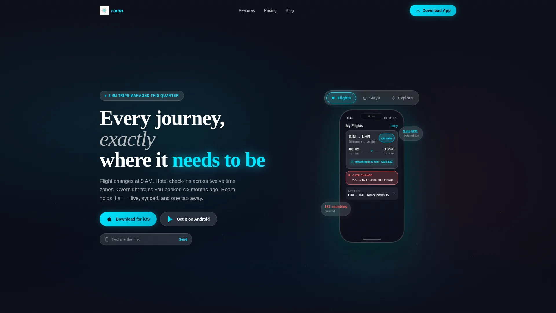
- A feature tab switcher header with an animated phone mockup showing Flights, Stays, and Explore tabs
- A stats-first impact section with live-counting odometer animations and staggered social proof cards
- Dual app store download calls to action, a sticky bottom bar, and a desktop-friendly "Text Me the Link" field
Feature list
This template is built around six core components that work together to move visitors from curiosity to download.
Animated Feature Tab Switcher Header
Three translucent tabs labeled Flights, Stays, and Explore sit above a centered phone mockup. Each tab click triggers a different animated screen inside the mockup. The Flights tab shows a live boarding countdown with a gate-change alert. Stays reveals a hotel card stack with swipeable photos and a check-in QR code. Explore surfaces a city map with coral-pinned restaurants.
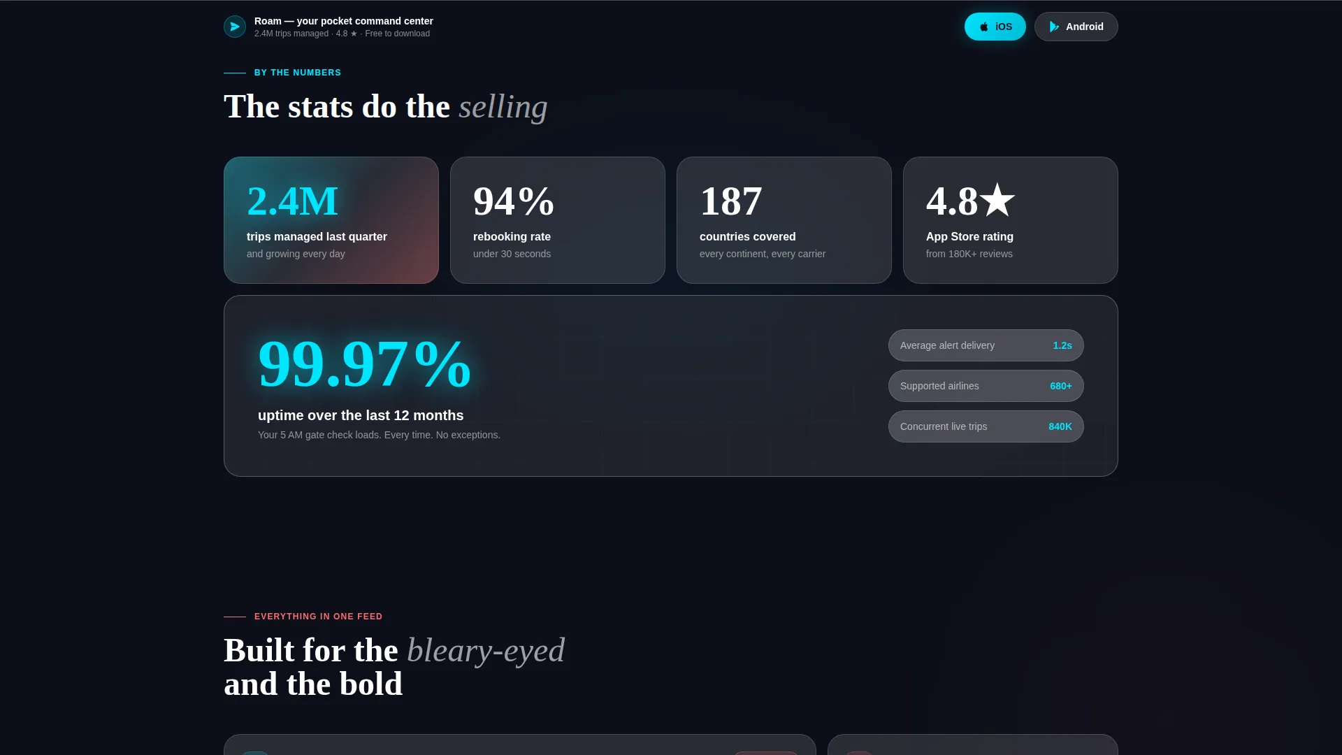
Stats-First Impact Section
The first scroll snap lands on a full-width glass card showing a live-counting odometer animation. Secondary stats fade in staggered left to right. This section does the selling before any direct call to action appears, so by the time visitors reach the download button, the numbers have already built the case.
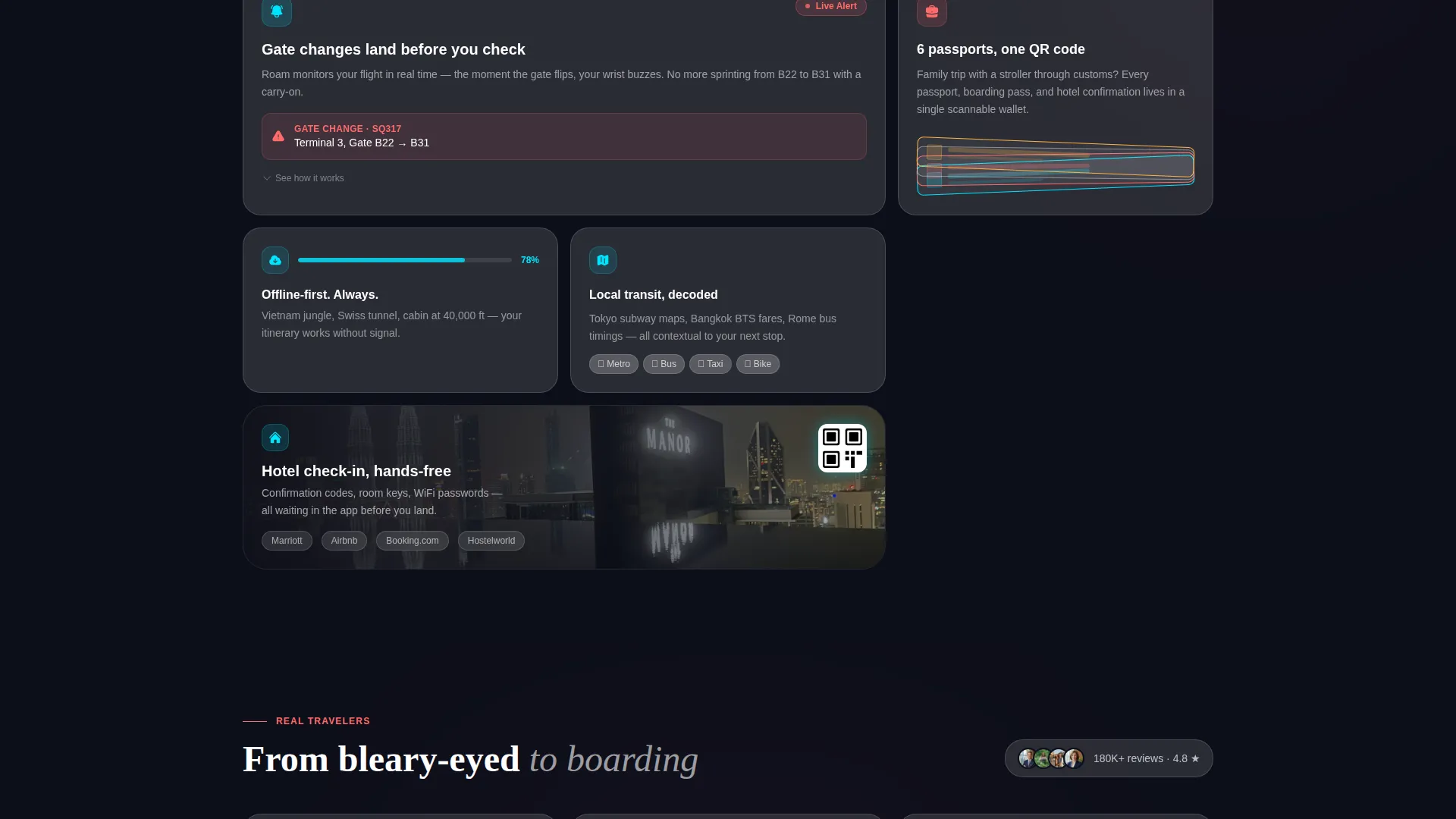
Modular Card Grid Layout
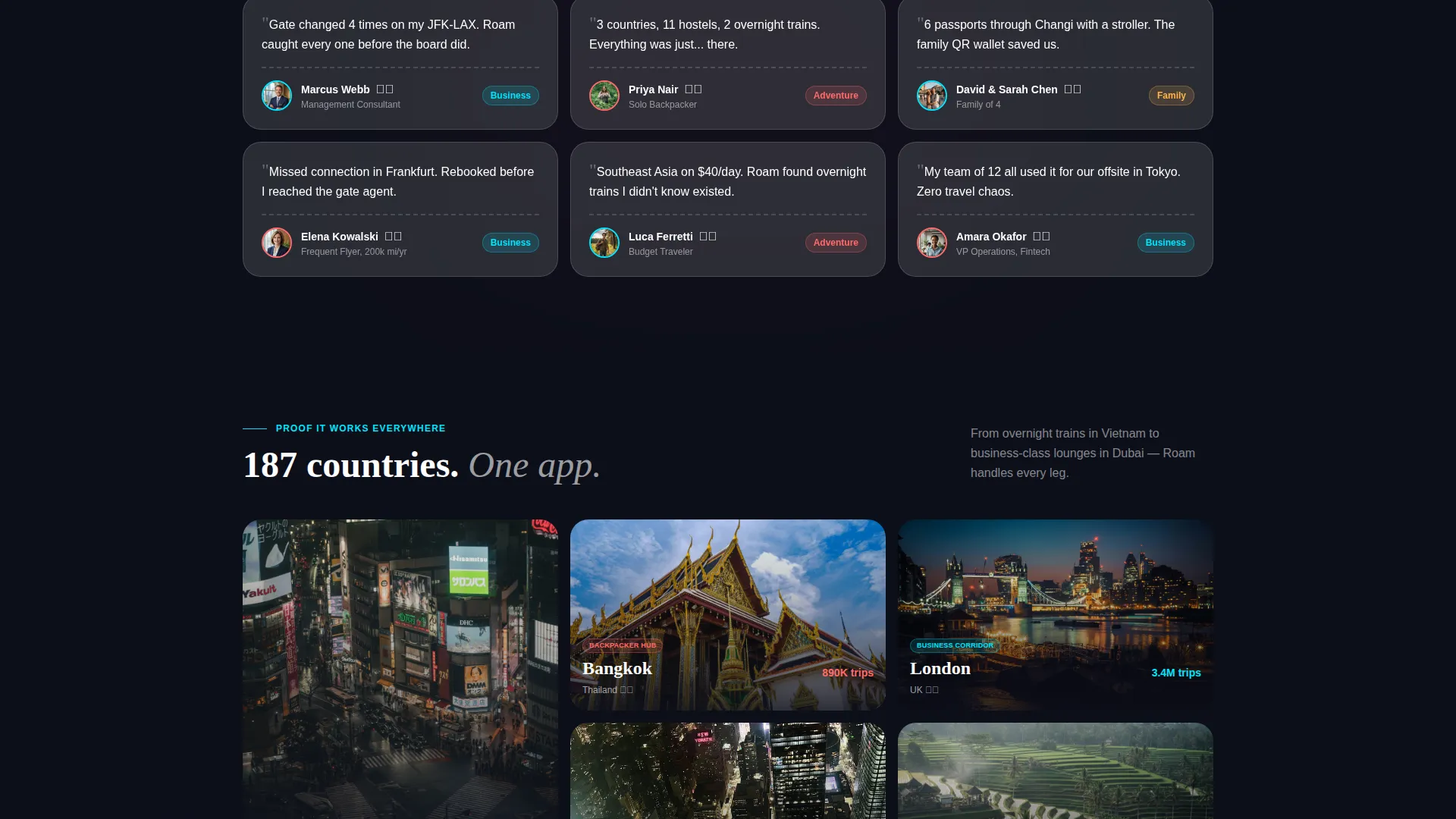
The page is built on a card grid that escalates from numbers to narrative as the visitor scrolls. Rows move from impact stats to social proof cards with traveler quotes and flag emojis, then to feature-deep expandable cards, and finally to editorial-style destination cards.
Glassmorphic Visual System
The design uses layered blur-backed glass cards floating over a subtly animated gradient background. Cards feel suspended in depth. Text sits in clean white. Interactive elements glow cyan on hover, reinforcing the sense that the interface itself is in motion.
Dual call to action and Sticky Download Bar
Platform-native download badges for both iOS and Android appear first in the header beside the phone mockup. After the second scroll, a sticky bottom bar resurfaces those same calls to action. Desktop visitors also see a lightweight "Text Me the Link" option with a single phone-number input field.
Parallax Aerial Background
The phone mockup floats over a slow-moving aerial timelapse of a coastline. Parallax shifting creates a sense of depth, making the device feel suspended between the visitor and the world below. This visual motion reinforces the app's promise without requiring a word of explanation.
Page sections overview
| Section | Purpose |
|---|---|
| Feature Tab Header | Showcases app screens via Flights, Stays, Explore tabs with animated phone mockup |
| Stats Impact Row | Builds immediate trust with odometer-animated travel stats and social proof |
| Social Proof Cards | Reinforces credibility with one-line traveler quotes and flag emoji context |
| Feature Deep Cards | Expands on tap to reveal micro-interactions and detailed capability highlights |
| Destination Editorial Row | Proves global app coverage through editorial-style destination card visuals |
| Sticky Download Bar | Resurfaces dual call to action after second scroll to recapture conversion intent |
Design & branding system
The visual identity follows a Dynamic Motion theme built on a glassmorphic color system. The palette is designed to feel like staring through an airplane window at dusk, with dark sky pressing against translucent reflections and city lights pulsing below.
- Core colors: deep altitude black (#0D0F1A), frosted-glass white at 12% opacity (#FFFFFF1F), neon boarding-pass cyan (#00E5FF), and soft passport-stamp coral (#FF6B6B)
- Text sits in clean white against dark-layered card backgrounds, with cyan hover glows on all interactive elements
- Backgrounds use a subtly animated gradient layered with blur-backed glass cards to create visual depth and motion
Mobile & speed optimization
The template is designed with the mobile traveler context at its center. Because the target user is often on a phone in an airport or a bus, the layout prioritizes clarity and tap-friendly interaction.
- Sticky bottom download bar ensures the app store call to action is always reachable on small screens without scrolling back up
- Card grid rows are modular and stack naturally for narrower viewports, keeping content readable at any screen width
- The "Text Me the Link" desktop field offers a practical handoff path so desktop browsers can convert to mobile installs without friction
How this template helps you convert
Every layout decision in this template is built around moving the visitor toward the download buttons. The structure is intentional and sequential.
- The stats-first impact section leads with proof before the ask, so visitors see "2.4M trips managed last quarter," "94% rebooking rate under 30 seconds," and "187 countries covered" before they ever see a download button
- The animated feature tab header puts the actual app interface in front of visitors immediately, replacing abstract marketing copy with a live-feeling product demo
- The dual call to action system covers three distinct conversion moments: the header, the sticky bottom bar, and the desktop text-link field, so no matter where a visitor pauses, the next step is always visible
Other information about this template
This template is categorized under the Technology vertical, specifically the Travel Software and SaaS subcategory, targeting the travel mobile app niche. It is a strong fit for teams that want a high-motion, visually distinctive presence in a competitive app market.
- The card grid structure makes it straightforward to swap in your own stats, quotes, and destination imagery without restructuring the layout
- The template is designed as a single-page app download flow, not a multi-page site, so all content lives in one scrollable experience
- The Dynamic Motion theme and glassmorphic color system are built to feel premium without requiring custom design work on top of the template
Theme
Dynamic Motion
Creative direction
Stats-First Impact
Color system
Glassmorphic
Style
Card Grid (Modular)
Direction
App Download
Page Sections
Animated Feature Tab Switcher
Stats-first Impact Section
Modular Card Grid Layout
Glassmorphic Color System
Dual Call to Action and Sticky Download Bar
Parallax Aerial Background
Related questions
Who is this landing page template designed for?
Can I change the stats and traveler quotes in the card grid?
What makes the header different from a standard app landing page hero?
Does this template include both iOS and Android download options?
Is this template suitable for a travel app that covers multiple trip types?


