Real Estate Client Management Landing Page Template
Rolodex is a real estate client management landing page template built around a comparison-table layout. It shows visitors exactly how disorganized workflows hold them back, then presents a drag-and-drop pipeline, real-time activity feed, and auto-logged contact history as the clear upgrade. The Electric Indigo color system and dashboard-preview header make the value impossible to miss.
by Rocket studio
Quick summary
Rolodex is a single-page, comparison-table landing page template for a real estate client management platform. It opens with a live-feeling dashboard preview, walks visitors through side-by-side workflow comparisons, and closes with a direct app-download call to action. The Electric Indigo palette and Feature Matrix layout make every section skimmable and persuasive.
Who this template is for
This template is built for real estate professionals who manage multiple active client relationships and need a clear way to present their platform's value. It suits teams that want to turn a cluttered workflow into a single, organized command center.
- Solo agents handling many active buyers across multiple zip codes
- Team leads who need to track which associate last touched a seller lead
- Brokerage operations managers who need pipeline visibility without chasing spreadsheets
What problem this template solves
Real estate professionals lose deals when client information is scattered across phone notes, whiteboards, and Monday morning email roundups. This template makes that pain visible, then resolves it with a structured comparison before the visitor ever reaches the download button.
- Scattered contact notes replaced by auto-logged call records
- Whiteboard deal tracking replaced by a drag-and-drop visual pipeline
- Weekly email check-ins replaced by a real-time team activity feed
What you get with this template
The template delivers a fully structured, single-page layout ready to present a client management platform to any real estate audience. Every section is purposeful, sequenced, and styled for immediate visual impact.
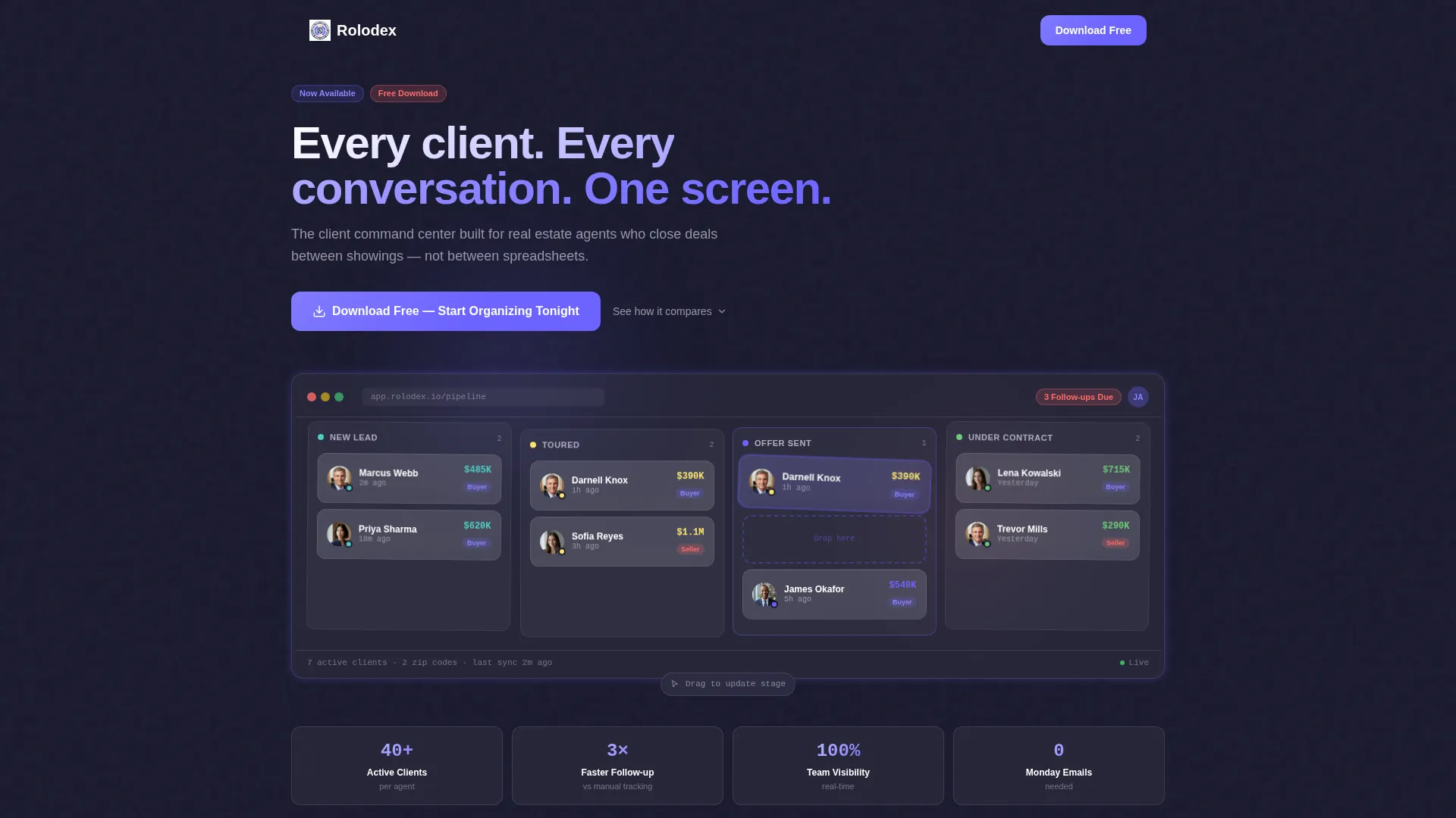
- A full-width dashboard preview header with pipeline stage cards and status indicators
- Three animated comparison tables contrasting old workflows against the platform's approach
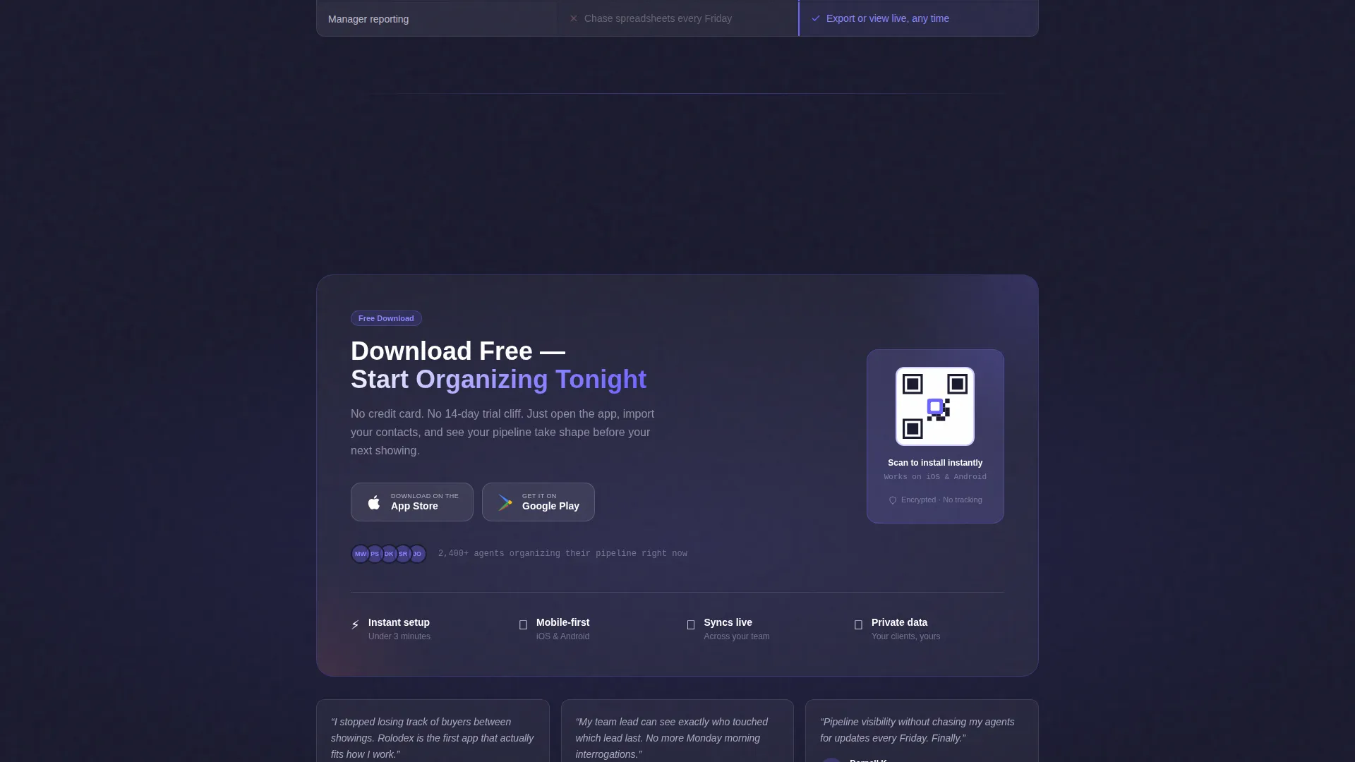
- A primary app-download call to action with App Store and Google Play badges, plus a desktop QR code
Feature list
This template delivers a focused set of design and layout features grounded in the source brief. Each one serves the goal of moving a real estate professional from skeptical visitor to confident downloader.
Full-Width Dashboard Preview Header
The header opens with a pixel-perfect screenshot of the client board showing seven cards across pipeline stages. Each card includes a small avatar, a last-contact timestamp, and a colored status dot. One card appears mid-drag, creating an immediate sense of an active, living tool.
Animated Feature Matrix Tables
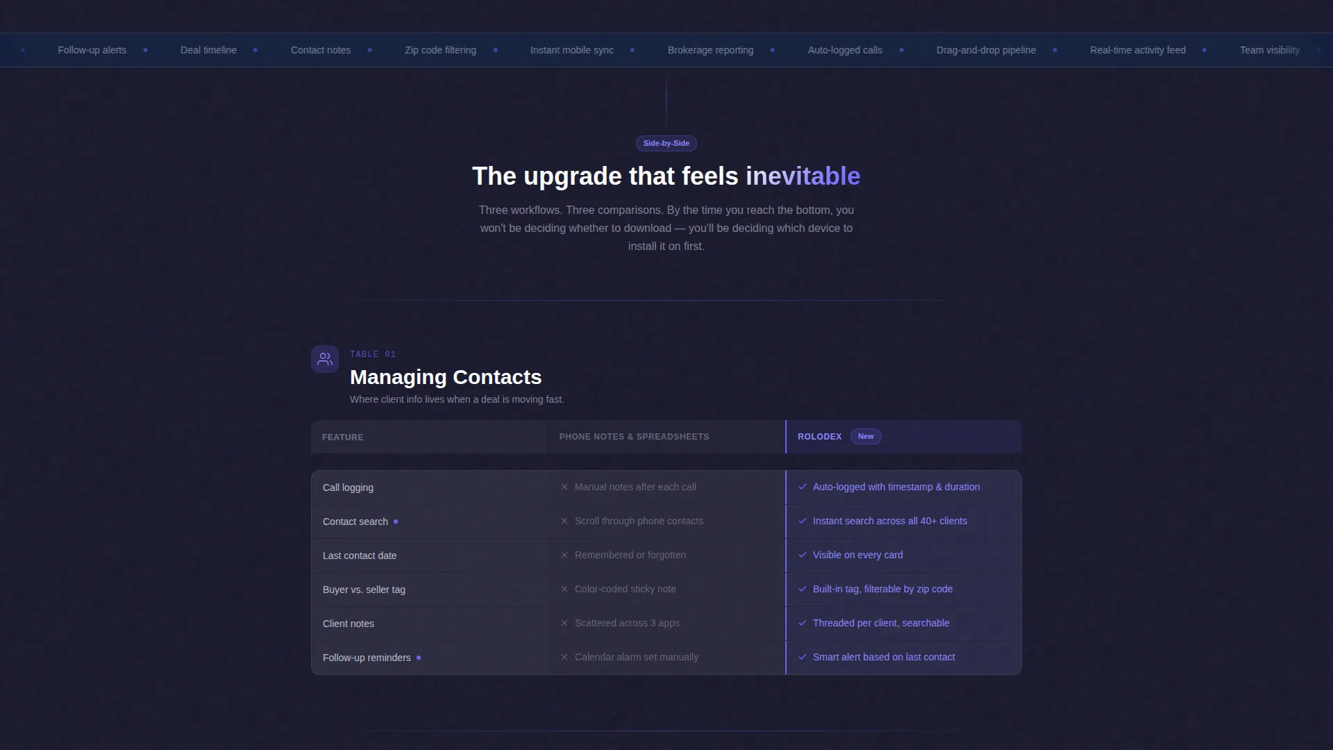
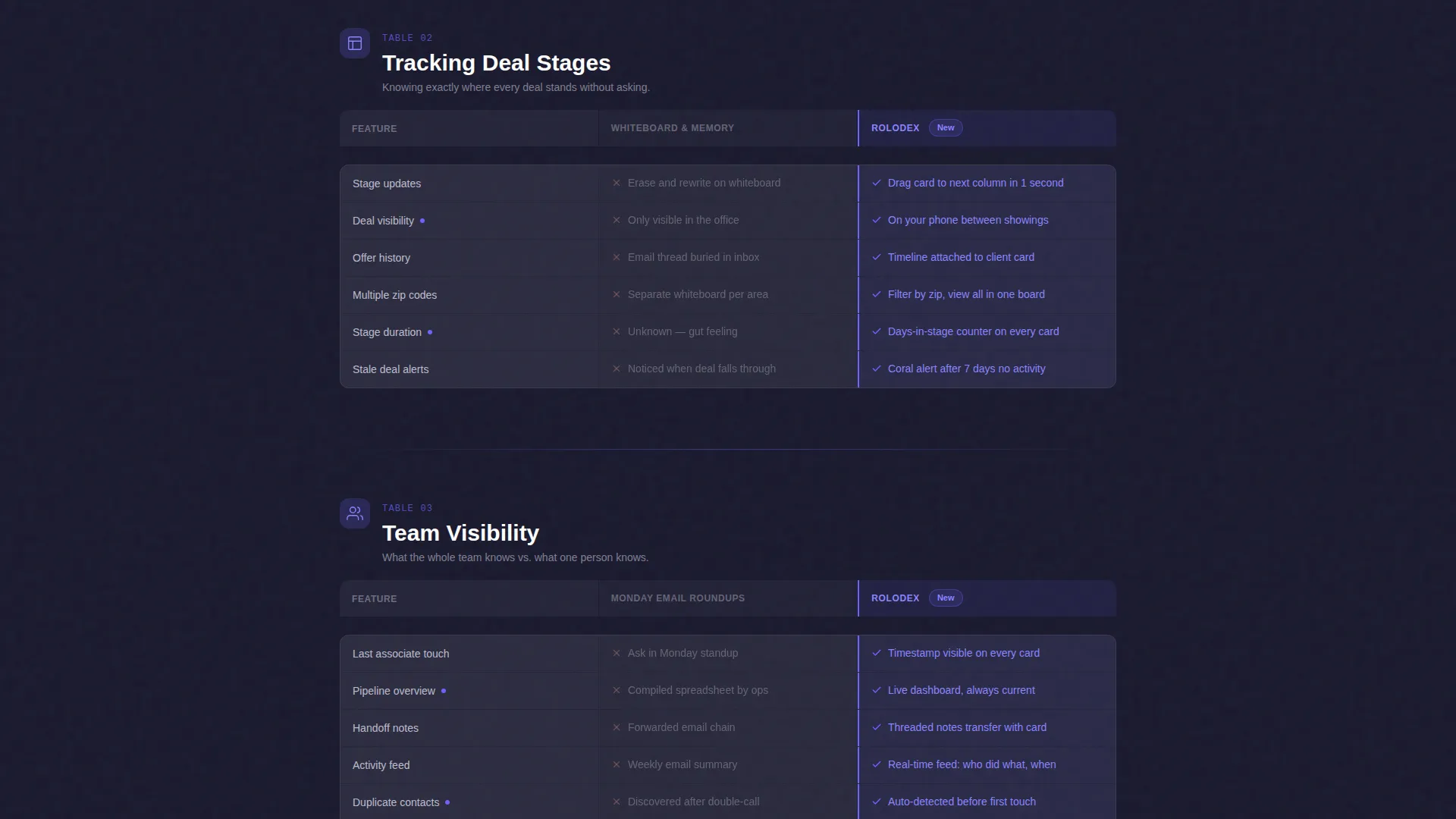
Three side-by-side comparison tables walk visitors through managing contacts, tracking deal stages, and monitoring team activity. The legacy column renders in a desaturated tone while the platform column glows in charged indigo. This visual contrast makes the upgrade feel obvious rather than argued.
Drag-and-Drop Pipeline Visualization
The pipeline section displays client stages visually: New Lead, Toured, Offer Sent, and Under Contract. The layout communicates the platform's core workflow at a glance. No explanation is needed because the structure speaks for itself.
Real-Time Activity Feed Layout
A dedicated comparison row shows the shift from Monday email roundups to a continuous, real-time activity feed. The layout makes team visibility feel immediate and reliable. Solo agents and team leads both recognize the value instantly.
App Download Call-to-Action Block
The primary call to action reads "Download Free - Start Organizing Tonight" and pairs App Store and Google Play badges side by side. A QR code is included for desktop visitors who want to switch to mobile instantly. The block is positioned after the comparison tables, when trust is already earned.
Electric Indigo Color System
Deep dashboard navy, charged indigo, cool slate, signal white, and accent coral work together as a cohesive visual language. Coral highlights notifications and urgent follow-up indicators. The palette reads clearly at a glance while projecting a serious, professional tone.
Page sections overview
| Section | Purpose |
|---|---|
| Dashboard Preview Header | Opens with a client board screenshot and animated headline to establish immediate credibility |
| Contacts Comparison Table | Contrasts phone notes against auto-logged call records to surface workflow pain |
| Deal Stage Comparison | Shows whiteboard tracking versus a drag-and-drop visual pipeline |
| Team Visibility Comparison | Replaces Monday email roundups with a real-time activity feed layout |
| App Download call to action Block | Drives app installs with paired store badges and a desktop QR code |
Design & branding system
The Electric Indigo color system gives this template a sharp, dashboard-native look that feels built for professionals who work on screens all day. Every color choice has a functional role, not just a decorative one.
- Deep dashboard navy (#1A1A2E) as the base, charged indigo (#6C63FF) for primary actions and active pipeline states
- Cool slate (#E2E2F4) for table backgrounds and alternating comparison rows, signal white (#FFFFFF) for card surfaces
- Accent coral (#FF6B6B) reserved for notification indicators and urgent follow-up markers
Mobile & speed optimization
The template is designed with mobile-first real estate users in mind. Agents often review client pipelines between showings, so the layout needs to be readable on a phone screen in a parked car as much as on a desktop monitor.
- Comparison tables scale cleanly for smaller screens without losing the visual contrast between columns
- The QR code block converts desktop visitors to mobile app installs without friction
- Card components with avatars, timestamps, and status dots remain legible at reduced sizes
How this template helps you convert
The Rolodex template is structured so that persuasion builds through the page rather than arriving all at once at the bottom. Each section earns the next one.
- The dashboard preview header establishes credibility immediately by showing a real, active-looking client board before any text makes a claim.
- The three comparison tables systematically surface the exact frustrations the target audience already feels, making the platform's value feel earned rather than sold.
- The app-download call-to-action block arrives only after trust is built, so the visitor is choosing which device to install on rather than whether to install at all.
Other information about this template
This template sits within the Technology category and the Real Estate Software and SaaS subcategory. It is purpose-built for the real estate client management niche and follows a Directory and Discovery theme.
- The template style is a Comparison Table layout, and the creative direction follows a Feature Matrix approach
- The header concept is a Dashboard Preview, and the landing page direction is App Download
- The color system is classified as Electric Indigo, combining deep navy, charged indigo, cool slate, signal white, and accent coral
Theme
Directory & Discovery
Creative direction
Feature Matrix
Color system
Electric Indigo
Style
Comparison Table
Direction
App Download
Page Sections
Full-width Dashboard Preview Header
Animated Feature Matrix Comparison Tables
Drag-and-drop Pipeline Visualization
App Download Call-to-action Block
Electric Indigo Color System
Real-time Activity Feed Layout Section
Related questions
Who is this landing page template designed for?
Can I customize the comparison table content?
Does this template include App Store and Google Play badges?
What makes the Feature Matrix layout effective for driving app downloads?
Is this template suitable for a solo agent or only for larger teams?



