Edtech Landing Page Template for Student Information Systems
Roster is an authoritative edtech landing page template built for student information system providers. It combines a diagnostic quiz starter, a scrollable case study narrative, and a persistent sidebar companion into one conversion-focused layout. The Electric Indigo color system and institutional typography give it the weight and credibility that K-12 and higher education decision-makers expect before they trust a vendor.
by Rocket studio
Quick summary
Roster is a sidebar companion landing page template designed for student information system platforms. It opens with a five-question infrastructure diagnostic, guides visitors through three escalating district case studies, and gates personalized results behind an email field. The layout pairs institutional authority with practical conversion paths, earning trust before asking for any commitment.
Who this template is for
This template is built for edtech vendors and student information system providers who sell to institutional buyers. If your sales cycle involves skeptical administrators who need proof before they act, this layout was designed with that audience in mind.
- K-12 district IT directors managing state reporting deadlines and legacy system sprawl
- University registrars overseeing tens of thousands of student records on outdated software
- Charter school operations leads who still export data manually every week
What problem this template solves
Education technology vendors often struggle to communicate complex product value to busy administrators. A generic product page cannot earn the trust of a registrar who has been burned by three failed software migrations. This template replaces that generic pitch with a structured, evidence-led experience.
- Visitors arrive skeptical and leave without a clear reason to act on most product pages
- Feature lists alone do not convey operational relief to someone drowning in compliance deadlines
- No single conversion path suits buyers at different stages of awareness
What you get with this template
The template delivers a complete, section-led landing page layout with four distinct conversion layers built in. Every section serves a specific purpose in the buyer journey, from initial diagnosis to serious purchase intent.
- A quiz starter header that surfaces real operational pain before introducing the product
- A three-part case study narrative with a persistent left sidebar that tracks scroll progress
- Gated content conversion paths at three different depth points in the scroll
Feature list
This template is built around the following capabilities drawn directly from the source brief.
Diagnostic Quiz Header
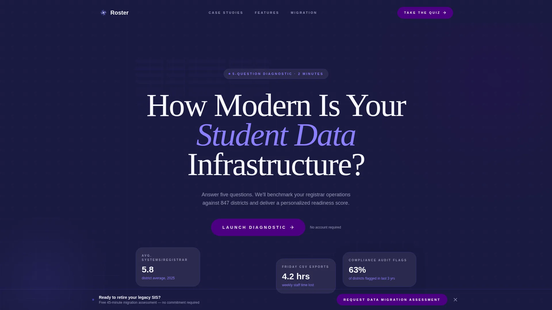
The header section hosts a five-question infrastructure readiness quiz displayed in bold serif type over a faint grid of redacted student records. The quiz feels authoritative rather than playful. Each question mirrors a real operational pain point, such as the number of systems a registrar logs into daily or recent compliance audit flags.
Persistent Sidebar Companion
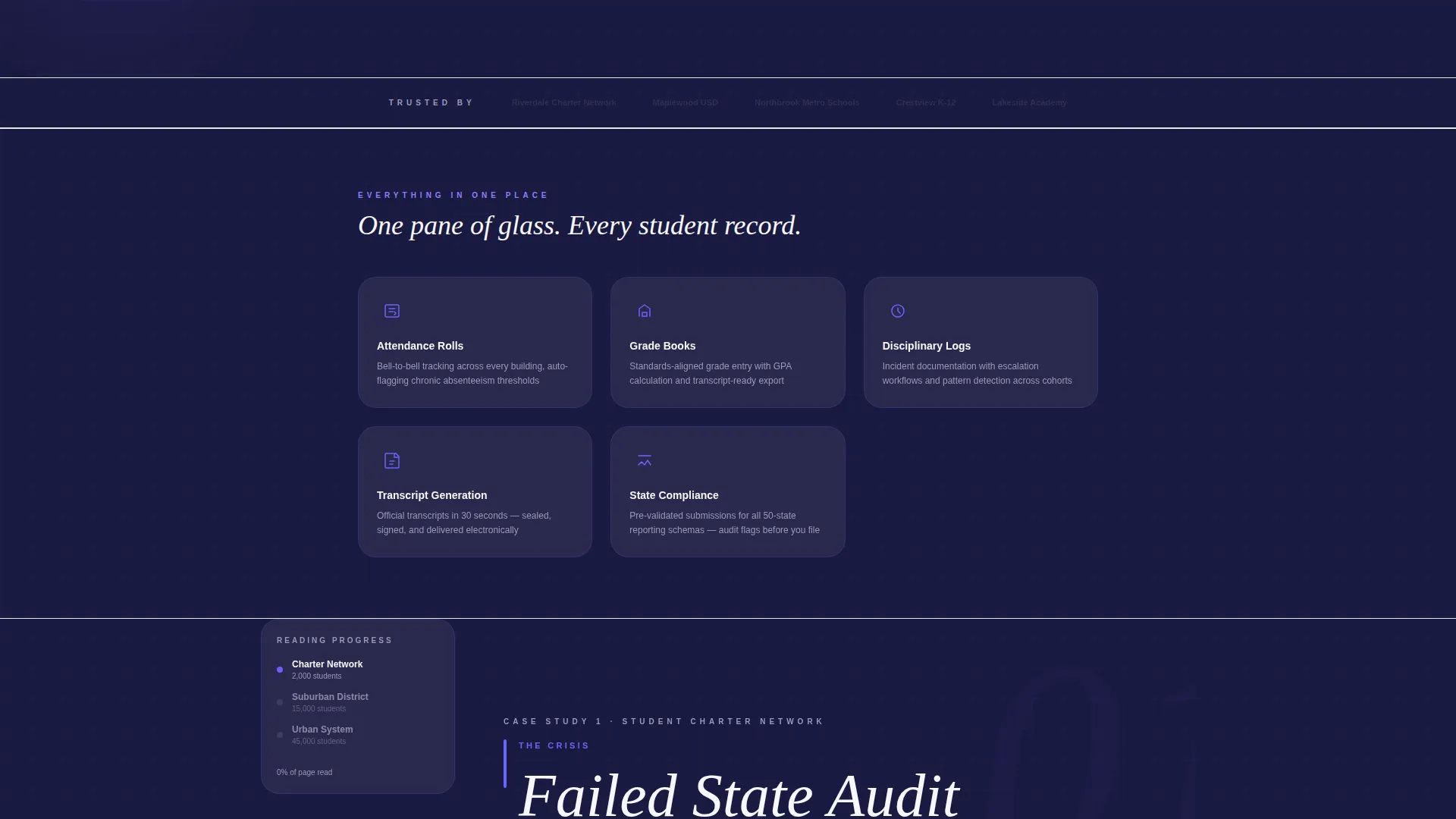
A left-side sidebar persists as visitors scroll through the full page. It tracks reading progress through the case study narrative and surfaces contextual resources at the right moment, including a whitepaper beside the compliance section, a return-on-investment calculator beside the budget discussion, and a recorded webinar beside the analytics story.
Case Study Narrative Flow
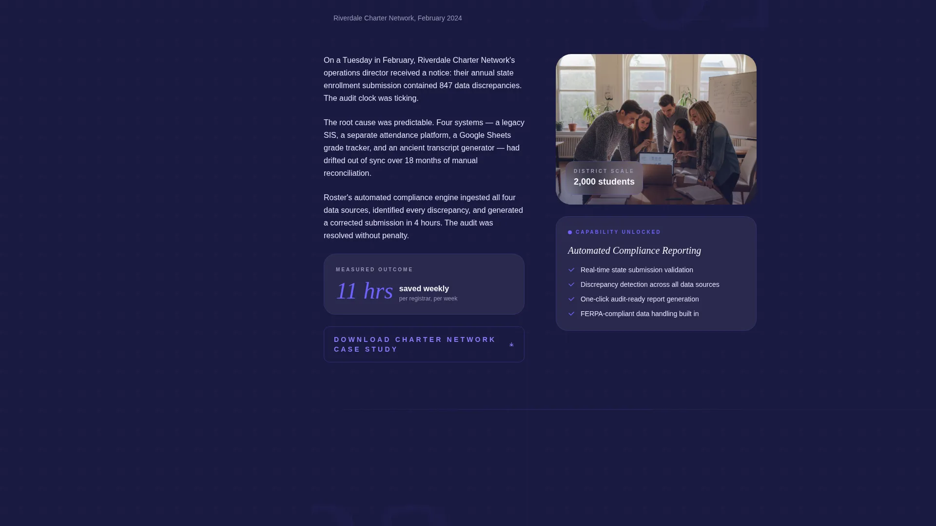
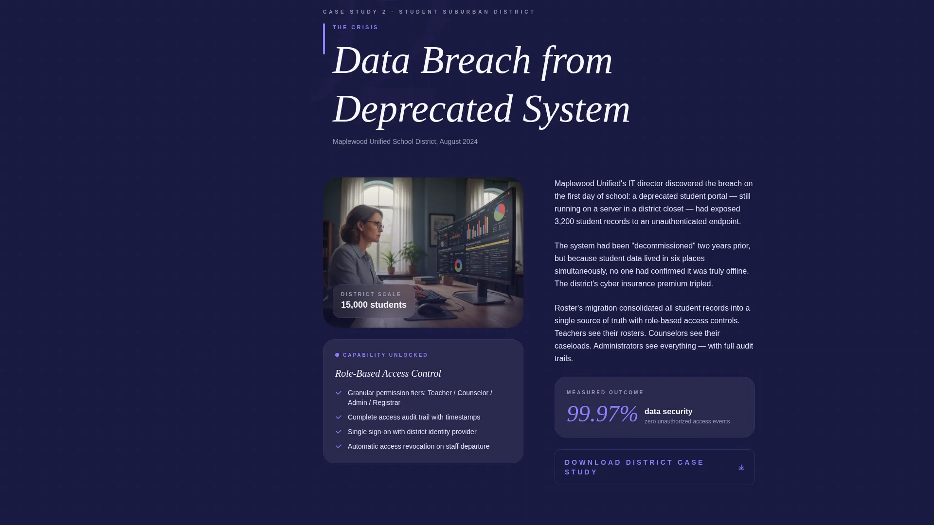
Three district transformation stories unfold in chronological sequence, each opening with a specific institutional crisis. The scale escalates from a 2,000-student charter network to a 15,000-student suburban district to a 45,000-student urban system. Each story introduces a new product capability through narrative rather than a feature specification list.
Gated Results Conversion Path
After the quiz completes, a personalized readiness score is gated behind a single email field. The call to action reads "Get Your Readiness Score" and delivers a benchmarking PDF comparing the visitor's answers against anonymized district averages. The gate appears only after the visitor has already received diagnostic value.
Secondary Sidebar Conversion Paths
Each case study conclusion surfaces a "Download the Full Case Study" button requiring only an institutional email domain. These micro-conversions keep lower-intent visitors engaged without forcing a full sales conversation before they are ready.
Persistent Bottom-Bar Call to Action
A fixed bottom bar carries the offer "Request a Data Migration Assessment" for visitors who have scrolled deep enough to signal serious buying intent. This path targets the most qualified visitors without interrupting the reading experience for everyone else.
Page sections overview
| Section | Purpose |
|---|---|
| Quiz Starter Header | Opens with a five-question infrastructure diagnostic to surface pain |
| Quiz Results Gate | Collects email in exchange for a personalized readiness score PDF |
| Case Study One | Chronicles a charter network crisis and introduces compliance reporting |
| Case Study Two | Covers a suburban district breach and reveals role-based access control |
| Case Study Three | Follows an urban system and demonstrates real-time analytics capability |
| Sidebar Progress Tracker | Tracks scroll depth and surfaces contextual resources beside each story |
| Sidebar Resource Offers | Delivers whitepaper, ROI calculator, and webinar at relevant scroll points |
| Case Study Download calls to action | Offers gated full case studies at the close of each narrative section |
| Persistent Bottom Bar | Surfaces a data migration assessment offer for high-intent visitors |
Design & branding system
The visual identity follows an Institutional Authority theme. The palette feels like a university seal rebuilt by a modern product team, carrying the weight of academic tradition through a clean, backlit screen aesthetic.
- Deep academic navy (#1A1A40) anchors the sidebar and footer with institutional gravitas
- Electric indigo (#4B0082) powers primary buttons and progress indicators as the action color
- Soft chalkboard slate (#3D3D5C) handles secondary text and card borders, while bright transcript white (#F8F7FF) fills content panels and form fields
Mobile & speed optimization
The layout is structured to remain functional and readable across device sizes, with the sidebar companion designed to adapt as screen width changes.
- The persistent sidebar collapses gracefully on smaller screens so narrative content remains the primary focus
- Conversion paths including the bottom bar and gated email fields are sized and spaced for touch interaction
How this template helps you convert
This template earns conversions by proving expertise before asking for anything. The architecture layers three distinct conversion opportunities at increasing levels of commitment.
- The quiz header captures attention and creates diagnostic engagement before any product claim is made, lowering the barrier for visitors who would normally bounce from a traditional product pitch.
- The gated readiness score converts mid-funnel visitors by delivering personalized value, using benchmarked PDF results to reward the email exchange with something immediately useful.
- The persistent bottom bar targets deep-scroll visitors with a high-intent offer, so the most qualified buyers always have a direct path to requesting a data migration assessment.
Other information about this template
This template sits at the intersection of the Education and Training category and the EdTech and Learning Platform subcategory, with a niche focus on student information systems. It is built as a sidebar companion layout, which differs from a standard single-column landing page by maintaining a persistent contextual panel throughout the scroll experience.
- The template style is classified as a Sidebar Companion under the Content and Resource landing page direction
- The creative direction is Case Study Narrative, meaning the product reveals itself through institutional stories rather than a feature grid
- The Intersection Match Score for this template is 13, reflecting strong alignment between the chosen theme, color system, and conversion goal
Theme
Institutional Authority
Creative direction
Case Study Narrative
Color system
Electric Indigo
Style
Sidebar Companion
Direction
Content/Resource
Page Sections
Diagnostic Quiz Header Section
Persistent Scrolling Sidebar
Three-part Case Study Narrative
Gated Readiness Score Delivery
High-intent Bottom Bar Offer
Related questions
Who is the primary audience for this template?
What makes the quiz header different from a standard hero section?
How does the sidebar companion work during the case study scroll?
Can this template support multiple conversion goals at once?
Is this template suitable for a platform with multiple product capabilities?



