Software & SaaS Comparison Website Template
The Roster Automated Member Tracking Landing Page Template is a card grid layout built for B2B SaaS membership management platforms. It uses a dark glassmorphic visual system, an animated code-to-card hero, an interactive bento grid, and a scroll-triggered comparison table to help operations teams understand and trust the platform before signing up.
by Rocket studio
Quick summary
This roster automated member tracking landing page template gives membership management platforms a high-converting, interactive single-page layout. It opens with a live code terminal animation, flows through a modular card grid, and anchors on a twelve-dimension comparison table. Every section is designed to reduce doubt, build trust, and move operations managers toward action.
Who this template is for
This template is built for teams that need to convince busy, skeptical operations professionals. It speaks directly to the people responsible for keeping member records accurate and current.
- Association directors and nonprofit coordinators who spend working hours manually chasing expired memberships and lapsed renewals each week.
- Coworking space managers who juggle tier upgrades, shift times, and month-end billing across a growing member base.
- Technical evaluators and project managers who want to verify API access and infrastructure before committing to new software.
What problem this template solves
Most membership platforms look like every other SaaS landing page. They list features without proving value. This template solves the trust gap by showing the product working, not just describing it.
- Operations teams can not easily identify where manual processes fail until they see a direct before-and-after comparison. This template delivers exactly that with scroll-animated contrast.
- Visitors who manage a staff roster or member directory need to keep track of renewals, shift times, and tier details across many employees. Generic pages do not speak to that daily reality.
- Technical buyers want to see actual API calls before they explore further. The animated code terminal gives them a credible first impression in under four seconds.
What you get with this template
You get a fully structured single-page layout with interactive modules, dark glassmorphic styling, and conversion-focused sections built to a specific brief. Every component is prompt-backed and purpose-driven.
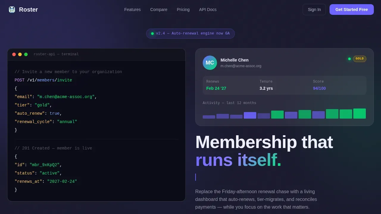
- A hero section with a syntax-highlighted code terminal that transforms into a live member card, followed by a typewriter tagline.
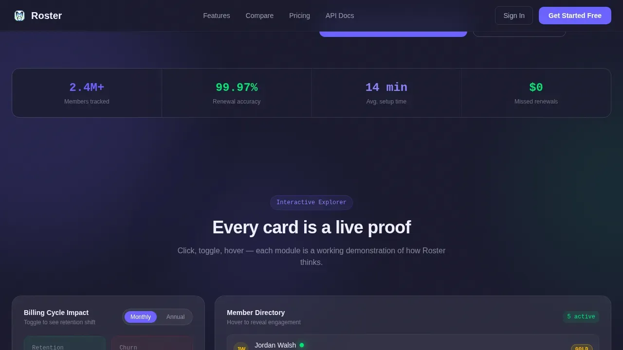
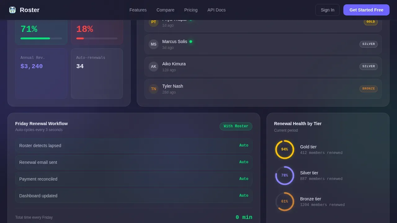
- An interactive bento grid with a billing toggle, a hoverable member directory, and a before-and-after workflow animation.
- A twelve-dimension comparison table with scroll-triggered checkmarks, a gap analysis quiz, and a secondary path to API documentation.
Feature list
This template includes six core design and interaction systems, each built to serve a distinct role in the conversion flow.
Animated Code Terminal Hero
The header opens with a real POST /members/invite API call that types itself line by line against a deep charcoal background. The response object then blooms into a full member card showing an avatar, tier badge, renewal date, and activity sparkline. The entire sequence completes in under four seconds, proving the platform is both developer-friendly and human-readable at a glance.
Interactive Bento Grid Modules
Each card in the modular grid is a clickable, manipulable station. A billing toggle lets visitors watch retention metrics shift between monthly and annual plan views in real time. A miniature member directory reveals engagement scores on hover. A side-by-side animation contrasts the before-roster and after-roster workflows so visitors can track progress through the comparison without reading a wall of text.
Scroll-Triggered Comparison Table
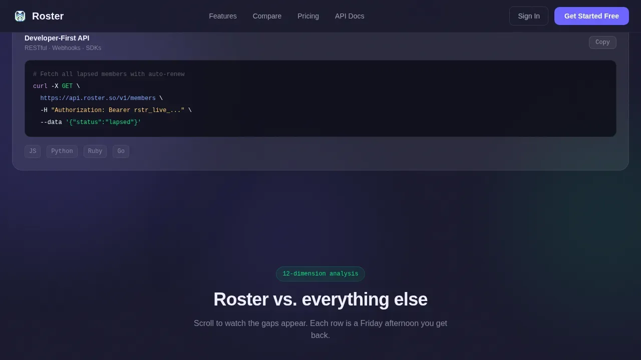
A persistent two-column comparison table anchors the middle of the page. It pits the platform against spreadsheets, legacy customer relationship management systems, and manual invoicing across twelve specific dimensions. Each row animates a checkmark or a gap indicator as the visitor scrolls into it, building cumulative evidence and helping managers prioritize tasks that the platform solves automatically.
Gap Analysis Quiz and Dual call to action
The primary call to action is a three-dropdown quiz: current tool, member count range, and biggest frustration. Keeping the form to three essential fields reduces friction significantly. The quiz generates a personalized gap analysis. A secondary path labeled "Explore the API Docs" serves technical evaluators who need to review infrastructure details before they commit.
Glassmorphic Card Grid Layout
Cards sit on layered glass planes with translucent frosted white surfaces at twelve percent opacity over blur. Subtle border luminance at eight percent white creates depth without relying on heavy shadows. Each module appears to hover above the next like stacked transparencies, giving the entire layout a control-room aesthetic that feels organized and data-driven.
Social Proof Section
Role-specific testimonial cards and specific metrics, such as total members managed and hours saved per week, are presented in glassmorphic card panels. This section uses social proof to build trust with association directors and nonprofit coordinators who need reassurance from peers in similar positions before they move forward.
Page sections overview
| Section | Purpose |
|---|---|
| Hero Code Terminal | Animate API call into member card with typewriter tagline |
| Interactive Bento Grid | Billing toggle, directory hover, before-and-after workflow |
| Comparison Table | Twelve-dimension scroll-animated Roster versus alternatives |
| Social Proof Panel | Metrics and role-specific testimonial cards |
| call to action Quiz and API Path | Gap analysis quiz and secondary API documentation link |
| Footer | Minimal dark-theme footer pattern |
Design & branding system
The visual identity follows a Dashboard Pro theme with a glassmorphic color system. Every color and type choice is designed to feel like a control room at 2 a.m.: dark surfaces, glowing data points, and everything backlit and floating.
- Color palette: deep workspace charcoal (
#1A1A2E) for surfaces, soft iris accent (#6C63FF) for interactive states and progress rings, and signal green (#00E676) for active-member indicators and success confirmations. - Typography: DM Sans handles headers and body copy for clarity and warmth, while JetBrains Mono carries all code snippets and data labels for authentic technical credibility.
- Cards use translucent frosted white at twelve percent opacity with an eight percent white border glow, creating layered depth without traditional drop shadows.
Mobile & speed optimization
The template is built desktop-first for operations managers working at a desk, with full mobile responsiveness included. Interactive elements and the glassmorphic card grid adapt gracefully to smaller viewports.
- GPU-accelerated transforms power the terminal animation, scroll-triggered checkmarks, and card interactions, keeping motion smooth without layout jank.
- Intersection Observer controls all scroll-triggered reveals, so elements animate only when they enter the viewport rather than loading all at once.
- Mobile layouts feature large, thumb-friendly call-to-action buttons and a simplified card stack so all the information remains accessible on any screen size.
How this template helps you convert
This template is structured to guide different buyer types toward conversion through proof, not persuasion. Every interactive station is a small demonstration that the product thinks the way an operations manager thinks.
- The hero animation establishes technical credibility immediately. Visitors who might otherwise bounce stay engaged because they see the platform working before they read a single feature bullet.
- The interactive bento grid lets visitors self-discover value. Toggling billing views and hovering over member directories makes abstract features feel concrete and real, which builds confidence faster than static screenshots.
- The comparison table and gap analysis quiz create a personalized case for switching. By the time a visitor completes the three-dropdown form, they have already identified their own pain points and seen Roster address each one row by row.
Other information about this template
This template is designed for teams that have outgrown basic spreadsheet-based roster management. It works especially well for organizations that currently rely on a free spreadsheet template or a free employee schedule template and are ready to move to an automated platform. Teams using Microsoft Excel for staff roster tracking will recognize the column and row logic built into the comparison table, making the gap obvious without any explanation needed.
- The roster templates in this collection are built to keep track of employee information across daily, weekly, and monthly scheduling cycles. Roster templates can include fields for shift details, availability, working hours, and payroll data so human resources teams have all the information they need in one place.
- A staff roster template in this system gives managers a structured way to organize employee shifts, define responsibilities, and calculate payroll without switching between separate tools. The staff roster updates automatically, so status reports and status updates reflect the current state of the team without manual entry.
- This template supports organizations that need to monitor progress toward project goals, maintain status reports for stakeholders, and keep track of upcoming tasks. It gives project managers and human resources leads a clear plan for managing timelines, responsibilities, and resources across a specific period.
- Other templates in static formats such as a basic Excel spreadsheet require manual effort to print, recalculate, and redistribute each time period something changes. This template replaces that process with a living dashboard that updates itself, so teams can focus on work rather than administration.
- The roster landing page template can also serve as a great tool for demonstrating the platform to potential clients. Its interactive design makes it easy to download, customize, and deploy for specific needs across hospitality, nonprofit, and coworking industries. Teams can explore the full layout and adapt columns, date fields, and scheduling logic to match their organization's specific needs.
- Maintaining visibility across a growing member base is one of the hardest parts of running an association or coworking space. This template uses a clear visual strategy to help managers prioritize tasks, identify gaps in coverage, and lead their teams with accurate information at every stage of the membership lifecycle.
Theme
Dashboard Pro
Creative direction
Interactive Explorer
Color system
Glassmorphic
Style
Card Grid (Modular)
Direction
Comparison/Versus
Page Sections
Animated Code-to-card Hero Section
Interactive Bento Grid with Live Toggles
Twelve-dimension Scroll-animated Comparison Table
Gap Analysis Quiz with Dual Call to Action Paths
Glassmorphic Card Grid Layout System
Role-specific Social Proof Section
Related questions
Who is this landing page template designed for?
What sections are included in the template?
Can the template support different scheduling and roster use cases?
Does this template include a lead capture form?
What visual style and typography does this template use?



