Staffing & Recruiting Digital Presence Portfolio Website Template
Roster is a dark-theme, dashboard-style landing page template built for staffing agencies and talent acquisition teams. It presents a real-time scheduling interface through a Problem→Solution comparison grid, an interactive efficiency assessment, and a live feature showcase. The design uses deep graphite, holographic lilac, and spectral teal to turn a complex scheduling pitch into a clear, compelling story.
by Rocket studio
Quick summary
Roster is a single-page landing page template designed for staffing and recruiting scheduling tools. It leads with a product screenshot hero, walks visitors through a scroll-animated problem-versus-solution comparison, and closes with an interactive efficiency assessment. The "2am control room" aesthetic makes complex scheduling data feel immediate and actionable.
Who this template is for
This template is built for B2B software teams in the staffing and recruiting space. It works best when your product solves a real operational pain around booking, shift matching, or calendar coordination.
- Regional staffing coordinators managing 40 or more open requisitions across multiple time zones
- Agency owners who lose placements because recruiters double-book client interviews
- Talent acquisition leads at mid-market firms who still reconcile schedules in a spreadsheet every Monday
What problem this template solves
Staffing and recruiting tools often struggle to communicate urgency on a landing page. Visitors see a generic product pitch and leave before they understand the cost of their current workflow.
- No clear before-and-after structure that connects pain to product value
- No mechanism to make a visitor's own inefficiency feel quantifiable and personal
- No visual language that matches the fast-paced, high-stakes nature of placement-driven work
What you get with this template
You get a fully structured, single-page layout that builds a case from first scroll to final call to action. Every section is purpose-built for a scheduling or booking product in the staffing space.
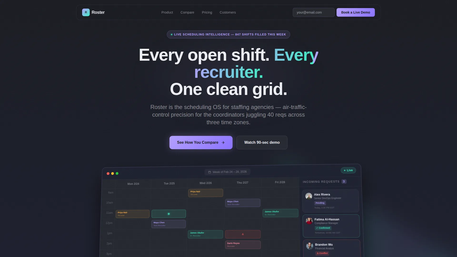
- A hero section with an angled product screenshot, iridescent halo, and floating booking cards
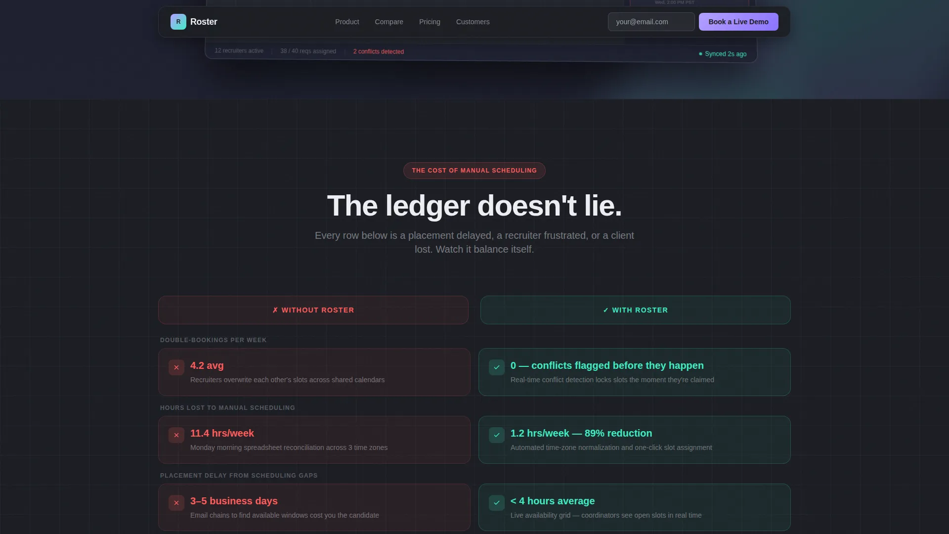
- A scroll-animated Problem→Solution comparison grid with red pain cards and teal resolved metrics
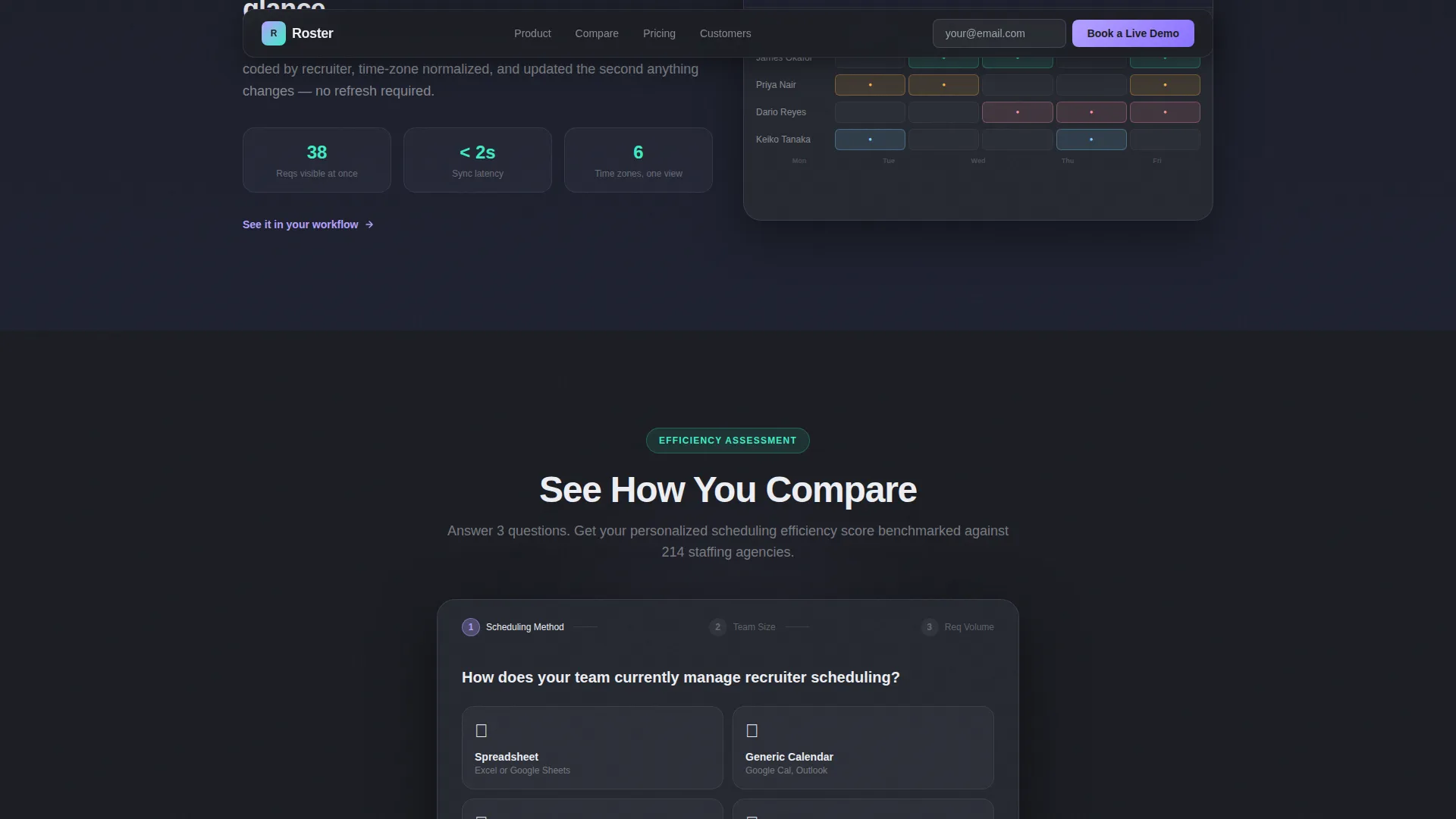
- A multi-step interactive efficiency assessment that delivers a personalized score against benchmarks
Feature list
This template is built around high-interactivity components and a deliberate narrative arc. Each feature below is directly drawn from the template structure.
Angled Product Screenshot Hero
The hero section displays a full-width, pixel-perfect dashboard screenshot positioned at a slight angle on a deep graphite canvas. A soft iridescent halo bleeds from behind the monitor frame. Floating booking cards and a pulsing confirmed-interview indicator sit beside the screenshot to signal live product activity.
Problem→Solution Comparison Grid
Below the fold, a side-by-side grid presents "Without Roster" pain metrics as red-flagged data cards on the left. The right column mirrors each point with a resolved metric rendered in spectral teal. Each row animates on scroll, creating a ledger-balancing effect that builds the product case progressively.
Live Dashboard Feature Showcase
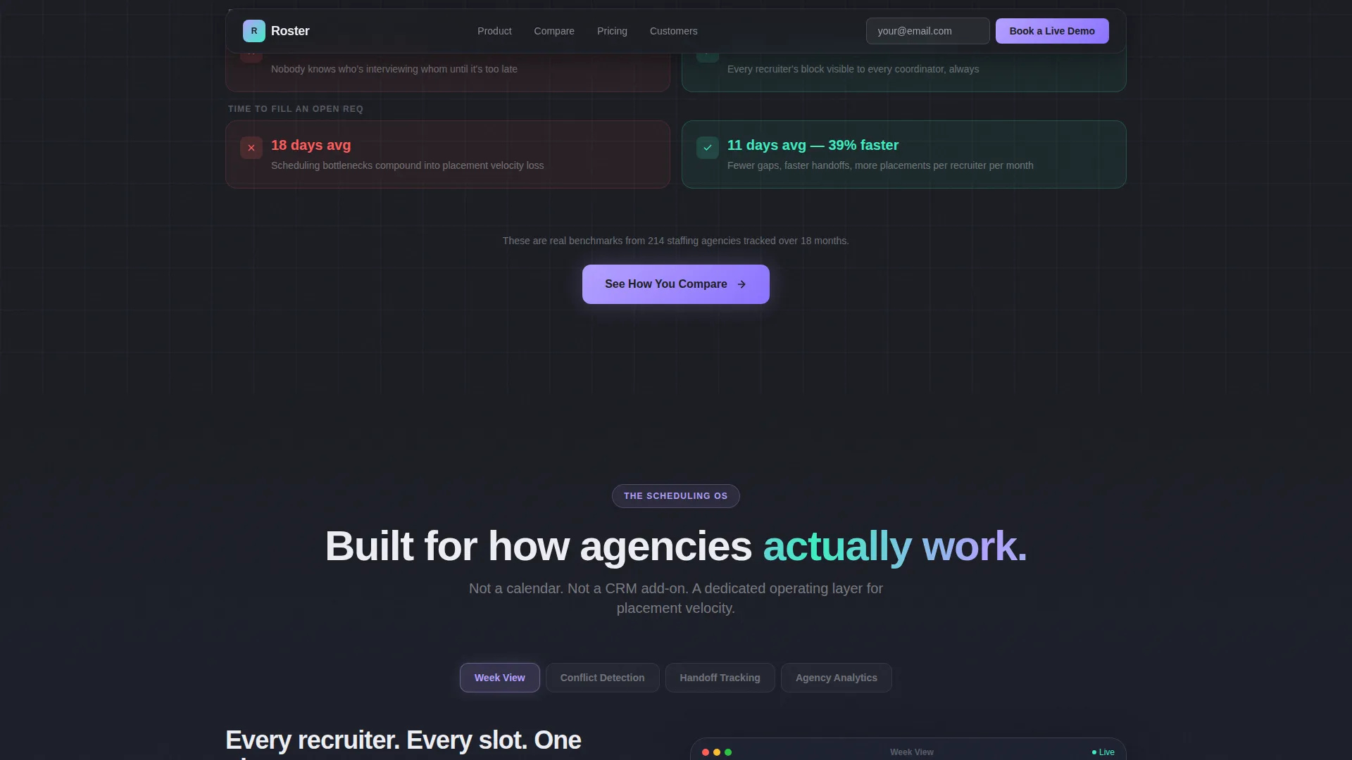
Four functional tabs let visitors explore the product in context: Week View, Conflict Detection, Handoff Tracking, and Analytics. Each tab reveals a distinct dashboard view, layering the value proposition from individual scheduling clarity to team-wide visibility to agency-level reporting.
Interactive Efficiency Assessment
A multi-step modal lets visitors select their current scheduling method (spreadsheet, generic calendar, or a competitor tool) and their team size. They then receive a personalized efficiency score compared against Roster benchmarks. The assessment makes inefficiency feel concrete before any contact details are requested.
Sticky Navigation with Email Capture
A persistent navigation bar carries a "Book a Live Demo" secondary call to action with a single-field email capture. The sticky placement keeps a conversion point visible throughout the entire scroll journey without interrupting the narrative flow.
Role-Specific Social Proof Section
A dedicated testimonials section features staffing coordinators identified by role tag, paired with specific placement velocity metrics and agency logos. This grounds the product claims in real operational outcomes rather than generic praise.
Page sections overview
| Section | Purpose |
|---|---|
| Hero Dashboard View | Establish product credibility with an angled screenshot and iridescent visual treatment |
| Problem Comparison Grid | Contrast scheduling pain metrics with resolved outcomes row by row |
| Feature Tab Showcase | Let visitors explore Week View, Conflict Detection, Handoff Tracking, and Analytics |
| Efficiency Assessment Modal | Deliver a personalized score that quantifies the visitor's current scheduling gap |
| Social Proof Strip | Reinforce claims with role-tagged testimonials and placement velocity numbers |
| Single-Row Footer | Close with a clean, dark-theme linear footer row |
Design & branding system
The visual identity follows a Directory and Discovery theme built on an AI Iridescent color system. The palette is designed to feel like a screen refracting light through a prism at 2am: futuristic but never cold, with every accent color earning its glow by signaling something actionable.
- Deep graphite (#1B1D23) as the primary background, holographic lilac (#B4A0FF) for active states and hover glows, spectral teal (#3EEDC4) on confirmation badges and success metrics, and soft pearl (#EDEEF3) for card surfaces and data rows
- Typography uses Plus Jakarta Sans with bold, tracking-tight headings and medium-weight body text throughout
- GSAP ScrollTrigger powers the comparison row animations, iridescent glow pulses, and section reveal sequencing
Mobile & speed optimization
The template is built desktop-first, reflecting the work environment of its primary audience: staffing coordinators who operate from a desk. Responsive mobile layouts are included so the page remains functional across all screen sizes.
- Static sections use server components to keep initial load lean, while interactive elements like the assessment modal and animated comparison grid run as client components
- High-animation sections including the comparison grid and dashboard tabs are scoped to client-side rendering to avoid blocking the initial page paint
How this template helps you convert
The conversion strategy is built around making a visitor's inefficiency feel real and personal before asking for anything in return.
- The primary call to action, "See How You Compare," triggers the multi-step assessment. Visitors choose their current scheduling method and team size, then receive a benchmark score. This turns abstract product claims into a number tied to their own workflow.
- The sticky "Book a Live Demo" call to action with a single-field email capture stays visible throughout the full scroll journey, keeping a low-friction conversion path open without disrupting the narrative.
Other information about this template
This template is categorized under Technology and sits at the intersection of Staffing and Recruiting Digital Presence and Staffing and Recruiting Booking and Scheduling Site. It is an appropriate starting point for teams building a B2B SaaS landing page for an intelligent scheduling or workforce coordination product.
- The template uses North American staffing industry terminology, USD formatting, and MM/DD/YYYY date conventions throughout
- The footer follows a Pattern 1 Linear Single-Row layout in a dark theme, keeping the page close with minimal visual weight
- The template is built to support a Comparison/Versus conversion model, a recognized approach in B2B SaaS positioning where the visitor's own current method becomes the foil for the product pitch
- Animation intensity is high, with GSAP ScrollTrigger used for row-level reveals, glow pulses on iridescent accents, and tab transition effects
Theme
Directory & Discovery
Creative direction
Problem→Solution Arc
Color system
AI Iridescent
Style
Dashboard/Data Grid
Direction
Comparison/Versus
Page Sections
Angled Product Screenshot Hero
Problem Versus. Solution Comparison Grid
Live Dashboard Feature Tabs
Interactive Efficiency Assessment
Sticky Demo Call to Action
Role-tagged Social Proof Section
Related questions
Who is this landing page template designed for?
What makes the comparison grid different from a standard feature list?
Can I customize the colors and typography?
What does the interactive efficiency assessment do?
Is this template suitable for a product that is not yet fully launched?



