Dental Staff Scheduling Landing Page Template
Roster is a Bold Brutalist dental staff scheduling landing page template built for the high-pressure world of dental office management. A split-screen layout pairs a frosted-glass scheduling grid with hard-hitting staffing data, guiding visitors through the real cost of scheduling chaos before presenting the platform as the clear resolution. One call to action. No forms. Pure forward momentum.
by Rocket studio
Quick summary
Roster is a single-page, click-through landing page template designed for a dental staff scheduling platform. It uses a split-screen layout, a Bold Brutalist visual theme, and an Industry Report scroll structure to move visitors from pain to product. The template ends at a single teal call-to-action button with no on-page form.
Who this template is for
This template was built for teams selling dental scheduling software to operations-focused buyers. It speaks directly to the people managing the daily grind of dental office staffing, not to clinical staff.
- Dental office managers coordinating multiple providers across compressed four-day work weeks
- Multi-location practice owners tracking which associate is at which clinic on any given day
- Dental service organizations scaling staffing decisions across dozens of clinics with uneven patient volumes
What problem this template solves
Dental scheduling is not a simple calendar problem. A hygienist calling out at 7 AM, two operatories needing simultaneous coverage, and a front desk already managing patient complaints before the first patient arrives creates a compounding pressure that generic software pages do not address. This template solves the communication gap between that daily reality and the product that fixes it.
- Visitors arrive already feeling the pain of manual scheduling, so the page validates that frustration before pitching a solution
- The Industry Report scroll structure presents hard staffing data first, building urgency before the product screenshots appear
- The click-through structure removes friction by skipping the on-page form entirely and pushing qualified visitors to a free trial screen
What you get with this template
You get a fully structured, single-page landing page layout with every section pre-built and ready to customize. The design system is pre-defined with a four-color palette, and the scroll narrative is already sequenced for maximum tension and release.
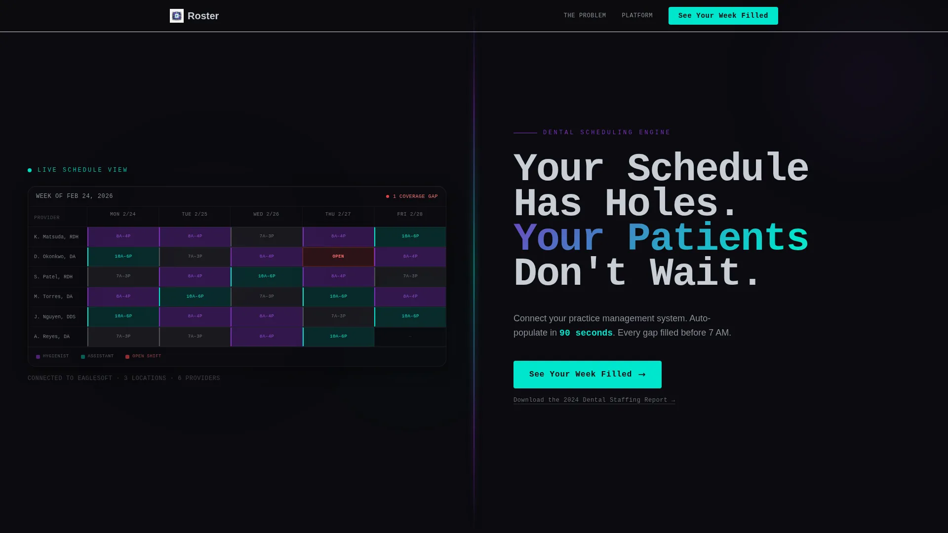
- A split-screen header with a frosted-glass scheduling grid on the left and a brutalist headline panel on the right
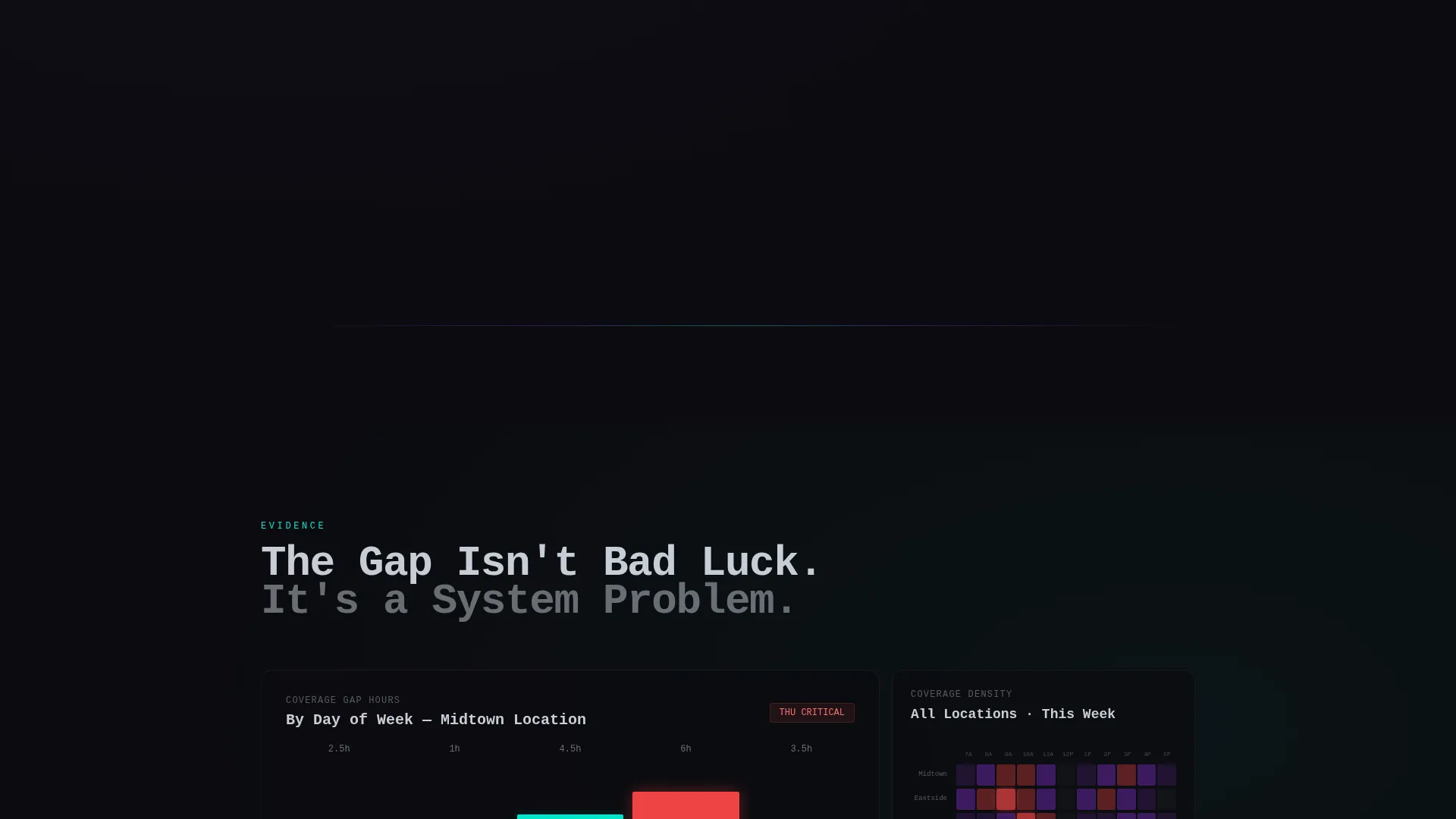
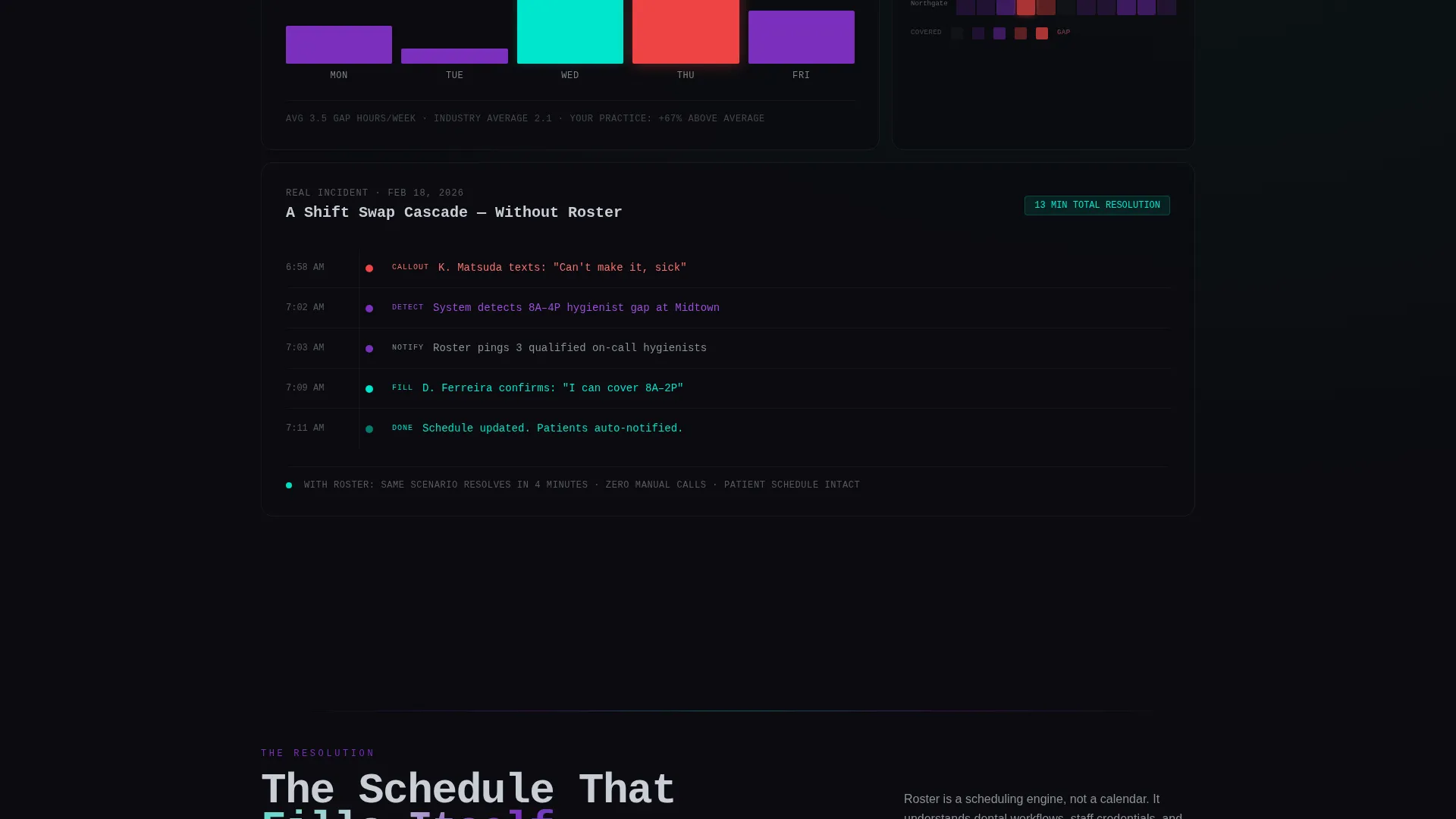
- An alternating data-and-visualization scroll flow presenting staffing statistics alongside animated brutalist charts, heat maps, and shift-swap timelines
- A persistent bottom-bar call-to-action that activates after the visitor scrolls past the third data section, plus a secondary text link for lead capture via a staffing report download
Feature list
A brief overview: every feature in this template is deliberately chosen to serve one goal, moving a skeptical dental operations buyer toward clicking "See Your Week Filled."
Split-Screen Header Layout
The header divides the viewport into two equal panels. The left panel holds a dense frosted-glass scheduling grid showing a full week of staff assignments, with shifts color-coded in violet and teal and one gap pulsing red. The right panel is pure black with an oversized mono-weight brutalist headline.
Industry Report Scroll Narrative
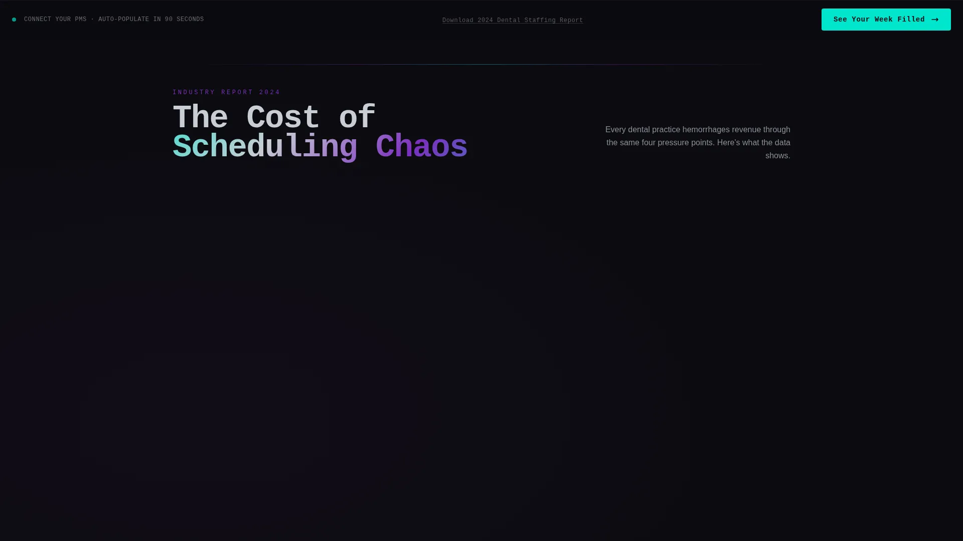
The page body unfolds as a scrolling data report. Left panels present stark staffing statistics in oversized type, including average no-show cost per operatory hour, dental assistant turnover rates, and hours lost monthly to manual scheduling. Right panels pair each stat with an animated brutalist chart or heat map.
Dark Glass Panel Visual Effect
A frosted-glass treatment on the left header panel creates depth and clinical tension. An iridescent refraction runs along the center seam between the two panels, giving the impression that light bends at the boundary between the problem and the solution.
Progressive call to action Placement
The primary call-to-action button appears first anchored to the right panel after the header. It then resurfaces as a persistent bottom bar once the visitor scrolls past the third data section. This ensures the call to action is always reachable without interrupting the data narrative.
Secondary Lead Capture Link
A text link below the primary call to action reads "Download the 2024 Dental Staffing Report." This captures email addresses from visitors who are not yet ready to start a trial, giving the data-heavy scroll a concrete conversion purpose beyond direct sign-up.
Bold Brutalist Typography System
Headlines are set in oversized mono weight. Violet anchors section headings and dividers. Chrome handles body text and secondary interface elements. The type hierarchy is intentional and unapologetic, built for readers who scan fast and decide faster.
Page sections overview
| Section | Purpose |
|---|---|
| Split-Screen Header | Introduces the scheduling gap and the headline |
| Staffing Statistics Panel | Presents no-show cost and turnover data |
| Animated Chart Panel | Visualizes coverage gaps and shift-swap timelines |
| Escalating Data Sections | Builds urgency through sequential staffing evidence |
| Product Resolution Screen | Introduces the platform after the data case is made |
| Primary call to action Block | Drives click-through to the free trial screen |
| Persistent Bottom Bar | Keeps call to action accessible during deep scroll |
| Secondary Capture Link | Offers the staffing report download as a soft conversion |
Design & branding system
The visual identity follows a Bold Brutalist theme executed through an AI Iridescent color system. Every color has a strict role, and none are used interchangeably.
- Void black (#0B0B0F) dominates backgrounds in heavy slabs; shifting violet (#7B2FBE) anchors headlines and section dividers; liquid chrome (#C8CDD5) handles body text and secondary interface elements
- Iridescent teal (#00E5CC) fires only on hover states, active toggles, and the call-to-action button, making every clickable moment feel deliberate and distinct
- The overall palette reads like polished surgical steel under ultraviolet sterilization light, clinical and cold, with an alien shimmer that signals intelligent software running underneath
Mobile & speed optimization
The template is structured to remain readable and navigable on smaller screens. The split-screen layout adapts to a stacked single-column flow on mobile without losing the data-narrative sequence.
- The persistent bottom-bar call-to-action is particularly effective on mobile, keeping the primary action reachable as users scroll through dense data sections
- Heavy black backgrounds and minimal decorative elements keep the visual weight manageable across device sizes
How this template helps you convert
The entire page is engineered around a single conversion action: clicking through to start a free trial. Every design and copy decision supports that goal.
- The Industry Report scroll structure builds measurable urgency before the product appears, so visitors arrive at the call-to-action already convinced of the problem's cost
- The progressive call to action placement, anchored first in the header panel and then as a persistent bottom bar, ensures the button is always one scroll away without interrupting the data argument
- The secondary staffing report download link captures email from visitors who are not yet ready to commit, giving every scroll depth a conversion outcome
Other information about this template
This template is part of a broader marketplace collection designed for dental software and SaaS products targeting operations buyers. A few additional details worth knowing before you start building.
- The template style is Split Screen (50/50), and the creative direction follows an Industry Report structure, both of which are defined in the intersection match context for this template
- The header concept is Dark Glass Panels, and the landing page direction is Click-Through, meaning there is no embedded form and the page routes visitors to an external trial or sign-up screen
- The color system is classified as AI Iridescent, a specific palette variant within the Bold Brutalist theme family used across this template collection
- This template is categorized under Technology, with a subcategory of Dental Software and SaaS, making it a strong fit for platforms targeting dental group practices and dental service organizations
Theme
Bold Brutalist
Creative direction
Industry Report
Color system
AI Iridescent
Style
Split Screen (50/50)
Direction
Click-Through
Page Sections
Split-screen Header with Glass Grid
Industry Report Scroll Structure
Progressive Call-to-action Placement
Secondary Lead Capture Link
AI Iridescent Color System
Bold Brutalist Typography System
Related questions
Is there a form on this landing page?
Who is this template designed for?
Can I update the staffing statistics in the data sections?
How does the persistent bottom-bar call to action work?
What is the page direction for this template?



