K-12 Client Portal Landing Page Template
Roster is a bold brutalist K-12 client portal landing page built for school district administrators who need clarity fast. A 50/50 split-screen layout pairs raw pain points with live user interface answers. The Feature Tab Switcher, animated district stats, and a two-step demo request form turn this single page into a high-converting pitch for modern student data management.
by Rocket studio
Quick summary
Roster is a single-page K-12 client portal template built on a bold brutalist design system. It pairs a 50/50 split-screen layout with confrontational statistics, a tabbed dashboard preview, and a sticky lead-generation bar. Every section is structured to show district administrators exactly what the portal solves and why the old way no longer works.
Who this template is for
This template is designed for education technology vendors and district software teams pitching a student data portal to K-12 decision-makers. It speaks directly to the people who feel the daily friction of fragmented school data.
- Assistant superintendents who spend too much time reconciling spreadsheet exports instead of making decisions
- Building principals who need accurate enrollment counts before the school day begins
- IT directors tasked with consolidating legacy systems before the next fiscal year
What problem this template solves
District administrators are managing student records, attendance data, and grade-level benchmarks across disconnected tools. That gap creates reporting delays, compliance risk, and lost time. This template frames those pain points visually and then answers each one with a live portal screenshot.
- Attendance figures that arrive a day and a half too late for any corrective action
- Grade-level proficiency data buried across multiple exports with no district-wide view
- No single interface that shows compliance audit trails and parent communication logs together
What you get with this template
The template delivers a fully structured landing page ready for customization. Every section is purpose-built to guide a district buyer from recognition to request.
- A Feature Tab Switcher header with three active states: ATTENDANCE, GRADES, and BENCHMARKS, each displaying a corresponding live dashboard preview
- A full-width stats band with three district-scale metrics rendered in oversized monospaced type, animating from zero on scroll entry
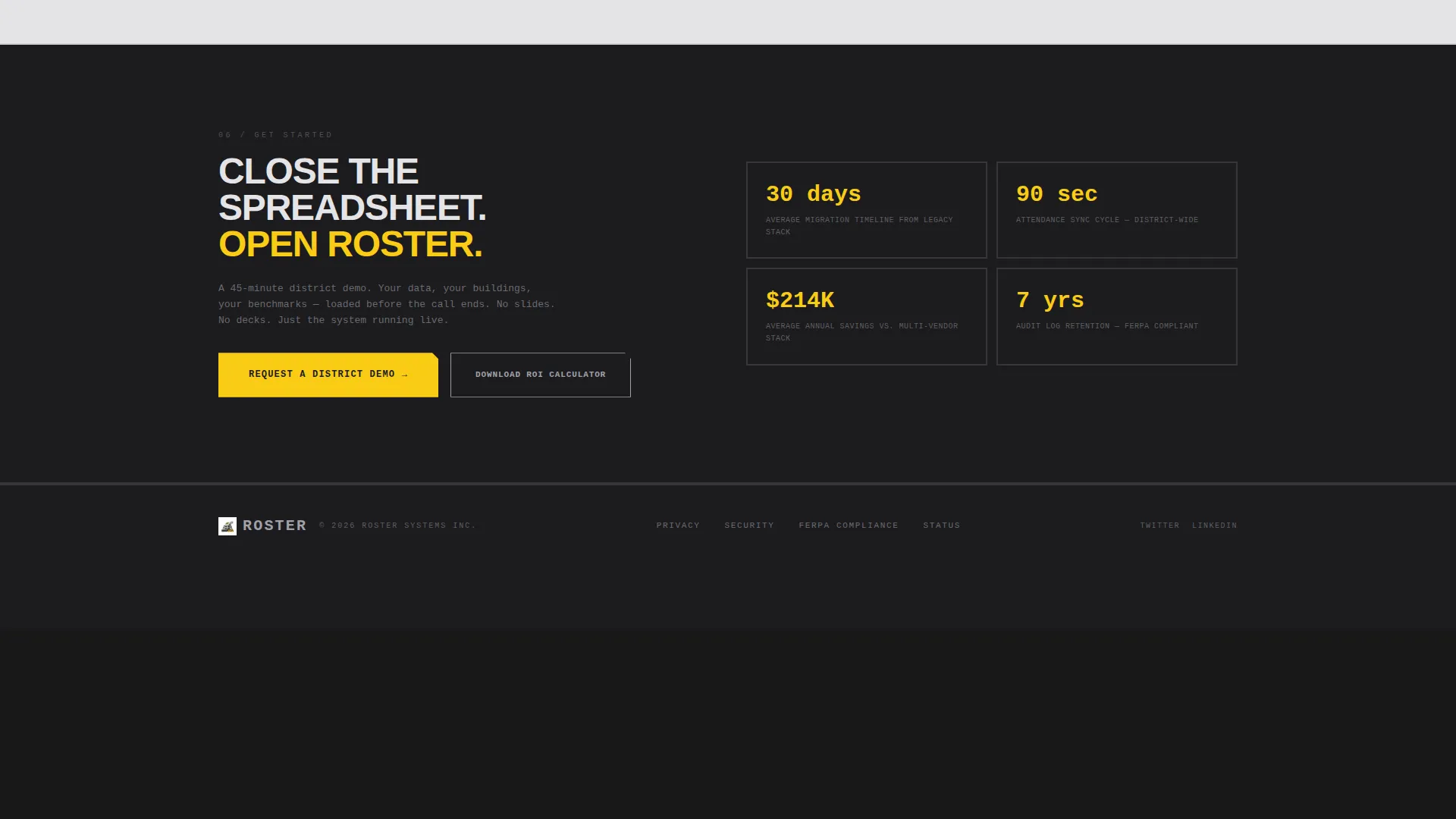
- A sticky bottom bar with a "Request a District Demo" call to action and a secondary "Download the ROI Calculator" lead capture path
Feature list
This section describes the core built-in components the template provides.
Feature Tab Switcher Header
The header splits the screen 50/50. The left side holds three industrial-style tabs labeled ATTENDANCE, GRADES, and BENCHMARKS. The right side renders a live dashboard preview that changes with each active tab. Signal yellow highlights the selected tab and every data point that exceeds its target.
Animated Stats Band
Immediately below the header, a full-width charcoal band displays three district-scale statistics in oversized monospaced type. Each number counts up from zero as the section enters the viewport. The metrics cover average daily logins, records synchronized per hour, and reduction in reporting time.
Split-Screen Pain and Solution Sections
Each scroll section presents a single bold pain-point sentence on the left side, such as "Your attendance data is 36 hours old." The right side responds with a live user interface screenshot. Signal yellow draws the eye to the resolved metric on every panel.
Sticky Demo Request Bar
A sticky bottom bar appears after the first stats band scrolls into view. It anchors a "Request a District Demo" call to action throughout the rest of the page. The bar stays visible without blocking content, keeping the conversion path always reachable.
Two-Step Demo Request Form
Clicking the demo call to action opens a two-step form. Step one collects district name, enrollment size via dropdown, and the visitor's role. Step two asks which modules matter most via checkboxes and the visitor's preferred demo week. The submit button is filled with signal yellow.
ROI Calculator Lead Capture
A secondary link styled in brushed aluminum lets visitors download an ROI calculator instead of booking a demo. This path captures an email address and delivers a spreadsheet that quantifies time saved against their current tool stack. It converts leads who are not yet ready to commit to a live session.
Page sections overview
| Section | Purpose |
|---|---|
| Tab Switcher Header | Introduce the three core portal modules with an interactive preview |
| Animated Stats Band | Confront visitors with district-scale performance numbers immediately |
| Attendance Pain Split | Show the attendance data delay problem alongside its portal solution |
| Compliance Audit Split | Present compliance audit trail gaps and the portal answer |
| Parent Comms Split | Surface parent communication log fragmentation and the fix |
| Sticky Demo Bar | Keep the primary call to action visible throughout scroll |
| Two-Step Demo Form | Qualify district leads and capture role, size, and module priorities |
| ROI Calculator Capture | Convert undecided visitors with a downloadable value calculator |
Design & branding system
The visual identity follows a Bold Brutalist theme built on a Monochrome Steel color palette. The aesthetic feels like a brutalist campus library from 1971, where structure is the design and every element earns its place.
- Core palette: structural charcoal (#1C1C1E), brushed aluminum (#A1A1AA), exposed concrete white (#E4E4E7), and signal yellow (#FACC15) reserved for interactive elements and data callouts only
- Typography is oversized and heavy, monospaced where data appears, set in thick sans-serif weights that look stamped rather than typeset
- Section backgrounds alternate between charcoal and concrete white in hard, unpadded blocks with no softening transitions
Mobile & speed optimization
The layout is built with a strict 50/50 split-screen structure and section-by-section alternating blocks. Both patterns translate well to responsive stacking on smaller screens.
- Tab switcher panels and split-screen sections are structured to reflow vertically on narrow viewports without losing the visual hierarchy
- Monospaced data typography and hard-block section breaks maintain readability at any screen width
- No stock photography is used anywhere; all visuals are rendered data interfaces, which keeps asset weight low by design
How this template helps you convert
Every section is sequenced to move a skeptical district buyer from awareness to action. The design does not ask for trust; it demonstrates competence through data.
- The animated stats band confronts visitors with district-scale numbers the moment they scroll, establishing the portal's operational weight before any feature is explained.
- The split-screen pain-and-solution wall builds cumulative evidence across multiple sections, making the status quo feel irresponsible by the time the sticky demo bar comes into focus.
- The two-path conversion strategy captures both high-intent buyers ready to book a demo and lower-intent visitors who need a tangible value proof before committing.
Other information about this template
This template is categorized under Technology, within the Education K-12 Digital Presence subcategory and the Education K-12 Client Portal niche. It is well suited for vendors building a K-12 school data management platform, a student information system landing page, or a district-wide education dashboard product page.
- The template style is Split Screen (50/50), a layout well matched to side-by-side problem-solution storytelling used in education software sales
- The creative direction is Stats-First Impact, meaning data credibility is established before any feature description appears
- The lead generation direction supports both high-intent demo requests and lower-funnel content downloads from the same page
- This template works for any K-12 education technology product that needs to communicate operational value to district-level administrators quickly


Theme
Bold Brutalist
Creative direction
Stats-First Impact
Color system
Monochrome Steel
Style
Split Screen (50/50)
Direction
Lead Generation
Page Sections
Feature Tab Switcher with Live Previews
Animated District Stats Band
Split-screen Pain and Solution Wall
Sticky Demo Request Bar
Two-step Qualifying Demo Form
ROI Calculator Lead Capture Path
Related questions
Who is this landing page template designed for?
Can I customize the tab labels and dashboard previews?
What does the two-step demo form collect?
Does this template include the ROI calculator spreadsheet?
Is this template suitable for a single school rather than a full district?


