Nonprofit Software Directory Website Template
Roster is a split-screen landing page template built for nonprofit membership management platforms. It uses a Data Command visual theme with phosphorescent accents on void black to make every feature feel live and mission-critical. The layout guides executive directors, development coordinators, and board treasurers from curiosity to demo request without friction.
by Rocket studio
Quick summary
Roster is a lead generation landing page template for a nonprofit membership management platform. It pairs a Feature Tab Switcher header with a scrolling Feature Matrix to show the product working before asking for anything. The Acid Digital color system and split-screen layout make every capability block feel like a live command center, not a marketing brochure.
Who this template is for
This template is built for teams launching or promoting a B2B software product in the nonprofit membership space. It is especially useful when your audience is skeptical and needs to see the product before they trust it.
- Executive directors managing 500 to 50,000 members across mid-size nonprofits
- Development coordinators who currently chase renewals manually through email
- Board treasurers who need clean retention reports before high-stakes meetings
What problem this template solves
Nonprofit membership teams lose time and members because their data lives in too many places. A generic product page cannot convey the operational relief that a unified dashboard delivers. This template makes that relief visible before a visitor fills out a single field.
- Staff waste hours chasing renewals and reconciling duplicate member records
- Leadership cannot produce a credible retention report quickly or confidently
- Visitors leave product pages without understanding what the platform actually does
What you get with this template
You get a fully structured, single-page lead generation layout built around progressive trust. Every section earns the next click rather than demanding it upfront.
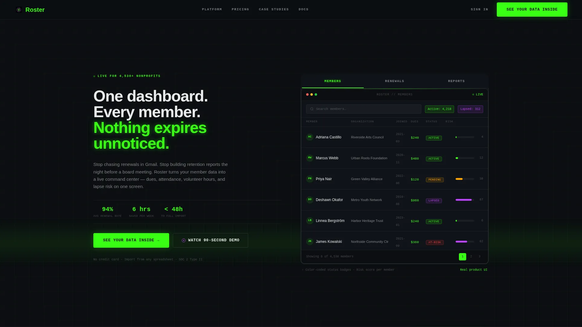
- A three-tab interactive header that swaps between Members, Renewals, and Reports screenshots
- Four alternating 50/50 feature blocks that escalate from data import through predictive scoring to board-ready reports
- A three-field progressive lead form plus a ghost-button inline video path for visitors who are not ready to commit
Feature list
This template includes six purpose-built layout components, each grounded in the platform's core value proposition.
Feature Tab Switcher Header
The hero section splits 50/50. The left panel holds the primary headline. The right panel contains three labeled tabs, Members, Renewals, and Reports, where clicking each tab swaps in a pixel-sharp annotated screenshot with a crossfade transition. This lets visitors explore the platform before reading a single feature description.
Alternating Feature Matrix
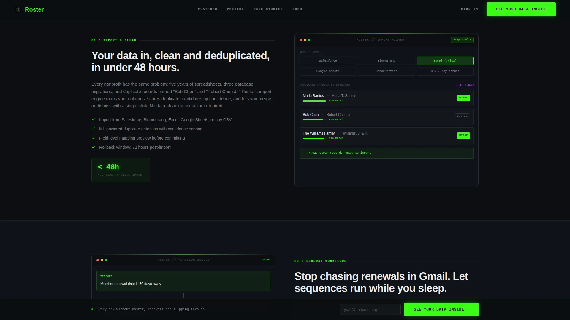
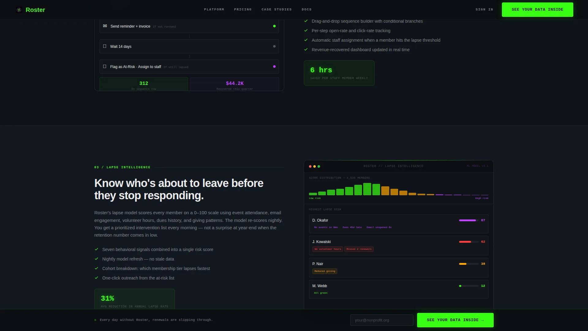
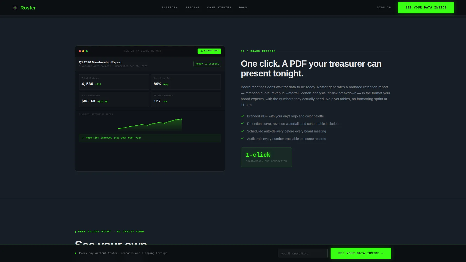
After the header, four content blocks scroll in a structured descent. Each block pairs a concise feature description with an annotated interface screenshot, and the sides alternate left-to-right every section to keep visual momentum. Section backgrounds shift subtly darker to pull the visitor deeper into the product story.
Progressive Three-Field Lead Form
The lead capture form asks only three things in sequence: organization name, current member count via a dropdown, and a work email address. The short, staged sequence reduces friction and qualifies leads at the same time, since the member count dropdown segments responses automatically.
Inline Video Demo Trigger
A ghost-button secondary path labeled "Watch the 90-Second Demo" sits alongside the primary call to action. When clicked, it triggers an inline video player rather than opening a new tab. The template captures an email address on play, providing a lower-commitment conversion path for hesitant visitors.
Sticky Bottom Call-to-Action Bar
The primary call to action, "See Your Data Inside," appears after the header and then reappears as a sticky bar that follows the visitor on scroll. This persistent nudge keeps the conversion action available without interrupting the reading experience.
Section-by-Section Capability Blocks
Each of the four feature blocks covers a distinct capability stage: member import and deduplication, automated renewal workflows, predictive lapse scoring, and one-click board-ready PDF reports. The escalating sequence mirrors how a nonprofit team would actually adopt and benefit from the platform over time.
Page sections overview
| Section | Purpose |
|---|---|
| Hero Tab Switcher | Introduce the platform with interactive screenshot tabs |
| Member Import Block | Show deduplication and clean roster setup |
| Renewal Workflow Block | Demonstrate automated drip-sequence timeline |
| Lapse Scoring Block | Present predictive risk scoring by member |
| Board Report Block | Highlight one-click PDF report generation |
| Footer Row | Provide linear single-row navigation and links |
Design & branding system
The visual identity follows a Data Command theme. Every color choice is intentional: each accent is earned by the importance of the element it marks, so the interface reads like a mission-control dashboard rather than a decorated marketing page.
- Void black (#0B0E11) dominates backgrounds and card surfaces throughout
- Terminal green (#39FF14) marks live data states, active tab indicators, and primary call-to-action buttons
- Electric violet (#BF40FF) highlights secondary actions, hover states, and chart segments; interface white (#EAEAEA) keeps body text and labels razor-legible against dark surfaces
- JetBrains Mono handles data labels and monospaced user interface elements; Manrope carries headlines and body copy
Mobile & speed optimization
The template is designed desktop-first to match how executive directors typically research software at their desks. Full mobile support is included so the layout remains functional and readable on any screen size.
- The split-screen columns stack vertically on smaller viewports for clear readability
- The sticky call-to-action bar and tab switcher remain accessible on mobile without layout breakage
- Scroll-triggered feature reveals and crossfade tab transitions are built to perform smoothly across modern browsers
How this template helps you convert
The page is structured to build confidence through product evidence first and ask for contact details second. This sequence is deliberate and mirrors how skeptical nonprofit decision-makers actually evaluate software.
- The tab switcher in the hero lets visitors explore Members, Renewals, and Reports screenshots before any form appears, so they arrive at the lead form already convinced the platform understands their problems.
- The escalating feature matrix moves from operational pain (import and deduplication) through time savings (renewal automation) to strategic proof (lapse scoring and board reports), matching the visitor's mental journey from frustration to solution.
- The dual-path conversion design, primary form plus inline video trigger, captures both ready buyers and cautious researchers, widening the funnel without diluting lead quality.
Other information about this template
This template is built specifically for the USA-centric nonprofit sector. It uses English copy, USD formatting, and MM/DD/YYYY date conventions throughout. It is categorized under Technology, Nonprofit Software, and the Nonprofit Membership Management niche.
- The layout style is Split Screen (50/50), with the Feature Tab Switcher as the header concept and a Feature Matrix as the creative direction
- Animation level is high: tab switching uses crossfade, feature blocks use scroll-triggered reveals, and the call-to-action bar is sticky on scroll
- The Acid Digital color system and Data Command theme are the defining visual identity choices for this template
- Inline social proof metrics covering time saved, renewal rate lift, and member count range are included as part of the layout structure
Theme
Data Command
Creative direction
Feature Matrix
Color system
Acid Digital
Style
Split Screen (50/50)
Direction
Lead Generation
Page Sections
Interactive Feature Tab Switcher
Alternating 50/50 Feature Matrix
Progressive Three-field Lead Form
Ghost-button Inline Video Path
Sticky Scroll Call-to-action Bar
Escalating Capability Block Sequence
Related questions
Who is this landing page template designed for?
Can I adapt the tab switcher to show different platform features?
Does the template include two separate conversion paths?
Is this template usable on mobile devices?
What visual style does this template use?



