Nonprofit Staff Scheduling Landing Page Template
Roster is a scroll-reveal landing page template built for nonprofit staff scheduling platforms. It guides visitors through a Problem-to-Solution narrative arc, opening with a crisis-state dashboard screenshot and closing with a frictionless call-to-action. The Monochrome Steel color system and Data Command theme give it the authority of an operations console, not a charity brochure.
by Rocket studio
Quick summary
Roster is a single-page, scroll-reveal landing page template designed for nonprofit scheduling software. It opens on a crisis dashboard, walks visitors through the real cost of manual scheduling, then reveals the solution section by section. Every scroll transition earns its reveal. The final call-to-action arrives only after the visitor has watched their own problem get solved.
Who this template is for
This template is built for SaaS founders, product marketers, and growth teams promoting scheduling tools aimed at the nonprofit sector. If your platform helps overwhelmed coordinators replace spreadsheet chaos with reliable shift coverage, this page was designed around your exact buyer.
- Operations managers at food banks handling high-volume holiday surges
- Volunteer coordinators at crisis hotlines filling overnight and weekend gaps
- Executive directors at after-school programs losing tutors to seasonal schedule conflicts
What problem this template solves
Nonprofit scheduling software often gets sold with generic SaaS landing pages that feel nothing like the lived experience of the buyer. A food bank coordinator does not see themselves in a polished tech hero shot. This template bridges that gap by leading with the problem before the product.
- Visitors abandon pages that jump straight to features before acknowledging the pain
- Generic layouts fail to build the trust that mission-driven buyers need before clicking
- No-form click-through pages often feel thin without a strong narrative to carry the conversion
What you get with this template
You get a fully structured, scroll-reveal landing page built around a single conversion goal: getting the visitor to click through to a free trial signup. Every section is sequenced to deepen the problem, then deliver the solution at the exact right moment.
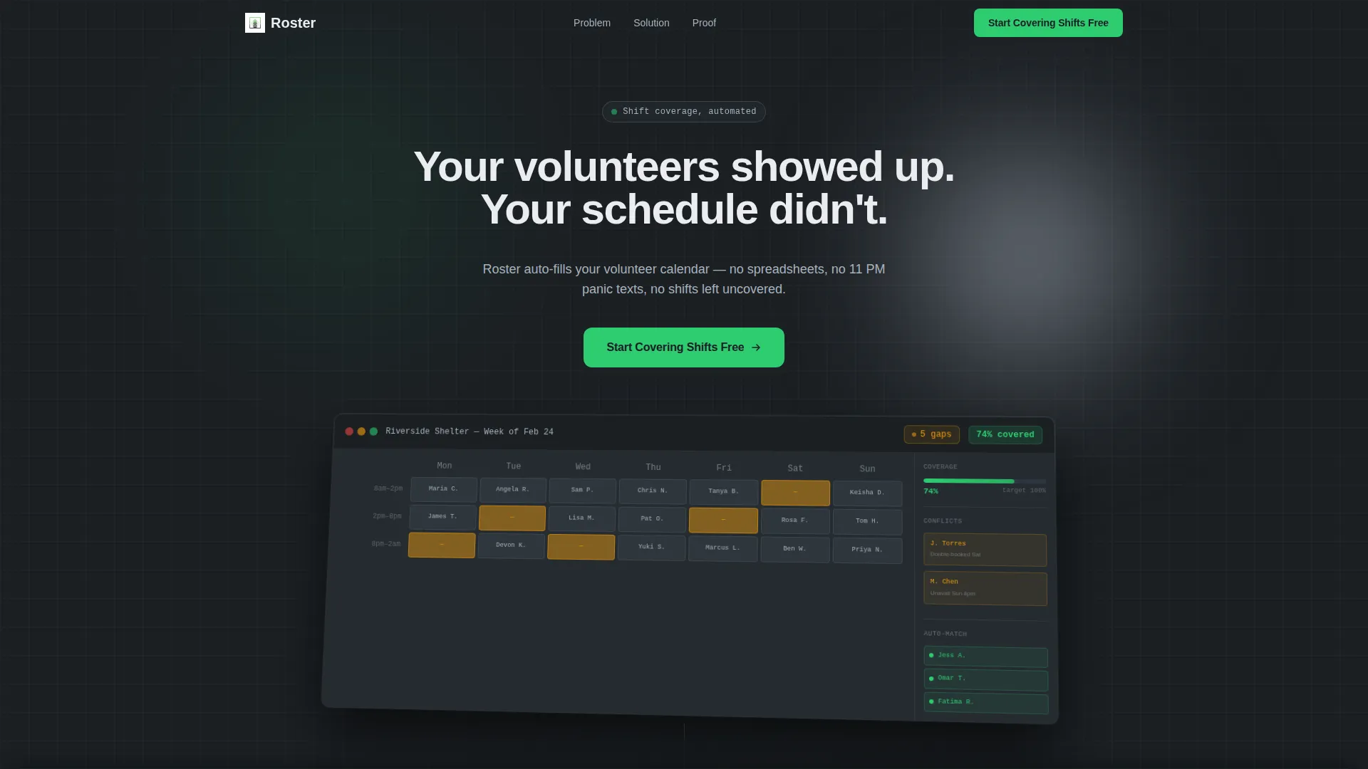
- A header section with a product screenshot, a delayed typewriter headline, and a primary call-to-action
- Three scroll-reveal narrative sections covering the problem, the live solution moment, and third-party proof
- A sticky bottom call-to-action bar and a closing full-width call-to-action block
Feature list
This section covers the core built-in capabilities delivered by this template.
Scroll-Reveal Progressive Layout
Each section of the page is hidden until the visitor scrolls into view. This controls the narrative pace precisely. The problem lands first. The solution arrives second. The proof closes the argument.
Crisis-State Dashboard Header
The header opens with a full-width product screenshot showing a scheduling dashboard mid-crisis: three unfilled overnight shifts, a volunteer availability sidebar, and a coverage gauge at 74%. The screenshot sits slightly rotated on a gunmetal surface with a soft ambient shadow. A typewriter headline fades in after a two-beat delay.
Animated Problem Statistics Block
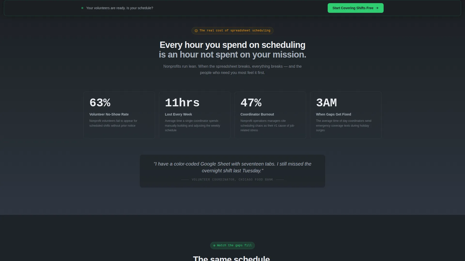
The first scroll reveal displays key statistics about nonprofit staff burnout, volunteer no-show rates, and hours lost to manual scheduling. Each number animates upward like a live counter, making the cost of inaction feel immediate and concrete.
Live Solution Transition Animation
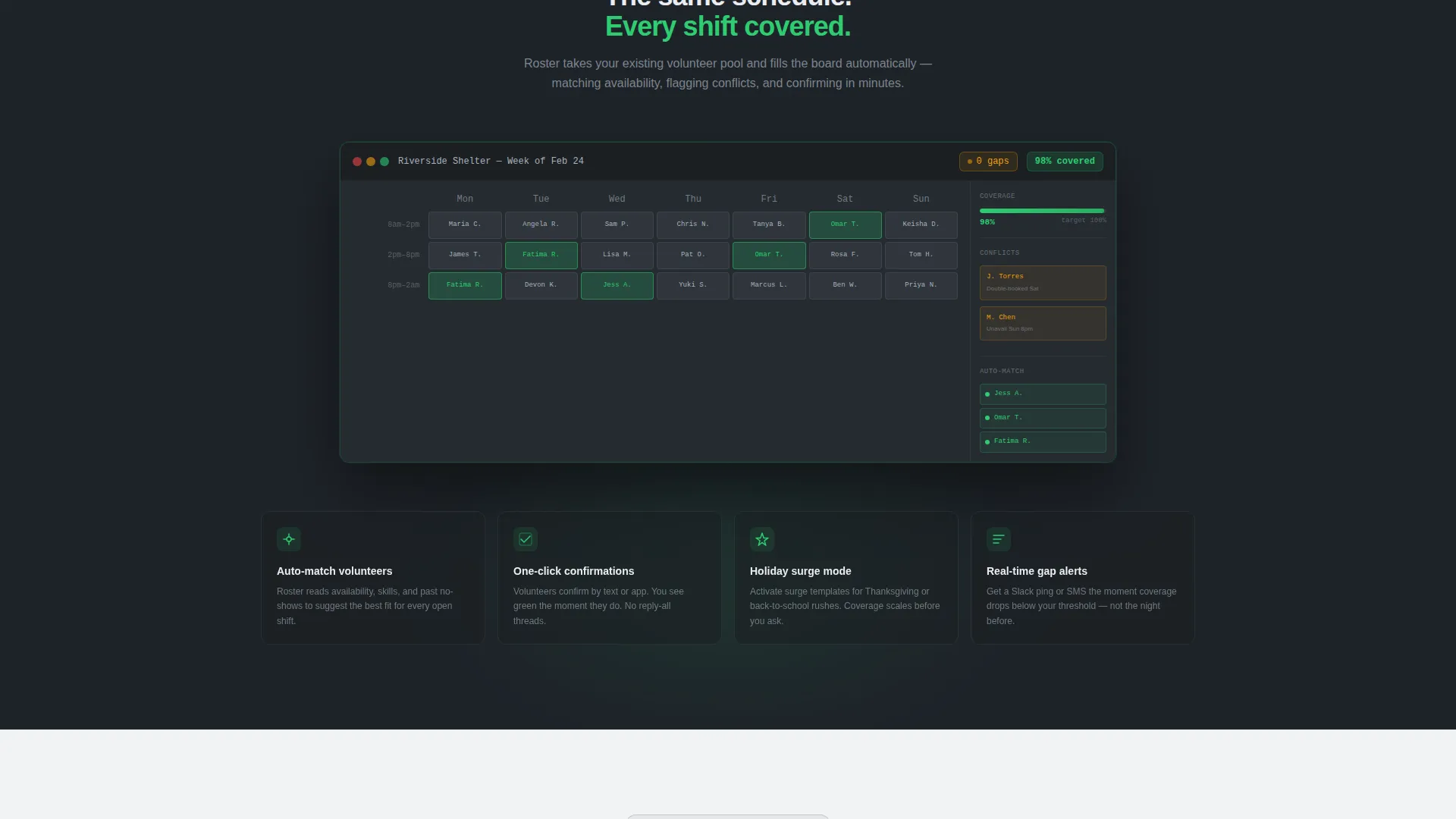
The second scroll reveal replays the same dashboard from the header. This time, amber gaps fill green one by one as auto-match suggestions populate. The coverage gauge climbs from 74% to 98%. The transformation is visual, not described.
Social Proof Layer
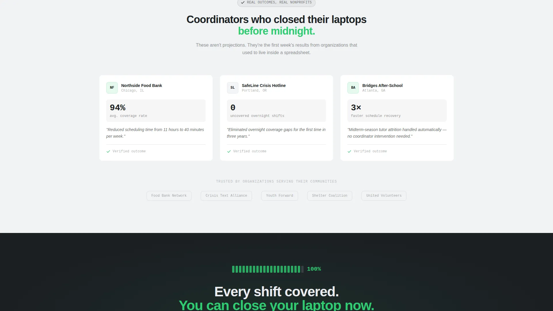
The third reveal presents three nonprofit logos paired with single-sentence outcomes. An example outcome reads: "Reduced scheduling time from 11 hours to 40 minutes per week." The proof section reinforces credibility right before the final call-to-action.
Signal-Green Call-to-Action System
The primary call-to-action reads "Start Covering Shifts Free" and appears in three positions: anchored below the header screenshot, as a sticky bottom bar after the second reveal, and as a full-width closing block. No form fields appear anywhere on the page. The click is the only conversion action.
Page sections overview
| Section | Purpose |
|---|---|
| Header screenshot block | Opens with crisis dashboard and delayed typewriter headline |
| Anchored call to action button | Places first conversion opportunity below the header |
| Problem statistics reveal | Animates the real cost of manual scheduling |
| Solution dashboard reveal | Shows the same dashboard filling green in real time |
| Sticky bottom call to action bar | Keeps conversion accessible after the second scroll reveal |
| Proof logos block | Three nonprofit outcomes to build trust before the close |
| Full-width call to action block | Final frictionless click-through to free trial signup |
Design & branding system
The visual identity follows a Data Command theme using a Monochrome Steel color palette. The design feels like a mission-control console: precise, serious, and built for people who live inside operational pressure. Backgrounds graduate from deep gunmetal at the top to control-room white at the bottom, mirroring the arc from problem darkness into solution clarity.
- Deep gunmetal (#1B1F23) for dark section backgrounds, brushed aluminum (#A8B2BD) for body text on dark sections, and control-room white (#EAECEF) for light section backgrounds
- Signal green (#2ECC71) reserved exclusively for confirmations, filled shifts, hover states, progress bars, and all primary call-to-action elements
- Gunmetal text on light sections, aluminum text on dark sections, with no decorative color used anywhere outside the signal-green accent system
Mobile & speed optimization
The scroll-reveal animations and rotated screenshot presentation are structured to translate cleanly to smaller screens. The sticky call-to-action bar is particularly effective on mobile, where it stays accessible throughout the scroll without blocking content.
- Progressive reveal sections restack vertically on narrow viewports without losing narrative sequence
- The dashboard screenshot scales responsively so the coverage gauge and shift indicators remain readable on mobile displays
- The no-form conversion model removes all field-entry friction, which is especially important for mobile visitors
How this template helps you convert
This template is engineered around a single click-through goal. There are no distractions, no form fields, and no dead-end sections. Every design and copy decision moves the visitor forward.
- The scroll-reveal structure withholds the solution until the problem has been fully established, so the call-to-action lands at peak motivation rather than before it.
- The signal-green color system trains the visitor's eye throughout the page to associate that color with resolution, so the call-to-action button reads as confirmation before it is even read as a button.
- The sticky bottom bar and three-position call-to-action placement ensure the conversion opportunity is never more than a glance away, regardless of where the visitor pauses in the scroll.
Other information about this template
This template is categorized under Technology and sits within the Nonprofit Software and Software as a Service subcategory. It is specifically scoped for the nonprofit staff scheduling niche, which means the design decisions, copy structure, and visual metaphors are all grounded in that context rather than adapted from a generic SaaS layout.
- The template style is Scroll Reveal (Progressive), meaning each content block enters the viewport as the visitor reaches it
- The landing page direction is Click-Through, optimized for a single outbound action with no on-page form fields
- The intersection match score for this template's category, subcategory, niche, theme, color system, creative direction, header concept, and landing page direction is 13 out of a possible range, indicating a high degree of alignment across all design and strategy variables
Theme
Data Command
Creative direction
Problem→Solution Arc
Color system
Monochrome Steel
Style
Scroll Reveal (Progressive)
Direction
Click-Through
Page Sections
Scroll-reveal Progressive Sections
Crisis-state Dashboard Header
Animated Live-counter Statistics
Real-time Solution Dashboard Animation
Three-position Call to Action System
Social Proof Outcomes Block
Related questions
Does this template include a contact form or signup form?
Can I adapt this template for a scheduling platform outside the nonprofit sector?
How does the scroll-reveal effect work across the page?
How many times does the call-to-action appear on the page?
What does the signal-green accent color apply to?



