Pet Care Staff Scheduling Landing Page Template
Roster is a bento grid landing page template built for pet care staff scheduling platforms. It uses a Tech Glass visual identity with a Monochrome Steel palette, interactive shift-dragging tiles, and a click-through funnel leading to a single mint-glowing call to action. Designed for kennel managers, veterinary practice owners, and mobile grooming operators who need clarity at a glance.
by Rocket studio
Quick summary
Roster is a dark-glass bento grid landing page template for pet care staff scheduling software. It pairs a cinematic Tech Glass aesthetic with hands-on interactive tiles, letting visitors drag a fictional staff member into an open shift before they ever sign up. The result is a page that earns trust by letting people feel the product work.
Who this template is for
This template is built for teams who already know their scheduling process is broken and need a tool that proves its value instantly. It speaks directly to the people managing the controlled chaos of daily pet care operations.
- Kennel managers handling part-time bathers and full-time vet techs across overlapping shift patterns
- Veterinary practice owners losing weekend staff to burnout and coverage gaps
- Mobile grooming operators dispatching vans and staff across multiple zip codes
What problem this template solves
A single no-show in a kennel or clinic can cascade fast. Twelve dogs go unwalked, a vet tech covers two rooms alone, and the day spirals before 8 AM. Most scheduling pages describe a solution in text. This template demonstrates it in motion.
- Visitors feel a real scheduling problem get solved before they create an account
- The page removes the need for a long sales pitch by putting the product in their hands
- A focused single call-to-action path eliminates decision fatigue and keeps the funnel tight
What you get with this template
You get a fully designed, single-page bento grid layout built around the visual identity and interaction patterns described in the Roster brief. Every section has a defined purpose, and nothing is left to placeholder guesswork.
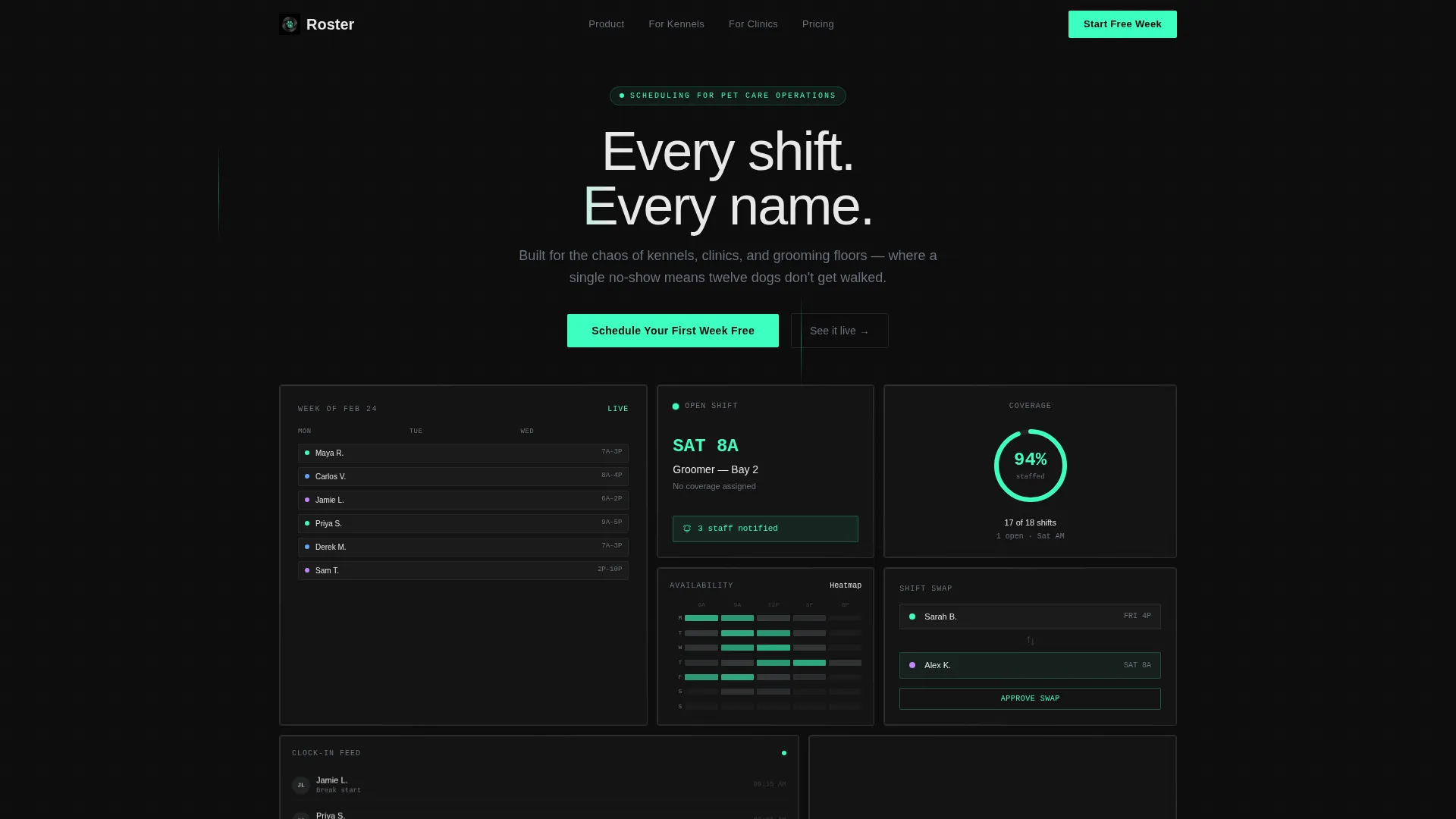
- Six asymmetric frosted-glass header tiles showing live shift data fragments and an open-shift alert
- An interactive body grid with draggable shift tiles, scenario cycling, and a live coverage score update
- A mint-glowing floating call-to-action pill and an embedded in-tile call to action, both pointing to one onboarding flow
Feature list
This template is built around six distinct design and interaction capabilities, each grounded in the source brief.
Dark Glass Panel Header
The header fills the viewport with six translucent, frosted bento tiles arranged asymmetrically. Each panel holds a different shift data fragment: a weekly grid with names and roles, an open-shift alert pulsing in electric mint, a staff availability heatmap, a scrolling clock-in feed, a coverage percentage ring at 94 percent, and a drag-and-drop swap animation mid-motion. Panels sit at slightly different depth levels with soft parallax on scroll.
Interactive Shift-Drag Tile
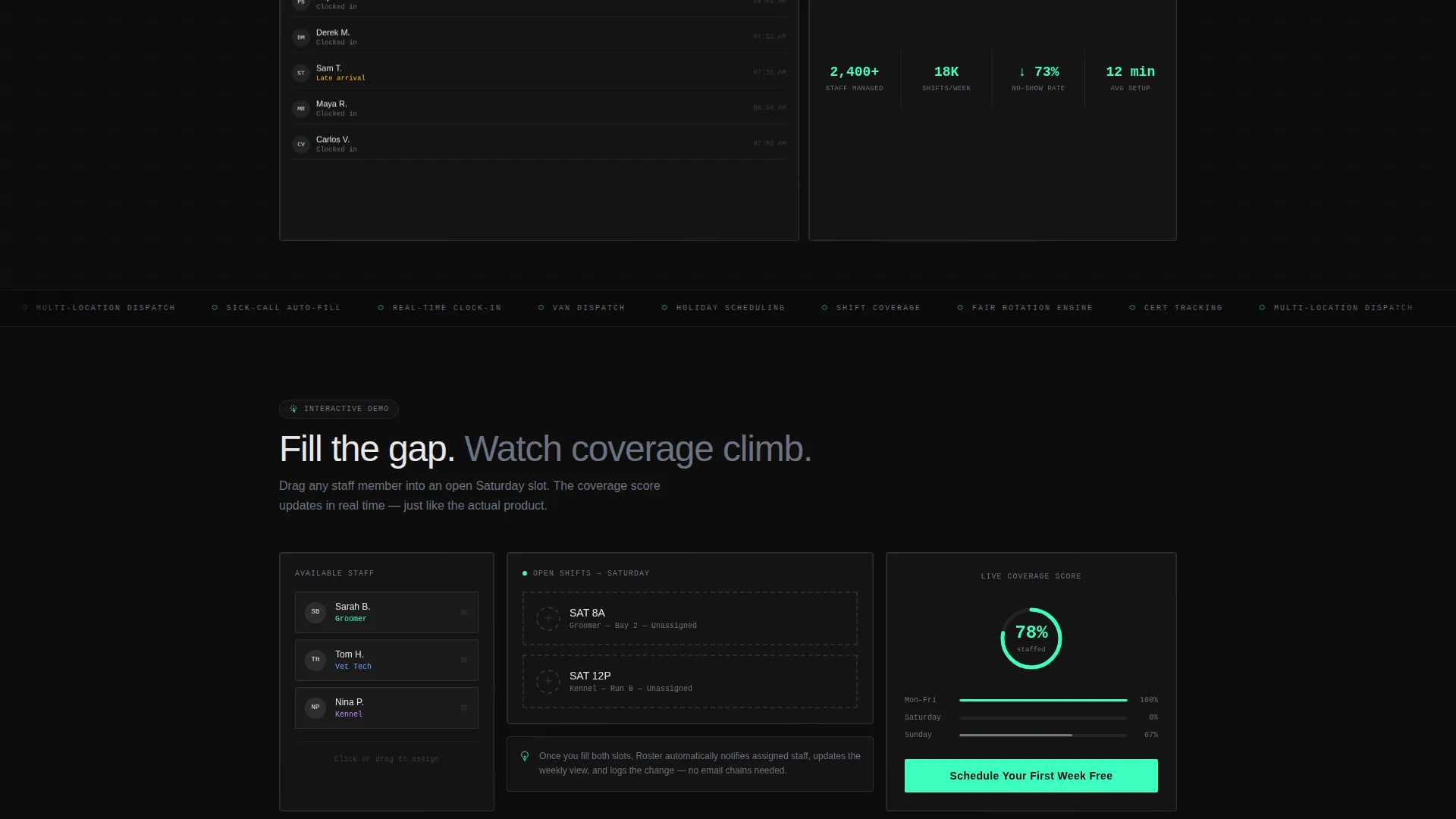
One body tile lets visitors drag a fictional staff member, Sarah B., into an open Saturday slot and watch the coverage score update live. This single interaction communicates the core product value without any explanatory copy. It is the most direct proof-of-concept element on the page.
Scenario Cycling Tile
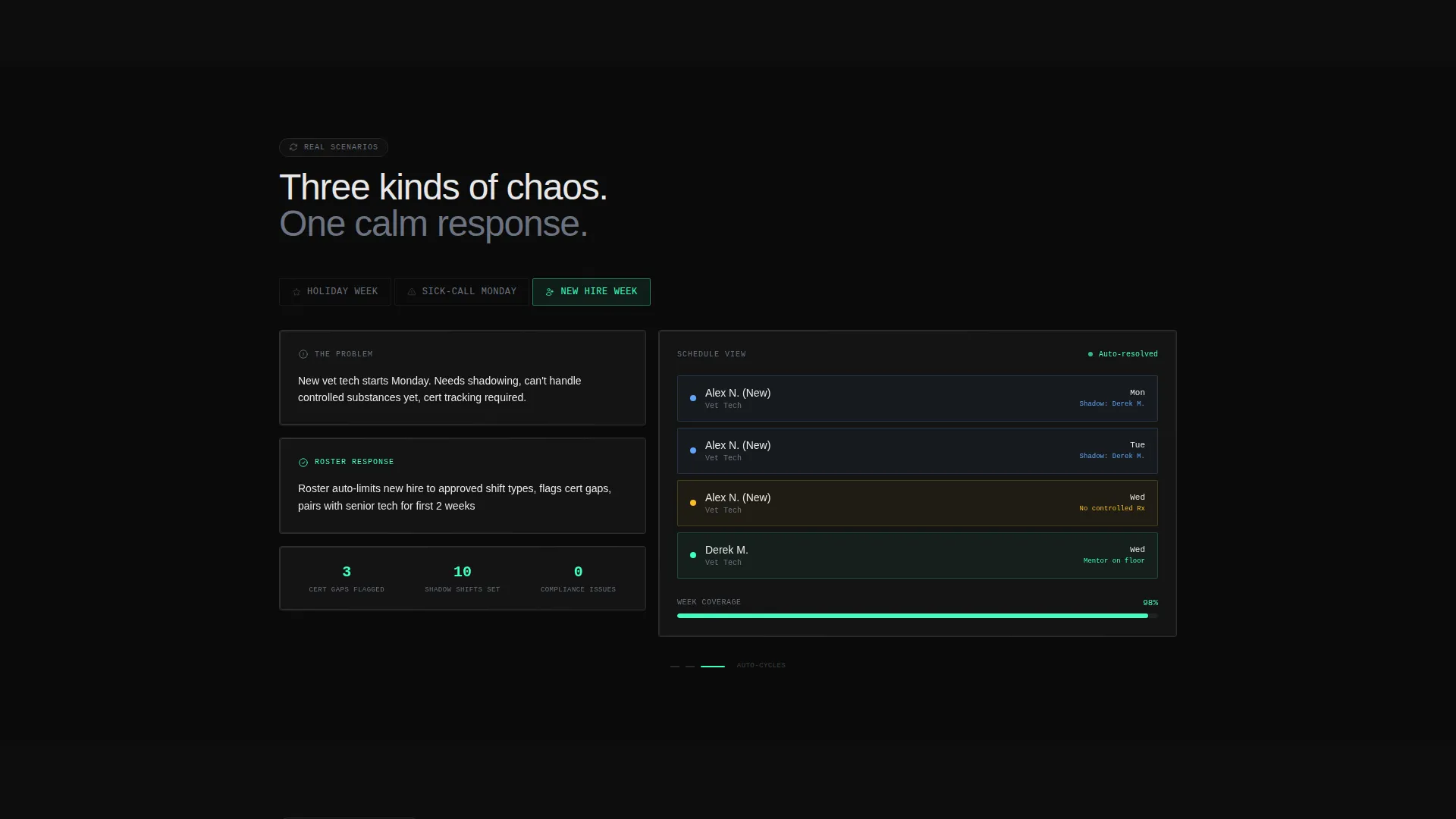
A second body tile cycles through three real scheduling scenarios: holiday week, sick-call Monday, and new hire onboarding. Each scenario shows how the schedule adapts, giving visitors a concrete sense of the platform's flexibility. The cycling happens without navigating away from the page.
Progressive Complexity Scroll
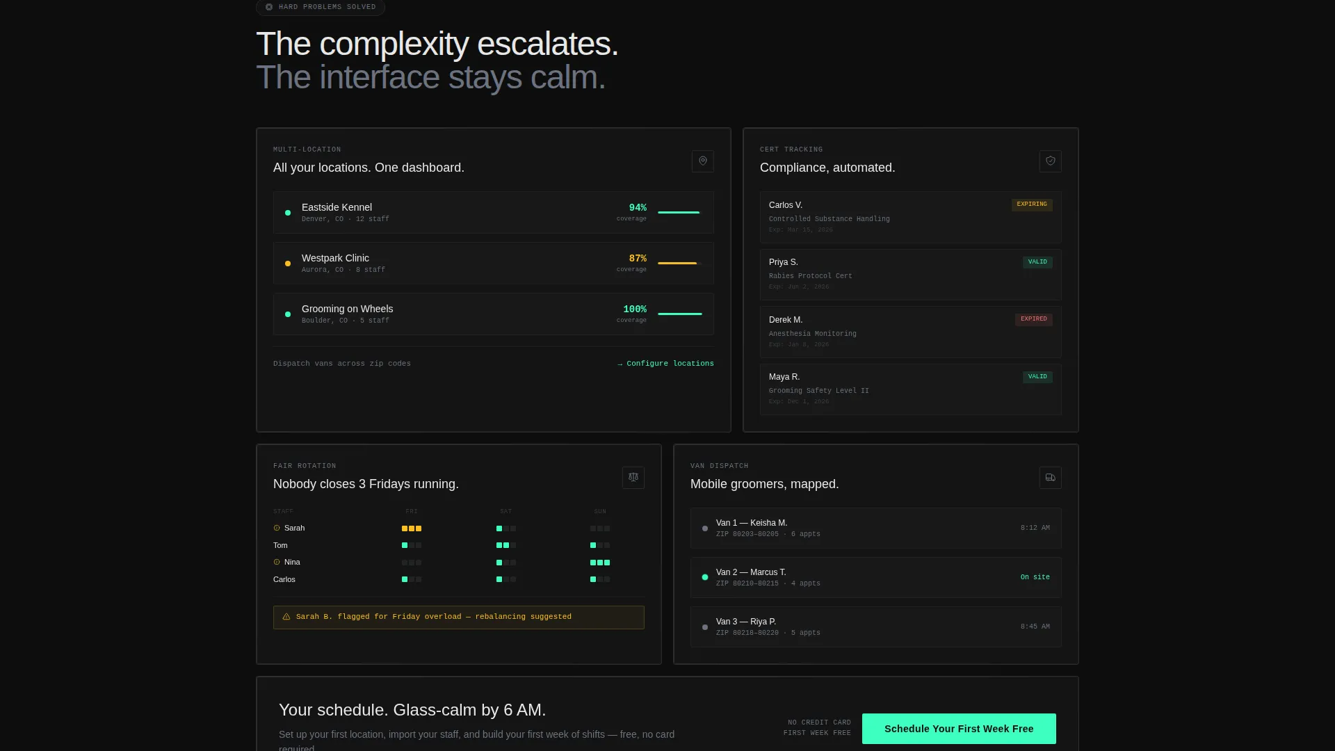
As the visitor scrolls deeper, the grid reveals progressively harder problems: multi-location coverage, certification tracking for vet techs, and automated fair-rotation logic. Each section adds depth without overwhelming the interface. The visual language stays glass-calm throughout.
Single-Focus Click-Through Funnel
Every interaction on the page funnels toward one call to action: "Schedule Your First Week Free." It appears first as a floating mint pill after the header, then reappears embedded inside the interactive tile after the visitor has engaged. There is no form on this page. The click lands on a pre-filled onboarding flow.
Monochrome Steel Visual System
The color system uses deep obsidian as the background, brushed steel for card surfaces and borders, and bright chrome for headline text. Electric mint appears exclusively on interactive states, active shifts, and call-to-action pulses. The palette is clinical and precise, designed to feel like a stainless-steel surface in a dark room.
Page sections overview
| Section | Purpose |
|---|---|
| Dark Glass Header | Six frosted bento tiles showing live shift data at a glance |
| Open Shift Alert | Pulsing mint tile signaling an unfilled slot in the current week |
| Staff Heatmap Tile | Visual availability map helping managers spot coverage gaps |
| Clock-In Feed | Scrolling real-time log of staff arrivals and shift starts |
| Coverage Ring Tile | Percentage ring displaying current schedule fill rate at 94 percent |
| Shift Swap Animation | Mid-motion drag tile demonstrating the swap interaction |
| Interactive Drag Tile | Visitor drags Sarah B. into Saturday and watches coverage update |
| Scenario Cycling Tile | Cycles holiday week, sick-call Monday, and new hire onboarding views |
| Multi-Location Section | Reveals coverage logic across multiple facility locations |
| Certification Tracking | Shows role-specific credential visibility for vet techs |
| Fair Rotation Section | Demonstrates automated rotation preventing repeated closers |
| Floating call to action Pill | Mint-glowing pill call to action appearing after the header scroll |
| Embedded Tile call to action | Second call to action inside the interactive tile post-engagement |
Design & branding system
The visual identity follows a Tech Glass theme built entirely on the Monochrome Steel color system. Every element earns its place in the palette, and nothing decorative distracts from the shift data on screen.
- Deep obsidian (#0D0D0D) as the page background, brushed steel (#71797E) for card surfaces and borders, bright chrome (#E8E8E8) for headline text, and electric mint (#3DFFC0) reserved strictly for active and interactive states
- Frosted-glass card edges with soft blur and layered z-depths create the impression of physical panels suspended in dark space
- Light refraction effects at card borders and parallax scroll behavior give the header genuine visual depth without relying on hero images or stock photography
Mobile & speed optimization
The bento grid layout is designed to restack gracefully on smaller viewports. The interaction-heavy tiles translate to touch-friendly drag behavior on mobile devices.
- Frosted-glass panels and layered z-depth effects are built to scale across screen sizes without losing visual hierarchy
- The single call-to-action funnel keeps the mobile experience as focused as the desktop version, with no competing links or secondary forms
How this template helps you convert
The page earns the click by making the visitor feel the product before asking for anything. Every layout decision pushes toward one outcome.
- The interactive shift-drag tile lets visitors solve a real scheduling problem with their own hands, building product trust before any account creation is required.
- The floating mint call-to-action pill and the embedded in-tile call to action both lead to the same pre-filled onboarding flow, keeping the conversion path frictionless and singular.
Other information about this template
This template is part of a broader set of Tech Glass bento grid designs built for software and SaaS landing pages. It is a strong fit for teams evaluating modern scheduling tools and comparing purpose-built pet care platforms against general workforce management software.
- The template style is Bento Grid, the theme is Tech Glass, and the creative direction is Interactive Explorer with a Click-Through funnel structure
- It is designed as a single landing page, not a multi-page website, and the entire conversion flow happens within one scroll
- The pre-filled onboarding flow it links to covers three steps: naming a location, setting a first shift template, and inviting one staff member
Theme
Tech Glass
Creative direction
Interactive Explorer
Color system
Monochrome Steel
Style
Bento Grid
Direction
Click-Through
Page Sections
Dark Glass Panel Header
Interactive Shift-drag Tile
Scenario Cycling Tile
Progressive Complexity Scroll
Single-focus Conversion Funnel
Monochrome Steel Color System
Related questions
Is this template suitable for a mobile audience?
Does this template include a contact form or sign-up form?
Can I adapt this template for a grooming salon or veterinary clinic specifically?
What makes the interactive tiles different from a standard screenshot or video?
How many calls to action does this template include?



