Roster - Powerful Recruiting Landing Page Template
Roster is a hub-and-spoke recruiting landing page built for staffing professionals who need one clear view of every open role, candidate, and placement. The Electric Indigo design system signals urgency without noise. A spec-sheet layout walks visitors through each portal screen, and dual app download calls to action make claiming the tool frictionless.
by Rocket studio
Quick summary
Roster is a single-page recruiting portal template designed around a hub-and-spoke anchor navigation. It gives hiring managers and agency recruiters a visual command center layout: open requisitions, shortlisted candidates, interview timelines, and compliance reports all visible at a glance. The Electric Indigo color system keeps every status signal readable and intentional.
Who this template is for
This template is built for recruiting professionals who manage high volume, tight deadlines, and multiple stakeholders at once. It fits people who already think in pipelines and want a client-facing portal that reflects that mindset.
- Operations directors at mid-market logistics firms filling dozens of warehouse roles on short timelines
- Boutique agency recruiters managing multiple client accounts across different time zones
- Human resources generalists at scaling startups who handle talent acquisition on their own
What problem this template solves
Recruiting teams lose time when their tools look cluttered and their clients lose confidence when the portal feels unclear. Roster solves the experience problem before it becomes a trust problem.
- Candidates, requisitions, and placements are scattered across separate views with no unified status signal
- Clients and hiring managers have no single place to check pipeline progress without sending a message
- The page itself fails to communicate the product's speed and organization before the visitor even signs up
What you get with this template
You get a fully structured recruiting portal landing page with a persistent anchor navigation bar, five spoke sections mirroring actual app screens, and a repeating app download call to action. Every visual element is mapped to a specific recruiting workflow.
- A logo bar header featuring a scrolling marquee of employer and agency logos for immediate credibility
- Five anchor-linked spoke sections covering Dashboard, Candidates, Requisitions, Messages, and Reports
- A sticky bottom bar with app download buttons that appears once the visitor scrolls past the hero fold
Feature list
This template covers every layer of a recruiting portal product page, from first impression to final conversion tap.
Scrolling Logo Bar Header
A slow, seamless marquee of employer and agency logos runs against the deep indigo ribbon at the top of the page. No hero image competes for attention. The logos themselves carry the credibility signal, telling visitors immediately that real organizations trust this portal.
Hub-and-Spoke Anchor Navigation
A persistent top navigation bar links directly to five spoke sections: Dashboard, Candidates, Requisitions, Messages, and Reports. Visitors can jump to any screen spec in one tap and return to the hub without losing context. The rhythm is fast and clinical, matching how recruiters actually scan tools.
Spec Sheet Section Layout
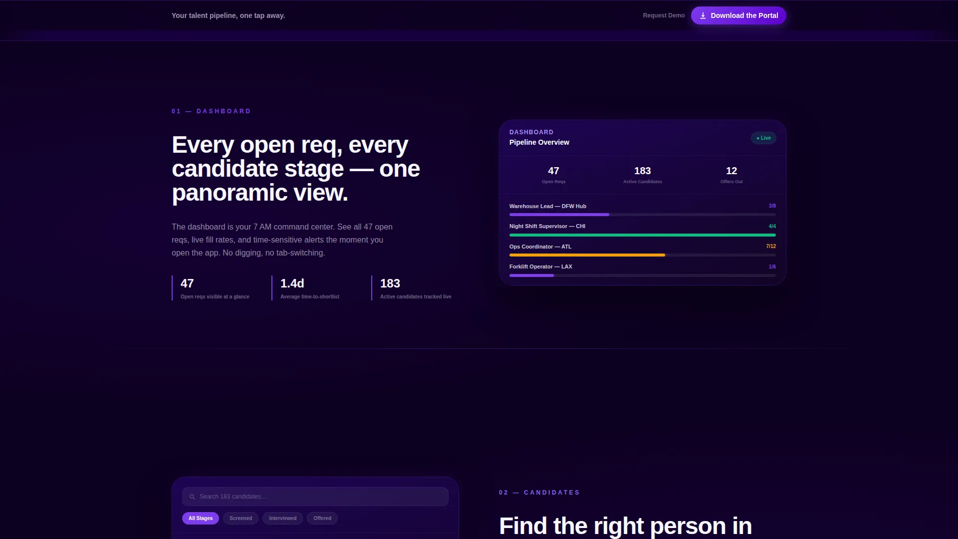
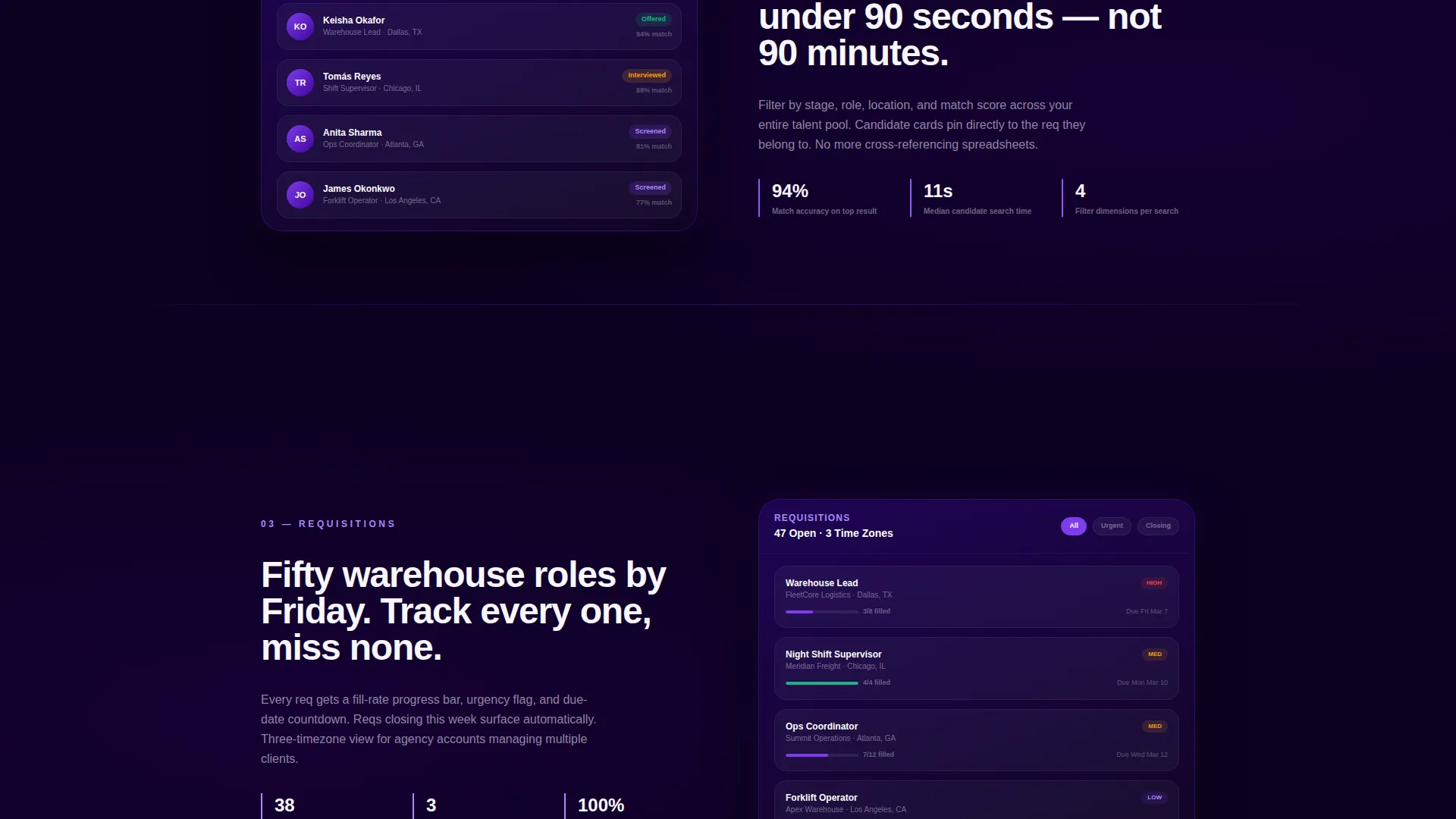
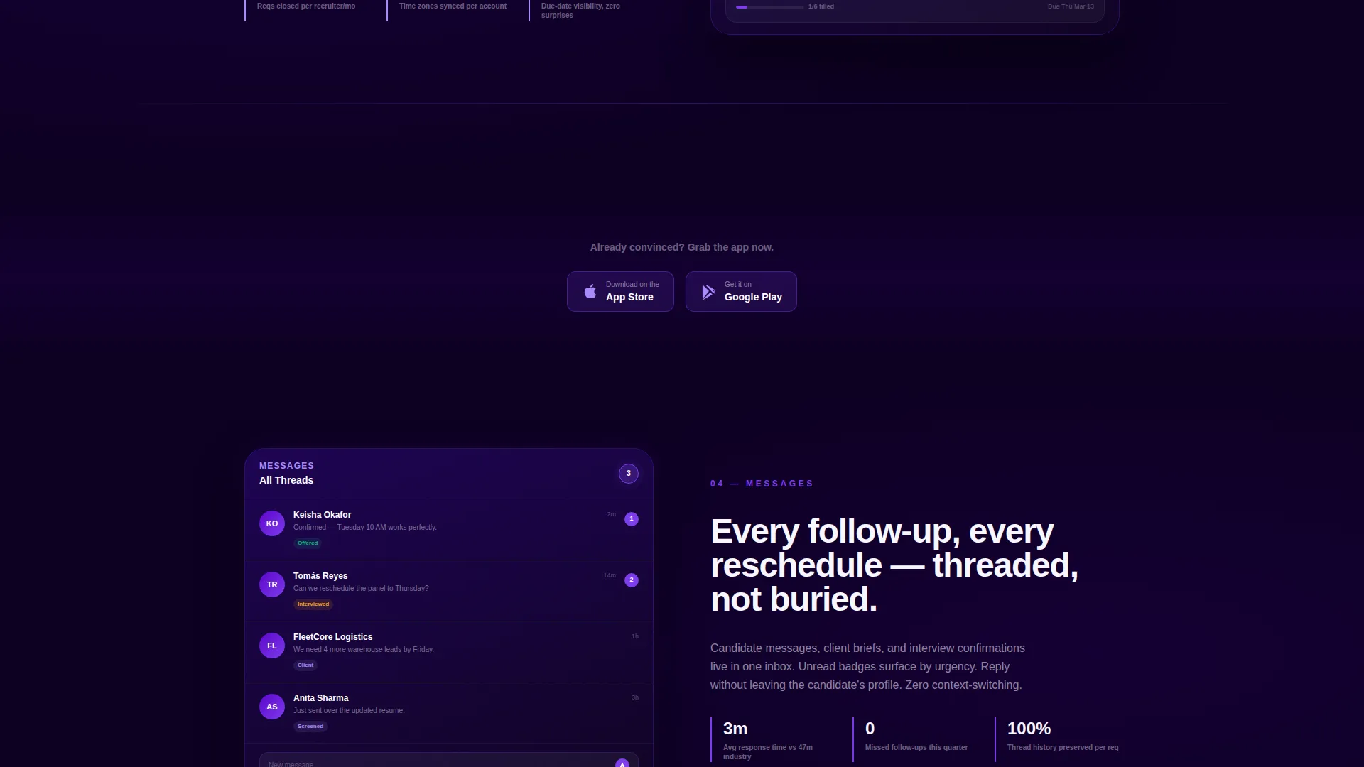
Each spoke section presents a cropped app screenshot, three short performance statistics, and a single-sentence capability line. The format mimics a product datasheet. Visitors absorb each screen in roughly five seconds before moving to the next, building familiarity before they ever tap download.
Floating Phone Mockup
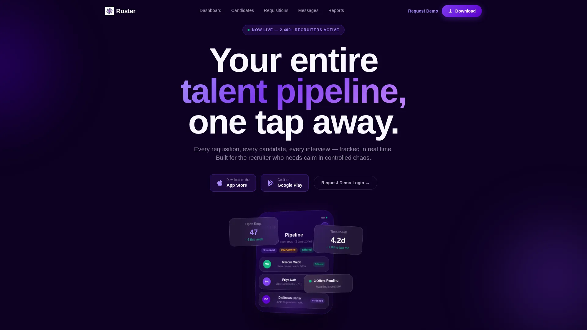
A phone mockup rises just below the fold, angled at fifteen degrees to show depth. The screen displays a live requisition dashboard with candidate avatars, stage chips labeled Screened, Interviewed, and Offered, and an unread-message badge glowing in violet. It communicates product quality without a word of description.
Repeating App Download Calls to Action
The primary call to action, "Download the Portal," appears three times: at the hero, after the third spoke section, and in the sticky bottom bar. App Store and Google Play badges are rendered in violet on white. A secondary path, "Request a Demo Login," serves enterprise buyers who want to see their own data first.
Status-Signal Color System
Candidate stage badges, notification pulses, and active placement indicators each carry a specific color from the Electric Indigo palette. Status-green marks confirmed placements. Live-wire violet marks active alerts. Every color earns its place as a functional signal rather than visual decoration.
Page sections overview
| Section | Purpose |
|---|---|
| Logo Bar Header | Establishes portal credibility through scrolling employer and agency logos |
| Hero with Mockup | Introduces the portal value proposition with a floating phone screen |
| Dashboard Spoke | Shows the full pipeline panorama as the first spec panel |
| Candidates Spoke | Highlights candidate search filters and shortlist management |
| Requisitions Spoke | Displays open role tracking and requisition status |
| Messages Spoke | Presents real-time messaging thread capabilities |
| Reports Spoke | Covers exportable compliance and placement reporting |
| Mid-Page call to action | Repeats the app download prompt after the third spoke |
| Sticky Bottom Bar | Keeps the download call to action visible on scroll |
Design & branding system
The Electric Indigo color system is built to read like a recruiter's screen at the start of a working day. Every shade carries a specific information role, so the interface feels organized rather than decorative.
- Deep interface indigo (#3D0099) forms the dark backbone of the header and navigation
- Live-wire violet (#7C3AED) drives interactive elements, badges, and the app download buttons
- Card-surface white (#F8F7FF) with a faint lilac undertone keeps candidate cards clean and readable
- Status-green (#10B981) marks active placements and confirmed interview slots
Mobile & speed optimization
The template is built with a mobile-first recruiting audience in mind. Recruiters check pipelines on phones between meetings, at airport gates, and before 8 AM, so every section needs to load and read cleanly on a small screen.
- The floating phone mockup and spoke sections reflow naturally for portrait mobile viewports
- The sticky bottom bar with app download badges stays accessible without covering key content on smaller screens
- Spec panels are cropped and framed so screenshot details remain legible at reduced sizes
How this template helps you convert
The page earns the download tap by making every spec section function as proof. Visitors do not just read about the portal; they inspect it screen by screen until the download feels like claiming a tool they have already learned.
- The logo bar immediately signals that real hiring organizations use this portal, lowering skepticism before the visitor reads a single feature claim
- The spec-sheet rhythm gives each recruiting workflow its own panel, so visitors mentally map their own process onto the interface as they scroll
- Three strategically placed download calls to action and a persistent sticky bar mean the path to the app store is never more than one tap away
Other information about this template
Roster is categorized under Technology with a subcategory focus on staffing and recruiting digital presence. It is purpose-built for the staffing and recruiting client portal niche, where the intersection of Directory and Discovery theme with a Spec Sheet creative direction creates a uniquely functional feel.
- The template style is Hub and Spoke with Anchor Navigation, making it well-suited for portal products that have multiple distinct feature areas
- The lp direction is App Download, meaning the entire page structure is oriented toward driving mobile app installs alongside a secondary enterprise demo path
- The header concept is a Logo Bar, which distinguishes Roster from hero-image-led competitors and positions social proof as the opening statement
- The color system is Electric Indigo, a palette that signals technology and precision without veering into generic corporate blue
Theme
Directory & Discovery
Creative direction
Spec Sheet
Color system
Electric Indigo
Style
Hub & Spoke (Anchor Nav)
Direction
App Download
Page Sections
Scrolling Logo Bar Header
Hub-and-spoke Anchor Navigation
Spec Sheet Section Layout
Floating Phone Mockup
Repeating App Download Calls to Action
Status-signal Color System
Related questions
Who is this template designed for?
Can I customize the spoke sections for different feature areas?
What makes the design feel different from a generic recruiting page?
Where does the app download call to action appear on the page?



