Entertainment Software & SaaS Professional Website Template
Roster is a comparison table landing page template built for entertainment client management platforms. It uses a Tech Glass visual theme with a Midnight Blue color system to present a talent management app with authority and precision. Managers see a hero dashboard screenshot, structured feature comparison tables, and a frictionless app download call to action, all in one sharp, scrollable page.
by Rocket studio
Quick summary
Roster is a single-page template designed for a talent management app that helps managers track deals, auditions, and residual checks across their full client roster. The layout follows a Spec Sheet creative direction with comparison tables, glassmorphic callout cards, and a direct app download path, all wrapped in a Midnight Blue Tech Glass visual identity.
Who this template is for
This template is built for teams launching or marketing an entertainment client management platform. It speaks directly to the people who live inside those tools every day.
- Boutique talent managers handling multiple actors across broadcast networks
- Music managers coordinating tour schedules alongside sync licensing windows
- Agency assistants running mid-six-figure operations currently held together by spreadsheets
What problem this template solves
Talent managers lose time because their tools are not built for the entertainment industry. Generic spreadsheets and broad CRM platforms miss the specific workflows that managers actually use. This template presents a purpose-built app as the clear answer.
- No organized way to track auditions, booked status, and next payment dates side by side
- Spreadsheets require manual maintenance and break down at scale
- Managers cannot quickly see the full status of every client from a single view
What you get with this template
You get a fully structured landing page that makes the case for your app through evidence and visual clarity. Every section is purposeful and directly connected to the buyer's decision.
- A hero section with a large, tilted product screenshot showing real-looking roster data
- Two structured comparison tables that systematically differentiate the app from alternatives
- A sticky app download call to action bar and paired App Store and Google Play badge components
Feature list
This template ships with a set of built-in layout components and interaction patterns designed specifically for the entertainment software niche.
Hero Dashboard Screenshot Display
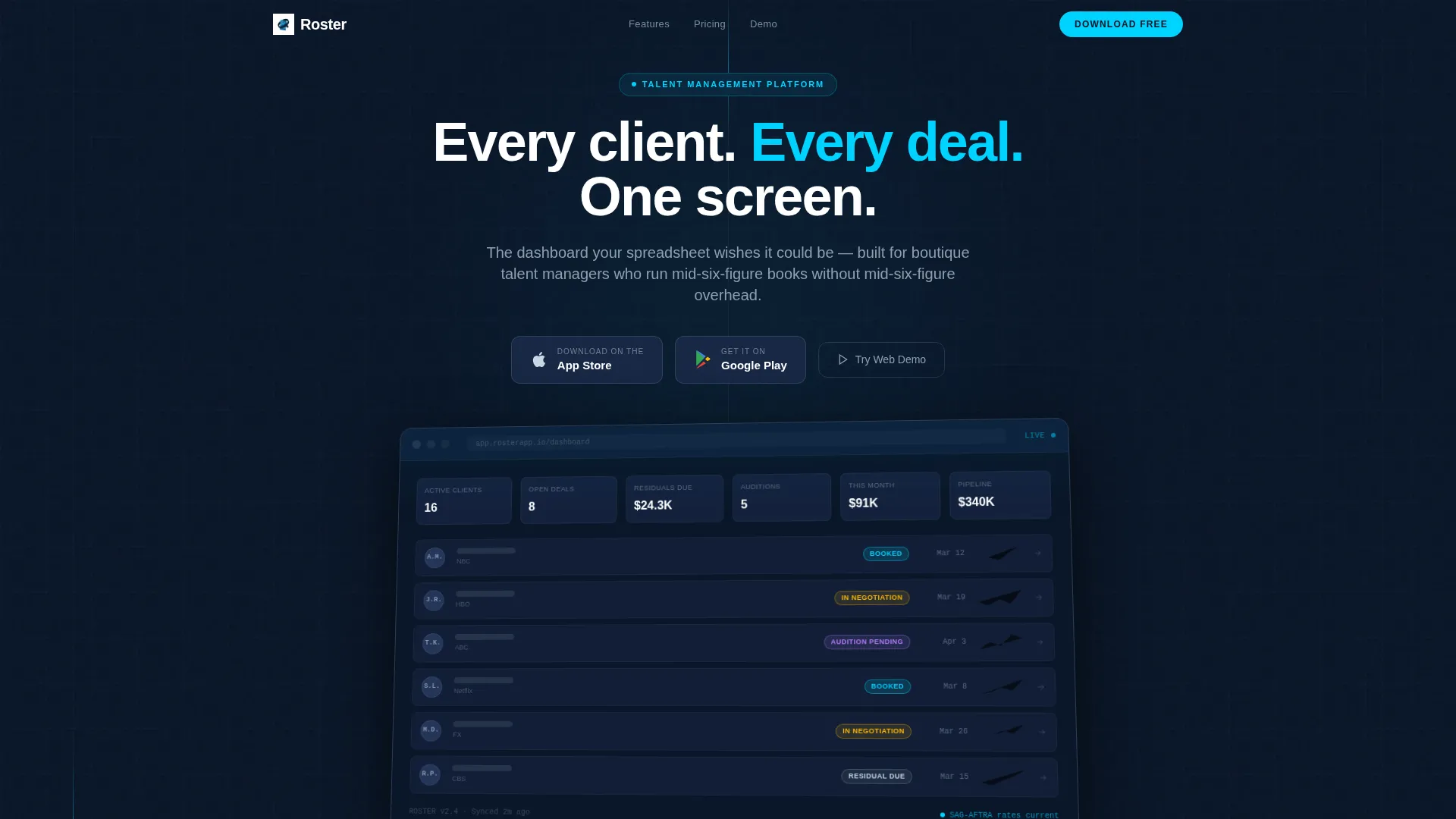
The header section renders the app's main dashboard at hero scale with a slight 3D tilt and a frosted glass shadow underneath. Six client cards with redacted names are shown, each displaying a status pill, a next payment date, and a small quarterly earnings spark-line. This gives visitors an immediate, credible preview of what the product actually does.
Comparison Table Layout
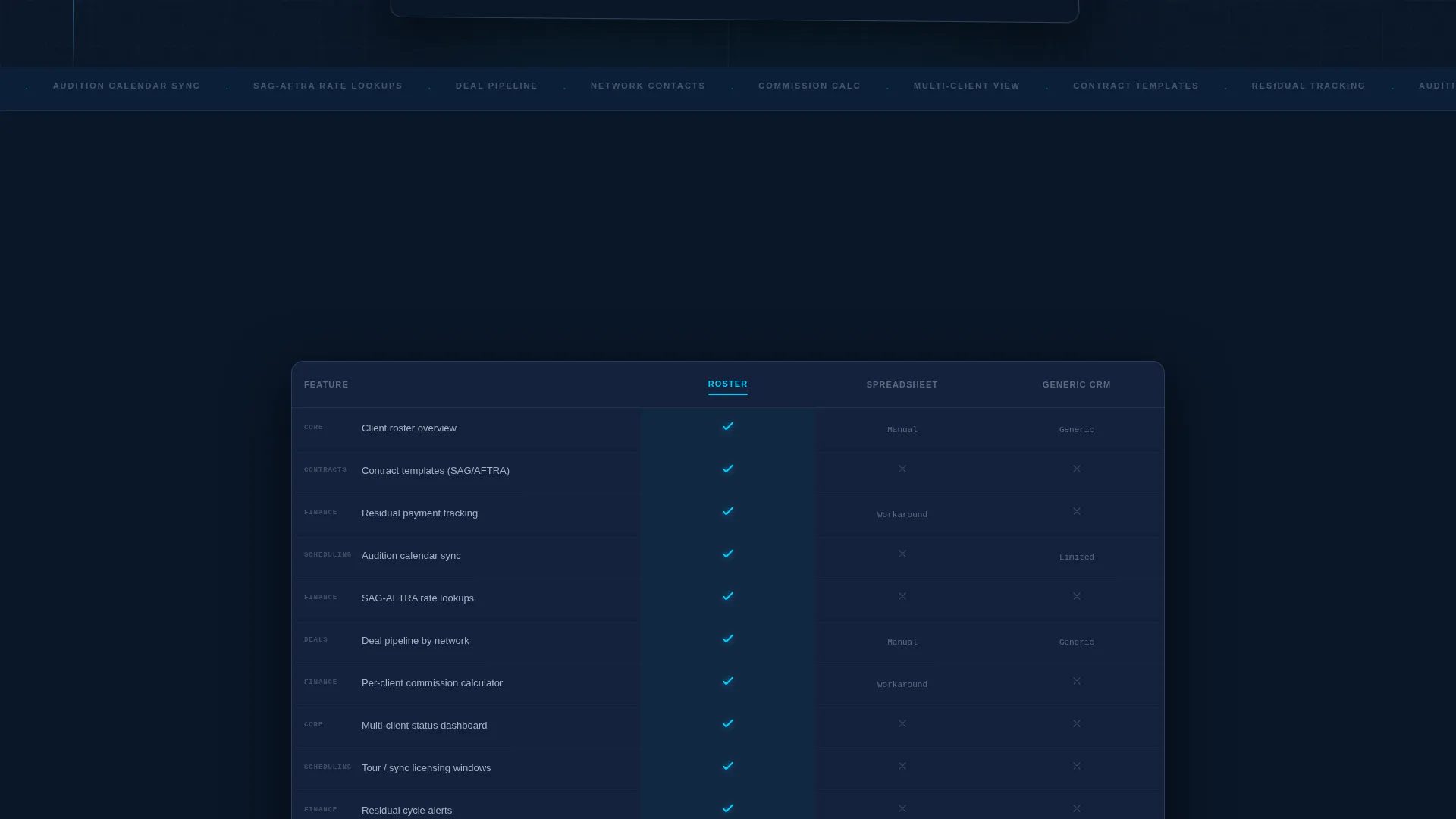
The first comparison table sets the app against spreadsheets and generic CRM platforms row by row. Rows cover capabilities such as contract templates, residual tracking, audition calendar sync, and SAG-AFTRA (Screen Actors Guild-American Federation of Television and Radio Artists) rate lookups. Roster's column lights up with cyan checkmarks across every relevant row, making the differentiation immediate and visual.
Plan Tier Breakdown Table
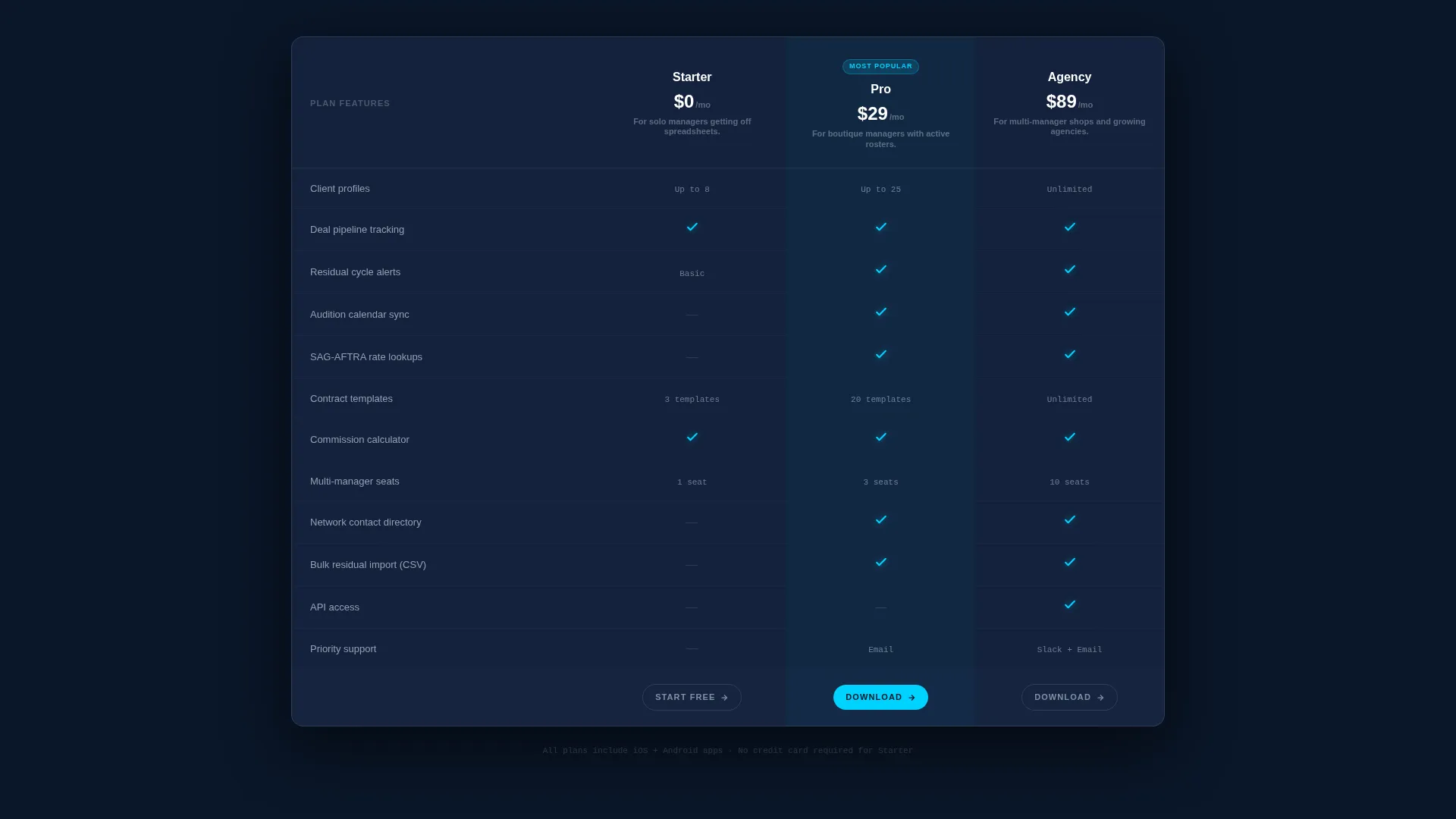
A second comparison table breaks down plan tiers and their feature differences. Each row reveals on scroll with a micro-animation that mimics a screen refresh, keeping the experience dynamic without distracting from the data.
Glassmorphic Stat Callout Cards
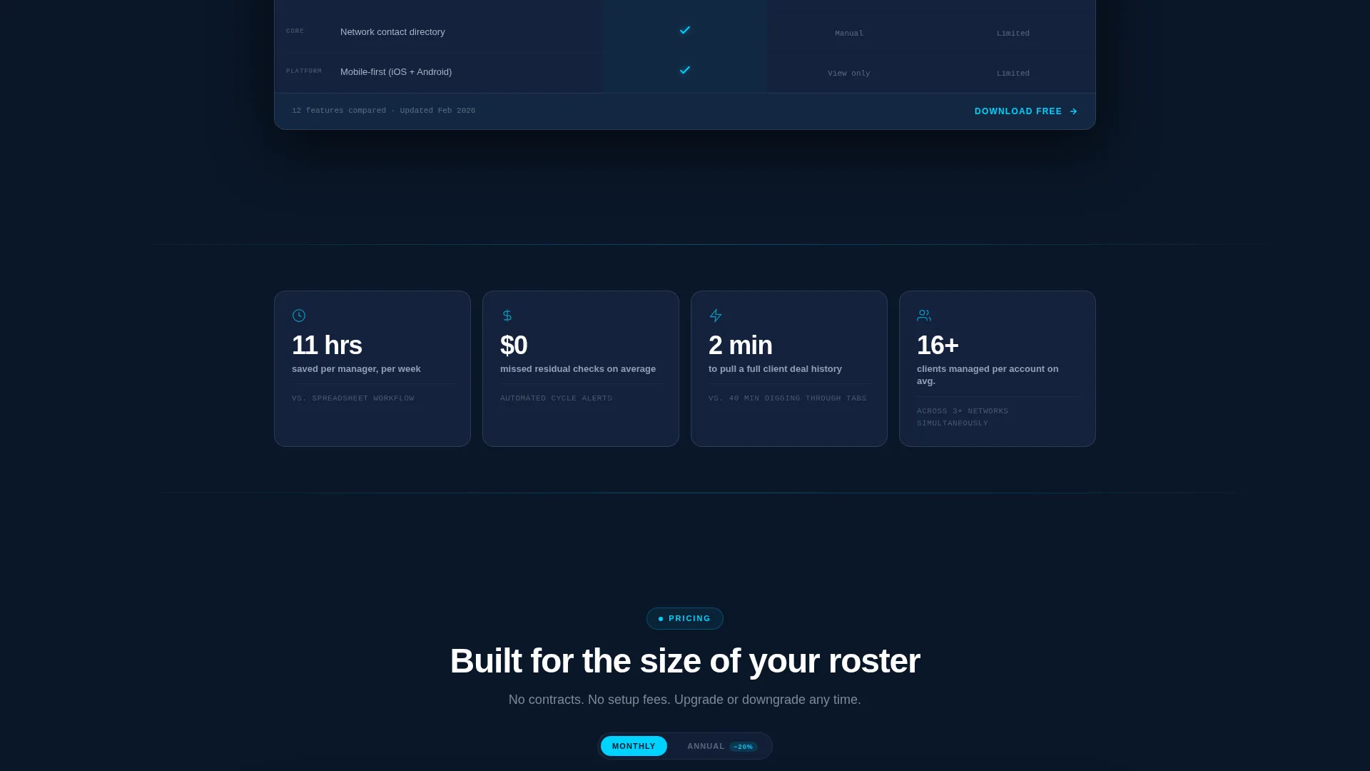
Between the two comparison tables, single-stat callout cards float inside glassmorphic containers. One example reads "Average manager saves 11 hours/week." These cards carry the rhythm of evidence between the dense table sections and build trust through specificity.
Sticky App Download Bar
After the first comparison table, a sticky bottom bar anchors the primary call to action to the viewport. It holds the "Download Roster Free" button alongside frosted-glass-styled App Store and Google Play badges so the download path is always within reach.
Secondary Web Demo Path
A secondary call to action labeled "Try the Web Demo" is available for desktop visitors. It opens an interactive sandbox without requiring any form submission, keeping the path to exploration completely frictionless.
Page sections overview
| Section | Purpose |
|---|---|
| Hero Screenshot Header | Introduces the app with a large tilted dashboard render and the headline "Every client. Every deal. One screen." |
| Primary call to action Block | Places the "Download Roster Free" button and app store badges directly below the hero |
| App versus. Alternatives Table | Compares Roster against spreadsheets and generic CRM tools using cyan checkmarks |
| Stat Callout Cards | Delivers punchy single-stat evidence between the two comparison tables |
| Plan Tier Table | Shows feature differences across pricing tiers with scroll-reveal row animations |
| Sticky Download Bar | Anchors the primary download call to action to the bottom of the viewport after scroll |
Design & branding system
The visual identity is built around a Tech Glass theme using a Midnight Blue color system. Every layer is intentional, from the deepest background tone to the electric accent used on interactive elements.
- Background layers move from deep terminal navy (#0A1628) to polished panel blue (#1B2A4A), with glassmorphism cards floating above
- Body text renders in frosted glass highlight (#C8D6E5) and headlines in pure white, creating a clear reading hierarchy
- All interactive elements, including buttons, table row hovers, and comparison checkmarks, use electric accent cyan (#00D2FF) to draw the eye at the right moments
Mobile & speed optimization
The template is designed to carry its visual weight without slowing the experience. Every component is built to work across screen sizes.
- The tilted hero screenshot and glassmorphic cards are structured to scale cleanly on smaller viewports
- Sticky call to action bar and app store badge layout adapt to mobile screen widths without breaking the download flow
- Comparison tables are formatted to remain readable on narrow screens, keeping the key differentiators visible
How this template helps you convert
The page is structured so that trust is earned before the call to action is pressed. By the time a visitor reaches the second comparison table, the app has already demonstrated that it understands their exact workflow.
- The hero screenshot creates immediate credibility by showing a real-looking, populated dashboard rather than abstract feature claims
- The sequential comparison tables provide systematic, evidence-led proof that moves the visitor from curiosity to confidence
- The frictionless download path, with no form fields and a persistent sticky bar, removes every barrier between decision and action
Other information about this template
This template is a strong fit for teams positioning a talent management app in a competitive software market. A few additional details are worth noting for buyers evaluating the template.
- The template is categorized under Technology, specifically Entertainment Software and Software as a Service (SaaS), making it well-suited for niche positioning
- The Spec Sheet creative direction is intentional: the page leads with data and structure rather than emotion, which matches how experienced managers evaluate tools
- The scroll-reveal micro-animations on table rows are designed to feel like a screen refresh, reinforcing the product's digital-native identity throughout the page
Theme
Tech Glass
Creative direction
Spec Sheet
Color system
Midnight Blue
Style
Comparison Table
Direction
App Download
Page Sections
Hero Dashboard Screenshot at Scale
Comparison Tables with Cyan Checkmarks
Glassmorphic Stat Callout Cards
Sticky App Download Call to Action Bar
Frictionless Secondary Demo Path
Scroll-reveal Table Row Animations
Related questions
What type of page is this template?
Does this template include form fields or a sign-up flow?
Can this template work for a SaaS product outside the entertainment industry?
What makes the visual design feel distinct from a generic tech template?
Are the app download buttons and store badges customizable?



