Directory & Marketplace Platforms Provider Directory Website Template
Roster is a bold, data-driven fitness trainer directory landing page built on a Dashboard/Data Grid layout with a Bold Brutalist visual identity. It puts verified trainer stats, specialty filters, and client outcome metrics front and center. A pinned lead-generation form matches visitors to trainers in seconds, making every scroll feel like reading a scouting report before a big decision.
by Rocket studio
Quick summary
Roster is a single-page fitness trainer directory landing page designed to convert serious fitness seekers into matched leads. It leads with live-looking aggregate stats, renders trainer profiles as filterable data cards, and drives action through a pinned two-field form. The Bold Brutalist design uses a Carbon Fiber color palette that feels industrial, direct, and credible.
Who this template is for
This template is built for fitness platforms, gym networks, and trainer marketplace operators who need to present a large roster of certified professionals in a way that earns immediate trust. It works best when the audience arrives with a specific goal and needs fast, evidence-based reasons to commit.
- Fitness marketplace founders launching a trainer directory platform
- Gym brands and training studios building a coach-selection experience
- Independent platform builders serving niche fitness communities such as sport-specific coaching or post-rehabilitation strength training
What problem this template solves
Most trainer directory pages bury the proof. They lead with lifestyle photography and vague taglines instead of the numbers that actually move a decision. Roster flips that priority. Data appears before copy, and every profile element is designed to answer a real buyer question without extra scrolling.
- Visitors leave directory pages when they cannot quickly filter by specialty, availability, or verified results
- Generic photo-grid layouts make it hard to compare trainers side by side at a glance
- Lead capture forms placed deep in the page miss visitors who decide fast and leave faster
What you get with this template
You get a fully structured, single-page directory landing page that sequences from aggregate proof to individual trainer profiles to a pinned lead-capture form. Every section is designed around decision-making, not decoration.
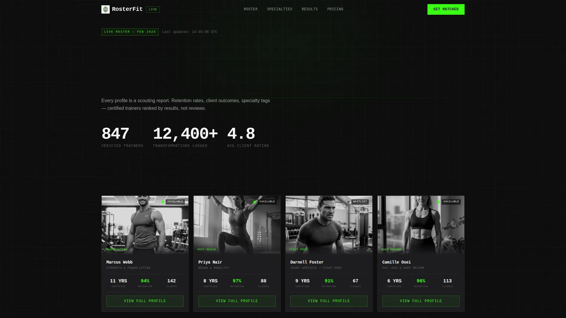
- A live-style Dashboard Preview header with four trainer profile cards and floating aggregate statistics
- Specialty breakdown stat bars, client outcome line graphs, and brutalist wipe section transitions
- A progressive-disclosure lead form with a pinned viewport position and a secondary qualifier expansion on submit
Feature list
This template ships with a tightly scoped set of layout components built specifically for fitness trainer directory use cases.
Live Dashboard Header Grid
The header renders a fully visible trainer grid before the visitor reads a single word of copy. Four profile cards display black-and-white trainer photos, specialty tags, years certified, client retention percentages, and pulsing green availability indicators. Oversized monospaced aggregate stats float above the grid, showing verified trainer count, total transformations logged, and average client rating.
Specialty Stat Bar Section
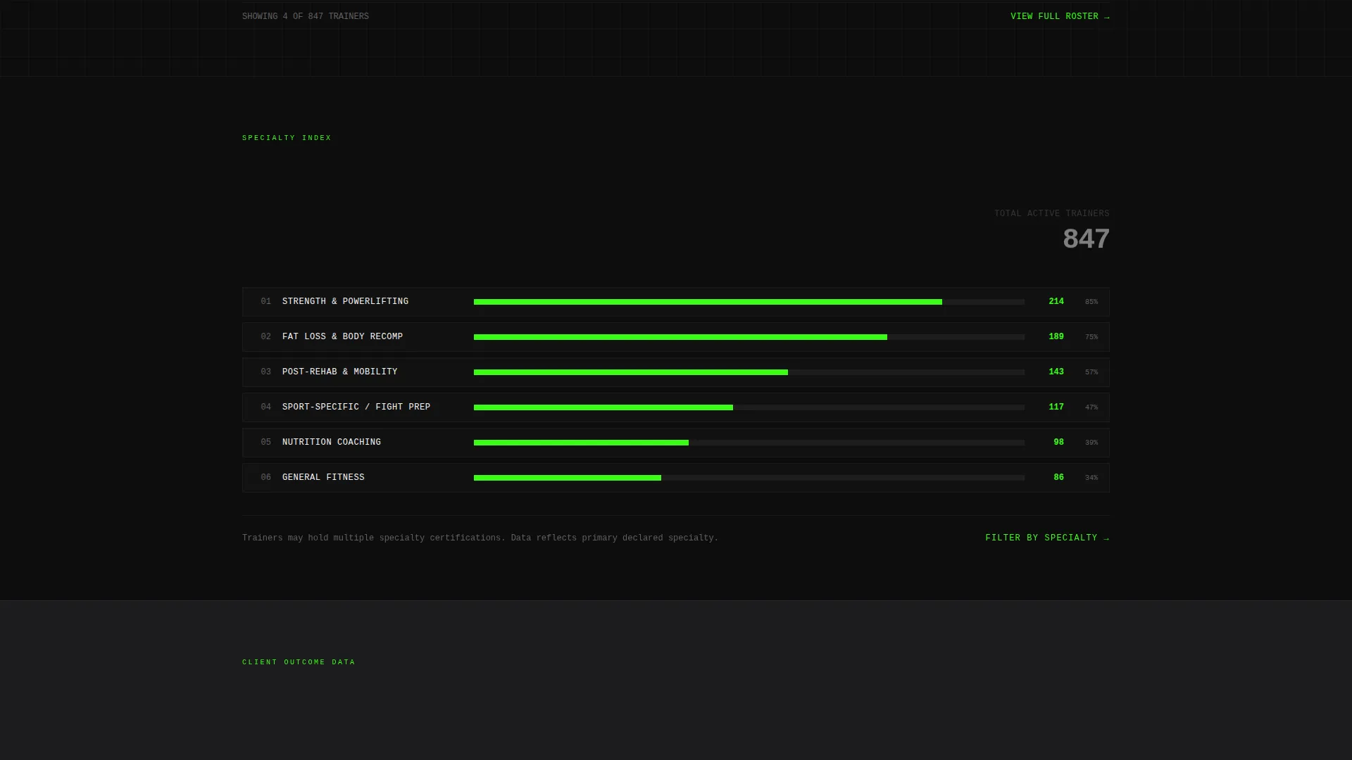
Below the header, trainer density across categories such as strength, mobility, nutrition, and sport-specific coaching is visualized as horizontal stat bars. Each bar communicates relative supply at a glance, helping visitors orient toward the category that matches their goal without reading a paragraph.
Client Outcome Data Section
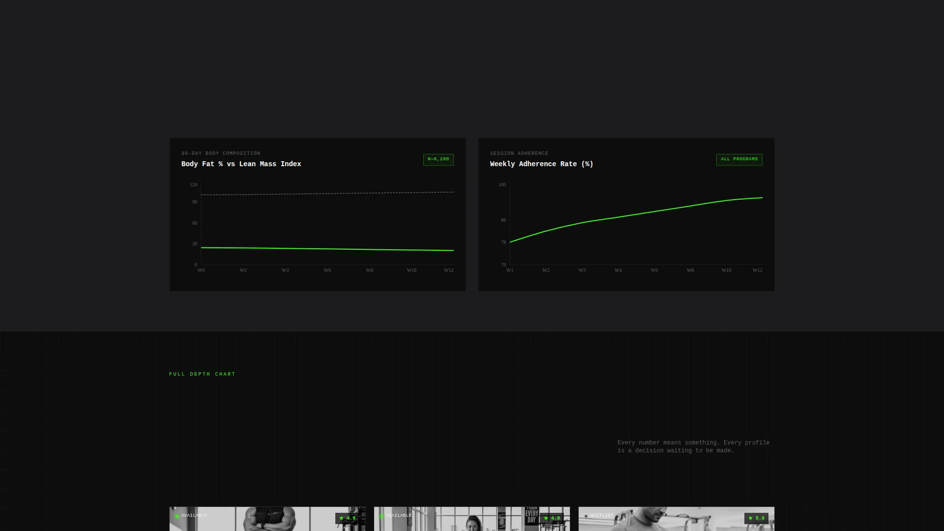
This section presents measurable client results using line graph visualizations rather than before-and-after photo sliders. Average body composition change at 90 days and session adherence rates give the page a clinical, evidence-first credibility that lifestyle imagery cannot replicate.
Pinned Lead-Generation Form
A two-field inline form stays fixed at the bottom of the viewport throughout the entire page scroll. It asks for a zip code and a goal selection from five options: Fat Loss, Strength, Rehab, Sport, or General Fitness. The electric signal green call-to-action button reads "Match Me With a Trainer" against a matte black background.
Progressive Disclosure Qualifier Flow
Submitting the pinned form expands a secondary qualifier without a page reload. Visitors choose their experience level, preferred session frequency, and budget range. The first action stays frictionless because the deeper questions only appear after the initial commitment.
Trainer Card Secondary calls to action
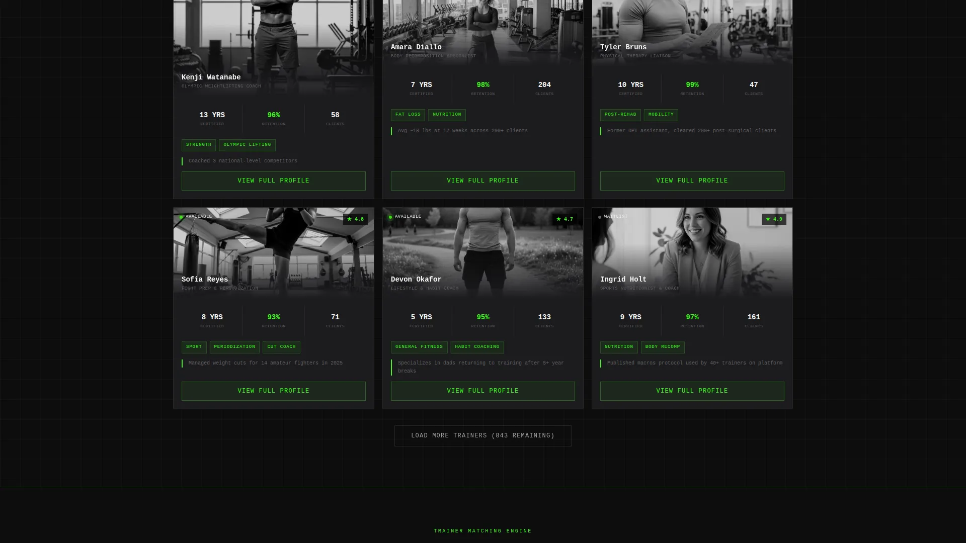
Every trainer profile card throughout the page carries a "View Full Profile" secondary call-to-action. This gives manual browsers a direct path to individual profiles without requiring them to go through the matching flow.
Page sections overview
| Section | Purpose |
|---|---|
| Dashboard Preview Header | Opens with live-style trainer grid and floating aggregate stats |
| Specialty Stat Bars | Shows trainer density per fitness category as horizontal data bars |
| Client Outcome Metrics | Displays 90-day result data and adherence rates as line graphs |
| Pinned Lead Form | Captures zip code and goal at the bottom of every viewport position |
| Progressive Qualifier Expansion | Deepens lead data after initial form submission |
| Trainer Profile Cards | Surfaces individual trainer details with a secondary call to action throughout |
Design & branding system
The visual identity follows a Bold Brutalist theme built on a Carbon Fiber color system. The palette is intentionally industrial, with no softening gradients or decorative flourishes. Every color choice reinforces function over aesthetics.
- Deep matte black (#0D0D0D) as the base background, titanium mid-gray (#3A3A3C) for structural contrast, and woven carbon texture gray (#1C1C1E) for layered surfaces
- Electric signal green (#39FF14) reserved exclusively for live-data accents, active states, and call-to-action surfaces including the primary form button
- Trainer photos rendered in high-contrast black and white; section transitions use hard brutalist wipe animations with no easing curves
Mobile & speed optimization
The layout is structured to maintain hierarchy and scannability on smaller screens. The data-grid approach means content stacks cleanly without losing its decision-support logic on mobile viewports.
- Trainer profile cards reflow from a four-column grid to a single-column stack on narrow screens
- The pinned lead form remains fixed to the viewport bottom on mobile, keeping the primary conversion action always reachable
- Brutalist wipe animations use hard cuts rather than complex easing, keeping transitions visually clean without heavy rendering overhead
How this template helps you convert
Roster is engineered around a single behavioral reality: people convert when they trust the data and the next step feels small. Every layout decision on this page serves that principle.
- Aggregate stats appear before any copy, so the first impression is numerical proof rather than a marketing claim, building instant credibility with a skeptical fitness audience
- The pinned two-field form reduces the perceived effort of starting a match to almost zero, while the progressive disclosure flow gathers richer qualifier data only after the visitor has already committed to the first action
- Trainer card secondary calls to action give manual browsers a parallel conversion path so no engaged visitor reaches a dead end
Other information about this template
Roster is designed for the fitness trainer directory niche inside the broader Technology and Directory and Marketplace Platforms category. It is particularly well suited for platforms that serve high-intent, goal-driven audiences who respond to data rather than aspirational imagery.
- The template style is Dashboard/Data Grid, making it a strong fit for any directory platform that needs to present dense professional data in a scannable, credible format
- The Stats-First Impact creative direction means the template naturally supports audiences such as post-rehabilitation patients, competitive athletes, and goal-specific clients who want evidence before they commit
- The Bold Brutalist theme and Carbon Fiber color system differentiate this template from conventional pastel-toned fitness landing pages, giving marketplace operators a visually distinctive starting point
Theme
Bold Brutalist
Creative direction
Stats-First Impact
Color system
Carbon Fiber
Style
Dashboard/Data Grid
Direction
Lead Generation
Page Sections
Live Dashboard Header Grid
Specialty Stat Bar Section
Client Outcome Data Visualizations
Pinned Two-field Lead Form
Progressive Disclosure Qualifier Flow
Trainer Card Secondary Ctas
Related questions
Who is the target audience for this landing page template?
Can I customize the trainer card data points shown in the grid?
Does the lead form support custom goal categories?
What makes this template different from a standard fitness directory layout?
Is the progressive disclosure qualifier built into the template?



