Roster - Powerful Volunteer Management Landing Page Template
Roster is a hub-and-spoke landing page template built for restaurant volunteer management platforms. It opens with a live estimator that calculates wasted scheduling hours, then guides visitors through metric-led spoke sections covering fill rate, response time, no-show recovery, and hour tracking. The design uses a high-contrast Acid Digital palette and converts visitors through a low-friction three-field lead form.
by Rocket studio
Quick summary
Roster is a single-page, hub-and-spoke landing page template designed for volunteer scheduling platforms in food service settings. It leads with an interactive estimator, delivers stats-first scrolling impact, and closes with a frictionless lead capture form. The design is built around a void black and terminal green dashboard aesthetic that signals clarity and operational control from the first scroll.
Who this template is for
This template is built for teams selling or showcasing volunteer management software in community food service contexts. It speaks directly to the coordinators and directors who feel the daily cost of scheduling chaos.
- Soup kitchen directors managing large pools of irregular weekly volunteers
- Community café managers coordinating part-time, schedule-sensitive contributors
- Food bank warehouse leads losing volunteers to unreliable group-text communication
What problem this template solves
Volunteer coordinators in food service rely on spreadsheets, group texts, and manual follow-up to fill every shift. That process leaks hours, misses no-shows, and leaves shift logs incomplete when accountability matters most.
- No single view of who is scheduled, who confirmed, and who did not show
- Hours spent each week on manual outreach instead of actual coordination work
- Shift data scattered across texts and inboxes, impossible to audit or report
What you get with this template
You get a complete, conversion-focused landing page that makes the cost of the old way visible before it asks for anything. Every section is built to prove value through data before introducing a form.
- A live calculator header that renders the visitor's own wasted hours in real time
- Five metric-anchored spoke sections, each opening with a headline number and a mini-dashboard visual
- Two distinct conversion paths: a primary lead form and a secondary checklist download gate
Feature list
This template delivers a structured set of purpose-built components, each designed to move a skeptical coordinator from curious to convinced.
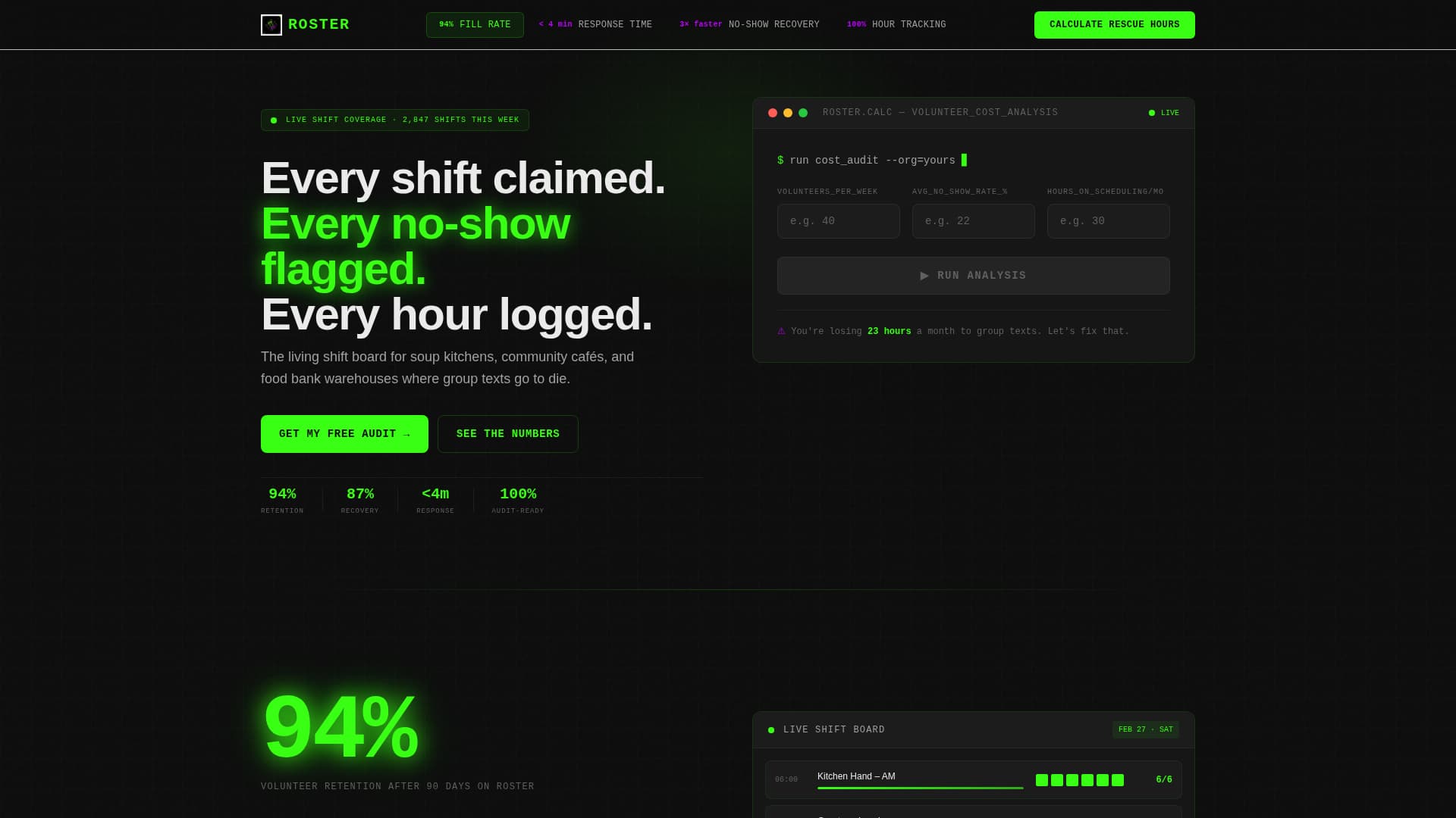
Live Scheduling Estimator Header
The header is a sleek black calculator panel. Visitors enter three values: volunteers per week, average no-show rate, and hours spent scheduling manually. Animated terminal-green counters instantly display hours reclaimed, projected fill-rate improvement, and estimated cost savings versus paid staffing. A single line beneath the calculator reads: "You're losing 23 hours a month to group texts. Let's fix that."
Hub Navigation with Metric Anchors
A sticky anchor navigation bar ties the page together. Each nav label is a metric keyword: Fill Rate, Response Time, No-Show Recovery, and Hour Tracking. The terminal-green "Calculate Your Rescue Hours" button stays fixed in the nav rail so the primary call to action is always one tap away.
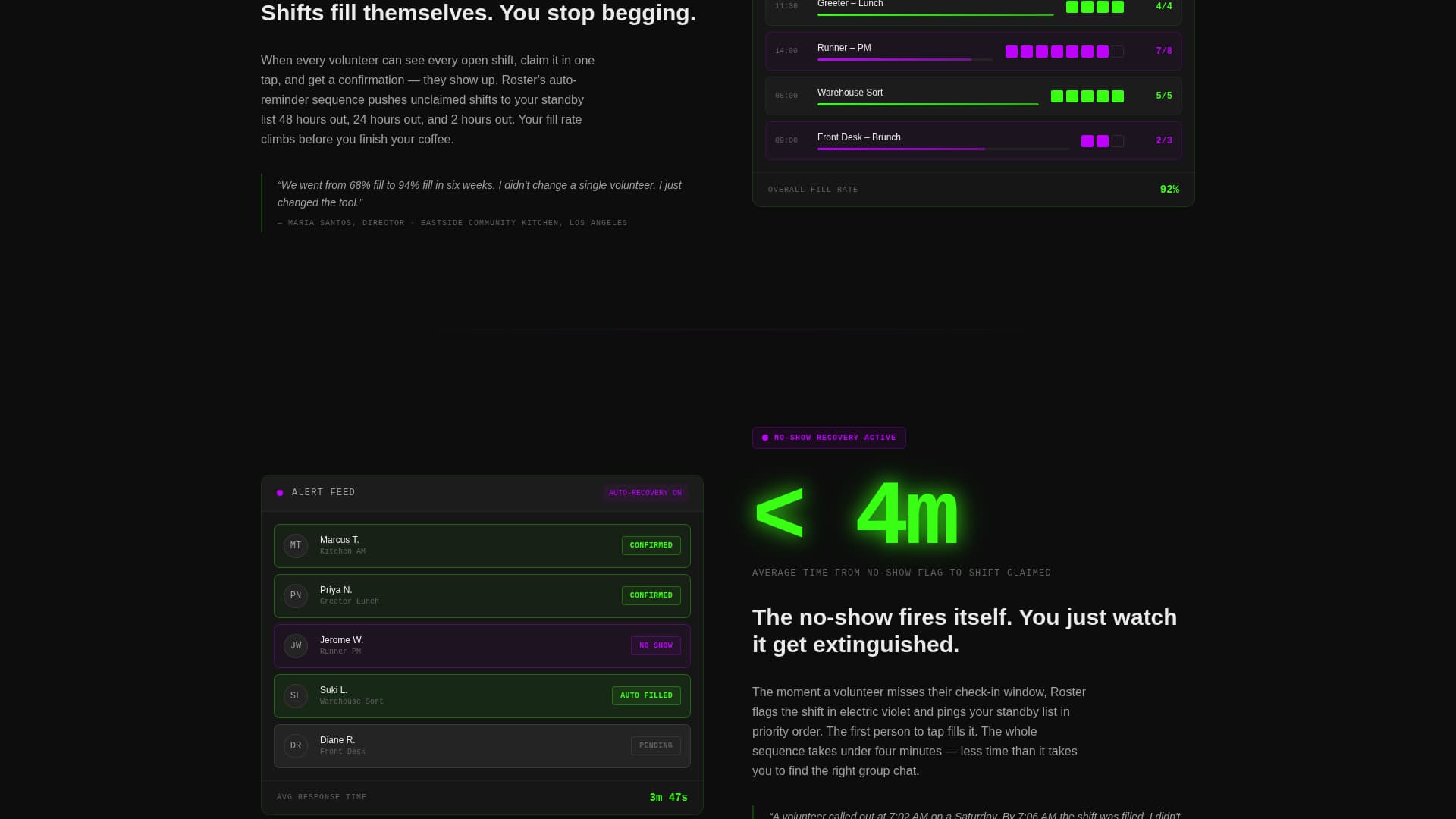
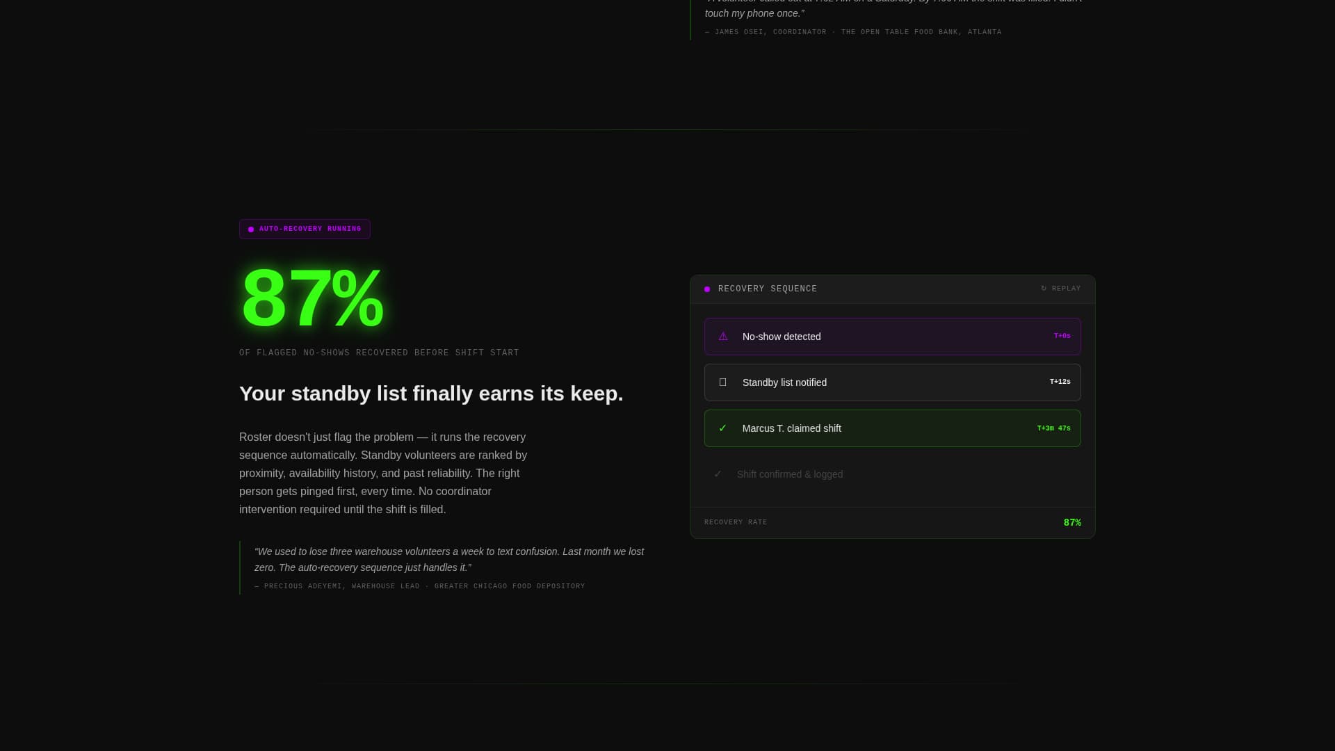
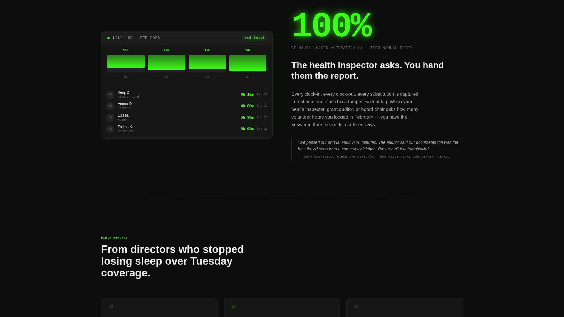
Stats-First Spoke Sections
Each spoke section opens with a large headline number before its explanation appears. A massive figure like "94%" loads first, then its context fades in below. This rhythm of punch-then-prove repeats across every spoke, ensuring visitors encounter a compelling data point within every viewport of scroll.
Mini-Dashboard Visuals with Case Studies
Every spoke section includes a mini-dashboard screenshot alongside a one-sentence case study drawn from a real food bank or community kitchen scenario. The combination of visual proof and operational context makes each feature feel grounded rather than theoretical.
Dual Conversion Path System
The primary path is a slide-out form triggered after the estimator. It asks for organization name, a volunteer count range via dropdown (10 to 25, 25 to 75, or 75 plus), and a work email. The secondary path offers a downloadable "Volunteer Scheduling Audit Checklist" gated behind email-only capture for visitors not yet ready to commit.
Micro-Interaction Feature Demonstrations
Each spoke section includes a micro-interaction that shows the featured capability in motion. These small animations give visitors a feel for how the platform behaves without requiring a live demo or video embed.
Page sections overview
| Section | Purpose |
|---|---|
| Estimator Header | Render visitor's wasted hours live |
| Sticky Hub Nav | Anchor navigation with persistent call to action |
| Fill Rate Spoke | Prove shift coverage improvement |
| Response Time Spoke | Show speed of volunteer confirmation |
| No-Show Recovery Spoke | Demonstrate flagging and re-fill logic |
| Hour Tracking Spoke | Illustrate automatic shift-log accuracy |
| Primary Lead Form | Capture org details and work email |
| Checklist Download Gate | Secondary email capture for cold visitors |
Design & branding system
The visual identity follows a Dashboard Pro theme using an Acid Digital color system. The palette feels like a mission control screen at 2 a.m., high-contrast and zero warmth, built entirely for signal over decoration.
- Void black (#0D0D0D) dominates all backgrounds and navigation rails for depth and focus
- Terminal green (#39FF14) fires on live data counters, active shift indicators, and primary buttons
- Electric violet (#BF00FF) marks alerts, overdue shifts, and hover states throughout the page
- Interface white (#EAEAEA) keeps card content and body typography readable against the dark backgrounds
Mobile & speed optimization
The template is structured to remain clear and functional at any screen size. The high-contrast palette and large typographic numbers are inherently readable on small displays without additional styling complexity.
- The sticky hub nav collapses cleanly on mobile so the persistent call to action remains accessible
- Calculator input fields are sized and spaced for thumb-friendly interaction on touch screens
- Mini-dashboard visuals are laid out to reflow gracefully at narrow breakpoints
How this template helps you convert
The conversion architecture is built around the estimator. By the time a visitor fills in their own numbers, the cost of inaction is no longer abstract. The form that follows feels like a logical next step rather than a sales push.
- The live estimator makes the problem personal before any copy does, replacing generic claims with the visitor's own calculated losses
- The sticky "Calculate Your Rescue Hours" button stays visible across all spoke sections, removing friction between intent and action at any scroll depth
- The checklist download path captures email from visitors who are not yet ready for a conversation, keeping them in the funnel without pressure
Other information about this template
This template is purpose-built for the restaurant volunteer management niche and is optimized as a lead generation landing page. It fits naturally into the broader restaurant software and food service technology category.
- Template style: Hub and Spoke with anchor navigation, ideal for platforms with multiple distinct feature areas
- Theme: Dashboard Pro, suited to data-heavy platforms that need to project authority and operational clarity
- The Acid Digital color system distinguishes this template visually from generic SaaS or hospitality designs
- The secondary checklist download asset can be customized to match any organization's specific audit criteria
- The volunteer count dropdown (10 to 25, 25 to 75, 75 plus) allows the platform team to segment leads by organization size at the point of capture
Theme
Dashboard Pro
Creative direction
Stats-First Impact
Color system
Acid Digital
Style
Hub & Spoke (Anchor Nav)
Direction
Lead Generation
Page Sections
Live Scheduling Estimator Header
Sticky Hub Navigation with Call to Action
Stats-first Spoke Sections
Mini-dashboard Visuals and Case Studies
Dual Conversion Path System
Micro-interaction Feature Demos
Related questions
Who is this landing page template designed for?
Can I customize the calculator fields for my platform?
What are the two conversion paths included in this template?
How many spoke sections does this template include?
Does this template work for volunteer programs outside food service?