Roster - Seamless Scheduling Landing Page Template
Roster is a comparison table landing page template built for hospitality staff scheduling platforms. It walks visitors through an eight-row side-by-side breakdown of the old way versus a smarter solution, then deepens the arc with a three-panel crisis scenario. The design runs on deep midnight navy with confirmation teal, built to convert managers who already feel the pain.
by Rocket studio
Quick summary
Roster is a single-page, click-through landing page template designed for hospitality staff scheduling platforms. It opens with a Feature Tab Switcher header, moves through a hard-hitting comparison table, and closes with two clear calls to action. The Midnight Blue color system and Directory and Discovery theme give it the polished weight of a hotel operations screen.
Who this template is for
This template is built for software teams and product marketers promoting hospitality scheduling tools. It speaks directly to buyers who already live inside the problem every day.
- Front-of-house managers juggling large part-time teams across multiple service periods
- Hotel operations directors overseeing staff across several properties from one interface
- Catering leads and event venue coordinators who need full coverage confirmed days in advance
What problem this template solves
Hospitality managers are not short on scheduling tools. They are short on tools that speak their language and earn their trust fast. This template solves the landing page problem of explaining a complex platform to a skeptical, time-poor buyer.
- Visitors arrive with real pain but low patience; the comparison table names their problems before they scroll away
- Generic SaaS landing pages fail hospitality buyers who need role-specific language like "runner," "night audit," and "cover shift"
- Most scheduling platform pages bury the value proposition; this template surfaces it in the first viewport
What you get with this template
You get a fully structured, single-page layout that takes visitors from pain recognition to trial signup without a single form on the page. Every section is designed to reduce friction and build confidence.
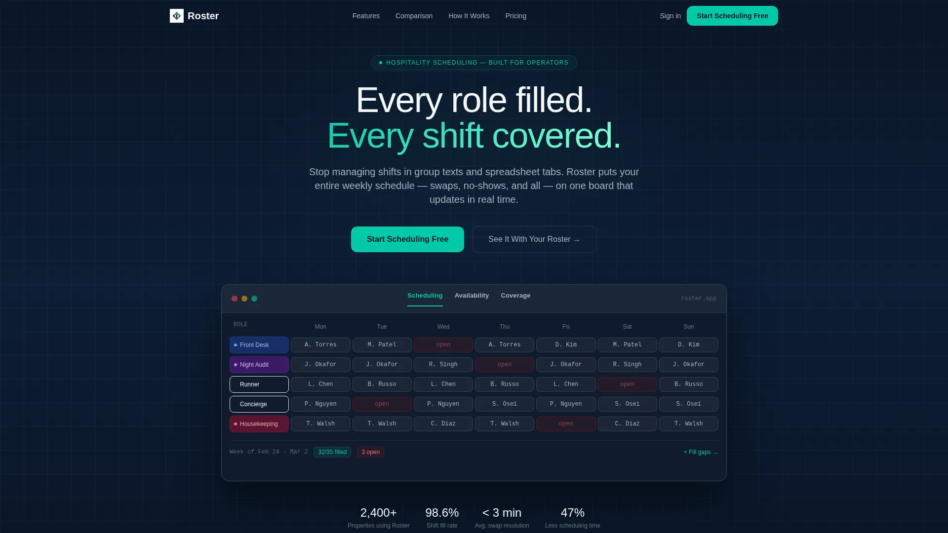
- A Feature Tab Switcher header with three live-state views: Scheduling, Availability, and Coverage
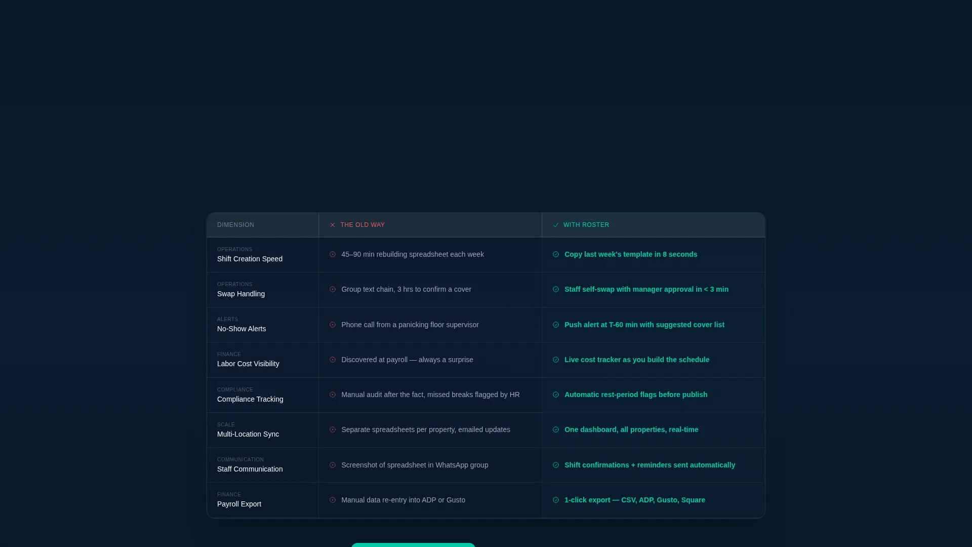
- An eight-row comparison table contrasting the old workflow against the platform across real operational dimensions
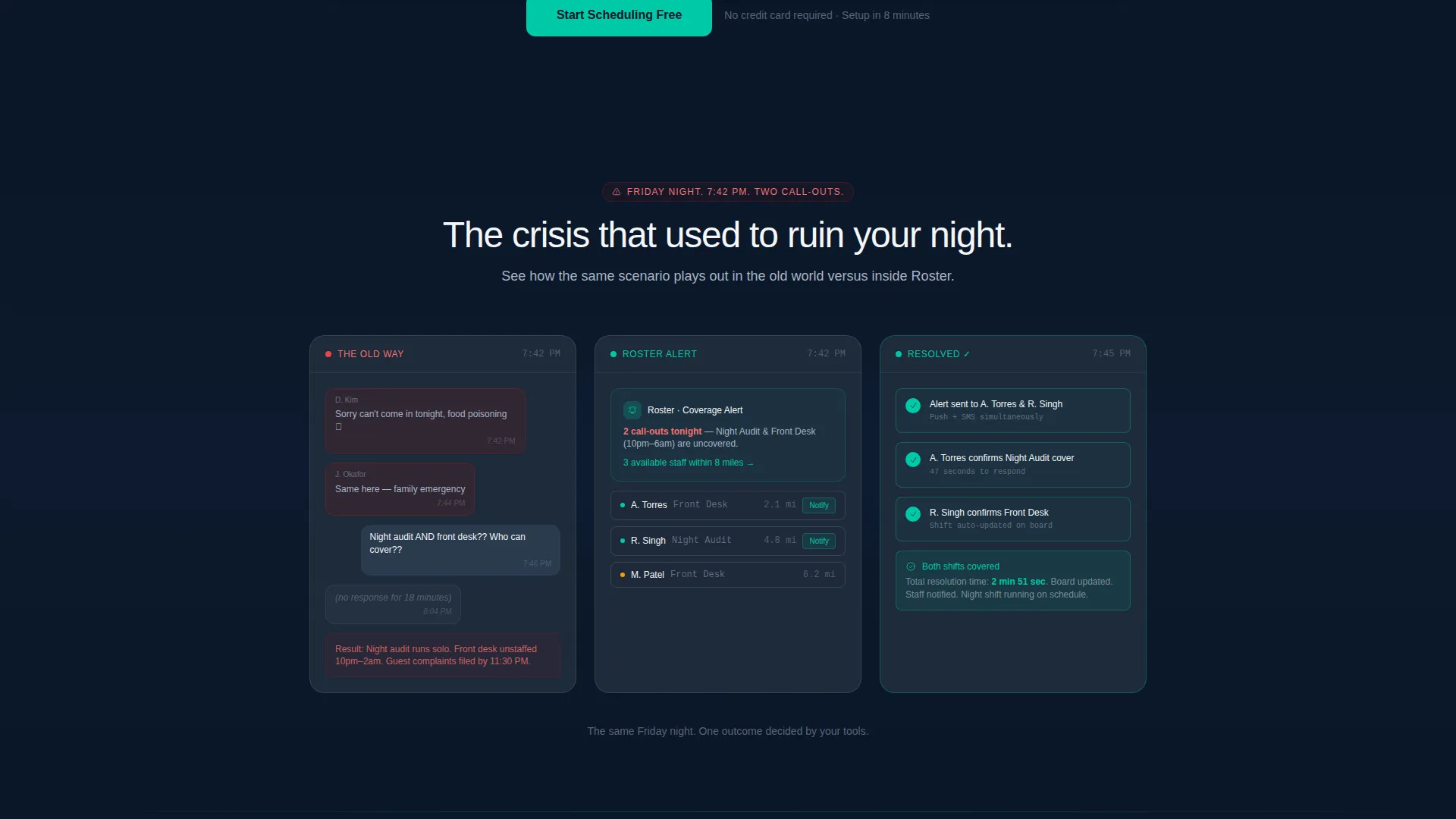
- A three-panel narrative sequence showing a Friday night crisis resolved in three clicks
- Two strategically placed calls to action: a sticky header button and an anchored section button
Feature list
This template is built around components that earn trust through operational specificity. Each section does a distinct job in moving a hospitality manager from skeptical to ready.
Eight-Row Comparison Table
The table stacks the old workflow against the platform across eight operational dimensions: shift creation speed, swap handling, no-show alerts, labor cost visibility, compliance tracking, multi-location sync, staff communication, and payroll export. Problem-side cells use gray text; solution-side cells use confirmation teal highlights. The contrast is immediate and readable.
Feature Tab Switcher Header
Three tabs sit across the top of a live product frame. The default tab shows a weekly scheduling grid with staff name chips. Switching to Availability reveals a staff directory with green and amber presence indicators. Switching to Coverage surfaces a gap report where red flags resolve to teal checkmarks. The header alone communicates product depth before a visitor reads a single line of copy.
Three-Panel Crisis Narrative
A sequential storytelling block walks through a real scenario: Friday night, two call-outs. Panel one shows the old-world chaos. Panels two and three show the same situation resolving inside the product in three clicks. The sequence uses real role names and real shift language to make the scenario feel genuine to a hospitality operator.
Dual Call-to-Action Structure
The primary call to action, "Start Scheduling Free," appears in the sticky header after scroll and again anchored below the comparison table. A secondary call to action, "See It With Your Roster," offers a personalized demo with a calendar embed. No form lives on this page; both buttons link to a downstream signup or demo flow.
Drag-and-Drop Scheduling Grid
The header's default tab previews a weekly scheduling board where staff names appear as colored chips and shifts snap visually into position. This gives first-time visitors an instant sense of the product's core mechanic without needing a walkthrough.
Page sections overview
| Section | Purpose |
|---|---|
| Tab Switcher Header | Previews scheduling, availability, and coverage product states |
| Comparison Table | Contrasts old workflow against the platform across eight dimensions |
| Crisis Narrative Panels | Shows a real scheduling problem resolving inside the product |
| Sticky Header call to action | Keeps the primary trial action visible throughout the scroll |
| Anchored call to action Block | Converts visitors after the comparison table closes the argument |
Design & branding system
The template uses a Midnight Blue color system that evokes a hotel lobby after midnight: precise, controlled, and quietly authoritative. Every color choice serves a functional role in the layout.
- Deep terminal navy (#0A1628) forms the primary background, giving the page its grounded, professional weight
- Slate corridor gray (#1E2A3A) surfaces card backgrounds and table rows, separating content layers without harsh contrast
- Crisp linen white (#F4F6F8) handles all body text and empty-state space for clean, fatigue-free reading
- Bright confirmation teal (#00C9A7) activates on filled shifts, active tab states, and every call-to-action button, drawing the eye exactly where the page needs it
Mobile & speed optimization
The layout is built to perform on the screens hospitality managers actually use, including phones checked between service periods and tablets propped at the host stand.
- The comparison table is structured to remain readable on smaller screens without collapsing into unreadable columns
- The tab switcher header adapts so that the product frame remains legible on mobile viewports
- The sticky call-to-action button stays accessible throughout the scroll on all screen sizes
How this template helps you convert
The page is engineered around a Problem to Solution Arc. Every section moves the visitor one step closer to clicking the trial button with confidence.
- The comparison table names eight problems the visitor already has, creating immediate recognition and building the case for change before any product pitch begins
- The crisis narrative makes the value proposition concrete by showing a specific scenario with real role names and operational language, so a hospitality manager sees their own situation on screen
- The dual call-to-action structure removes decision friction by offering both a self-serve free trial and a guided demo, giving every visitor a path that matches their readiness level
Other information about this template
This template is categorized under Technology, specifically within the Hospitality Software and SaaS subcategory. It is purpose-built for the hospitality staff scheduling niche and carries a strong intersection match with that use case.
- The template style is a Comparison Table layout, paired with a Directory and Discovery visual theme
- The creative direction follows a Problem to Solution Arc, meaning the scroll is sequenced to build urgency before releasing it
- The landing page direction is Click-Through, so there is no embedded form; conversions happen in the downstream signup flow
- The header concept is a Feature Tab Switcher, which gives the page interactive product depth from the first scroll position
- This template is suited for any hospitality scheduling software brand looking to run a direct-response campaign targeting operations managers, property directors, or event staffing leads
Theme
Directory & Discovery
Creative direction
Problem→Solution Arc
Color system
Midnight Blue
Style
Comparison Table
Direction
Click-Through
Page Sections
Eight-row Comparison Table
Feature Tab Switcher Header
Three-panel Crisis Narrative
Dual Call-to-action Structure
Drag-and-drop Scheduling Grid Preview
Related questions
Who is this landing page template designed for?
Does the page include a signup form?
What does the comparison table cover?
Can I use this template for a restaurant group or catering company?
What are the two calls to action on this page?



