Home Services Subscription Management Landing Page
Roster is a modular card-grid landing page template built for a home services subscription management app. It uses a Feature Tab Switcher header, spec-style scroll sections, and an app-download flow to show homeowners exactly how they can pause, swap, and track every recurring home service from one clean dashboard.
by Rocket studio
Quick summary
Roster is a single-page, card-grid template designed to market a home services subscription management app. It opens with an interactive tab switcher inside a device mockup, then scrolls through modular spec cards covering core features. The primary call to action drives app downloads via iOS and Android store badges, with an optional email fallback for desktop visitors.
Who this template is for
This template is built for app founders, product marketers, and growth teams promoting a home services subscription platform. It speaks directly to the pain points of time-pressed homeowners and property managers who juggle multiple recurring service contracts.
- Dual-income households managing lawn care, HVAC, plumbing, and cleaning contracts on overlapping schedules
- First-time homeowners overwhelmed by vendor communications and renewal dates
- Property managers tracking maintenance rosters across multiple residential units
What problem this template solves
Most homeowners have no single place to see all their recurring service contracts at once. Renewal dates slip by, unwanted services auto-renew, and cancellation windows close before anyone notices. This template presents an app that solves exactly that problem, and the page itself is structured to prove it section by section.
- Visitors instantly see how pausing, swapping, and tracking services works before they download anything
- Each spec card addresses one specific frustration, so no one has to read everything to find their answer
- The app-download flow removes account-creation friction from the landing page entirely
What you get with this template
You get a fully structured, single-page layout that moves a visitor from curiosity to download in a direct, low-friction path. Every visual element is defined in the brief, from the teal header to the alternating card rhythm.
- A Feature Tab Switcher header with three tabs ("My Services," "Upcoming," and "Spending") inside an angled device mockup
- A modular card grid of feature spec sections, each demonstrating one real app interaction
- A pinned mobile bottom bar and a repeating desktop call to action block, both driving the "Organize My Home Services" app download flow
Feature list
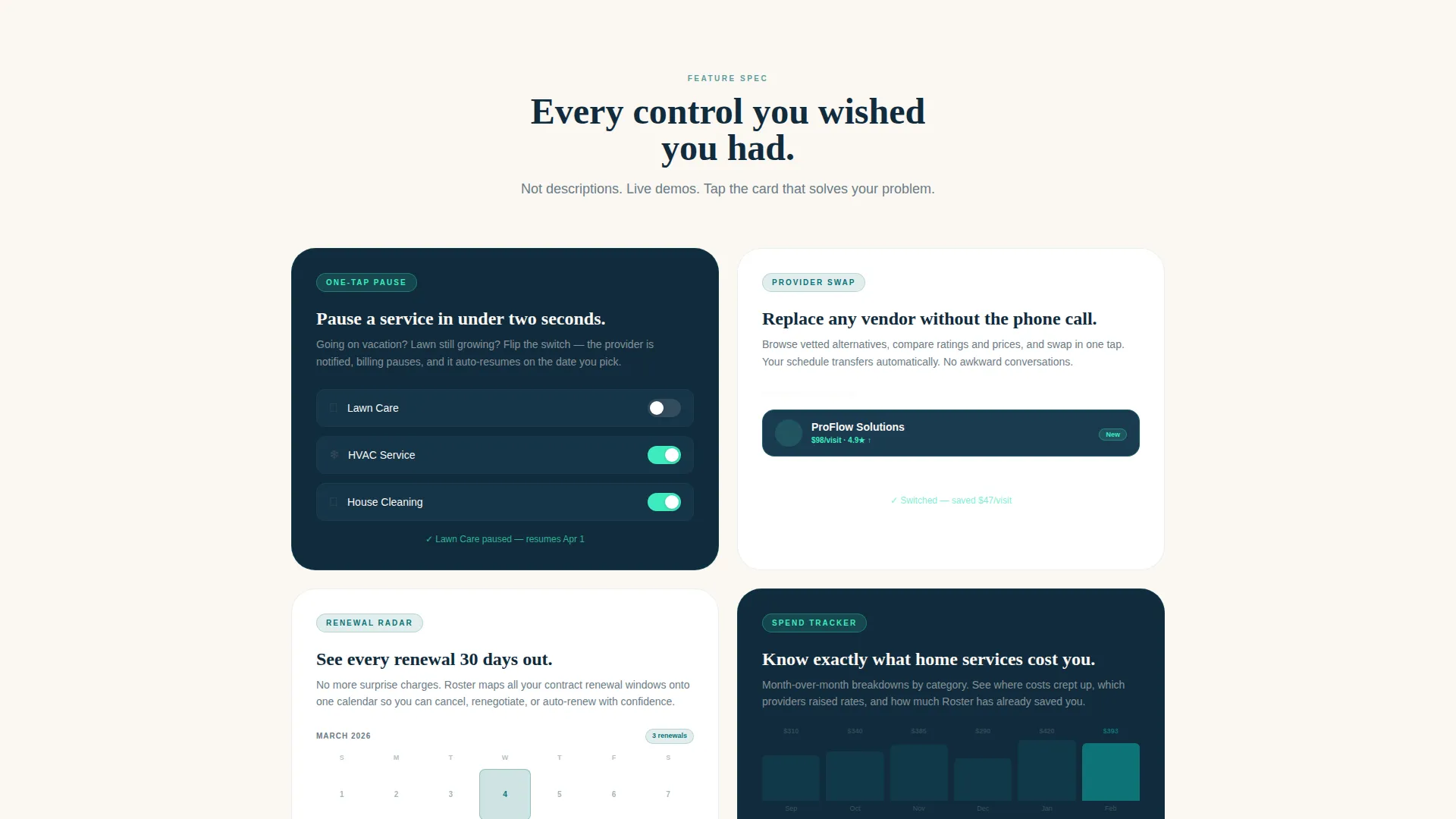
This template is built around a set of clearly defined, interaction-driven feature sections. Each card is a self-contained spec unit that demonstrates a real product behavior.
Feature Tab Switcher Header
Three tabs sit inside a floating device mockup angled five degrees on the canvas. Each tab swaps the visible screen content: "My Services" shows provider cards with live toggle states, "Upcoming" shows a service date timeline with provider avatars, and "Spending" shows a bar chart of monthly costs by category. The default tab is caught mid-toggle on a lawn care card.
One-Tap Pause Card
A dedicated spec card shows a micro-animation of a toggle switch pausing an active service. The interaction is demonstrated visually rather than described in text, giving visitors an immediate sense of how the app responds to their input.
Provider Swap Card
This card displays a drag-and-replace interaction showing how a homeowner can substitute one service provider for another. The design makes the process feel as intuitive as rearranging apps on a phone screen.
Renewal Radar Card
A 30-day alert calendar is embedded in this spec card, showing upcoming renewal windows across multiple service categories. It directly addresses the missed-deadline frustration that property managers and busy homeowners face most often.
Spend Tracker Card
A month-over-month bar chart comparison sits inside this card, showing spending by service category. It gives visitors a clear picture of the financial visibility the app delivers before they commit to downloading.
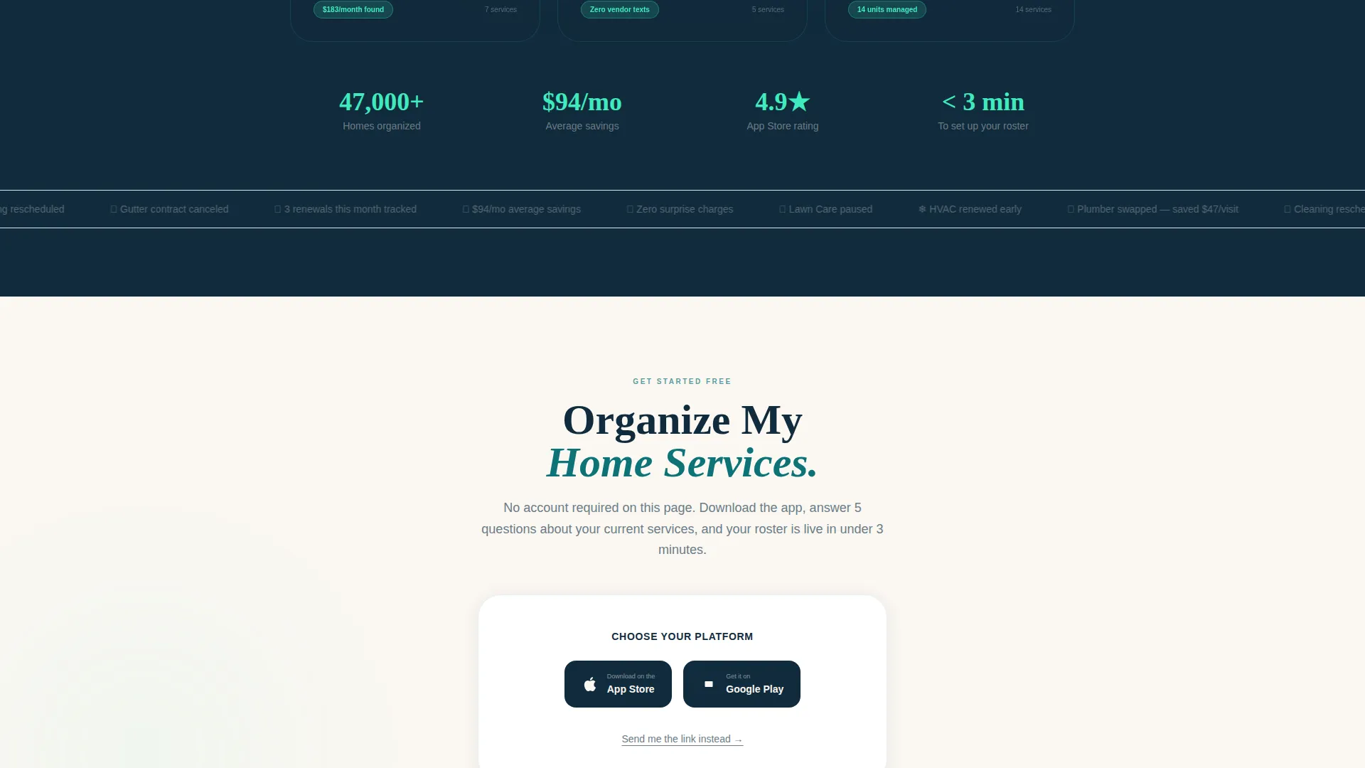
App Download call to action Flow
The primary call to action reads "Organize My Home Services" and appears in a pinned bottom bar on mobile and after every third card on desktop. Tapping opens a two-step flow: store badge selection first, then an optional email field labeled "Send me the link instead" for visitors on desktop.
Page sections overview
| Section | Purpose |
|---|---|
| Tab Switcher Header | Introduces three core app views inside an angled device mockup |
| One-Tap Pause | Demonstrates service pausing via toggle micro-animation |
| Provider Swap | Shows drag-and-replace provider substitution interaction |
| Renewal Radar | Displays 30-day renewal alert calendar per service |
| Spend Tracker | Presents month-over-month cost comparison by category |
| Mobile call to action Bar | Pins app download call to action at bottom on mobile |
| Desktop call to action Block | Repeats download prompt after every third feature card |
| Download Flow | Two-step iOS/Android badge selector with email fallback |
Design & branding system
The template uses a Teal Catalyst color system built around four defined values. The palette is described as a well-lit control room at dawn: calm enough to build trust, electric enough to prompt action.
- Deep operational teal (#0D7377) anchors headers and status badges; midnight dashboard (#112B3C) fills card backgrounds and navigation surfaces
- Bright catalyst mint (#3EEBBE) fires only on interactive elements such as toggle switches, hover states, and download buttons
- Warm linen white (#FAF7F2) is the page canvas; soft charcoal (#3B4A54) carries body text so cards remain the visual focus
Mobile & speed optimization
The template is structured with a mobile-first call-to-action experience. The bottom bar keeps the download prompt visible at all times on smaller screens without interrupting the spec card scroll.
- A pinned slim bottom bar on mobile keeps the "Organize My Home Services" call to action accessible without covering the main content
- The two-step download flow is deliberately minimal: store badge selection first, email field second, no account creation required on the page
- Card-grid layout stacks cleanly for single-column mobile viewing, preserving the alternating dark-and-light card rhythm
How this template helps you convert
The page is engineered so visitors self-qualify by the time they reach any call-to-action block. Each spec card demonstrates a real interaction rather than describing a concept, so trust is built through demonstration.
- The tab switcher lets visitors explore three different app views before scrolling, creating early engagement and reducing bounce
- The checkerboard card rhythm lets users scan directly to the feature that solves their specific frustration, then stop and act
- The two-step download flow removes all friction from conversion: no forms, no account setup, just a store badge tap or an email link
Other information about this template
This template is categorized under Technology and sits within the Home Services Software subcategory, targeting the Home Services Subscription Management niche. It is built as a Card Grid (Modular) layout following a Directory and Discovery theme.
- The Intersection Match Score for this template is 13, reflecting strong alignment across template style, color system, creative direction, and landing-page goal
- The creative direction follows a Spec Sheet approach: each card answers one objection, letting visitors scan rather than read linearly
- The visual checkerboard rhythm alternates between dark midnight dashboard cards and white surface cards to maintain visual momentum through the scroll
- No account creation is included on the landing page itself; the app handles all onboarding after download


Theme
Directory & Discovery
Creative direction
Spec Sheet
Color system
Teal Catalyst
Style
Card Grid (Modular)
Direction
App Download
Page Sections
Feature Tab Switcher with Device Mockup
Modular Spec Card Grid
One-tap Pause and Provider Swap Cards
Renewal Radar and Spend Tracker Cards
Pinned App Download Call to Action Flow
Related questions
Who is the Roster template best suited for?
Does the landing page include an account signup form?
Can I customize the tab labels and feature card content?
How does the mobile call-to-action work on this template?
What color values define the visual identity of this template?


