Bold Brutalist Sports Staff Scheduling Landing Page Template
The Roster Bold Brutalist Sports Staff Scheduling Landing Page Template is a split-screen Framer landing page built for venue operations teams. It puts your scheduling platform front and center with a Feature Tab Switcher, a Before/After proof section, a scroll-triggered metrics band, and a three-field lead generation form. Bold, raw, and built to convert.
by Rocket studio
Quick summary
This template is a single-page, split-screen lead generation landing page for a sports staff scheduling platform. It uses a Bold Brutalist design with hard-cut black and white sections, caution yellow calls to action, and oversized uppercase typography. Every section is built to show the product working before asking the visitor for anything.
Who this template is for
Operations teams at large venues find this template immediately useful. It speaks directly to the people managing hundreds or thousands of event-day workers across multiple roles and zones.
- NFL stadium operations directors managing 2,000-plus event-day workers
- Premier League venue managers coordinating stewards across multiple competitions
- Division I university athletic department admins staffing several sports at once
What problem this template solves
Venue operations teams waste time on overlapping spreadsheets, group texts, and printed sign-in sheets. A professional landing page needs to make the chaos visible and the solution undeniable.
- No clear way to show the product working before asking for a demo
- Generic landing page design that fails to match the high-stakes tone of game-day operations
- Weak lead capture that loses visitors who are not yet ready to book a call
What you get with this template
You get a complete, ready-to-customize single-page layout with every section pre-built and editable. Swap in your brand colors, fonts, copy, and product visuals without needing to write a line of code.
- Full-viewport Feature Tab Switcher hero with three interactive product states
- Before/After proof section with annotation callouts and a scroll-triggered metrics band
- Venue-type selector with swappable content pairs and a three-field lead generation form
Feature list
This template covers six distinct interactive and visual components, each designed to do specific conversion work.
Interactive Feature Tab Switcher
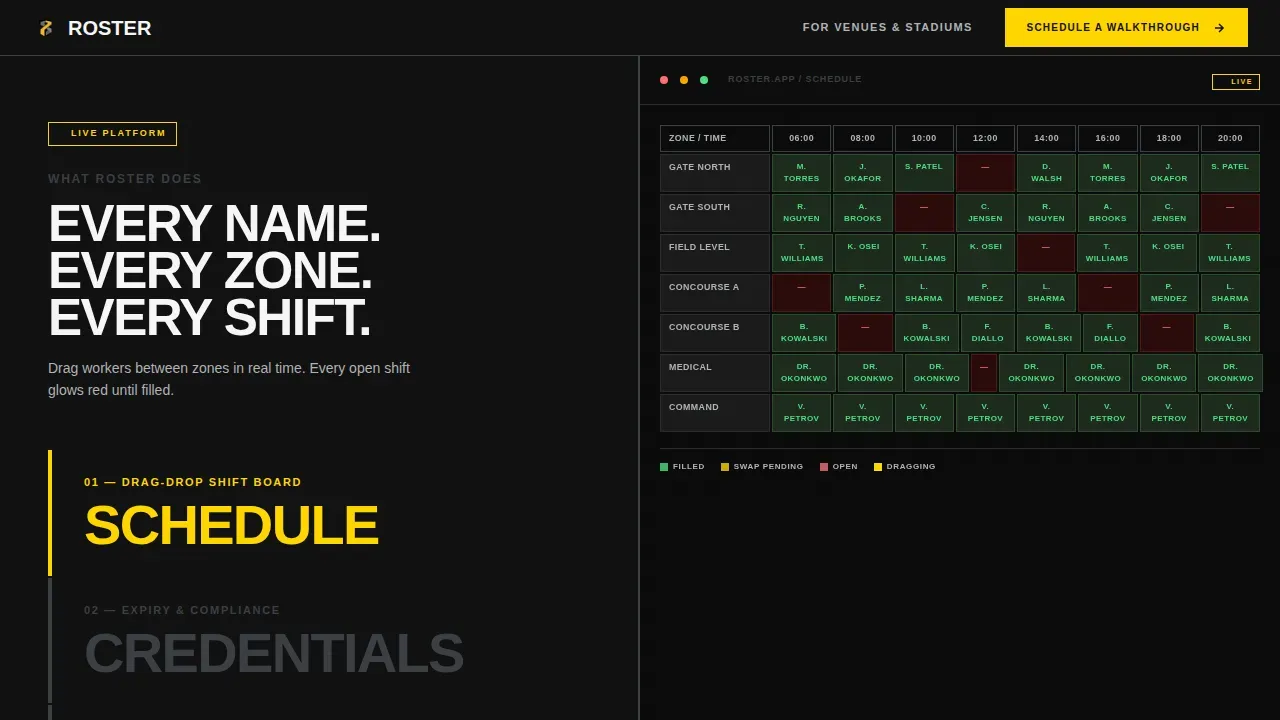
The header splits 50/50. The left side holds three brutalist tabs: SCHEDULE, CREDENTIALS, and COMMS. Clicking each tab swaps the right half with a matching product screenshot on a dark field. The active tab glows caution yellow, giving visitors agency in the first two seconds on site.
Before/After Proof Section
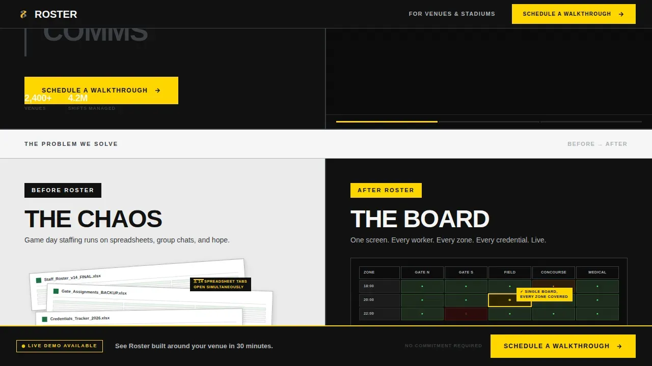
A stark black-and-white photography split shows spreadsheet chaos on the left and the clean scheduling interface on the right. Yellow annotation callouts highlight the key differences. This section makes the value proposition visual and immediate, with no need for long paragraphs.
Scroll-Triggered Metrics Band
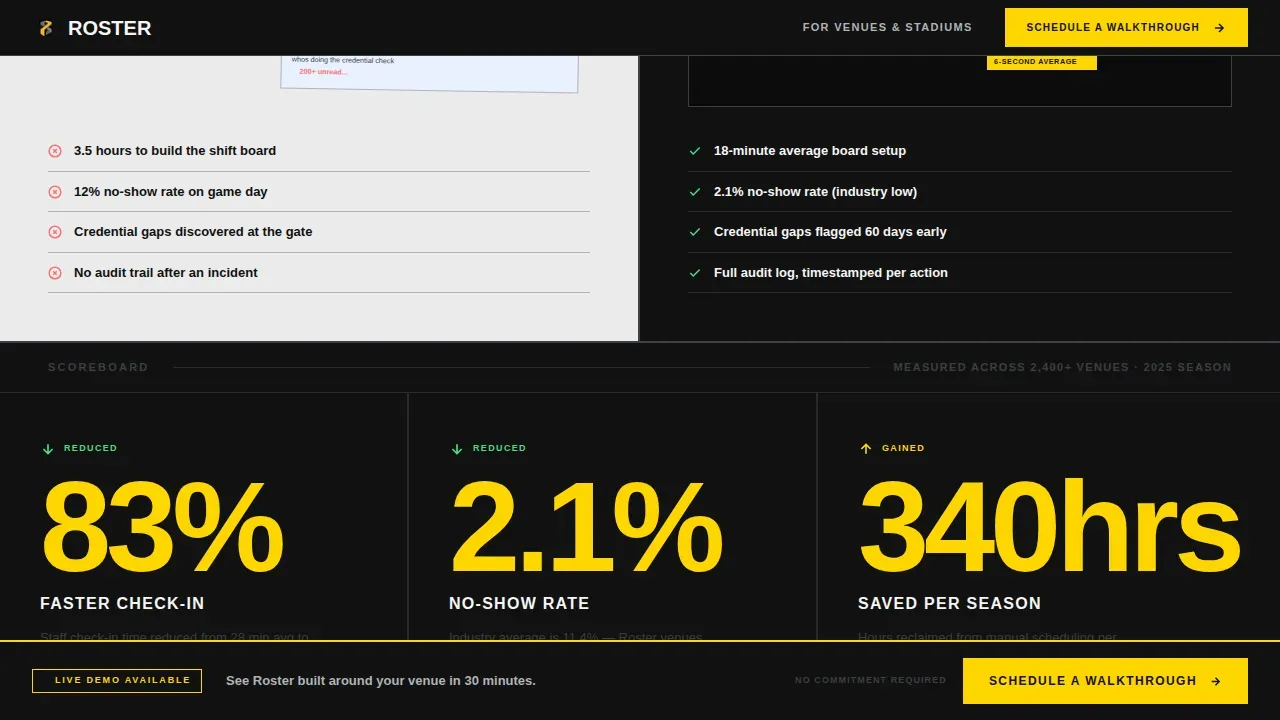
Three large numbers count up on scroll like a scoreboard. Each metric covers a core operational win: staff check-in time reduced, no-show rate, and hours saved per event. The band stretches edge to edge for maximum visual impact.
Venue-Type Selector
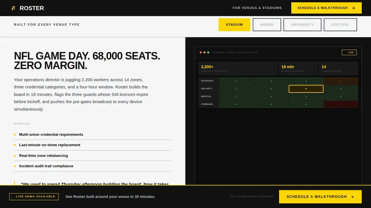
A four-option selector lets visitors choose Stadium, Arena, University, or Festival. Each selection swaps in a tailored use-case paragraph and screenshot pair. This gives the page specificity without multiplying pages.
Lead Generation Form and Secondary Download
The primary form collects venue name, average event-day headcount, and work email. A secondary path offers a gated PDF checklist for visitors not ready to book. Both paths share the same three-field simplicity to reduce friction.
Sticky Call-to-Action Bar
After the second scroll section, a sticky bottom bar appears with the primary call to action. It keeps the conversion option visible throughout the rest of the page without interrupting the content flow.
Page sections overview
| Section | Purpose |
|---|---|
| Feature Tab Switcher Hero | Show three core product states interactively |
| Before/After Split | Visualize the problem and solution side by side |
| Scroll Metrics Band | Deliver proof through three count-up numbers |
| Venue-Type Selector | Serve tailored content for four audience types |
| Lead Generation Form | Capture qualified leads with minimal friction |
| Sticky call to action Bar | Keep the primary call to action always visible |
| Footer | Single-row linear layout with supporting links |
Design & branding system
The design follows a Monochrome Steel color system with a single loud accent. Every visual decision reflects the raw, load-bearing aesthetic of a stadium underbelly.
- Colors: forge black (#111111), rolled steel (#3B3F45), brushed aluminum (#B0B3B8), stadium-light white (#F5F5F5), and caution yellow (#FFD600) reserved for calls to action and live-status indicators
- Typography: Manrope, oversized, uppercase, tight-tracked with no gradients, no rounded corners, and no decorative ornamentation
- Visuals alternate between forge black and stadium-light white in hard cuts, with steel gray carrying secondary text and divider lines
Mobile & speed optimization
The template is desktop-first, built for operations directors working at a workstation. Responsive design ensures the layout adapts cleanly to smaller screens without losing the brutalist visual identity.
- Hard-cut section alternation and block layouts translate well to stacked mobile views
- Interactive elements including the tab switcher and venue selector use minimal animation to keep load practical and fast
- Sticky call-to-action bar repositions cleanly on smaller screen sizes
How this template helps you convert
The page earns the click by showing the product working before asking for anything. The conversion flow is deliberate and sequential.
- The Feature Tab Switcher gives visitors interactive control in the first viewport, building trust through product exposure before any form appears
- The Before/After section and metrics band deliver evidence in two blunt steps, so the lead form feels like the logical next move rather than a leap
Other information about this template
This template is built in Framer, making it easy to customize, share, and publish without traditional programming skills. Framer's no-code environment means agencies, freelancers, and in-house creative teams can take the template from draft to live site quickly.
- Customize colors, fonts, copy, and graphics directly inside Framer with no code required
- Share the project via link, download assets for offline use, or publish pages to a live domain in minutes
- Find more templates in the same collection to match other creative projects, portfolios, or services
- The template supports exploration of different brand directions by making changes to the color system non-destructive
- Agencies and creative studios can use this template across multiple projects without starting from scratch each time
- Free plan users can access and customize the template; publishing to a live site may require a paid Framer plan
- Resources including the gated PDF checklist design are covered inside the template layout, ready to promote
Theme
Bold Brutalist
Creative direction
Launch Energy
Color system
Monochrome Steel
Style
Split Screen (50/50)
Direction
Lead Generation
Page Sections
Feature Tab Switcher Hero
Before/after Proof Section
Scroll-triggered Metrics Band
Venue-type Content Selector
Dual-path Lead Capture
Sticky Call-to-action Bar
Related questions
Can I customize the colors and fonts in this template?
Do I need coding skills to use this template?
Is this template suitable for venues outside North America?
How does the lead generation form work?
Can agencies use this template across multiple client projects?



