Fitness & Gym Software Complete Professional Website Template
Route is a split-screen landing page template built for a gym route optimization platform. It combines an animated city map, a Feature Tab Switcher header, and an Industry Report scroll experience to turn commute data into compelling lead generation. The Carbon Fiber color system and electric lime accents give the page a sharp, dashboard-ready feel from the first scroll.
by Rocket studio
Quick summary
Route is a single-page lead generation template for a fitness and gym route optimization platform. The split-screen layout pairs an animated map with data-driven scroll sections, guiding visitors from curiosity to conversion through escalating industry findings. It is purpose-built for multi-gym members, corporate wellness coordinators, and franchise operators.
Who this template is for
This template is designed for teams and individuals who manage gym access across multiple locations or user groups. The layout speaks directly to the way these audiences think about time, distance, and scheduling friction.
- Multi-gym members balancing CrossFit boxes, yoga studios, and daily commute windows
- Corporate wellness coordinators routing employees to partner fitness facilities
- Gym franchise owners analyzing why specific time slots lose members to nearby competitors
What problem this template solves
Finding the most efficient path between gym visits, class schedules, and daily life is genuinely hard. Most fitness platforms show you what is available, not what makes sense given where you already are. This template frames that gap as a quantifiable problem and positions the platform as the solution.
- Visitors arrive without realizing how much weekly time suboptimal gym placement costs them
- Franchise operators lack a clear visual argument for why route data changes member retention
- Corporate coordinators have no fast way to communicate the value of intelligent facility routing to employees
What you get with this template
You get a fully structured, single-page lead generation layout that moves visitors through a logical sequence: awareness, evidence, and action. Every section is designed to build conviction before the call to action appears.
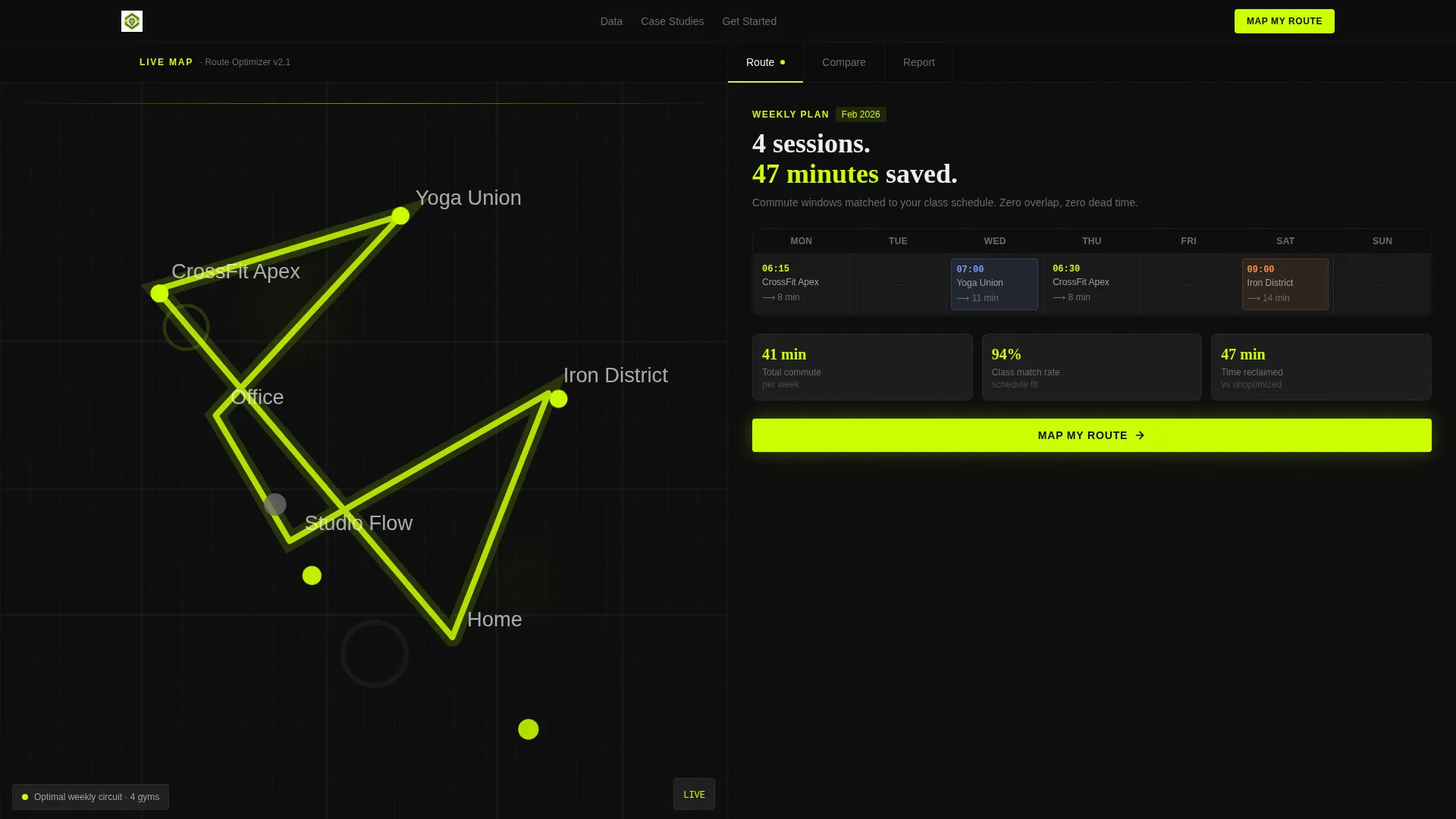
- A Feature Tab Switcher header with three interactive tabs covering route planning, gym cluster comparison, and industry reporting
- An animated split-screen viewport pairing a live-draw city map with swappable right-panel content
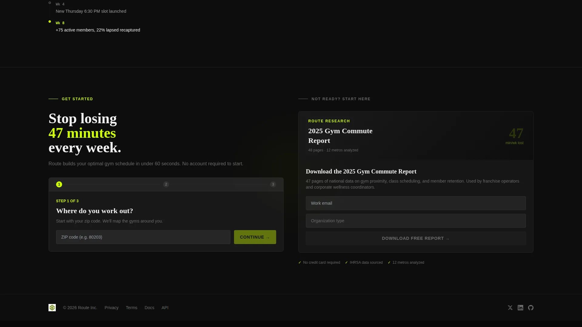
- Two conversion paths: a primary "Map My Route" form and a secondary gated PDF download for the 2025 Gym Commute Report
Feature list
This template delivers a focused set of layout and interaction components drawn directly from the platform brief. Each one serves the lead generation objective.
Animated City Map with Route Drawing
The left panel of the split-screen header displays a city map with pulsing gym location pins and a route line that draws itself in real time. This immediate visual communicates the platform's core function before a single word is read.
Feature Tab Switcher Header
Three tabs sit above the split viewport and swap the right-panel content on click. Tab one shows a weekly calendar with color-coded gym sessions snapped to commute gaps. Tab two reveals a side-by-side gym cluster comparison scored by travel time, class overlap, and peak-hour congestion. Tab three surfaces an animated count-up stat showing average weekly minutes lost to poor gym placement.
Industry Report Scroll Sections
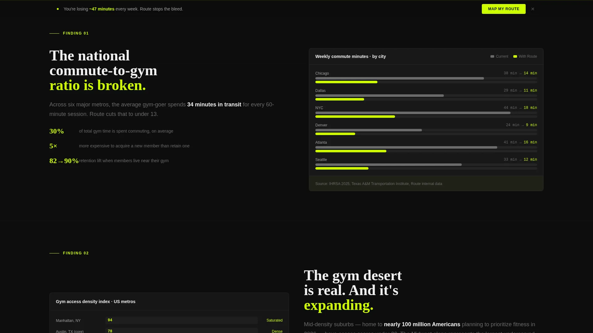
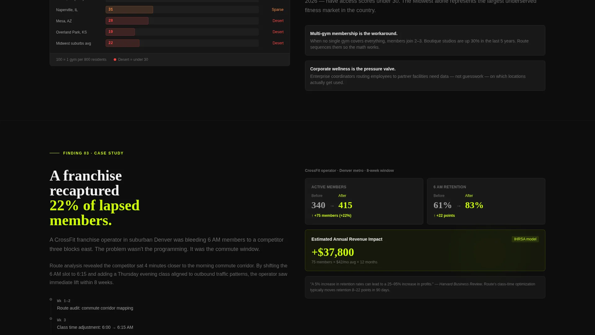
Each scroll section delivers a data finding that reframes how visitors think about their own routine. An animated bar chart quantifies the national commute-to-gym ratio. A map section illustrates gym deserts in mid-density suburbs. A before-and-after metric card shows a franchise that recaptured 22 percent of lapsed members after shifting class times using route data.
Dual Conversion Path Layout
The primary call to action, "Map My Route," appears first inside the Route tab and again as a sticky bar after the second scroll section. A secondary path offers a gated PDF download to capture visitors not yet ready to commit. Both paths use a short sequential form designed to reduce friction while collecting high-intent signals.
Sequential Low-Friction Form
The lead form collects three fields in order: zip code first for the lowest friction entry point, then number of gyms currently visited, then email. The secondary download form captures email and company size to segment franchise operators from individual users.
Carbon Fiber Visual System
The layout uses a four-tone color system built around deep black backgrounds, structured gray card containers, titanium body text, and electric lime reserved exclusively for calls to action, active route indicators, and live data accents. This keeps visual hierarchy clear and action-oriented throughout.
Page sections overview
| Section | Purpose |
|---|---|
| Feature Tab Header | Introduces the platform via three interactive tabs over a split-screen map and content viewport |
| Route Tab Panel | Shows a weekly calendar with color-coded gym sessions aligned to commute gaps |
| Compare Tab Panel | Displays a side-by-side gym cluster comparison scored on travel time and congestion |
| Report Tab Panel | Presents a count-up industry stat on weekly minutes lost to poor gym placement |
| Commute Ratio Chart | Animated bar chart quantifying the national average commute-to-gym time ratio |
| Gym Desert Map | Contextualizes the problem on a societal scale using mid-density suburb mapping |
| Case Study Card | Before-and-after metric card showing a franchise member recapture result |
| Sticky call to action Bar | Persistent "Map My Route" call-to-action bar activating after the second scroll section |
| Primary Lead Form | Three-field sequential form capturing zip code, gym count, and email |
| Gated PDF Download | Secondary conversion path offering the 2025 Gym Commute Report for email capture |
Design & branding system
The visual identity follows a Directory and Discovery theme executed through a Carbon Fiber color system. The palette is industrial and zero-ornament, designed to feel like a competition tool rather than a consumer app.
- Deep cockpit black (#0D0D0D) dominates all backgrounds; woven carbon gray (#2B2B2B) structures cards and map containers; titanium (#6B6B6B) carries body text
- Electric lime (#CCFF00) is reserved exclusively for calls to action, active route lines, tab indicators, and live data spikes so the eye always knows where to act
Mobile & speed optimization
The split-screen layout is structured to adapt without losing the visual hierarchy that makes the template effective. Interaction-heavy components like the tab switcher and animated map are designed to perform on the viewport they are given.
- The 50/50 split-screen stacks vertically on smaller viewports so map and content panels remain fully readable
- Animated elements including the route line draw, bar chart, and count-up stat are scoped to load progressively without blocking the initial render
How this template helps you convert
The page earns each click by building conviction through evidence before any form appears. The conversion architecture follows a deliberate sequence.
- The animated map and tab switcher give visitors an immediate product preview, establishing credibility and context before a single scroll
- The Industry Report scroll sections escalate from broad national data to a specific franchise case study, making the aggregate findings feel personally relevant by the time the sticky call-to-action bar appears
Other information about this template
This template is part of a fitness and gym software category and is suited for Technology-sector platforms operating in the gym route optimization niche. It is built as a single landing page with a clear section-led flow.
- The template style is Split Screen (50/50), and the header concept is a Feature Tab Switcher sitting over a live animated viewport
- The creative direction is Industry Report, meaning each scroll section presents a data finding rather than a feature list
- The landing page direction is Lead Generation, with two distinct conversion paths to serve both high-intent and research-mode visitors
- The theme is Directory and Discovery, reflecting a platform that helps users find and sequence physical locations intelligently
Theme
Directory & Discovery
Creative direction
Industry Report
Color system
Carbon Fiber
Style
Split Screen (50/50)
Direction
Lead Generation
Page Sections
Animated City Map with Route Drawing
Feature Tab Switcher Header
Industry Report Scroll Sections
Dual Conversion Path Layout
Sequential Low-friction Lead Form
Carbon Fiber Visual System
Related questions
Who is this landing page template designed for?
What does the Feature Tab Switcher show?
How does the dual conversion path work?
What makes the color system work for this type of platform?
Can this template be used for a platform that is still in early access?



