Intelligent Logistics Booking Landing Page Template
Dispatch is a dark-themed, card grid landing page built for public transit analytics platforms. It presents live ridership metrics, route performance scores, and equity reporting tools through an interactive Problem→Solution Arc. Designed for transit operations directors, planning analysts, and city transportation chiefs, the template turns complex network data into a compelling, demo-ready page.
by Rocket studio
Quick summary
Dispatch is a single-page, card grid landing page template built for public transit analytics dashboards. It opens with four glowing live-metric cards, walks visitors through a three-act Problem→Solution scroll, and closes with a persistent demo-request bar. Every section is designed to feel like a real control room, not a brochure.
Who this template is for
This template speaks directly to the people running transit networks and the teams who build tools for them. It is purpose-built for operators who need to demonstrate analytical depth before a board meeting or a procurement decision.
- Operations directors at mid-size metro transit agencies managing multiple legacy data sources at once
- Planning analysts at regional transit authorities who currently build Title VI equity reports by hand
- City department of transportation chiefs who need a board-ready dashboard view on short notice
What problem this template solves
Transit technology products are hard to sell on a static page. A screenshot of a dashboard rarely earns trust from experienced operations staff. This template solves the credibility gap by letting the page itself behave like the product.
- Siloed General Transit Feed Specification feeds and manual National Transit Database reporting workflows look messy and slow; this template frames those pain points visually before offering the solution
- Equity analyses stitched together in spreadsheets are a shared frustration for planning teams; the template surfaces that problem in Act One before resolving it in Act Two
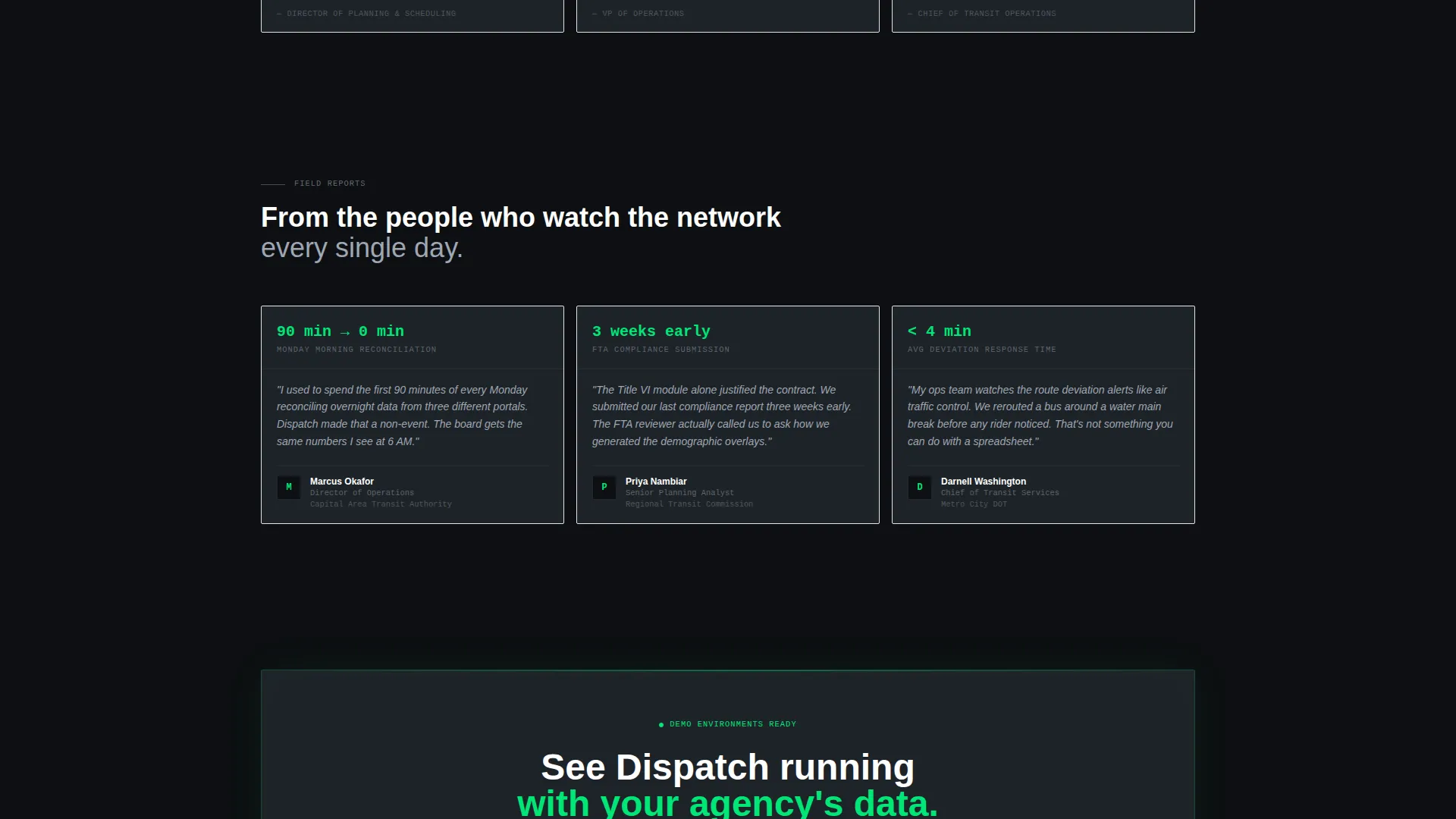
- Decision-makers need outcome evidence, not feature lists; Act Three delivers anonymized agency case study metrics that make the value concrete
What you get with this template
You get a fully structured, modular landing page layout that moves visitors through a clear narrative arc from recognized pain to demonstrated solution to measurable outcome. Every card section is self-contained and easy to adapt.
- A live-metric header tableau with four oversized animated stat cards, no stock photography required
- A three-act card grid scroll covering problem cards, solution module cards with hover interactions, and outcome cards with real performance metrics
- A persistent bottom call-to-action bar linking to a dedicated demo-booking page, keeping the conversion path clean and low-friction
Feature list
This section describes the core functional and visual building blocks included in the Dispatch template.
Animated Live-Metric Header
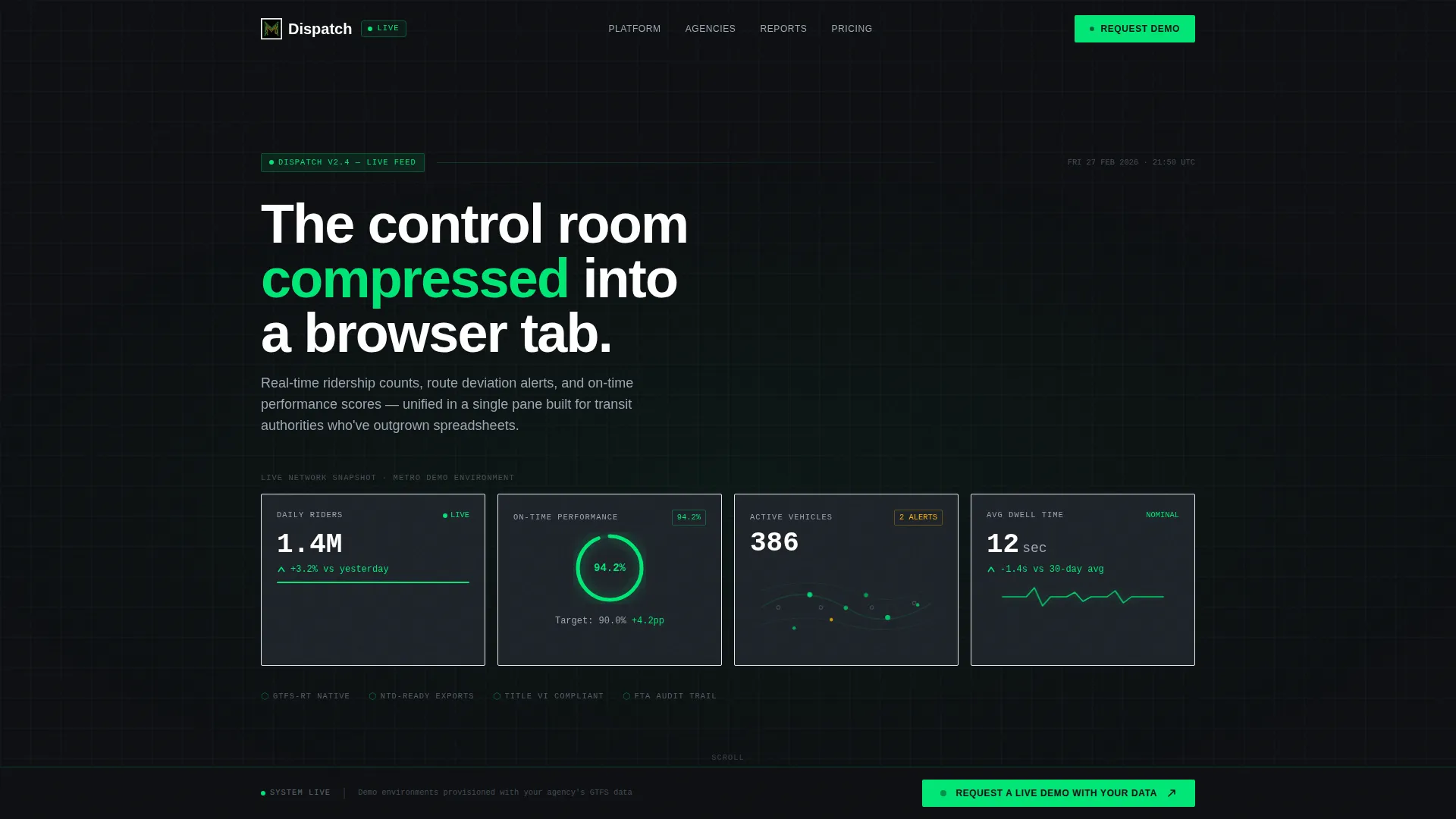
The header is a simulated dashboard frame, not a hero image. Four oversized metric cards display ridership counts ticking upward, an on-time performance arc, active vehicle dots on a route map, and a pulsing dwell-time indicator. The product is the hero from the first scroll position.
Three-Act Problem→Solution Card Grid
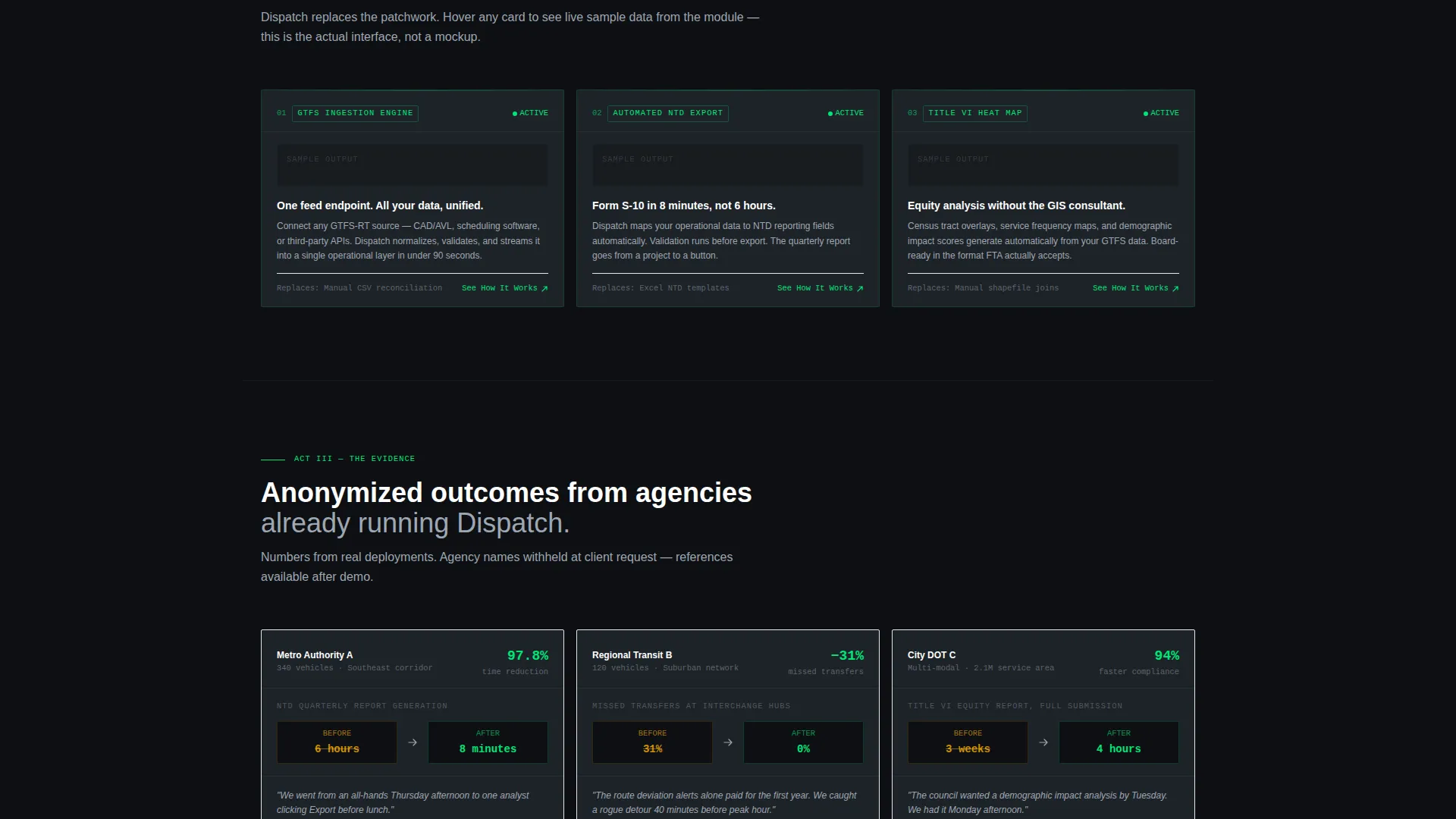
The page is structured as three sequential card rows. Act One uses amber-tinted problem cards with recognizable workflow screenshots. Act Two reframes each problem as a glowing signal-green solution module with hover-triggered sample data previews. Act Three presents outcome cards with real before-and-after metrics from anonymized agency case studies.
Persistent Demo-Request Bottom Bar
A sticky bottom bar reads "Request a Live Demo With Your Data" in signal-green on cockpit black. It is always visible as visitors scroll, creating a consistent and low-pressure conversion prompt without placing a form on the page.
Secondary Feature Deep-Dive Links
Every Act Two solution card includes a "See How It Works" secondary link. These links route visitors to dedicated feature detail pages, giving curious buyers a path to explore without abandoning the primary conversion flow.
Carbon Fiber Dark Color System
The entire template uses a precisely defined dark palette built for data-dense layouts. Deep cockpit black, instrument-panel charcoal, signal-green accents, caution amber alerts, and cool interface gray for secondary text work together to make every number glow against its background.
Modular Card Layout
Each section is built as an independent card grid module. This makes it straightforward to reorder sections, swap in updated metrics, or replace case study figures without rebuilding the page structure.
Page sections overview
| Section | Purpose |
|---|---|
| Live Metrics Header | Displays four animated real-time stat cards as the page hero |
| Act One Problems | Exposes siloed data pain points with amber-tinted problem cards |
| Act Two Solutions | Reframes each problem as a green-lit solution module with hover previews |
| Act Three Outcomes | Shows anonymized case study results with concrete before-and-after metrics |
| Persistent call to action Bar | Keeps the demo-booking prompt visible throughout the entire scroll |
Design & branding system
The visual identity follows a Data Command theme built around the Carbon Fiber color system. The palette is calibrated for dark, data-dense interfaces where contrast and precision matter more than decoration.
- Core colors: deep cockpit black (#0D0F12) for backgrounds, instrument-panel charcoal (#1E2329) for card surfaces, signal-green (#00E676) for live-data accents and positive trend indicators, caution amber (#FFB300) for threshold alerts, and cool interface gray (#9EA7B3) for secondary text and dividers
- Micro-interactions include a ticking counter animation on ridership figures, a thin green progress arc on the on-time performance card, moving vehicle dots on a faint route map, and a heartbeat pulse on the dwell-time metric
- No stock photography appears anywhere in the template; the data visualizations and animated metric cards carry the full visual weight of the page
Mobile & speed optimization
The card grid structure is inherently responsive. Each module is self-contained, which means it reflows cleanly across viewport sizes without requiring custom breakpoint overrides for every section.
- Modular card blocks stack vertically on smaller screens, keeping the Problem→Solution narrative intact on mobile without losing the three-act structure
- The absence of large hero images and stock photography reduces initial page weight, supporting faster load times on mobile connections
- The persistent bottom bar remains accessible on touch devices, keeping the demo-booking call to action reachable without scrolling back to the top
How this template helps you convert
Dispatch is designed to earn the demo request before asking for it. The page builds confidence in stages, reducing the leap of faith for skeptical operations buyers.
- The live-metric header immediately signals that this is a working analytics product, not a concept, giving visitors something real to engage with before reading a single line of body copy
- The three-act scroll mirrors how a transit professional actually thinks: identify the problem, understand the solution, verify the outcome with evidence, making the path to clicking "Request a Live Demo With Your Data" feel like a natural next step rather than a sales push
Other information about this template
This template is well suited for vertical software-as-a-service products in the public transit space, particularly platforms that need to communicate analytical depth to technically informed buyers through a single page.
- The template style is Card Grid (Modular), which makes individual sections easy to update as agency metrics or product features change over time
- The creative direction follows a Problem→Solution Arc, a structure proven effective for enterprise and government software buyers who need to see pain acknowledged before they trust a solution
- The header concept is a Stats and Metrics tableau, which works well for public transit analytics dashboard products where the data itself is the most persuasive sales asset
- The lp direction is Click-Through, meaning the page is intentionally designed to route qualified visitors to a separate demo-booking page rather than capturing leads directly on this page

Theme
Data Command
Creative direction
Problem→Solution Arc
Color system
Carbon Fiber
Style
Card Grid (Modular)
Direction
Click-Through
Page Sections
Animated Live-metric Header Tableau
Three-act Problem to Solution Card Grid
Persistent Demo-request Bottom Bar
Hover-interactive Solution Module Cards
Carbon Fiber Dark Visual System
Modular Card Section Architecture
Related questions
Is this template designed for a click-through conversion flow?
Can I replace the header metric figures with my own data?
Who is this template built for?
How does the three-act scroll structure help with sales?
Does the template include any photography or illustration assets?



