Architecture Firm Software Professional Website Template
Dispatch is a bold brutalist landing page template built for architecture firm field service management platforms. It features a live-dashboard header with three tab views, industry-report-style scroll sections loaded with sample data grids, and a freemium signup flow. The template shows prospects exactly what their command center looks like before they ever create an account.
by Rocket studio
Quick summary
Dispatch is a single-page dashboard landing page template designed for field service management platforms targeting mid-size architecture firms. It combines a feature tab switcher header, data-dense scroll sections styled as an industry report, and a dual-path conversion flow. The visual identity is bold brutalist with a midnight blue palette and signal orange calls to action.
Who this template is for
This template is built for software founders and product teams launching a field service management platform aimed at the architecture industry. It speaks directly to the pain points of operations-heavy firms managing multiple active projects at once.
- Operations managers at architecture firms juggling fifteen to fifty active projects
- Principals and project architects who need real-time visibility into site visits and field reports
- Software teams that want a data-forward landing page to drive freemium or free-trial signups
What problem this template solves
Mid-size architecture firms lose significant hours each week coordinating site visits, chasing punch list updates, and assembling compliance reports by hand. This template gives a platform the right stage to prove it fixes that problem before a visitor even signs up.
- Scheduling chaos caused by uncoordinated site visits and overlapping inspector assignments
- Field documentation gaps where photos, GPS logs, and punch lists live in disconnected tools
- Compliance reporting delays that expose firms to liability when sign-offs are missing or late
What you get with this template
The template delivers a complete, conversion-ready landing page with a strong visual hierarchy and real data density throughout every section. Everything is structured to build the case for the platform from the first scroll to the final call to action.
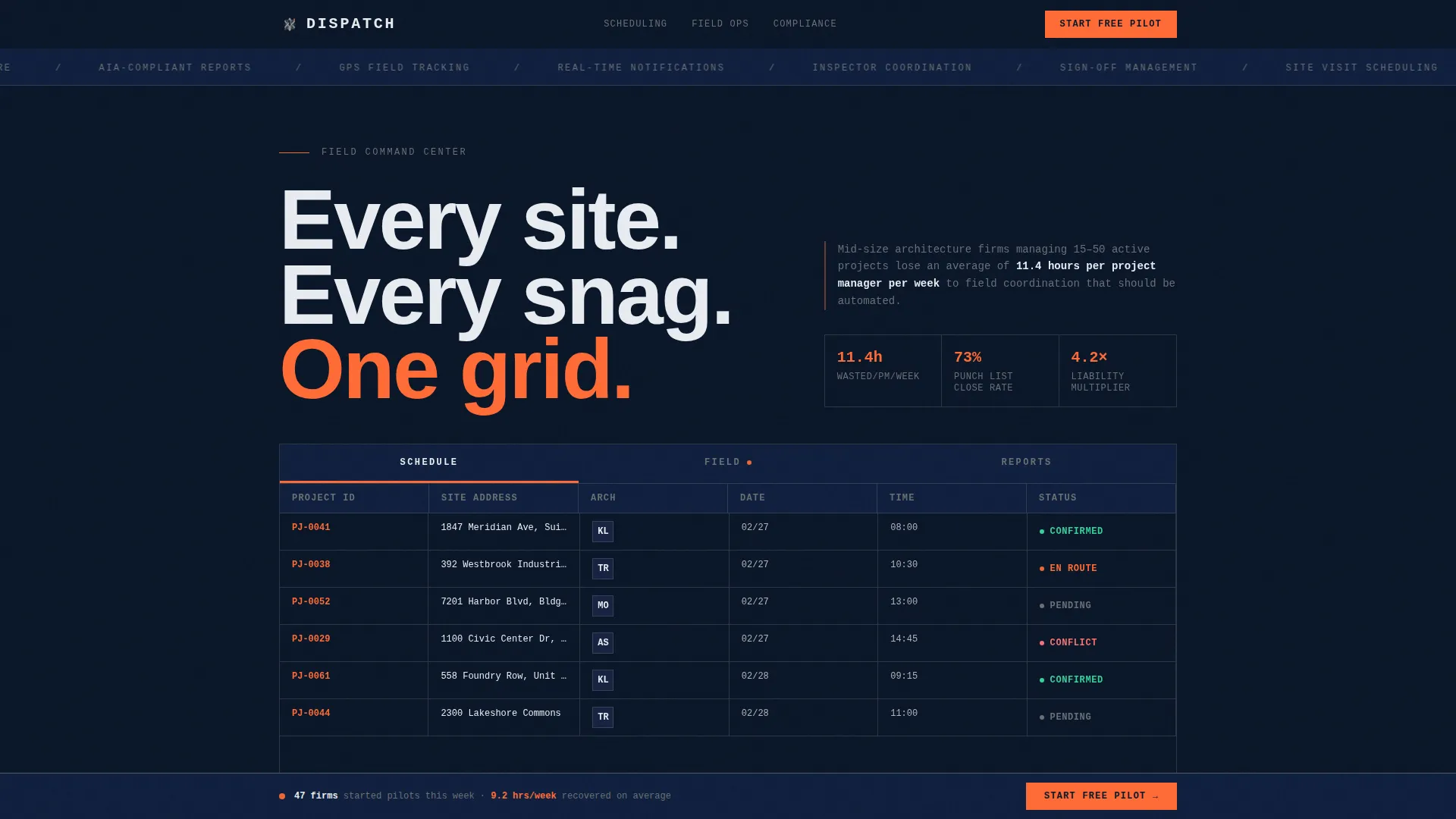
- A three-tab feature header showing Schedule, Field, and Reports dashboard views with sample data
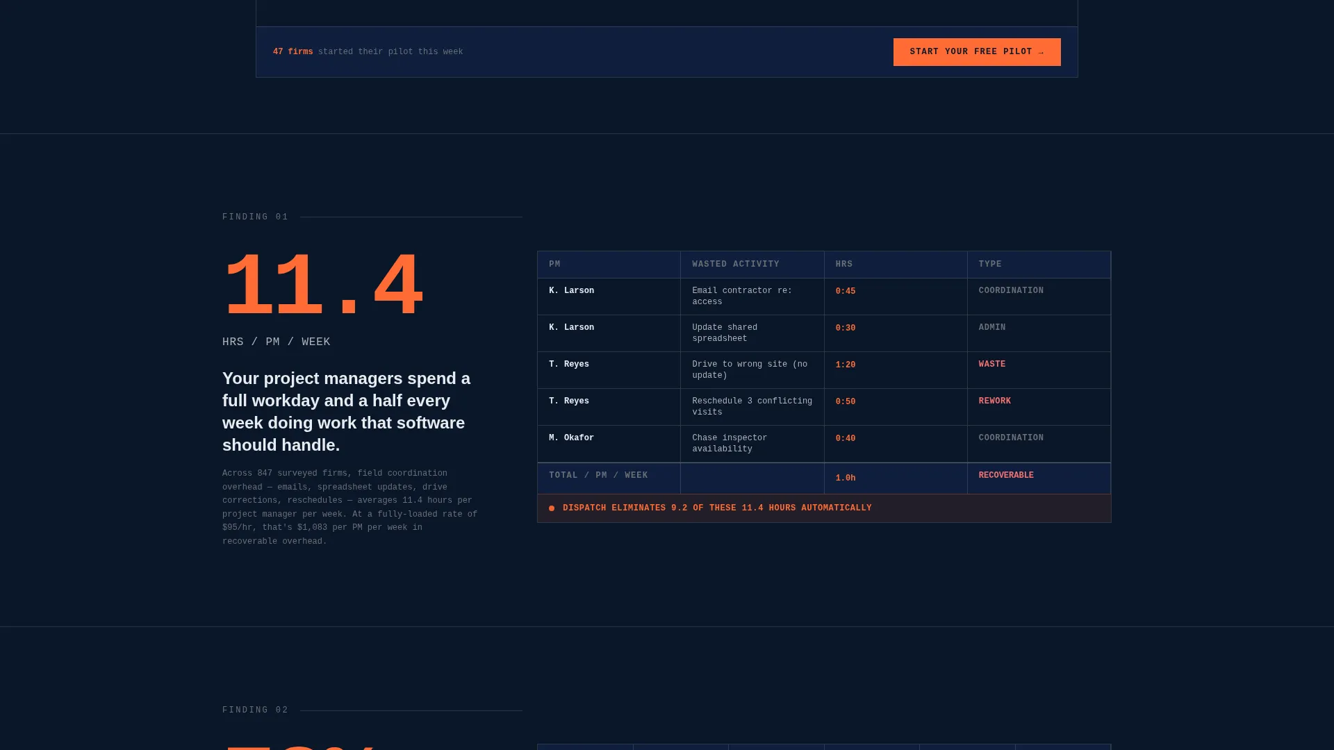
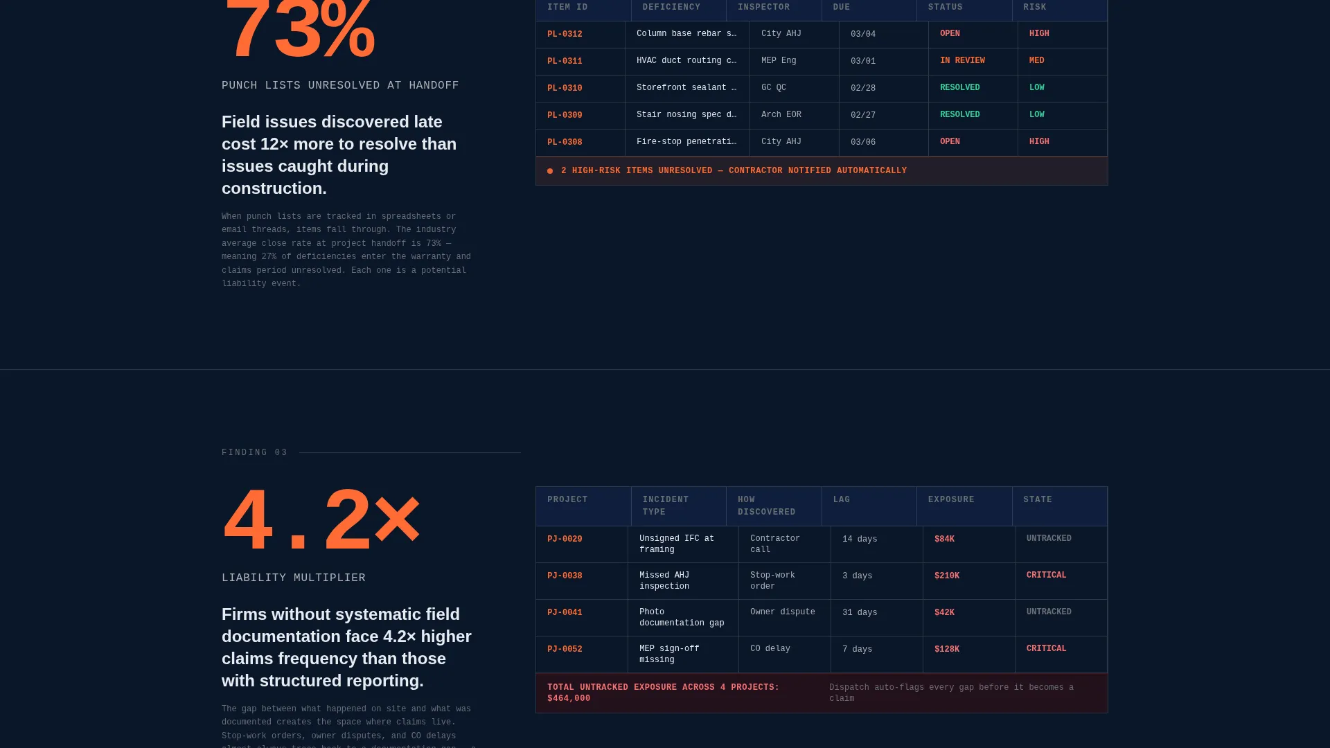
- Industry-report scroll sections pairing oversized statistics with inline data grids that demonstrate platform value
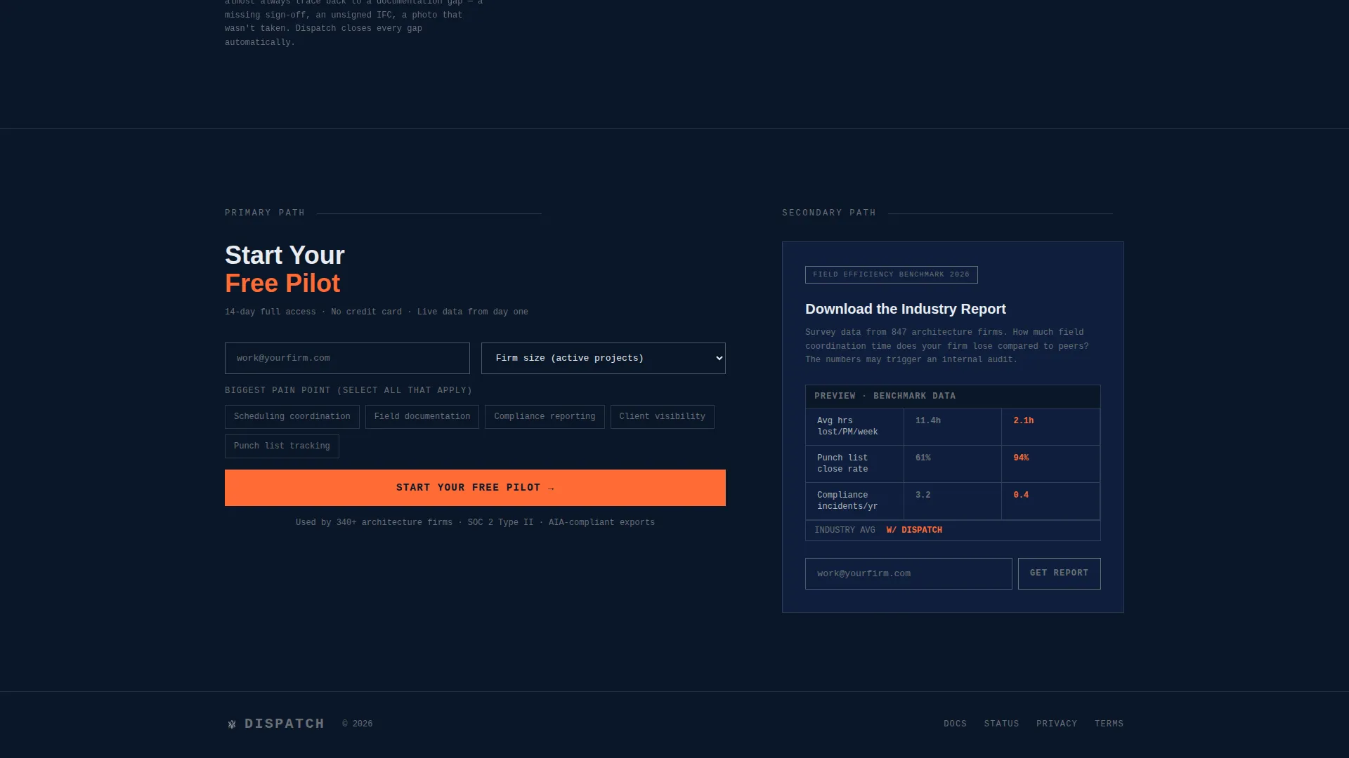
- A freemium signup form and a secondary gated lead-capture path for the Field Efficiency Benchmark download
Feature list
This template includes purpose-built components that make the platform's value immediately visible and the conversion path frictionless.
Three-Tab Dashboard Header
The header uses a brutalist tab rail with three views: Schedule, Field, and Reports. Each tab reveals a distinct live-dashboard mockup below it. Tab transitions are instant hard cuts with no animation, keeping the feel direct and functional.
Gantt-Style Site Visit Grid
The Schedule tab displays a Gantt-style grid with architect initials, project addresses, and color-coded status dots. It gives visitors an immediate sense of how the platform organizes and tracks every active site visit.
Mobile Field Capture Feed
The Field tab shows a timestamped photo feed, GPS site map pins, and a punch-list completion progress bar set at 73 percent. The layout simulates the real mobile experience field architects would use on-site.
Auto-Generated Compliance Reports View
The Reports tab presents sample compliance documents complete with signature fields and export buttons. Visitors can see the output format before committing to a trial, which reduces signup hesitation.
Industry-Report Scroll Sections
Each scroll section opens with a bold oversized statistic followed by a data grid that shows how the platform addresses that specific inefficiency. The escalating structure builds from scheduling waste to liability exposure to client-facing reporting.
Dual-Path Conversion Flow
The primary path is a "Start Your Free Pilot" signup form collecting work email, firm size, and biggest pain point. The secondary path gates the Field Efficiency Benchmark download behind email only, capturing leads who are not yet ready to trial.
Page sections overview
| Section | Purpose |
|---|---|
| Tab Switcher Header | Introduces Schedule, Field, and Reports dashboard views |
| Schedule Tab View | Shows Gantt-style site visit grid with status indicators |
| Field Tab View | Displays mobile photo feed, GPS map, and punch list bar |
| Reports Tab View | Presents compliance documents with signature and export options |
| Scheduling Waste Section | Pairs an oversized stat with a data grid on coordination loss |
| Liability Exposure Section | Escalates the case with field documentation risk data |
| Client Reporting Section | Shows client-facing report output and sign-off tracking |
| Persistent call to action Bar | Keeps "Start Your Free Pilot" visible after the second scroll section |
| Freemium Signup Form | Collects work email, firm size dropdown, and pain point selector |
| Benchmark Lead Capture | Gates the Field Efficiency Benchmark behind email-only form |
Design & branding system
The visual identity is bold brutalist, built around a midnight blue color system that feels like a construction site at dusk. Every design decision serves structural clarity over decoration.
- Color palette: deep navy (#0A1628) background, exposed-concrete gray (#B0B3B8) for grid borders, cold white (#E8ECF1) for body text, and signal orange (#FF6B35) reserved for live-status indicators and primary call-to-action buttons
- Typography is monospaced or heavy grotesque, set at large scale with no softening, landing on the page like poured concrete
Mobile & speed optimization
The template is designed so the data-heavy layout stays legible and functional across screen sizes. The brutalist grid structure translates naturally to narrower viewports without losing its authority.
- Data grids and tab views are structured to reflow cleanly on smaller screens
- The persistent bottom call-to-action bar remains accessible on mobile without obscuring primary content
How this template helps you convert
Every section of this template is engineered to reduce hesitation and move a qualified visitor toward either a free pilot or a lead-capture download.
- The dashboard header shows real sample data immediately, so visitors understand the product before reading a single line of marketing copy.
- The industry-report scroll structure presents concrete statistics and inline micro-dashboards that make abstract efficiency claims feel auditable and credible.
- The dual-path conversion flow serves both high-intent visitors ready to trial and lower-intent visitors who want a benchmark report first, so neither segment leaves empty-handed.
Other information about this template
This template is a strong fit for teams building in the architecture firm software space who want a landing page that feels like a product demo before signup. It is designed as a single-page layout with a clear section-led scroll flow.
- The template style is Dashboard and Data Grid, making it well-suited for platforms where showing real data density is part of the sales argument
- The bold brutalist theme and midnight blue color system are deliberate choices that signal precision and authority to an operations-minded audience
- The Industry Report creative direction distinguishes this template from typical SaaS landing pages that lead with feature lists and screenshots
Theme
Bold Brutalist
Creative direction
Industry Report
Color system
Midnight Blue
Style
Dashboard/Data Grid
Direction
Freemium/Trial
Page Sections
Three-tab Feature Header
Gantt-style Site Visit Grid
Mobile Field Capture Feed
Compliance Report Preview
Industry-report Scroll Sections
Dual-path Conversion Flow
Related questions
Who is the Dispatch template designed for?
What does the three-tab header actually show?
How does the dual-path conversion flow work?
Can this template work for a different field service niche?
What visual style does this template use?



