SaaS Product FAQ & Buyer Objection Website Template
A split-screen SaaS FAQ landing page built for buyers who need answers before they commit. The template pairs an interactive search header with a scroll-driven Problem→Solution Arc, guiding visitors from basic onboarding questions through integrations, security, and pricing logic. The Void & Violet color system keeps the experience sharp, technical, and trustworthy from first scroll to final click.
by Rocket studio
Quick summary
This is a single-page FAQ template designed for SaaS companies that need to earn trust before a visitor converts. It uses a 50/50 split-screen layout, a live search header, and a structured Problem→Solution scroll flow. The visual identity runs on a Void & Violet palette that feels technical and precise without being cold.
Who this template is for
This template is built for SaaS teams whose prospects ask hard questions before signing up. It serves the people responsible for reducing friction between curiosity and conversion.
- Mid-market operations managers evaluating competing platforms before a quarterly review
- Onboarding specialists building internal knowledge bases for new users
- Skeptical technical decision-makers who want clear answers before procurement
What problem this template solves
Most FAQ pages are an afterthought. They bury answers in accordion lists, ignore comparison intent, and give visitors no reason to stay. This template solves the credibility gap that kills free-trial conversions.
- Visitors abandon trials when they cannot find honest answers about pricing, security, or integrations
- Generic FAQ layouts do not address comparison intent from buyers evaluating multiple platforms
- Support teams receive repeat questions that a well-structured FAQ page could deflect
What you get with this template
You get a fully structured single-page layout that moves visitors through escalating questions and satisfying answers. Every section is designed to reduce doubt and build confidence.
- An interactive split-screen header with a live search bar and real-time FAQ card surfacing
- A Problem→Solution Arc that deepens from onboarding questions to security and pricing logic
- Two purpose-built calls to action tied to comparison and live chat conversion paths
Feature list
This template ships with purpose-built components that reflect the way real buyers research SaaS tools.
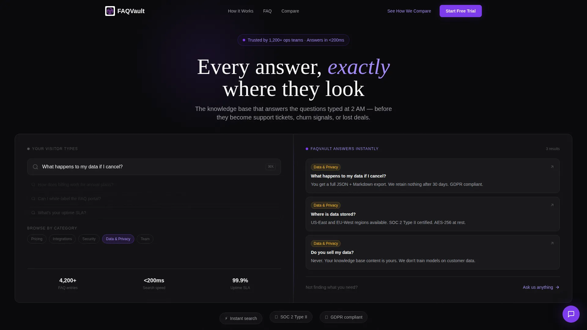
Animated Search Header
The header centers a live search bar on a split viewport. The left side animates a typed query character by character. The right side surfaces matching FAQ cards in real time. The search bar glows violet on focus, and ghost suggestions pulse beneath it.
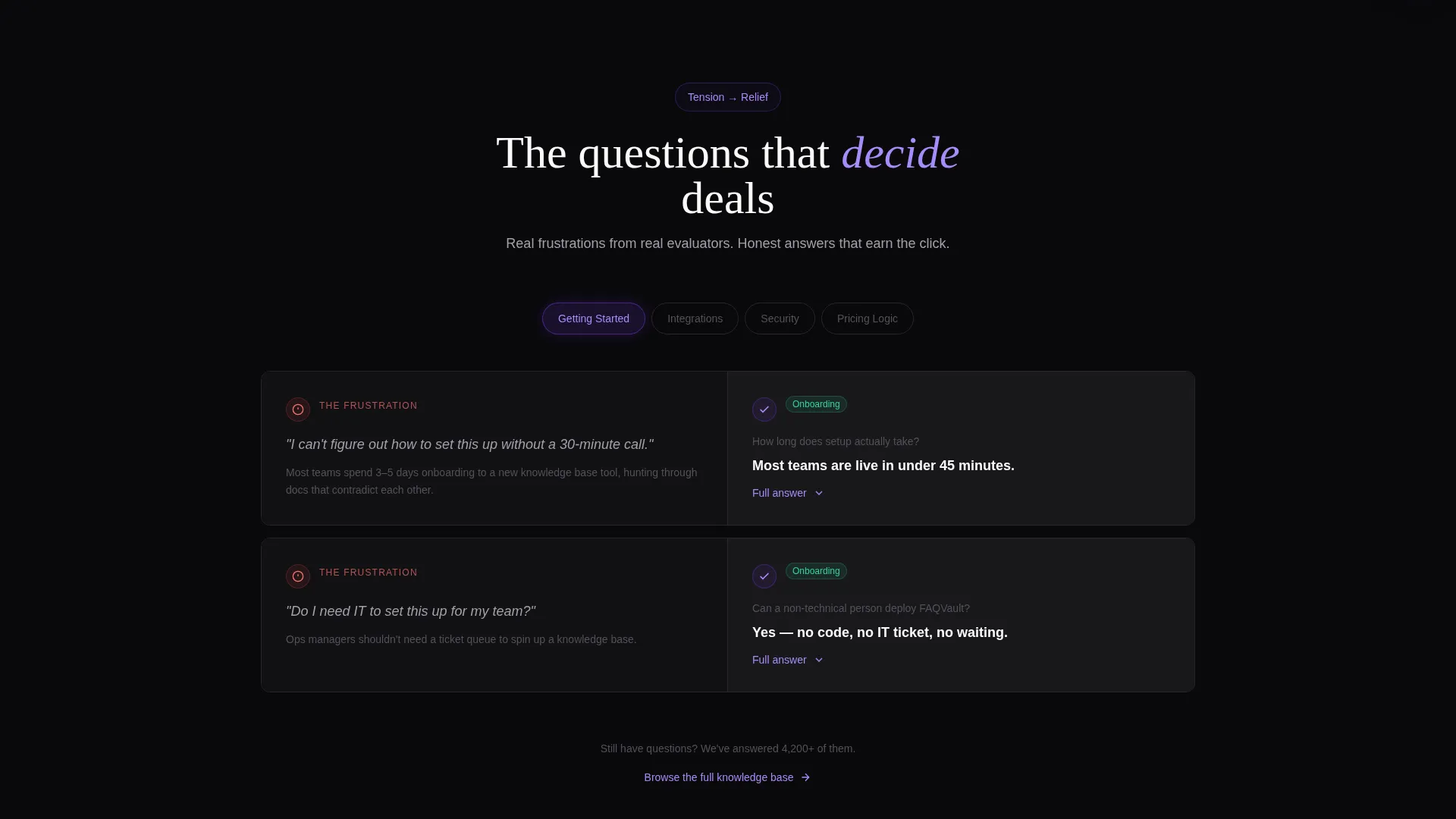
Problem→Solution Scroll Arc
Each scroll tier presents a user frustration on the left panel and a clean, expandable answer on the right. The sequence moves from simple onboarding questions through integrations, security, and pricing logic. The rhythm builds tension and releases it, making each answer feel more satisfying than the last.
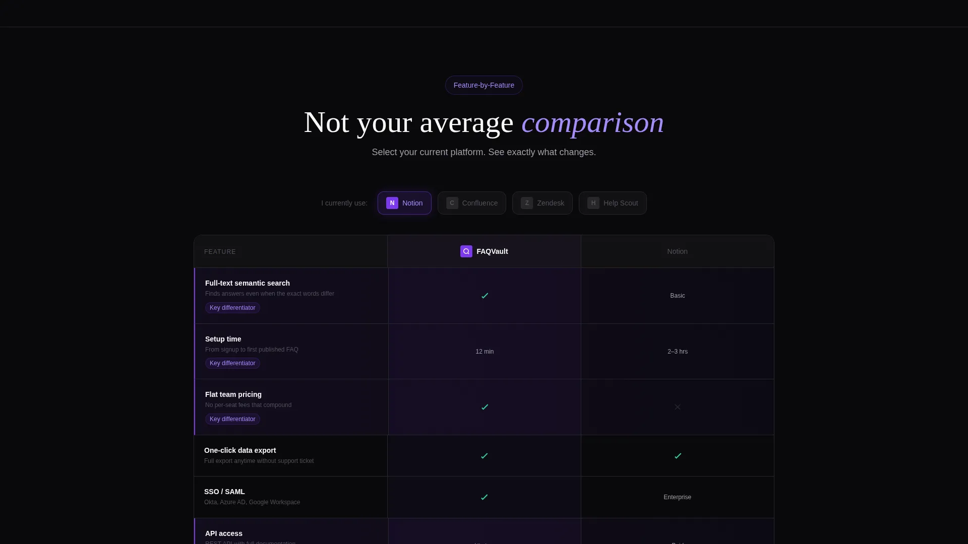
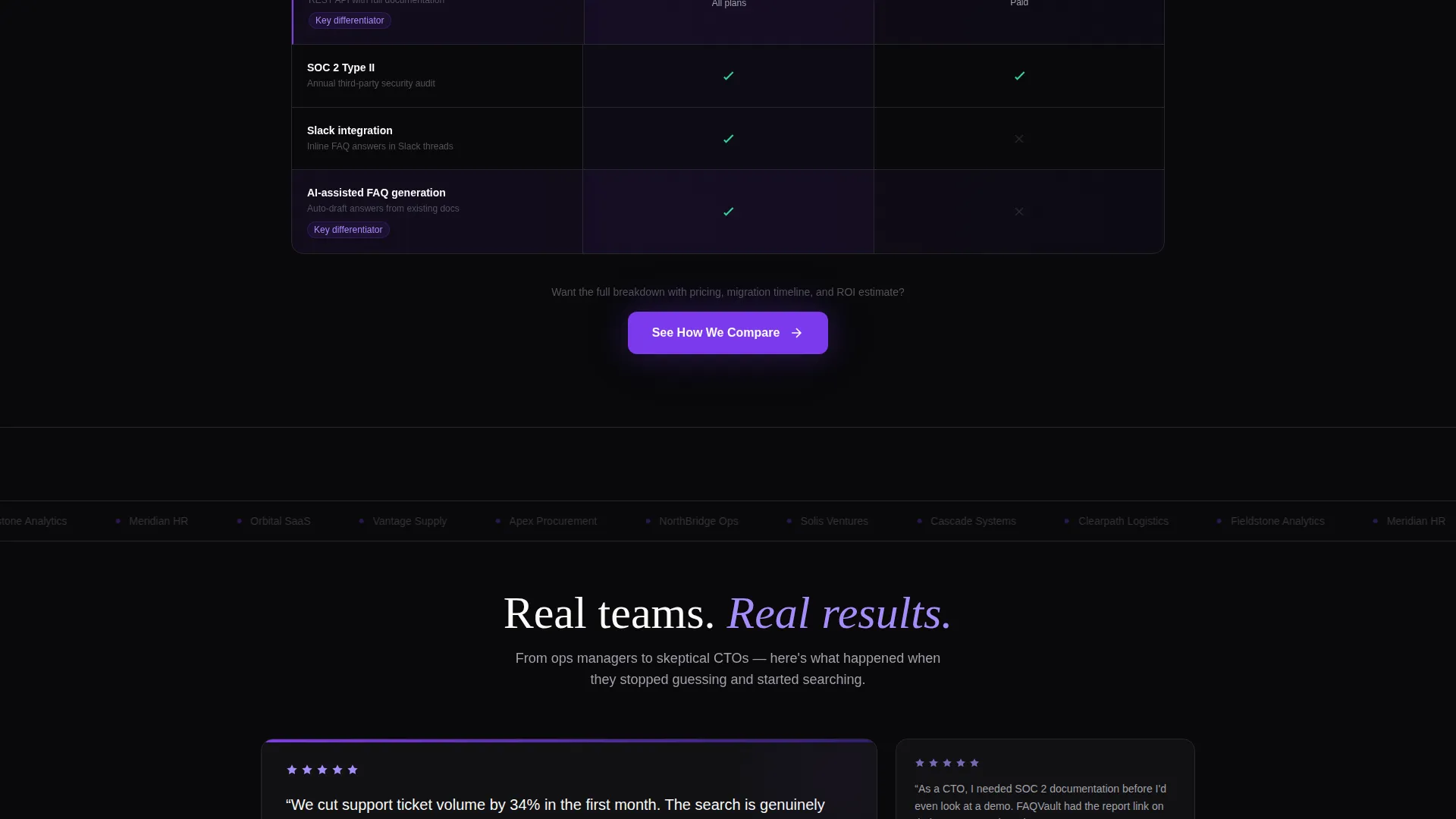
Competitor Comparison Panels
As the page deepens, the left column shifts from user questions to direct competitor comparisons. Side-by-side screenshots and real-time feature checkboxes let visitors see the difference without leaving the page.
Comparison Call to Action
The primary call to action reads "See How We Compare" and links to a dynamic comparison tool. Visitors select their current platform from a dropdown and receive a personalized feature-by-feature breakdown.
Contextual Live Chat Entry
The secondary call to action, "Ask Us Anything," opens a live chat pre-filled with context from whatever FAQ section the visitor scrolled deepest through. This removes friction from the follow-up conversation.
Void & Violet Visual System
Black dominates backgrounds while electric violet pulses through links, hover states, and active category indicators. White card surfaces float on the dark background, creating clear visual hierarchy without illustration or stock imagery.
Page sections overview
| Section | Purpose |
|---|---|
| Animated Search Header | Engages visitors with live query animation and real-time FAQ card matching |
| Onboarding FAQ Tier | Addresses basic setup questions with expandable left-right answer panels |
| Integration FAQ Tier | Covers connection and workflow questions as scroll depth increases |
| Security FAQ Tier | Handles trust-critical questions about data handling and access |
| Pricing Logic Tier | Explains pricing structure and addresses common cost objections |
| Competitor Comparison Panels | Places the product directly against alternatives with visual feature checkboxes |
| Comparison call to action Block | Drives visitors to a personalized platform comparison tool |
| Live Chat call to action Block | Opens a context-aware chat entry pre-filled from scroll behavior |
Design & branding system
The Void & Violet color system creates a terminal-like environment that feels technical, infinite, and quietly alive. The palette is precise and intentional, with every color assigned a specific role.
- Absolute void black (#09090B) dominates backgrounds, deep ultraviolet (#2D1B69) anchors depth layers, electric violet (#7C3AED) activates links and hover states, and phosphor white (#FAFAFA) surfaces text and card faces
- No stock imagery and no illustration are used anywhere; the product interface and FAQ content serve as the visual hero
- The Directory & Discovery theme keeps the layout organized like a well-labeled toolbox, where every section is exactly where a visitor expects it
Mobile & speed optimization
The split-screen layout is structured to adapt across viewport sizes without losing the visual logic of the left-right panel pairing. The template prioritizes lean, readable layouts that hold up on smaller screens.
- The 50/50 split transitions to a single-column stacked layout on mobile, preserving the Problem→Solution reading order
- Violet hover states and active indicators remain visible and functional on touch interfaces
How this template helps you convert
This template is designed to answer enough questions honestly that the visitor trusts the page to answer the rest. Conversion is earned through clarity, not pressure.
- The live search header captures visitors with high comparison intent immediately, before they scroll away or open a competitor tab
- The Problem→Solution Arc builds credibility tier by tier, so visitors arrive at the call-to-action section already convinced rather than still skeptical
- The dual call-to-action structure serves two different buyer readiness levels: one for visitors ready to compare now, and one for visitors who still have open questions
Other information about this template
This template fits naturally into a SaaS company website template stack as a standalone FAQ landing page or as a linked destination from a pricing page. It is particularly effective for teams positioned in a competitive market where buyers are actively comparing options.
- The template style is Split Screen (50/50), consistent with the Directory & Discovery theme and built to communicate structured information clearly
- The creative direction follows a Problem→Solution Arc, which is effective for SaaS company FAQ pages where visitor intent ranges from curious to deeply skeptical
- The header concept is classified as an Interactive Preview, meaning the search interaction itself demonstrates product clarity rather than relying on marketing copy alone
- This template is categorized under SaaS Company Website Templates in the Technology category, making it a strong fit for product-led growth teams, support-focused marketing teams, and competitive positioning campaigns
Theme
Directory & Discovery
Creative direction
Problem→Solution Arc
Color system
Void & Violet
Style
Split Screen (50/50)
Direction
Comparison/Versus
Page Sections
Animated Split-screen Search Header
Problem to Solution Scroll Arc
Real-time Competitor Comparison Panels
Personalized Comparison Call to Action
Context-aware Live Chat Entry
Void & Violet Design System
Related questions
Can I customize the FAQ content and categories for my product?
Does the template include the comparison tool, or just the call to action linking to it?
How does the context-aware live chat call to action work?
Is this template suitable for a SaaS product in a competitive market?
Can the Void & Violet color system be replaced with our own brand colors?



