Saccharide - Real-Time Confectionery Landing Page Template
Saccharide is a split-screen landing page template built for sugar and confectionery analytics platforms. It pairs a dark, full-bleed dashboard hero with a scrolling feature matrix that confronts legacy workflows head-on. The Void and Violet color system, role-based toggle, and a frictionless three-field form make it purpose-built for converting procurement directors and commodity traders.
by Rocket studio
Quick summary
Saccharide is a single-page, 50/50 split-screen landing page template for a real-time sugar and confectionery analytics dashboard. It uses a Data Command theme with a Void and Violet color system to communicate urgency and precision. The page is structured around a Feature Matrix and Comparison/Versus conversion flow that builds a compelling case section by section.
Who this template is for
This template is designed for vertical software-as-a-service (SaaS) products that serve the global sugar and confectionery supply chain. It works especially well for platforms that need to speak differently to two distinct buyer types at once.
- Procurement directors at multinational candy manufacturers who track production rates and input costs
- Commodity traders hedging price spreads across futures exchanges
- Confectionery finance leaders who need forward-looking cost intelligence before market moves
What problem this template solves
Supply chain analytics buyers are sophisticated. They have seen generic SaaS landing pages before and they ignore them. This template solves the credibility gap between a complex data platform and a first-time visitor who needs to trust it in under ten seconds.
- Legacy workflow comparisons show visitors exactly what pain the platform replaces
- A role-based toggle lets procurement directors and traders each see a tailored pitch
- A sandbox demo path lowers commitment friction before any sign-up decision
What you get with this template
The template delivers a fully structured, section-led landing page built around confrontation-style content blocks. Every layout decision supports the goal of moving a skeptical, data-literate buyer from first impression to conversion.
- A dark full-bleed hero with a live-style dashboard scene and a self-typing headline in signal white
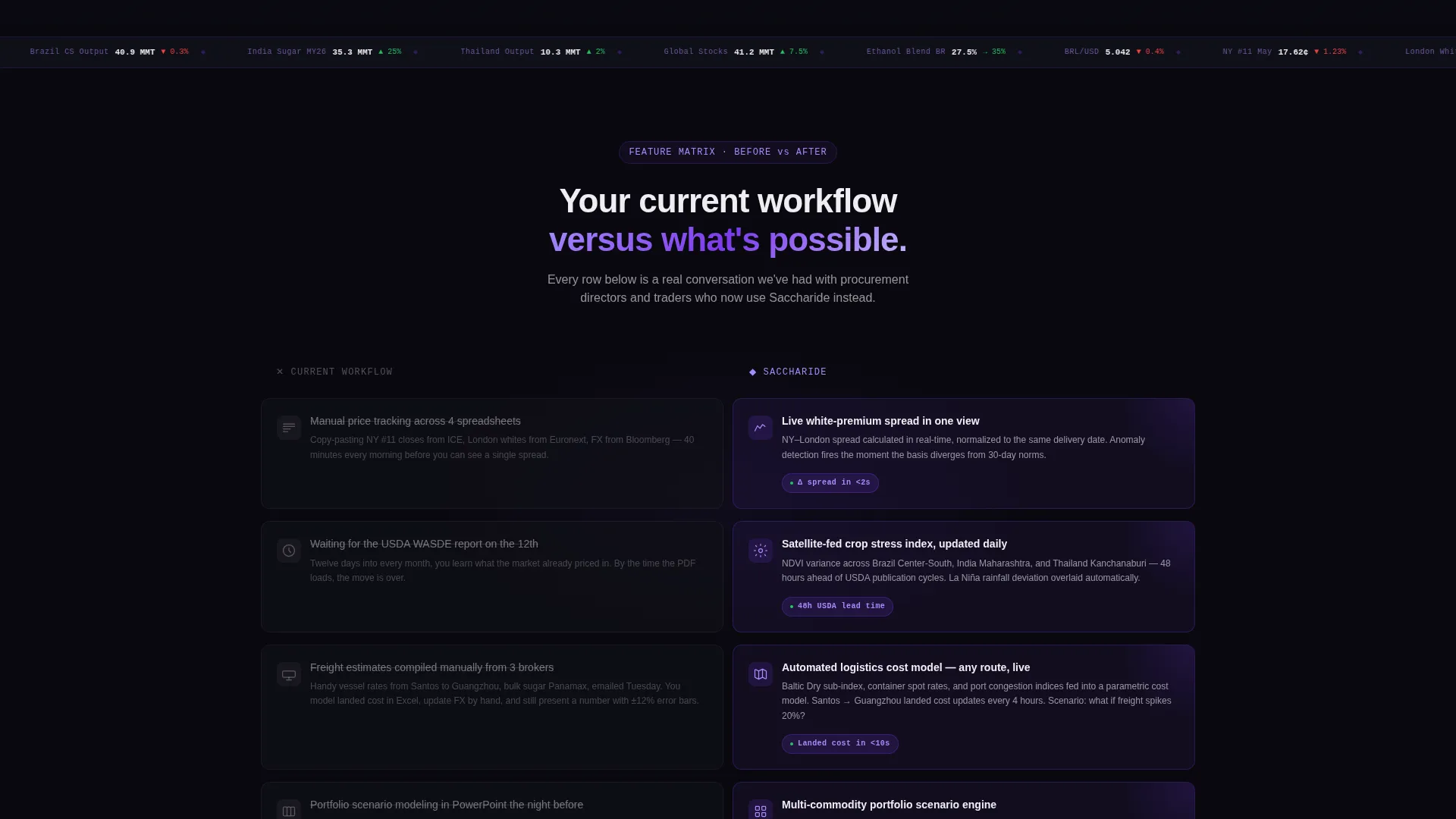
- A scrolling Feature Matrix with left-right split sections showing old workflow versus platform capability
- A three-field sign-up form and a secondary "See Live Demo Data" call-to-action path
Feature list
This section covers the core built-in components that define the Saccharide template.
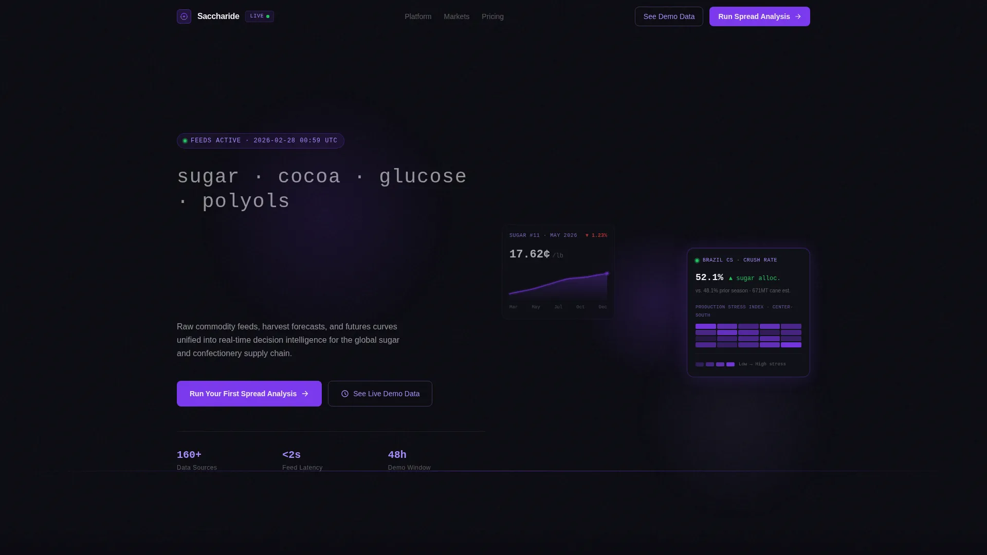
Dark Full-Bleed Hero with Glow Scene
The entire first viewport is filled with a void-black dashboard screenshot. Violet gradient glows bloom behind chart panels, and a live sugar futures curve, a Brazil production heatmap, and a margin ticker are visible at varying focal depths. The headline types itself into existence after a brief pause, reading "See the spread before it moves."
Split-Screen Feature Matrix
Each content section divides the screen 50/50. The left pane shows a painful legacy state: a cluttered spreadsheet, a delayed official crop report, or a manual freight estimate. The right pane glows with the platform's answer. The sections escalate in complexity, building from single-origin price tracking up to multi-commodity portfolio scenario modeling.
Role-Based Persona Toggle
A toggle at the top of the comparison matrix lets visitors switch between a "Commodity Trader" view and a "Procurement Director" view. Each view surfaces a different set of workflow comparisons, making the same page relevant to two distinct buyer personas without requiring separate URLs.
Three-Field Conversion Form
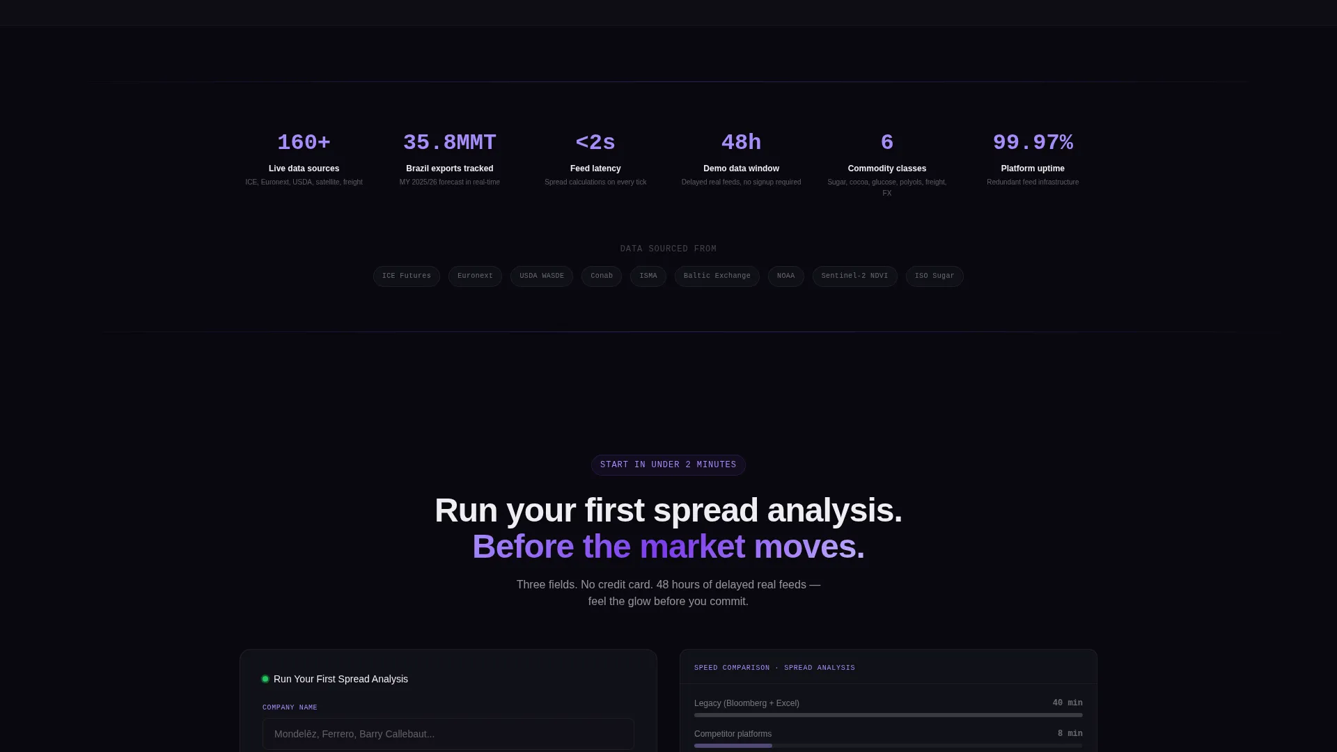
The sign-up form collects company name, primary commodity focus (sugar, cocoa, glucose syrups, or polyols), and current data source. Three fields only. This low-friction structure is placed at the midpoint of the page and repeated at the bottom alongside a final legacy-versus-platform comparison.
Sandbox Demo Path
A secondary call-to-action labeled "See Live Demo Data" routes visitors into a sandbox dashboard preloaded with 48 hours of delayed real feeds. This path earns the conversion by letting prospects feel the platform before they commit to a sign-up.
Dual Call-to-Action Structure
The primary call-to-action, "Run Your First Spread Analysis," appears twice: once at the page midpoint and once at the bottom. The repeated placement keeps conversion pressure steady without feeling aggressive, anchoring the final section beside a speed comparison between legacy tools and the platform.
Page sections overview
| Section | Purpose |
|---|---|
| Full-bleed hero | Immerse visitor in live dashboard scene and deliver the headline |
| Self-typing headline | Create a brief dramatic pause before the value statement appears |
| Feature Matrix rows | Confront legacy workflows with platform capability, section by section |
| Persona toggle | Let traders and procurement directors switch to their own comparison view |
| Midpoint call to action | Place "Run Your First Spread Analysis" at scroll depth before visitor exits |
| Sign-up form | Collect three fields with minimal friction at the conversion point |
| Demo sandbox call to action | Offer "See Live Demo Data" as a low-commitment secondary conversion path |
| Final comparison | Show legacy tools versus platform speed beside the closing call-to-action |
| Bottom call to action | Repeat the primary call-to-action anchored to the final comparison block |
Design & branding system
The Void and Violet color system is the visual backbone of this template. Every design decision reinforces the idea that violet only appears where data is live, making color itself carry informational weight.
- Absolute void black (#09090F) fills every background; near-black (#111118) floats the dashboard cards
- Electric violet (#7C3AED) pulses through live data lines and active interface states; muted orchid (#A78BFA) marks secondary labels and axis ticks
- Harsh signal white (#EEEEF2) is reserved exclusively for numbers and values that matter most
Mobile & speed optimization
The template is structured to translate the 50/50 split-screen layout into a readable single-column flow on smaller screens. The dark palette and minimal decoration keep the visual load focused.
- Split-screen sections restack vertically on mobile so left-pane pain points appear above right-pane platform answers
- The hero dashboard scene and glow effects are designed to remain legible at reduced viewport widths
- The three-field form renders cleanly on touch devices with no layout distortion
How this template helps you convert
The Comparison/Versus conversion direction is the organizing principle of this template. Every section is built to advance a single argument: the platform is faster, smarter, and more precise than whatever the visitor is using today.
- The Feature Matrix escalates complexity row by row, making each scroll feel like a growing case for switching, until the midpoint call-to-action lands at peak persuasion
- The role-based toggle makes the pitch personally relevant, reducing the cognitive distance between "this is a cool product" and "this is built for me"
- The sandbox demo path removes the biggest barrier to sign-up by letting visitors experience value before any commitment is required
Other information about this template
Saccharide is part of a broader family of Data Command theme templates designed for vertical analytics products that serve highly specialized professional audiences. The template style, color system, creative direction, and conversion flow are all matched from an intersection of proven design and conversion patterns for the technology category.
- The template sits inside the Sugar and Confectionery Vertical SaaS subcategory, making it a precise fit for niche analytics platforms rather than a generic dashboard template
- The Intersection Match Score for this template is 13, reflecting a high alignment between the Data Command theme, Feature Matrix creative direction, and Comparison/Versus landing-page direction
- The "See Live Demo Data" secondary path is designed specifically for data-literate buyers who need proof before trust, a common behavioral pattern in commodity trading and procurement audiences
- Template customization should focus on swapping the commodity-specific data visuals (futures curves, heatmaps, margin tickers) and adjusting the form's commodity focus dropdown to match the platform's actual product scope

Theme
Data Command
Creative direction
Feature Matrix
Color system
Void & Violet
Style
Split Screen (50/50)
Direction
Comparison/Versus
Page Sections
Dark Full-bleed Hero with Glow Scene
Split-screen Feature Matrix
Role-based Persona Toggle
Three-field Conversion Form
Sandbox Demo Secondary Path
Dual Call-to-action Placement
Related questions
Who is the primary audience for this landing page template?
Can I adjust the persona toggle to match different job roles?
What does the sandbox demo path include?
How many fields does the sign-up form collect?
Can this template be adapted for commodities beyond sugar and cocoa?



