Comprehensive School Policy Landing Page Template
Comply is a bold brutalist school privacy policy landing page template built for school administrators, academy founders, and IT directors who need to close FERPA and COPPA compliance gaps fast. It pairs a live compliance risk estimator with modular violation cards and a head-to-head comparison grid, translating dense legal requirements into clear, actionable language inside a raw, industrial Carbon Fiber design system.
by Rocket studio
Quick summary
Comply turns the most intimidating page in any school's digital environment into something a busy administrator can actually use. The template opens with a live compliance scoring tool, walks visitors through escalating violation scenarios, and delivers a direct audit path. Every element is built with purpose. Nothing exists to decorate. Everything exists to deliver clarity.
Who this template is for
This template speaks directly to the people who carry the weight of student data protection. It is not built for mainstream businesses or general audiences. It is built for educators and administrators who cannot afford to get privacy wrong.
- School administrators preparing for FERPA audits or facing board accountability for student data handling
- Academy founders who have just realized their enrollment forms collect minor data without proper parental disclosure
- IT directors at charter networks who need a reliable, compliant privacy policy template without reading a single statute
What problem this template solves
School privacy policies are usually either buried in unreadable legal text or pieced together from outdated DIY sources. Neither approach holds up when regulators ask questions. The real challenge is that most institutions do not know what they are missing until it is too late.
- Administrators cannot quickly identify which specific data collection practices violate FERPA or the Children's Online Privacy Protection Act (COPPA)
- Founders lack a clear, side-by-side comparison between a generic DIY policy and a professionally structured one
- IT directors have no fast way to quantify their compliance gap or communicate urgency to leadership before the next board meeting
What you get with this template
Comply is a single-page, modular card grid layout that guides visitors through their compliance reality from the first scroll. The architecture of the page is deliberate. Every section builds urgency before offering a resolution.
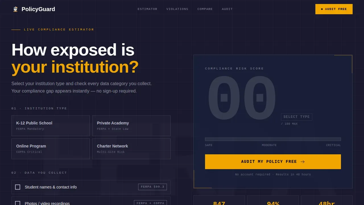
- A live compliance risk estimator with a 200-pixel monospaced score display and a brutalist progress bar that fills in real time as visitors check boxes for the data their institution collects
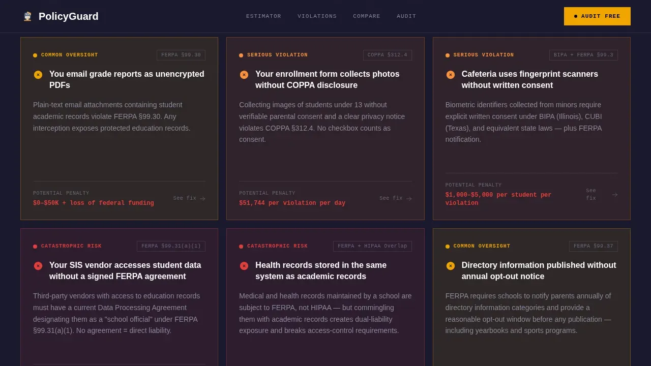
- A Problem-to-Solution card grid where each card surfaces a specific violation scenario on one face and reveals the compliant alternative on the other, escalating from common oversights to serious breach territory
- A head-to-head comparison grid, a floating call-to-action bar, a dual-path form section, and a single-row linear footer
Feature list
This template is packed with interactive, high-specificity components that all earn their place through utility rather than decoration.
Live Compliance Risk Estimator
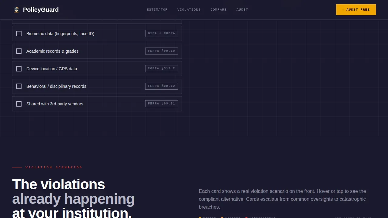
The hero section opens with a working calculator. Visitors select their institution type, including K-12 public, private academy, or online program, and check boxes for every category of data they collect. Names, photos, health records, and biometric data each trigger a real-time score update. The risk number displays at 200 pixels in bold monospaced type against a raw black background. The progress bar fills as the score climbs. By the time a visitor reaches the scroll, they already know their number.
Violation-to-Solution Card Grid
Each modular card in this section presents a real-world compliance failure on the left face and its correct alternative on the right. Examples escalate deliberately, moving from everyday oversights like emailing grade reports as unencrypted files to catastrophic data exposure scenarios. The cards are designed to create a lasting impression by making each violation feel immediately familiar. The structure follows a clear Problem-to-Solution arc that guides user behavior naturally down the page.
Head-to-Head Comparison Grid
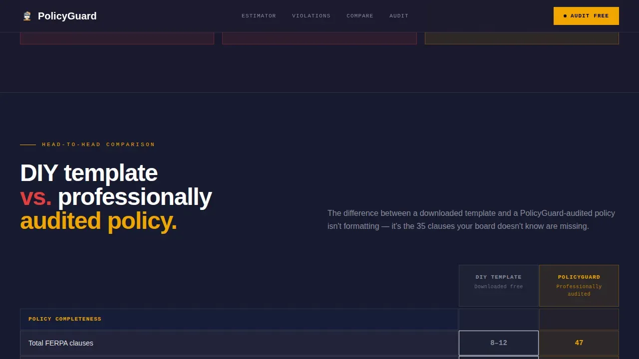
Every third row in the card sequence becomes a full comparison grid. These stark, black-and-white cells place a DIY policy template directly beside a professionally audited alternative. Visitors can compare clause count, FERPA alignment score, COPPA coverage, and last-updated freshness. Warning-stripe amber highlights mark the winning column. This is where the template does its most persuasive work by letting the data speak without commentary.
Dual-Path Call-to-Action Section
The primary call to action, "Audit My Policy Free," appears twice. It locks to the bottom of the estimator section and reappears as a floating bar after the third comparison card. The form collects institution name, an optional current policy URL with a drag-and-drop PDF upload fallback, and the administrator's role from a short dropdown. A secondary path, "Download the FERPA Clause Checklist," captures email-only leads who are not yet ready to submit a policy but need immediate proof of action for their next board meeting.
Institutions and Social Proof Stats
A dedicated section displays served institution counts, total policies audited, and FERPA alignment metrics across named school types. This section provides the social proof that turns visitors from skeptical browsers into confident action-takers. The numbers are displayed in the same oversized monospaced style used throughout, keeping the visual style consistent and authoritative.
Carbon Fiber Design System
The visual identity is built around deep carbon black, machined graphite, exposed aluminum, and warning-stripe amber. Typography combines JetBrains Mono for scores and numbers with DM Sans for body text and interface elements. The palette is matte, industrial, and utilitarian in the truest sense. Color earns its place through function, not decoration.
Page sections overview
| Section | Purpose |
|---|---|
| Hero Compliance Estimator | Live risk scoring tool with real-time progress bar and oversized monospaced score |
| Violation Solution Cards | Escalating problem-to-solution card grid surfacing specific FERPA and COPPA failure scenarios |
| Comparison Grid Rows | Head-to-head DIY versus audited policy comparison with amber-highlighted metrics |
| Institutions Stats Block | Social proof section showing served institution counts and audited policy metrics |
| Audit call to action Section | Dual-path form for policy audit submission and FERPA checklist email capture |
| Linear Single-Row Footer | Minimal single-row footer with navigation links and policy access |
Design & branding system
This template draws its visual language directly from brutalist architecture. Like raw concrete in physical buildings, every surface here is exposed and honest. Nothing is hidden behind polish. The design system is matte, industrial, and built for institutions that need to project authority rather than charm.
- Carbon Fiber color system: deep carbon black (#1A1A2E) as the primary background, machined graphite (#16213E) for card surfaces, exposed aluminum (#E2E2E2) for body text, and warning-stripe amber (#F0A500) reserved strictly for calls to action, toggle states, and comparison highlights
- Typography pairing: JetBrains Mono for all numeric displays, scores, and estimator outputs to reinforce a sense of precision; DM Sans for all body copy, labels, and interface text to keep reading comfortable
- Animation and interactivity: high-animation real-time score counter, card reveal transitions, progress bar fill, and a floating call-to-action bar that enters after the third comparison card
Mobile & speed optimization
The template is built desktop-first to match how administrators work, reviewing policy documents at their workstations rather than on a phone. Modern web design trends, however, require that any site also perform reliably across screen sizes. The template structure supports this expectation.
- Static sections use server-rendered components to keep initial load fast, while interactive elements like the calculator and card reveals are handled client-side for smooth real-time feedback
- The modular card grid layout reflows naturally across viewports, preserving the visual hierarchy of each card face without breaking the comparison logic
How this template helps you convert
This template earns every click by showing visitors their problem before asking them to act. The page is engineered so that by the time the call to action appears, the visitor has already quantified their own risk.
- The compliance estimator forces a personal reckoning in the first section. Visitors see their own score, rendered large and unavoidable, before they encounter any sales language. This mirrors real-world strategies that prioritize showing a problem before offering a solution, which is more effective at turning visitors into leads than leading with product claims.
- The comparison grid delivers the most persuasive content in the clearest format possible. Stark cell-by-cell comparison removes ambiguity and makes the gap between a weak DIY policy and a structured alternative impossible to dismiss. This approach reduces visual noise and directs attention exactly where the decision lives.
- The dual-path call to action gives visitors two on-ramps based on their readiness. Administrators ready to act submit their policy directly. Those who need to demonstrate action to a board or supervisor first can download the FERPA Clause Checklist with only an email. Both paths deliver value and move the visitor forward.
Other information about this template
This template sits at a specific intersection of web design disciplines. It draws from the history and principles of brutalism as both an architectural movement and a philosophy applied to digital interfaces. Brutalist architecture emerged in the 1950s and celebrated exposed materials, functional honesty, and the beauty of structure without ornament. Brutalist buildings rejected decorative excess in favor of raw concrete mass and utilitarian purpose. That same philosophy powers this template's visual identity.
In web design, brutalism translates those ideas into bold typography, monochromatic or highly limited color schemes, and stripped-back functional elements. Brutalist websites often stand out from sleek, homogenous designs precisely because they reject polish. The raw, unpolished aesthetic can, at times, compromise usability if not handled with care. This template navigates that tension by pairing the brutalist style with clear visual hierarchy and deliberate interaction patterns. Great design in any context balances striking visuals with usability. This template aims to achieve exactly that.
Web designers working in creative industries, building creative portfolios, or exploring niche audiences will recognize the aesthetic logic here. Brutalism resonates with audiences that value authenticity. It is used across art, construction, and technology contexts where directness is a virtue. The comply bold brutalist school privacy policy landing page template is a specific, purposeful application of that approach to the education compliance space.
Beyond aesthetics, the template supports real-world institutional needs. School privacy policies must address specific legal frameworks: the Family Educational Rights and Privacy Act (FERPA) for educational records, and COPPA for children's data protection. Policies should disclose which third-party vendors have access to site data, describe data retention timelines, define the process for data demolition, and explain parental consent rights for students under 13. The policy must use direct language rather than polished legal jargon, and it should prioritize accessibility so that every parent and guardian can read and understand it.
No-code tools and AI-powered platforms now allow school owners and administrators to build and deploy pages like this without traditional programming skills. The growing use of these tools across businesses of all sizes means that a template like Comply can be adapted and launched quickly. Designers and non-technical users alike can explore this template, customize it to their brand, and deliver a compliance-forward experience to their clients without writing a single line of code.
- This template is designed for the education niche and is most relevant to US-based institutions governed by federal and state-level student data laws
- The brutalist style makes it a strong fit for contexts where authority, transparency, and directness matter more than decorative aesthetics
- The template's utilitarian design approach means it can be adapted for similar compliance or legal disclosure contexts across education technology and related fields
- Designers building compliance-focused products will find the card grid structure reusable across multiple policy types and institution categories
- The template supports collaboration between legal, IT, and administrative teams by presenting policy information in a format that all stakeholders can read and act on
Theme
Bold Brutalist
Creative direction
Problem→Solution Arc
Color system
Carbon Fiber
Style
Card Grid (Modular)
Direction
Comparison/Versus
Page Sections
Live Compliance Risk Estimator
Violation-to-solution Card Grid
Head-to-head Comparison Grid
Dual-path Call-to-action Section
Social Proof Stats Block
Carbon Fiber Typography System
Related questions
What design style does this template use?
Who is this template best suited for?
What interactive components does the template include?
Can non-technical users customize this template?
Does this template cover both FERPA and COPPA requirements?



