Nonprofit Safety Management Landing Page Template
Safeguard is a nonprofit safety management landing page template built for organizations navigating compliance gaps, volunteer liability, and incident reporting. It uses a dark-glass visual system with iridescent accents, a persuasive comparison table, and a dual-path lead generation flow to turn safety anxiety into decisive action.
by Rocket studio
Quick summary
Safeguard is a single-page lead generation template for nonprofit safety management platforms. It leads with hard data, walks visitors through a stark three-column comparison, and closes with two conversion paths: a free safety audit form and a downloadable readiness checklist. The design is dark, data-forward, and built to resonate with operational leaders who already know they have a problem.
Who this template is for
This template speaks directly to the people running nonprofits day to day, not the communications team, but the operational leads who carry the compliance weight.
- Executive directors managing OSHA logs alongside grant deadlines
- Board treasurers who inherited outdated risk management policies
- Volunteer coordinators running background checks on informal, unreliable systems
What problem this template solves
Most nonprofit safety platforms struggle to communicate urgency without feeling alarmist. This template solves the sales communication problem: how do you show operational leaders that their current system is failing before an incident forces the lesson?
- Visitors arrive without a clear comparison point between doing nothing and using a real platform
- Spreadsheet-based tracking looks sufficient until it isn't, and the template makes that gap visible
- Decision-makers need a reason to act now, not after the next audit cycle
What you get with this template
You get a complete, single-page layout that moves a visitor from awareness to conviction to action. Every section is designed with a specific job in the conversion journey.
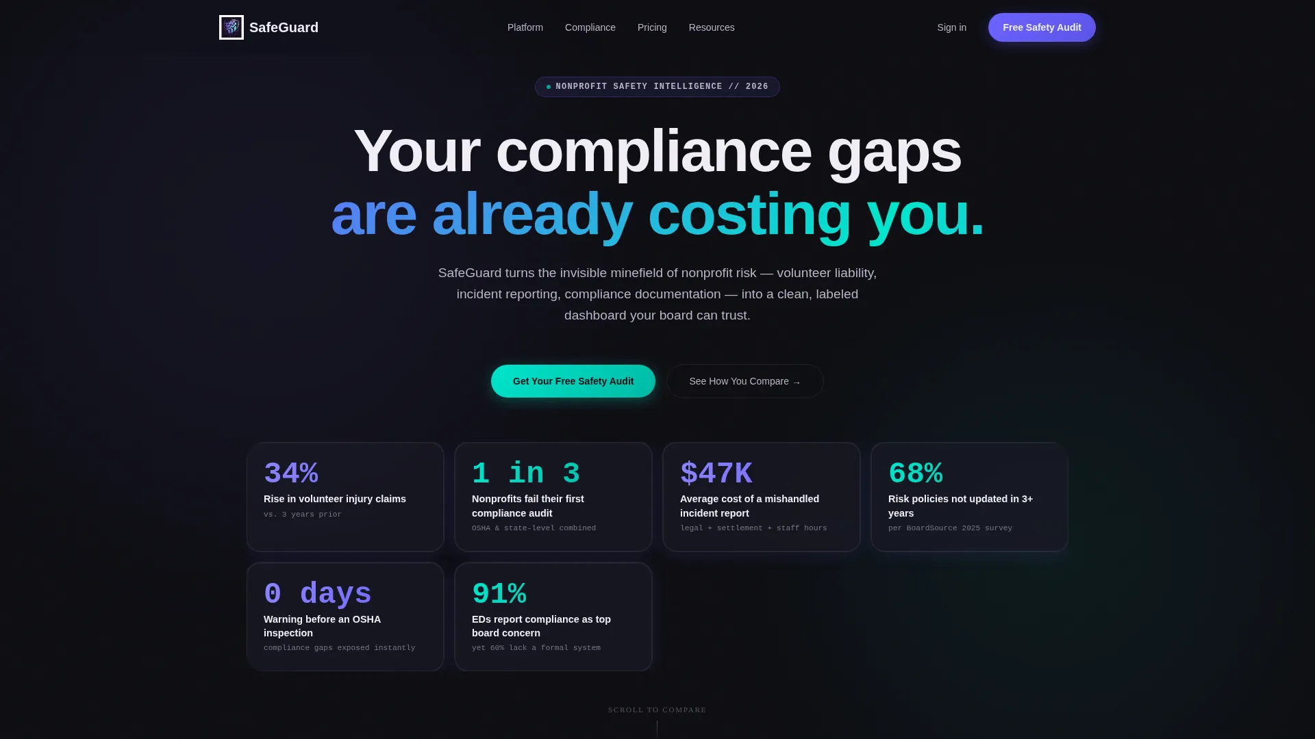
- A data-heavy header built from frosted dark-glass panels displaying real nonprofit safety failure statistics
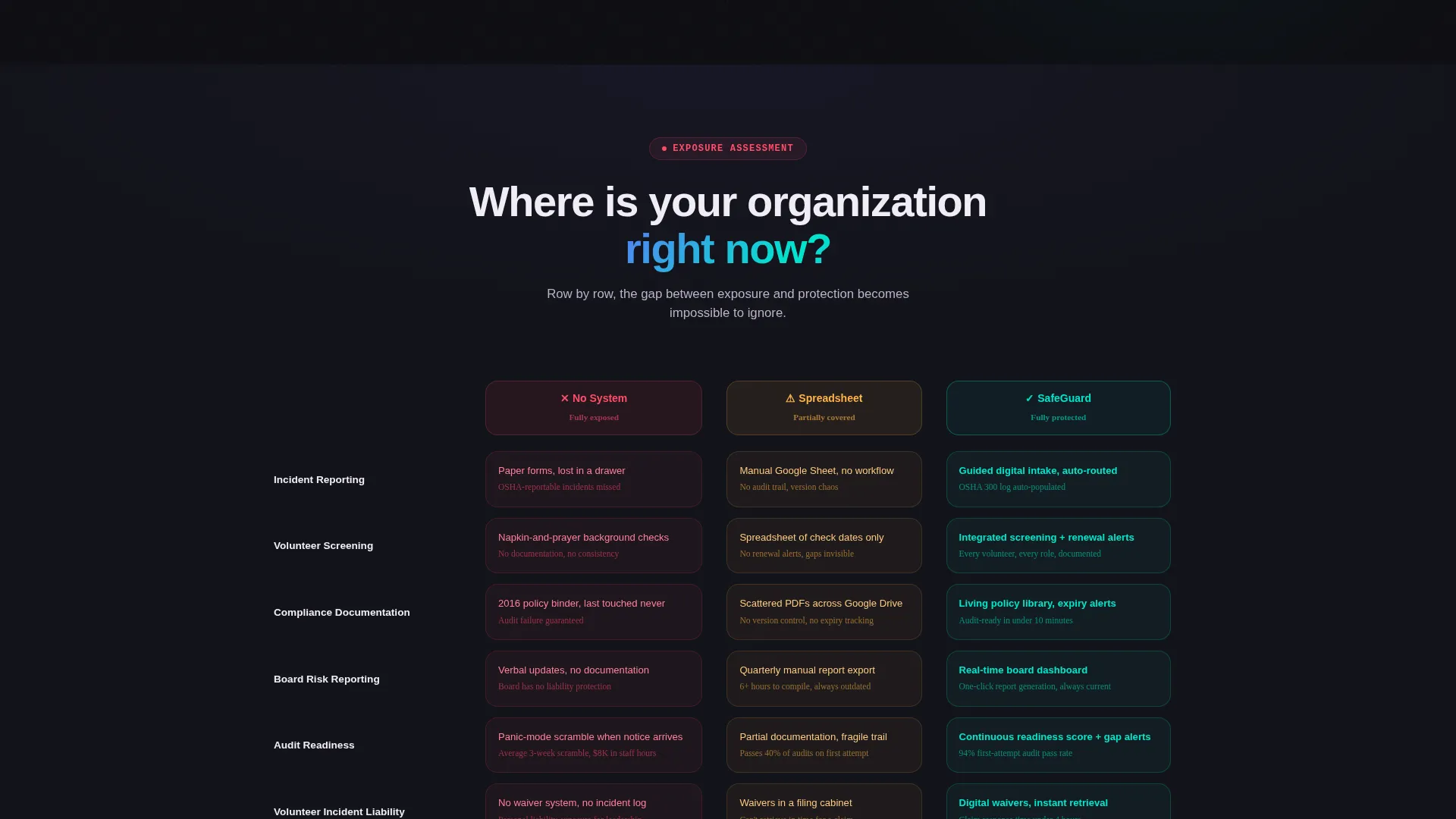
- A three-column animated comparison table contrasting no system, spreadsheet tracking, and the platform
- A dual lead capture flow: a three-field safety audit form and a gated checklist download requiring only an email
Feature list
This template's capabilities are drawn directly from the brief. Each section has a defined role in the Problem to Solution arc.
Dark Glass Panel Header
The header is built from translucent, frosted panel components floating against a deep obsidian background. Each panel holds a single nonprofit safety failure statistic in iridescent type. An animated light sweep passes across the panels at a slow, scanning pace, making the data feel live without being distracting.
Animated Comparison Table
The core of the page is a three-column table comparing "No System," "Basic Spreadsheet Tracking," and the platform across five dimensions: incident reporting, volunteer screening, compliance documentation, board reporting, and audit readiness. Each row animates in on scroll, with the first two columns rendered in red and amber failure states while the platform column pulses with iridescent confirmation.
Dual Lead Generation Flow
Two conversion paths run in parallel throughout the page. The primary path is a three-field form capturing organization name, active volunteer count, and biggest safety concern via dropdown. The secondary path offers a downloadable Nonprofit Safety Readiness Checklist gated behind a single email field, capturing leads who are not yet ready to book a call.
Floating and Anchored Call to Action
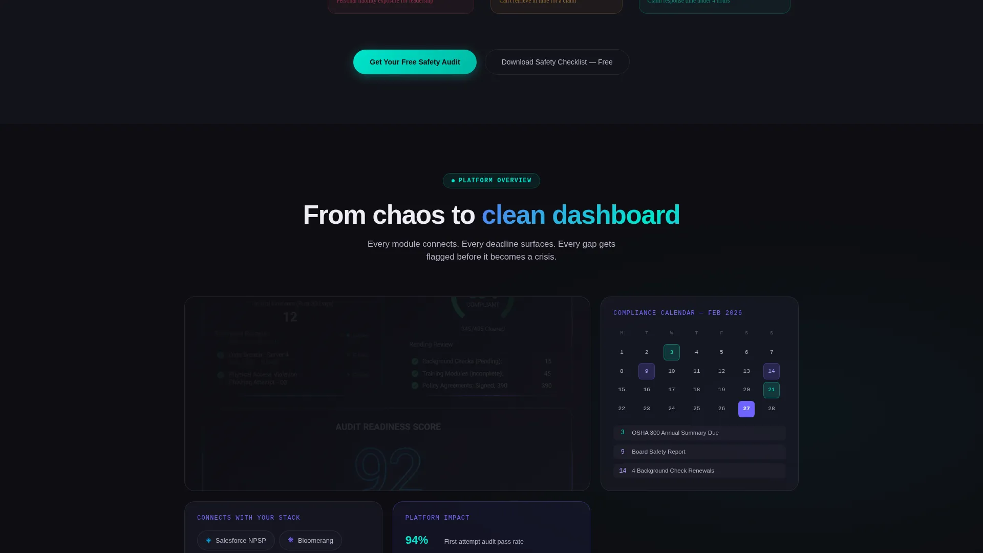
The primary call to action, "Get Your Free Safety Audit," appears as a floating button after the comparison table and again as an anchored element inside a final dark-glass panel at the bottom of the page. This dual placement keeps the conversion option visible throughout the scroll without being intrusive.
Solution Section with Proof Elements
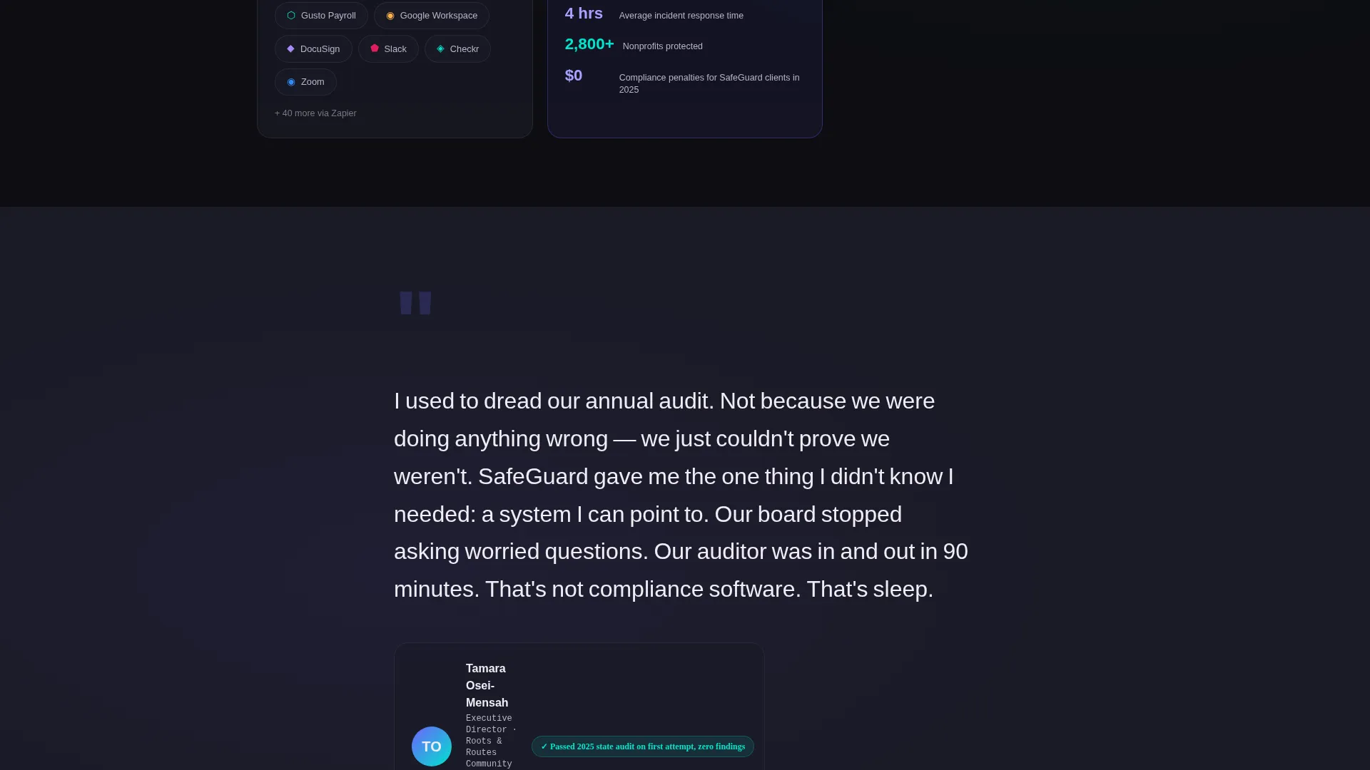
Past the comparison table, the page softens into solution territory. This section includes integration snapshots, a compliance calendar preview, and a testimonial block from an executive director describing their experience ahead of an annual audit. These elements shift the emotional tone from exposure to confidence.
Page sections overview
| Section | Purpose |
|---|---|
| Dark Glass Header | Display nonprofit safety statistics with iridescent animated panels |
| Comparison Table | Contrast three system states across five compliance dimensions |
| Solution Snapshots | Show integration previews and compliance calendar overview |
| Testimonial Block | Build trust through a real executive director perspective |
| Floating call to action Button | Maintain primary conversion access after the comparison section |
| Lead Capture Form | Convert ready visitors with a three-field safety audit request |
| Checklist Download | Capture early-stage leads with a single-field email gate |
| Bottom call to action Panel | Anchor the final conversion opportunity in a dark-glass panel |
Design & branding system
The visual identity follows a Directory and Discovery theme powered by an AI Iridescent color system. The palette is intentionally technological without feeling cold, and intelligent without feeling intimidating.
- Deep obsidian (#0D0D12) anchors every background; shifting violet-blue (#6C63FF) and holographic teal (#00E5CC) shimmer across interactive comparison rows and toggle states
- Soft pearl white (#F0EDF5) keeps body text breathable and trustworthy against the dark base panels
- The overall effect resembles a smartphone screen catching light in a dark conference room, grounding the data-heavy layout in a sense of calm precision
Mobile & speed optimization
The layout is built for the way nonprofit leaders actually browse. Decision-makers often review vendor options between meetings, on mobile, with limited patience.
- The comparison table is structured to remain scannable on smaller screens without losing the column contrast between failure states and the platform column
- The dual lead capture flow keeps form fields minimal: three fields for the primary form, one field for the checklist gate, reducing friction on any device
How this template helps you convert
The page is architected as a single persuasive arc. Every section has a functional role in moving a visitor from recognition of risk to readiness to act.
- The header establishes credibility through real statistics before asking for anything, setting a tone of authority rather than sales pressure.
- The animated comparison table does the persuasion work by making the cost of inaction visible row by row, converting doubt into conviction before the visitor reaches the form.
- The dual conversion paths meet visitors where they are: the safety audit form captures those ready to talk, while the checklist download catches those who know they have a problem but are not yet ready to commit.
Other information about this template
This template is designed for technology vendors serving the nonprofit sector, specifically platforms focused on nonprofit safety management and compliance workflow. It suits any product built to replace informal or spreadsheet-based safety tracking with a structured system.
- The template style is a Comparison Table layout, following a Problem to Solution Arc creative direction
- The header concept is Dark Glass Panels; the lead generation direction supports both high-intent and early-stage visitor capture
- The theme is Directory and Discovery, meaning the visual language is built to orient visitors quickly and reduce cognitive friction as they evaluate options
Theme
Directory & Discovery
Creative direction
Problem→Solution Arc
Color system
AI Iridescent
Style
Comparison Table
Direction
Lead Generation
Page Sections
Dark Glass Panel Header with Live Statistics
Scroll-triggered Comparison Table
Dual-path Lead Capture Flow
Floating and Anchored Call to Action Placement
Solution and Proof Section
Related questions
Can I customize the statistics shown in the dark-glass header panels?
Does the comparison table support more or fewer than three columns?
How does the checklist download capture leads differently from the main form?
What is the primary call to action on this landing page?
Is this template suitable for a nonprofit promoting an internal safety program?



